The Principle of Least Astonishment: “When two elements of an interface conflict or are ambiguous, the behavior should be that which will least surprise the human user.”—Wikipedia
The Principle of Least Astonishment, in shorthand, encompasses what we, as designers, must achieve to ensure consistency in our designs. Consistency is a fundamental design principle [1] for usable user interfaces. But the thing that astonishes me is that it’s actually necessary to explain this principle. Surprise implies the unexpected. Of course, users want the response to a given action to be what they expect; otherwise, they would have done something else. In user interactions, the unexpected is pretty much the same as the unwanted. Surprise usually implies something bad rather than something positive—unless users already have such dismally low expectations of their software that they might think, Wow! It worked. I’m so astonished.
What does our need to give this simple principle a name mean? Are there software designers who don’t believe software should do what users expect? Could it be that there’s a school of design that believes software’s responses need not be consistent with the way the software indicates it will respond? That would explain a lot about what I see on the Web, now that I think of it.
Champion Advertisement
Continue Reading…
The Problem of Consistency
The Principle of Least Astonishment is a good example of a design principle that, while absolutely true, is useless in actually helping us make design decisions. By all means, let’s design our user interfaces so they do what users expect. That’s helpful. While we’re at it, let’s also make sure the applications we design are easy to use. The problem is: this principle doesn’t tell us how to determine which design alternative will surprise users less.
My concern is that designers and developers might get a false sense of confidence in their designs if they’re based on such an algorithmic-sounding Principle of Least Astonishment. “I studied every button and menu,” they might say, “and made sure they did nothing surprising.” Or, “We should design our application this way, because of the Principle of Least Astonishment.” End of argument. But all they’ve really said is, “This design fits with what I think the user expects.” It could be only a guess about users’ expectations.
Another concern is that this principle seems to suggest that we remain consistent with current design conventions, [2] without doing any real analysis of their trade-offs. For example, in our quest for consistency we might put an Options command on a Tools menu—even though there are no other menu items on that menu. Why? Because this imitates Microsoft applications, so fits most users’ expectations.
What if something is consistent in one sense, but not another? Suppose you have an application that displays ship dimensions and nautical charts. Traditionally, ship dimensions are in feet, but water depth is in fathoms. Doing the same in your application would be consistent with nautical tradition, but would make ship dimensions and water depth inconsistent with each other. So, what should you do?
On the Web, documents such as PDFs open with a single click, but on the desktop, they open with a double-click. Is that inconsistent? Should desktop documents open with a single click? Microsoft thought so and, in Windows 97, made that the default behavior for Windows Explorer. However, they later abandoned that approach, because it ended up increasing user confusion. Could they have predicted this?
Should we never surprise users? Doesn’t the answer to this question depend on the valence, quantity, and quality of the surprise? What are the costs of not surprising users? There are interface design principles other than consistency, and sometimes these principles conflict with one another. The bottom line is: We want the best overall user experience for our users, and sometimes that means trading consistency for something else.
For example, suppose you have an input form in which some text boxes have a fixed number of characters for all possible values—for instance, for US users, social security number, credit card number, telephone number, postal code, or state abbreviation. You could make data entry faster by automatically advancing the focus to the next text box when a user hits the character limit of the current text box. However, such behavior would be inconsistent with the behavior of nearly all other text boxes—maybe even other text boxes in the same form. Is having this inconsistency worthwhile just for the sake of faster data entry?
If consistency became an uncompromising end in itself, the evolution of design would stagnate and innovation cease. Where would we be if, in the early 1980s, the Mac development team had said, “No, we can’t do this. It’s not consistent with CP/M”? Let me make one thing clear: Deliberately making a user interface inconsistent is not something you should do lightly. You should not create inconsistency on a hunch. From a usability standpoint, you need solid empirical evidence of substantial human performance benefit to justify creating inconsistency, as was the case for GUIs (Graphic User Interfaces) in comparison to the convention of command-line user interfaces.
User research and usability testing are the obvious ways of handling these concerns. Up-front, generative user research can tell us what users expect in a user interface and how surprised they’d be if it did something inconsistent with their previous experience. Usability testing lets us directly observe where and how our user interfaces surprise users or otherwise thwart their goals. While user research and usability testing are almost always beneficial, practicality prevents our doing research to answer all design questions. To minimize the time and expense of product development, UX designers usually need to take their best shot at designing a good user interface prior to testing with users.
To help us make better design decisions around the issue of inconsistency, it would be helpful to be able to analytically predict at least the rough impact of an inconsistency in the absence of exhaustive user research and usability testing. Analysis of the severity of an inconsistency involves evaluating the
type of inconsistency
strength of the inconsistency
potential impacts of the inconsistency and their relevance
situational relevance of the inconsistency
potential for design amelioration of the inconsistency
proximity of the inconsistency
Let’s explore each of these in depth.
The Type of Inconsistency
We achieve consistency when an interaction with a user interface (UI) element matches users’ expectations—thus, no surprises. User expectations, in turn, become established through users’ experiences within their environments. Over time, users learn that certain stimuli have certain meanings or usages, because those stimuli have had those meanings or usages in the past. Take, for example, a command button. Through exposure to GUIs—not to mention their physical analogues—users have learned to interpret the dimensional appearance of a rectangle that has a label as a button and clicking a button with the immediate execution of the command the button’s label represents. Remove the user from the equation, and we can see that consistency occurs when the stimuli / usage pairs for UI elements are the same as those for other UI elements that already exist. In human-computer user interfaces, stimuli include the following:
symbols—imagery—such as icons—that conveys information
codes—colors, sizes, weights, marks, and other graphic dimensions that may represent data values or invoke a metaphor
units of measurement—either for a particular numeric attribute or groups of related attributes
data formats—for data in the form of text
terms—identifying the objects, classes, actions, and events in user interactions
abbreviations—for terms, including the names of the function and control keys that are assigned to commands
layouts—UI elements’ relative locations on a page or in a menu, window, or temporal sequence
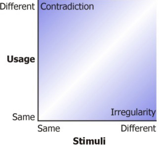
Inconsistency occurs when the meanings of these stimuli vary—when stimuli / usage pairs are not the same. This implies there are two kinds of inconsistency:
irregularity—When different sets of stimuli have the same usage, including behavior, the result is irregularity. For example, it’s an irregularity if some dialog boxes use the label Reset for a button that causes all of its settings to revert to their previous settings, while other dialog boxes use the label Undo. When each usage has a single symbol, code, unit, format, term, abbreviation, or layout, you have regularity.
contradiction—When the same sets of stimuli have different usages, the result is contradiction. It’s a contradiction if, in some dialog boxes, Undo causes only the last setting a user changed to revert to its previous setting, while in other dialog boxes, Undo causes all settings to revert to their previous settings. When each symbol, code, unit, format, term, abbreviation, and layout has a single usage, you have concordance.
Table 1 provides examples of irregularity and contradiction for each type of stimulus.
Table 1—Examples of irregularity and contradiction for stimuli
Stimulus
Irregularity
Contradiction
Symbols
One window represents Find with a binoculars icon, while another uses a magnifying glass.
One window uses a magnifying glass to represent Find, while another uses it to represent Zoom.
Codes
A red background distinguishes one error message, while a yellow background distinguishes another.
Red represents a dangerous valve configuration in an application for a steam plant, but for users, red means a closed valve.
Units of measurement
Ship length is in feet on one page and in meters on another page.
N/A
Data formats
Social security numbers display as 000-00-0000 in read-only fields and 000000000 in editable fields.
00/00/0000 represents month, day, and year in some applications and day, month, and year in others.
Terms
Standards dictate that a button that dismisses a modeless dialog box should have the label Close, but an application labels them Done.
Buttons with the label Close close a window in most applications, but in one application, it takes users back a page inside a window.
Abbreviations
In a legacy application, the Slash key displays a menu, while in its replacement application, the F10 key performs that function.
In a surveying application, the same character (') represents both feet and minutes of arc.
Layouts
An Options command is on the Tools menu in some applications, but on the File menu in other applications.
According to one user interface standard, the rightmost button in a dialog box is Cancel, while in another it’s OK or another button that accepts a user’s input.
Note—I have indicated that contradiction is N/A (Not Applicable) to units of measurement. I suppose a contradiction might be possible for a unit of measurement—for example, where the same unit has more than one usage. However, it’s not a usability concern.
With remarkably little effort, a UX designer can unwittingly achieve both irregularity and contradiction for the same set of stimuli. For example, I’ve seen one application in which, on some pages, an asterisk indicates required fields, while on other pages, it indicates optional fields. The contradiction: the same symbol, an asterisk, sometimes means required and sometimes means optional. The irregularity: sometimes an asterisk means required and sometimes the lack of an asterisk means required. Layout inconsistencies are often both irregular and contradictory, because in moving things around, we usually end up both using the same position for different usages and having multiple positions for a single usage.
The Strength of Inconsistency
Both irregularities and contradictions can vary in strength, depending on the degree of similarity between the two sets of stimuli or two usages in question. In Figure 1, darkness represents the strength of inconsistency.
Figure 1—The strength of an inconsistency
For example, in the application with contradictory meanings for asterisks, asterisks meaning optional were black, while those meaning required were red. This is a relatively weak contradiction, because the symbol isn’t quite the same for both usages—they have different colors. Similarly, the use of asterisks to indicate both the fields a user must complete and the fields a user must cross-check—making sure their default is correct—would also be a mild contradiction. The two usages are somewhat similar, so there is little practical difference if a user confuses them—either way, users attend to the fields as they should.
An example of weak irregularity would be choosing to style your own check box controls rather than using an operating system’s standard controls. This is only a mild irregularity, as long as an empty square means no and a checkmark in a square means yes. If the control is simply somewhat larger or heavier than a standard check box, that’s not nearly as irregular as doing something like making an X shape mean yes.
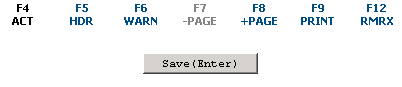
For a mercilessly strong contradiction, I need look no further than a certain frightful time-sheet application I have seen. On a particular input form in this application, there is a prominent button labeled Save, which you might think would save the changes a user makes to the form. Figure 2 shows a detail of this form.
Figure 2—Form detail
Having the Save button save changes would be consistent with just about every other computer application since Babbage’s Difference Engine, not to mention being consistent with the English language. But no, this Save button merely validates a user’s inputs. If the user leaves the page after clicking Save, the application loses all of the user’s changes—and, no, the application does not give any warning. Gotcha!
The first step in estimating the impact of an inconsistency is to assess the strength of the inconsistency—whether it be an irregularity or contradiction. For example, in certain circumstances, you might be able to justify using an extra-large check box, even though it’s inconsistent with a standard check box. A user could select the larger control more quickly, as Fitts’s Law states, which might provide an important benefit if users need to make time-critical inputs. That benefit might be worth introducing a weak irregularity. On the other hand, there is no way you could justify a Save button that does not save.
Impacts of Inconsistency
What is so bad about inconsistency? The world would be a boring place if everything always happened as expected. Novel stimuli / usage pairs could be amusing, even enlightening. Astonishment and surprise are not necessarily unpleasant experiences—otherwise, we wouldn’t have surprise parties. But in a product user interface, surprise is a sign of a potential problem.
The actual problem is the degree to which an inconsistency interferes with users achieving their goals when using a product. To assess the severity of an inconsistency, you also need to consider what form that interference takes. Interference can take several different forms—some worse than others and some related to irregularities, others to contradictions, and still others to both, as Table 2 shows. Generally, contradictions tend to be more severe than irregularities, having both more impacts and more serious impacts. While an occasional irregularity might be tolerable if it also provides some overriding benefit, strong contradictions are almost never acceptable.
Table 2—Impacts of contradictions and irregularities
Impact
Contradiction
Irregularity
Learning burden
Yes
Yes
Misunderstandings and misuse
Yes
No
Memory interference and mental effort
Yes
No
Difference camouflage
No
Yes
Cue blindness
Yes
Yes
Now, let’s take a look at each of these impacts in turn.
Learning Burden
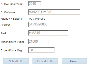
Both contradictions and irregularities result in users being unable to transfer their knowledge from past experiences, forcing them to learn new stimuli / usage pairs that are specific to a particular UI element. For example, I know from experience what an OK button means and what a Cancel button means. However, a cost-accounting Web application I’ve seen features a dialog box with a Return button. Figure 3 shows this dialog box.
Figure 3—Cost-accounting application dialog box with a Return button
Having had no prior experience with a Return button, I had no clue about whether it would apply or discard my changes. In trying to guess what the developers had been thinking, I considered the fact that no other dialog box in the application included a link or button with a Cancel function, so it seemed unlikely the developers were even aware of the concept. I reasoned that they might have been thinking of a function return, as in computer languages, so inferred that clicking Return might apply my input, in the same way a function applies its parameters and returns a value. But there was only one way to really know. Click. Nope, it discarded my input. But, hey, I’m a better person for it, aren’t I? I learned what Return means in this one application.
Learning takes time—delaying the completion of users’ tasks—and requires cognitive effort that users could better apply to completing their tasks. Not only do users have to learn an inconsistent UI element, they must learn when to apply that learning—that is, for which elements one rule applies and for which elements another rule applies.
For example, consider the well-known office productivity suite, Microsoft Office. In most of Office, as in many other applications, Ctrl-F is the shortcut for Find. This is the case for Office’s email client, Outlook. Well, actually, it’s true only if a user is writing a letter. If a user is reading a letter, the F3 key performs a find. I suppose this makes perfect sense, because F3, like Find, begins with the letter F. Assuming it were easy for users to learn that F3 finds, this irregularity would still be a significant burden, because users must also learn to use F3 when reading and Ctrl-F when writing.
Misunderstandings and Misuse
Contradictions can lead directly to errors when a user assumes one usage or meaning for a set of stimuli, but an application’s designers actually intended another. For example, while Ctrl-Ffinds text when writing a letter in Outlook, Ctrl-Fforwards a letter when reading the letter. Having the same abbreviation with different meanings in the same application—in this case, Ctrl-F, which means two different things, find and forward—would tend to cause users to misinterpret the abbreviation, substituting one usage for the other. Because of this abbreviation contradiction, I commonly find myself forwarding a letter when I meant to find something in it.
Irregularities can lead to a lack of understanding, but are less likely to lead to misunderstandings, because they imply that there is at least one stimulus for which users have no prior associated usage. Users may be puzzled by this new stimulus, because they cannot understand what it is trying to say, but they will realize they don’t understand what it says and, therefore, tend to proceed with caution. For example, when I made that guess about what Return meant in the cost-accounting application, I was prepared for the high probability that my guess might be incorrect. In contrast, misunderstandings—such as those from contradictions—suggest users think they know a user interface when they don’t. Pervasive contradictions in an application make users falsely predict how it will behave, causing them to lose control of the application.
Memory Interference and Mental Effort
Even once a user learns to use an inconsistent UI element, contradictions can prevent helpful habits from forming. As long as a user encounters conflicting, alternative usages for a given set of stimuli, no one association dominates. Slips occur, and a user must think to avoid errors. For example, my phone has the standard telephone keypad with the numbers 1, 2, and 3 in the top row. On the other hand, my computer keyboard, right next to the phone, has a standard adding-machine keypad, with 7, 8, and 9 in the top row. Sometimes, when using either of these keypads, I mistype, especially if I’m keying quickly or not thinking about what I’m doing. It seems my most common error is to key a 4 when I meant to key a 7 or a 1. It’s as if my fingers can’t tell which keypad I’m using, so the safest bet is to average the two and go for the middle.
Older versions of Microsoft Office provide another example of memory interference. Clicking the Close Window button on Excel’s title bar exits the application and closes all documents. However, the same button in Word closes only the current document. I have lived with this contradiction for eight years now, using Office almost daily, but I have yet to learn the difference. I’m still closing all of my Excel documents when I meant to close only the current document.
Difference Camouflage
Regularity is helpful in pointing out differences, ironically. A difference between two things is much more apparent when everything else is the same. The best example of this is comparing two different numbers in a column of numbers. If the numbers have the same formatting and alignment, it’s relatively easy to spot any differences. In contrast, irregularity makes it more difficult to see differences. For example, many applications fail to use consistent formatting, aligning columns of numbers on their decimal points. This failure makes it hard for users to scan down a column of numbers and spot differences in their order of magnitude. For example, compare the two columns shown in Table 3.
Table 3—Irregular and regular columns of numbers
Irregular Format
Regular Format
5.075
5.0750
1.8
1.8000
46.5
46.5000
.5209
.5209
8
8.0000
If irregularities exist within the same page or window, users are exposed to variability in stimuli without any compensating benefit. For example, high variability in a page’s or window’s graphics produces an experience of clutter and interferes with visual search [3], so users have more difficulty finding and seeing particular objects.
Cue Blindness
Generally, we give elements a different appearance for a reason. We can use differences in size, shape, color, and texture to encode differences in meaning like levels of importance, categories of content, responses to input, or relations between objects. For example, Web forms often use a red asterisk to indicate a required field. If users come to expect user interfaces to employ particular conventions, any irregularity might confuse them—thus, making them stop and think. For example, users might wonder why some fields in a Web form are on a green background, while others are on a white background. Does this mean the fields are optional? Or that the current values are acceptable? Or does being green just mean it’s green?
Such confusions are usually short lived. But more insidiously, irregularities and contradictions teach users that differences in stimuli do not necessarily represent a code and are sometimes arbitrary. Thus, they can blind users to differences that really do encode something significant. For example, if a user sees a field with a red border when other fields’ borders are in black, does this mean anything? Maybe not. Maybe it just means it’s red. Unfortunately, code blindness reduces a product’s predictability. When predictability declines, users come to believe a product’s behavior is arbitrary, so beyond their control.
Situational Relevance
Given their impacts, it’s generally correct to regard contradictions as more serious than irregularities. However, for a more precise estimation of the severity of inconsistencies, you should evaluate the relevance of each impact of inconsistency to your particular design and context. The relevance of these impacts depends on the users, tasks, and environments for your product. It always does. For example, having inconsistent formats, units of measurement, or sizes for a couple of fields is less of a concern if users won’t compare the fields to each other. However, if a user must compare a ship’s draft to the water’s depth, both should be in the same unit of measurement. An application that includes both nautical charts and ship dimensions has a couple of choices:
Express both water depth and ship dimensions—including draft—in feet, and live with the chart’s inconsistency with nautical tradition.
Express all ship dimensions in feet—except draft, which is in fathoms. Draft would be inconsistent with the other dimensions, but consistent with the chart, and the chart is consistent with tradition.
The impact of memory interference is not a problem if users will experience only new stimuli / usage pairs going forward. For example, when the Microsoft Office designers rearranged the layout of their commands—moving from the pre-2007 menus and toolbars to the ribbon—users experienced a definite learning burden. However, memory interference was a small issue for most users, because once they had upgraded to the ribbon version, they were no longer using the menu-and-toolbar version. For this reason, consistency with legacy products is generally not as important as consistency with products in concurrent use, for which interference is very relevant.
The significance of a learning burden depends on a product’s frequency of use, as well as its overall complexity. The more frequently users use a product, the better they can tolerate inconsistent elements in the product. Changing our expectations and learning is overhead, so the more users would have the opportunity to enjoy the benefits of learning something new, the more likely it is worth the effort.
For example, multitouch gestures are inconsistent with the simpler touch user interfaces that existed before. It probably wouldn’t be worth it for users to have to learn new multitouch gestures to use, say, an airport check-in kiosk, even if multitouch gestures would result in faster check-in times for the users who learn them. Most people fly so infrequently, it’s likely the time they would spend learning a new multitouch user interface during their first use of a kiosk would be greater than the time they would save during subsequent sessions, especially considering many users would forget what they’ve learned. On the other hand, learning standardized multitouch gestures that work in multiple applications for a hand-held computer would probably be worth the effort, because users are likely to see a return on their learning investment.
Users can better tolerate greater inconsistency in less complex products that have fewer potential interactions. Because products that present fewer possibilities for interaction are easier to learn overall, their users have more learning capital to dedicate to handling any inconsistencies. Simple, static Web sites can move away from the now-forgotten standard of using a blue font for links. Because these sites are so simple, distinguishing links from nonlinks is about all users have to learn. As long as links are colored and underlined—a weak irregularity from the standard #0000FF-colored links—users usually do okay. However, as users move into more complex, rich Internet applications, their tolerance of inconsistency diminishes. Therefore, we must achieve better consistency if we are going to maintain usability.
Design Amelioration
Design details can ameliorate the impact of an inconsistency—particularly details that make new stimuli / usage pairs easier to notice, learn, and remember. Take, for example, moving the Options command from the Tools menu to the File menu, which happened in Microsoft Office, Version 2007. The alleged reason for this move was that options apply to the entire application, and users associate universally applicable commands with the File menu, mostly because it contains the Exit command. (What used to be the File menu no longer has the label File, but that’s a different inconsistency.) On the other hand, users associated the Tools menu with, well, nothing in particular. [4] So, theoretically, users would find the Options command faster if it’s on the File menu than if it were on the Tools menu—at least users who haven’t already memorized that Options is on the Tools menu in most applications.
But what about users who have memorized that Options is on the Tools menu? How harmful is this inconsistency to them? It depends on the exact design. If there still is a Tools menu, it kind of sucks for users, because they'll habitually click the Tools menu, looking for Options, wasting their time and increasing their frustration. However, in Office 2007, Microsoft eliminated the Tools menu. Users did not see a misleading Tools menu that would draw them in the wrong direction. The lack of a Tools menu became a significant cue that a user’s cognitive context had changed and the old stimuli / usage pair no longer applied. Users still had to search for the new location of Options, so the cost of this inconsistency was nontrivial, but if Microsoft were right, the first place users would look for Options is on the File menu, assuming they realize that logo-thingy is a menu. But, again, that’s a separate inconsistency.
An even better design amelioration would have been to put options on their own Options menu. In this case, all users—regardless of whether they were expecting there to be a Tools menu—would immediately see the menu labeled Options. Jolly good. Just the thing they’re looking for. This design would virtually eliminate any learning burden. Put the Options menu in the same place where the Tools menu used to be and even users’ muscle memory would largely be preserved. A separate Options menu might be inconsistent with nearly every other application out there, but it’s also a self-documenting inconsistency with a near-zero severity. (As an aside, this design also offers an opportunity to break up that multirow, tabbed Options dialog box from hell into separate, simpler dialog boxes.)
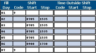
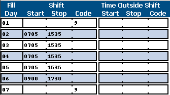
For another example, take the idea of automatically advancing focus to the next text box once a user hits the current box’s character limit. This is what that frightful time-sheet application I described earlier does. Its four-character time fields—labeled Start and Stop in Figure 4—automatically advance the insertion point, and it’s bloody awful. It’s a code contradiction. Fields with and without auto-advance—like the Code field—look identical. Users can’t tell when auto-advance will or won’t occur, and the result is input errors. Sometimes, I press the Tab key after entering a starting time and find myself entering the stopping time in the Code field instead of the Stop field.
Figure 4—Auto-advancing fields
Altering the appearance of fields with auto-advance would reduce the strength of the contradiction. I suggest making adjacent auto-advance fields look more like a single field, as shown in Figure 5. This would leverage users’ expectation that the insertion point would advance for each value within a field and, thus, weaken the inconsistency.
Figure 5—Design amelioration for auto-advance fields
The design in Figure 5 is better, although other usability issues with auto-advance probably outweigh the alleged advantage in increasing user input speed. The lesson here is that giving proper attention to labeling, layout, graphics, documentation, training, and promotion can go a long way toward making inconsistency a minor issue.
Proximity of an Inconsistency
We can think of both contradiction and irregularity as involving two sets of stimuli in two different locations. For contradictions, it’s the same set of stimuli with different usages in two locations, while with irregularity its two different sets of stimuli with the same usage in different locations. In addition to the strength, type, impact, and relevance of an inconsistency—and any design amelioration—the severity of an inconsistency depends on the psychological proximity of the two sets of stimuli in question. The closer the two sets of stimuli are, the more severe the inconsistency.
Psychological proximity can include the physical proximity of the sets of stimuli—that is, how close they are in time or space. For example, my keypad-entry errors are probably not helped by the fact that my phone is beside my computer keypad. I’d wager my phone-dialing errors are most likely to occur right after I’ve used the computer keypad and vice versa.
Psychological proximity also includes purely mental barriers. In the stimuli / usage associations that define consistency, the stimuli include the cognitive context in which the sets of stimuli exist. Differences in cognitive context result from the perceptual differences between two locations, which depend on both the physical appearance of the locations and what users know about the locations. If there is something to cue users that their context has changed, they relatively easily learn that stimuli / usage associations from one location don’t apply to another.
The phone and computer keypad may be next to each other physically, but they have very different cognitive contexts. They look different, and I know that they are different—that the phone is a completely different device from the computer keypad. The interference from the two keypads would likely be much worse—perhaps intolerably worse—if they looked the same and were part of the same device.
Take, for example, the time-sheet application’s fiendish nonsaving Save button. Just to add extra frustration, some pages in this application do have a Save button that does, in fact, save. Because two Save buttons in the same application close psychological proximity, this inconsistency is more severe. This Dirty Harry of user interfaces makes you wonder, Am I on a page where Save saves or not? You don’t really know. But since clicking Save could blow all of your input clean away, you’ve got to ask yourself one question: Do I feel lucky?
You can make a distinction between internal and external consistency, as follows:
Internal consistency is the degree to which a product is consistent with itself—that is, the degree to which its sets of stimuli have the same usages. In software applications, this includes consistency within and across windows and pages; Help and documentation.
External consistency is the degree to which a product is consistent with some reference other than a part of itself. This includes the following:
metaphors a product’s user interface employs—such as the desktop metaphor GUI operating systems use
other similar products a user uses concurrently with a product
legacy products a user had used before switching over to your new product
operating system user interface standards
general user or organizational knowledge
Usually, internal consistency is more important than external consistency. You can generally count on your product’s being regarded as its own cognitive context within the larger context of common metaphors, as well as other products and operating systems. Thus, the psychological proximity of any internal inconsistency is closer than that of any external inconsistency, and it is, therefore, more severe. So, if one part of your product must be externally inconsistent, the same inconsistency had better exist throughout your entire product to maximize internal consistency. Don’t think you’re better off having external inconsistency in only one place within your product if it means having internal inconsistency everywhere else.
For both internal and external inconsistency, there are various degrees of proximity. For example, an internal inconsistency within the same window is generally worse than an internal inconsistency between two windows. The worst inconsistencies occur when the same thing, in the same place, behaves differently at different times, without any change in appearance. In effect, such a contradiction constitutes a hidden mode that is almost certain to produce misunderstandings.
For external consistency, specific contexts tend to imply closer psychological proximity than broader contexts. For example, broadly in Western culture, red implies danger, while green implies safety. However, traditionally, for steam-plant valves, red implies closed, while green implies open. In some situations, an open valve can be very dangerous, so if you’re designing a steam plant application for experienced users, you should use red to encode closed rather than danger, because the steam-plant context is a more specific context than our general culture. Consistency with steam-plant traditions has greater proximity than consistency with Western traditions.
Among the various types of external consistency you should consider, it’s especially important to maintain consistency with UI standards. First, most standards are not arbitrary. They have been shown to be superior to their alternatives through user research or operational experience. It’s doubly important that you have hard data on the advantages of deviating from a standard before you consider producing a product design that deviates from standards. Second, even when standards are arbitrary, you should conform to them precisely because standards work only if there is broad conformance to them. I suppose, for every situation, there might be a nonstandard design that would have a slight human-performance advantage over the UI standard. However, if every designer created such situation-specific designs, we’d no longer have a standard. The performance deficit that results from widespread inconsistency would overwhelm whatever slight performance advantages we might gain in each situation.
Managing Consistency
By now, you have probably figured out the way to ensure internal consistency in your products: each set of stimuli should have exactly one usage, and each meaning should have exactly one set of stimuli. When developing your design deliverables, create a dictionary that defines each set of stimuli—that is, a single set of symbols, codes, units of measurement, data formats, terms, abbreviations, and layouts that you’ll apply throughout an application, giving each of them one meaning or usage. If there is a one-to-one correspondence between such sets of stimuli and usages, your products won’t have any internal irregularities or contradictions.
In general, our products should never have any internal inconsistencies. Unless we can ameliorate the impacts of internal inconsistencies through clever design, they are generally too severe to justify whatever performance benefit users might gain from them. As UX designers, we should find a way to obtain the benefit without creating designs that are internally inconsistent, even if it means decreasing external consistency.
And, indeed, balancing external consistency is generally a bigger challenge. You can maximize external consistency if you go through your dictionary and choose sets of stimuli that are consistent with external references like common metaphors, related products, UI standards, and general user knowledge that are applicable to your product. However, when these either conflict with each other or are inconsistent with a design that provides a validated performance advantage, consider the strengths of the inconsistencies, the relevance of their impacts, and their cognitive proximity, then make your design decision. To ameliorate such inconsistencies, adjust your design to provide more self-documentation that shows how your product deviates from external references.
When generating your dictionary of sets of stimuli, keep this in mind: you’ll get the best user performance if its definitions are simple and you tie a single, clear perceptual cue with each meaning. An example of a simple definition: A sunken box is a data field. This definition specifies that all fields—whether in a form or a table, whether read only or editable, whether they be single-line or multiline text boxes, list boxes, combo boxes, drop-down lists, or spinners—shall have 3D borders and nothing else shall have 3D borders. That is an easy-to-perceive set of stimuli—a code, in this case—that has a specific meaning to users. A complicated definition would have Boolean logic. Here’s an example of a complicated definition: A data field shall appear as a sunken box in a form and a flat box in a table, unless it’s a drop-down list, which appears raised in a form.
Simple definitions maximize consistency, making your sets of stimuli / usage pairs easier for users to recognize and learn. Complicated definitions imply reduced consistency, suggesting different sets of stimuli / usage pairs in different contexts that users might not notice.
It is not necessary for a product to be perfectly consistent. Indeed, considering all of the possible references users bring to a product, perfect external consistency is probably impossible. However, we owe it to our users to both eliminate any unwarranted inconsistency and ensure any deliberate inconsistency offers some net benefit to users. That’s the least users should expect from us.
[2] Raymond, Eric S. The Art of Unix Programming. Reading, MA: Addison-Wesley, 2003. Retrieved June 5, 2010.
[3] Zuschlag, Michael. “Graphics of Distinction.”Zusch Login: Problems and Solutions in Usability and User Interface Design, July 8, 2007. Retrieved June 5, 2010.
[4] Harris, Jensen. “Flea Market of Functionality.”Jensen Harris: An Office User Interface Blog, January 31, 2006. Retrieved June 5, 2010.
Disclaimer
Everything is this article is my personal opinion and does not represent the policies or positions of my employer. All examples in this article are real. The applications remain unnamed to protect the guilty.
Engineering Psychologist at the John A. Volpe National Transportation Systems Center
Cambridge, Massachusetts, USA
Working in transportation human factors for modes of transport spanning land, sea, and air, Michael’s projects range from airliner flight decks to public transit Web sites. His work encompasses applied experimental research, usability testing and evaluation, statistical analysis, computational modeling of human performance, user interface design, human-computer interface and human factors standards development, and program evaluation. Michael has a doctorate in psychology and a masters in industrial engineering from the University of Massachusetts at Amherst. Read More