Top

Date Filters: Successful Calendar Design Patterns

Search Matters

Creating the ultimate finding experience

A column by Greg Nudelman
August 23, 2011

In contrast to the decimal system for Arabic numerals that was invented in India around 1500 years ago, the Gregorian calendar has been in use for only about 428 years. As a consequence, humanity as a whole has had a bit less practice with calendars and dates, which on their own can be confusing to most people. Date filters frequently add to this confusion by neglecting usability and design best practices. Though date filters are among the hardest and most time-consuming controls for people to manipulate, many user interfaces stubbornly fail to retain the information they have so painstakingly provided or safeguard them from inadvertently making errors. Often, people literally groan during usability tests when asked to enter date values. Sloppy or indifferent designs for date filters lead to unhappy customers. This column shows you how to design date filters to be as intuitive and pain free as possible.

Champion Advertisement
Continue Reading…

Provide Good Defaults

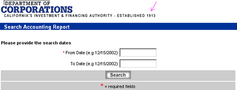
When it comes to user interfaces, people’s initial impression is usually the most telling. Take a look at this search interface from the California Department of Corporations Web site, pictured in Figure 1. Not only are there no useful date defaults, there is absolutely no indication of what range of dates would be acceptable. Could a user perhaps search as far back as 1913? It looks like we haven’t come far in making dates easier to handle since the invention of the Gregorian calendar in 1582.

Figure 1—California Department of Corporations’ site search offers no defaults for date
California Department of Corporations’ site search offers no defaults for date

Let’s take a look at how some popular ecommerce sites handle default calendar settings. Figure 2 shows the Web site for the upscale Iron Horse hotel in Milwaukee.

Figure 2—Default dates on the Iron Horse site produce zero results
Default dates on the Iron Horse site produce zero results

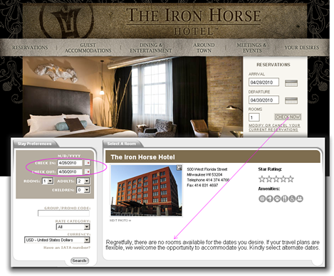
As you can see, the default settings for this date filter produced zero search results—not exactly what I’d expect from a hotel that caters to my every desire. Plus, the resulting no search results page commits several of the sins I outlined in an earlier column, “Starting from Zero: Winning Strategies for No Search Results Pages.” The biggest frustration is that the zero search results page reuses the same date values that just failed to get any results, so the customer is no wiser than before about what might be the soonest date available for a romantic get-away. At this point, the best outcome is that the frustrated customer might pick up a phone and call—costing the company at least $25—while the worst outcome is that he or she will simply give up and go to a more usable site. Poor defaults for search parameters lose customers even faster than overbearing ads, and nothing will bring them back.

Show Only Valid Date Values

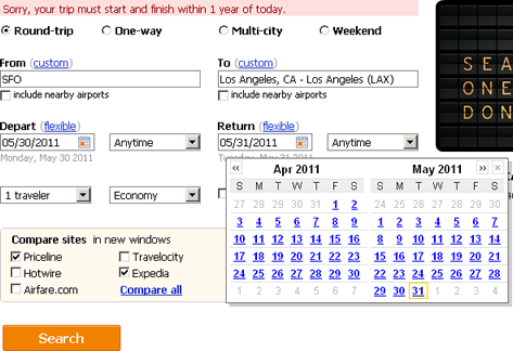
Providing good defaults is just the beginning of a successful search process. Effective calendar designs must also prevent customers from selecting invalid dates—that is, dates that either fall outside the range of supported dates or would return zero results—by making them unavailable and appear dimmed. Unfortunately, even otherwise top-notch sites often do not do this. For example, take a look at Figure 3, which shows this error on the Kayak site, which allows customers to select dates that are too far in the future, causing an error.

Figure 3—Kayak lets customers select dates too far in the future
Kayak lets customers select dates too far in the future

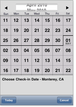
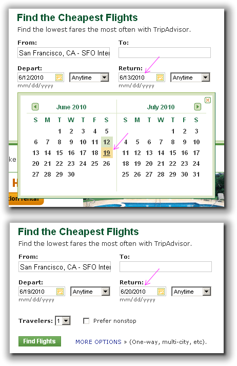
But the difficulties with selecting valid dates do not stop here. Take, for example, TripAdvisor.com, which is shown in Figure 4. When a customer selects a departure date (6/15/2010), then tries to select a return date, TripAdvisor does not in any way indicate the selected departure date or show what return dates would make sense. If someone inadvertently selects the wrong departure date, then selects a return date that occurs before the departure date (6/10/2010), TripAdvisor not so helpfully changes the return date to the next day after the departure date—a change that is both arbitrary and destructive. Worse, the system never brings this arbitrary change to the customer’s attention.

Figure 4—TripAdvisor arbitrarily resets the return date
TripAdvisor arbitrarily resets the return date

A much better approach would be to indicate the departure date within the calendar a customer uses to select the return date, clearly indicating dates that occur before the departure date and making them unavailable, so the customer cannot select them accidentally. However, on a site that does not prevent a customer from selecting a return date that is before the selected departure date, the system should at least indicate the problem rather than trying to divine the customer’s intent and taking some arbitrary action on behalf of the customer. As shown in Figure 5, a more successful design approach on Orbitz.com disables invalid options and makes it very clear which dates a user can select.

Figure 5—Orbitz.com makes it obvious which dates to select
Orbitz.com makes it obvious which dates to select

Requiring less thinking of customers results in fewer errors and unpleasant surprises, which means you’ll have happier customers. Any design that makes it more obvious what to do with a calendar is a big win for your user experience.

Minimize Clicks

TripAdvisor also demonstrates why it is important to do usability testing when it comes to specifying dates. Count the number of clicks that entering a date requires—especially for dates that are a few months in the future. As you can see in Figure 3, the TripAdvisor calendar shows two months of dates at the same time. Unfortunately, the JavaScript code allows the calendar to scroll only single month at a time, albeit very smoothly. This design effectively doubles the time and the clicks it takes to book a flight, because customers have to wait for each scroll of the calendar to come to a complete stop before they can go to the next month. I hope you are beginning to see why people groan during usability tests on date filters.

Alan Cooper proposed a much better design for a calendar that scrolls continuously, in his exceptional book About Face 3. Recently, I read an article on mobile form design by Luke Wroblewski, in which he cites a Kayak iPhone app that implements Alan Cooper’s very effective scrolling calendar design, as shown in Figure 6.

Figure 6—A scrolling calendar in Kayak’s iPhone app
A scrolling calendar in Kayak's iPhone app

Contrast the elegant design in Figure 6 with the design of the date picker in Kayak’s Web application, shown in Figure 3. Each month’s calendar actually duplicates dates from the preceding and following months and gives them a dimmed appearance, adding to the confusion. In my opinion, Kayak’s mobile application is much more usable and intuitive than its Web application.

Regardless of how fancy or usable your date picker is, make sure your Web form is accessible and lets people simply tab through the form fields and type the dates they want. I once had a client who proudly showed me his date picker user interface for enterprise search, which disabled manual date entry and instead displayed the date picker “to avoid errors.” It is critical that you always allow keyboard date entry, particularly in the enterprise environment, because people are often much faster and more accurate when typing in dates than when reaching for a mouse and clicking to select dates.

Retain Customer-Entered Values

It goes without saying that, if date values are hard to enter, it makes the most sense to retain them whenever possible, right? You’d think so, but many sites do not take the trouble to adhere to this common-sense principle. Figure 7 shows a search form that appears when a customer gets transferred from Kayak.com to the Southwest Airlines Web site. As you can see, the dates the customer provided were not included when transferring the query to the other site, defaulting instead to today’s date.

Figure 7—Transferring from Kayak to Southwest Airlines defaults to today’s date
Transferring from Kayak to Southwest Airlines defaults to today's date

Recently, Southwest Airlines implemented a sticky date design that retains dates even when customers want to start searching all over again. This is a great improvement, but what if a customer is considering multiple travel dates and looking for the best price on various dates? In some consumer and enterprise applications—for example, in Web analytics applications—people often use the same ranges of dates over and over again, in various queries. In such cases, a drop-down list that provides shortcuts to several of the ranges of dates customers have used in the past might be very helpful, as shown in Figure 8.

Figure 8—Drop-down list lets customers select dates they’ve used in the past
Drop-down list lets customers select dates they’ve used in the past

In usability testing, a wide range of people understand date pickers that employ drop-down lists. This design pattern can be very useful in helping customers recall either individual dates or date ranges and minimizes the numbers of clicks repetitive date-entry tasks require, causing sheer delight when customers discover this capability.

Important—Provide such date range drop-down lists only when data from past dates is available.

Consider Whether You Really Need Customers to Specify Dates

Often, particularly in enterprise systems, a date range picker is the default control for displaying object management screens or reports. Frequently, this is complete overkill. Figure 9 shows an alternative design pattern that I call Presets with Custom Date Range, which offers speed and flexibility.

Figure 9—Presets with Custom Date Range design pattern
Presets with Custom Date Range design pattern

Presets with Custom Date Range is a very simple, but effective design pattern. It offers several preset date ranges that customers use frequently. However, customers who want to specify a custom date range can click the more link, which expands a group of standard date pickers, comprising text boxes and calendars. In many cases, using this design pattern instead of a simple date range picker can save time and reduce cognitive loading for customers, while still allowing complete flexibility with only a single extra click.

In many cases, selecting date ranges is orthogonal to a customer’s current task at hand, yet many UX designers reach for the date picker without even considering the alternatives. Instead, I invite you to challenge yourself on your next project. Really consider whether a user interface that suggests the best time to travel to Thailand would not better serve your customers rather than forcing people to enter dates. Or perhaps a user interface could help people find the dates that offer the best price for their dream cruise to Alaska.

When booking a summer vacation, do most people really care whether they travel in July or August? Don’t make your customers choose a date range. Instead create pages that invite browsing as well as searching and let people leave those dreaded date boxes blank. Your customers—and your clients—will thank you. 

New Book: Designing Search: UX Strategies for eCommerce Success

To learn more about ecommerce search, read Greg Nudelman’s new book Designing Search: UX Strategies for eCommerce Success. For a 40% discount on the print version of this book, purchase it on Wiley.com by September 30, 2011, using the discount code: UXDS1.

References

Cooper, Alan, Robert Reimann, and David Cronin. About Face 3.0: The Essentials of Interaction Design. Indianapolis: John Wiley & Sons, 2007.

Wroblewski, Luke. “Better Mobile Form Design.LukeW Ideation + Design, March 9, 2010. Retrieved May 17, 2010.

Head of UX Research / Senior Director of User Experience

Principal at DesignCaffeine Inc.

Pleasanton, California, USA

Greg NudelmanFounder of the San Francisco Bay Area UX design consultancy DesignCaffeine, Greg is widely recognized as an experience design and user research expert, specializing in search, social networking, business dashboards, and process redesign for mobile and Web platforms. Greg has published over 30 articles and speaks regularly to audiences around the world about how to design intuitive and elegant systems that improve the quality of people’s lives while creating abundant ROI. He has led design projects for Fortune 500 companies and creative startups.  Read More

Other Columns by Greg Nudelman

Other Articles on Mobile UX Design

New on UXmatters