Top

Case Study: Methods of Evaluating an eCommerce Checkout Experience

December 17, 2012

Heuristic evaluation has its strengths and limitations. UX professionals evaluating Web sites and applications use this method to deliver succinct results to clients who require design guidance. When I was working for a previous employer, a client asked us to evaluate their Web site’s ecommerce checkout experience and deliver a report that would point out its various weaknesses.

The client was a global brand that offered products in a great diversity of categories—ranging from video and audio, to semiconductors and components, to mobile phones, and to games. The objective of the evaluation was to increase the site’s revenue by creating a simple, efficient, customized checkout process.

Champion Advertisement
Continue Reading…

The Process: Heuristic Evaluation

The team’s overall consensus was that a heuristic evaluation would provide the desired insights. So, a team of three evaluators analyzed the site using Jakob Nielsen’s set of heuristics. Each evaluator identified issues and made recommendations for solving them.

Our Observations and Findings

The findings that we reported to the client identified issues with navigation, findability, error handling, content hierarchy, page layout, and task flow. Our report documented specific problem areas, proposed solutions for them, and suggested priorities for implementing solutions. Our recommendations were as follows:

  • navigation—A more clearly defined layout and information hierarchy would improve customers’ understanding of how to fulfill their objectives on the Web site. Plus, the information taxonomy might consider means of inviting user-generated content. This could promote interaction and content generation across the Web site. The layout hierarchy would be more effective if important pieces of information were on the home page.
  • interaction—Users expect navigation bars to be consistent across a Web site. Therefore, tabs and menus should not disappear, then reappear as customers progress along their user journey. It is important to reduce users’ cognitive load by making information easily available. Providing appropriate feedback is essential to improving the user journey, including breadcrumbs, changing the color of a link once a user has clicked it, and the scent of information.
  • content—Labels, content, and lists need to be clear and descriptive. On the client’s Web site the labels of tabs did not clearly describe their function or destination. Page titles and subtitles must clearly describe the content to motivate customers to read further. Inconsistencies in font styles and sizes should be eliminated.

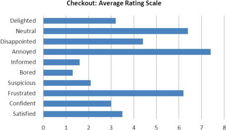
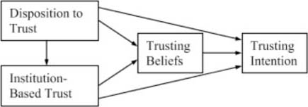
Although our heuristic evaluation provided an in-depth qualitative and quantitative analysis of the Web site’s task flows and interactions, heuristics failed to gauge customers’ satisfaction with the checkout experience. So, we followed up our heuristic evaluation with some usability testing to measure customers’ motivation and better understand other subjective factors like efficiency and satisfaction. However, these measures were limited to the ecommerce checkout system itself and did not take into account extraneous variables such as experience, privacy, motivation, or trust, shown in Figure 1.

Note—While various researchers differ on their understanding of trust, Kee and Knox considered a set of five factors: dispositional factors, situational factors, perceptions of the other, subjective trust, and behavioral trust.

Figure 1—The McKnight Model
The McKnight Model

A Critical Analysis of Our Method

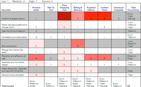
From the evaluators’ critical analysis of our heuristic evaluation method, it became evident that this method did not result in a complete set of formal guidelines for a holistic checkout process that would lead to a satisfying user journey. One possible way of addressing this deficiency would have been to create a framework for documenting and addressing the issues that we identified. When evaluators come together to propose their recommendations for solutions, formal guidelines can help in suggesting improvements and prioritizing recommendations. From our analysis, we derived the quantitative scorecard shown in Figure 2.

Figure 2—Heuristic evaluation scorecard, prioritizing issues and indicating their severity
Heuristic evaluation scorecard, prioritizing issues and indicating their severity

Although our formal assessment drove home some points, it failed to track issues relating to some essential factors of an ecommerce experience. For example, the report that we delivered failed to address any subjective factors of the checkout system’s customer experience. An evaluation scheme should address both subjective and objective heuristics for a system. It is also important to validate designs from an experiential perspective.

Advantages and Disadvantages

We identified the following advantages and disadvantages of the heuristic evaluation process.

  • Advantages:
    • objective—The results of a heuristic evaluation are structured objectively and well defined.
    • collaborative—Several evaluators can come together to provide recommendations that the evaluators and the business can later prioritize.
    • well structured—Heuristic evaluation is a formal process with clear, structured guidelines by which each evaluator can assess a product or service.
    • prioritized—Critical issues come to the fore.
  • Disadvantages:
    • disparate findings—Several different evaluators may propose findings that differ from one another.
    • lack of measurement—It is not possible to measure customer satisfaction, and task analysis does not reflect a keystroke model.
    • limited to the software system—This method does not address extrinsic factors.

Supplementary Laboratory Testing

Our heuristic evaluation failed to provide data regarding the satisfaction rate for the ecommerce experience. Therefore, soon after we conducted our heuristic evaluation, we decided to do some usability testing to collect subjective data for analysis and, thus, overcome the limitations of the heuristic evaluation method and supplement our observations and findings. The test task was to complete the checkout process and purchase a product.

During our usability study, we conducted test sessions with 12 participants. We analyzed our qualitative and quantitative results using both the system usability scale (SUS) and a rating scale that measured subjective satisfaction.

Throughout the course of the study, participants revealed missing subjective and motivational factors—for example, customers were not motivated to complete the checkout process. Figure 3 shows the emotional feedback we derived from testing the design of the Web site.

Figure 3—Qualitative feedback from usability testing
Qualitative feedback from usability testing

Although we were testing the Web site for a well-known brand, this did not encourage test participants to believe in the service it provided. It became clearly evident through our study that an inability to identify factors promoting a good and satisfying customer experience is a limitation of the heuristic evaluation method. Figure 4 shows a rating scale depicting subjective satisfaction.

Figure 4—Average rating scale for the checkout experience
Average rating scale for the checkout experience

Through laboratory testing, evaluators can uncover subjective factors that a formal list of heuristics and checklists cannot. Figure 4 shows measurable data that makes a clear distinction between observations and insights. In addition, testing lets you further explore factors you’ve uncovered during a heuristic evaluation.

While laboratory testing is an effective means of gathering subjective data and supports a rich analysis platform, it also has some limitations. For example, since participants don’t have the guidance that a formal evaluation method such as heuristic evaluation provides, it is unlikely that participants would be able to point out many of the design issues that an expert evaluation would identify.

Our Observations and Findings

We made the following observations and findings:

  • branding and communication—The client’s Web site should more clearly communicate its objectives on the home page. This would enable customers to quickly understand what they might gain by going through the checkout process and help in recruiting new and retaining existing customers. A more distinctive logo would build brand identity, especially in the minds of new customers who have not yet registered to become members. The inclusion of up-to-date content and information that speaks to the target customers would also have this effect.
  • aesthetics—While the Web site does provide visual imagery, a more prominent and well-defined corporate brand and color palette would enhance the site’s visual appeal and build brand loyalty and recognition. Some images do not clearly convey the Web site’s vision.
  • motivation—The content on the Web site is sometimes inadequate, causing a heavy drop-out rate. We advised the client that the Web site needed welcoming and motivating messages to encourage customers to go through the checkout experience.
  • trust—The Web site lacked elements that would enable customers to trust the site. For example, during a test session, one participant emphasized that “free delivery, a detailed product description, and security details around payment” were key elements that she would look for when buying a product on a Web site.

Conclusion

This case study has presented insights that we gained from our evaluation of a client’s ecommerce checkout experience. Our findings prompted our client stakeholders to rethink the way in which they evaluate customer experiences. The evaluation methods that enabled us to make the right recommendations in this case might not necessarily apply in other domains. Each industry and target market has unique objectives that must factor into an evaluation.

Throughout the course of our evaluation of our client’s ecommerce checkout experience, all stakeholders showed a willingness to invest in its objectives, which our consultancy and the client had defined. Client stakeholders believed investment in customer experience to be a key factor in the success of their business. 

References

Doney, Patricia M., Joseph P. Cannon, and Michael R. Mullen. “Understanding the Influence of National Culture on the Development of Trust.” The Academy of Management Review, July 1998.

Dumas, Joseph S., and Janice C. Redish. Practical Guide to Usability Testing. Norwood, NJ: Ablex Publishing, 1993.

Law, Effie Lai-Chong, and Paul van Schaik. “Modeling User Experience: An Agenda for Research and Practice.” Interacting with Computers, September 2010.

McKnight, D. Harrison, Vivek Choudhury, and Charles Kacmar. “Developing and Validating Trust Measures for e-Commerce: An Integrative Typology.” Information Systems Research, September 2002.

Nielsen, Jakob. “Heuristic Evaluation.” In Jakob Nielsen and Robert L. Mack, eds. Usability Inspection Methods. New York: John Wiley & Sons, 1994.

Nielsen Jakob, and Rolf Molich. “Heuristic Evaluation of User Interfaces.” CHI ’90 Proceedings of the SIGCHI Conference. Seattle, April 1990.

Senior Omni-Channel Commerce Consultant

London, UK

Afshan KirmaniWith over ten years of experience in customer experience, Afshan delivers ecommerce experiences based on omni-channel content and commerce solutions. She specializes in conversion-centric design, using behavioral psychology to persuade and drive conversions. Her projects focus on discovery and definition for content management and commerce platforms, and her design solutions have a proven track record of delivering growth in strategic accounts and revenue streams within global enterprises. Afshan has worked on Web sites and applications that take a mobile-first, responsive approach to produce designs that span hand-held devices, wearables, and retail kiosks. Her experience touches on social media, analytics, applications that leverage personalized content, and user experiences that optimize customer retention to increase sales.  Read More

Other Articles on Usability Testing

New on UXmatters