In Part III of this series, I explained how the relative importance of the following four elements of user experience varies depending on the type of product you’re designing:
value
adoptability
desirability
usability
For convenience, I’ll refer to these four UX elements using the acronym VADU (Value, Adoptability, Desirability, Usability).
Champion Advertisement
Continue Reading…
The relative importance of these elements in driving UX success reflects what matters most to your users, in your particular business context. For example, in the gaming industry, value is typically less important than desirability, but when it comes to enterprise software, it’s usually the other way around. That said, how do you know whether you need to work more on one UX element or another? In other words, how should you prioritize expending design resources on these elements to ensure that your focus is on the area that will have the biggest impact on your users?
The answer: Compare where your product currently stands in terms of these UX elements with where you want your product to be, and you’ll know what elements you need to focus on.
Now, in Part IV, I’ll show you how to do this by providing a step-by-step guide.
How to Set Design Priorities Using a VADU Scorecard
The most effective way to prioritize UX design decisions is to create a VADU-based scorecard. By rating a product’s various UX elements, then comparing your ratings with the targets that you’d like to hit for those elements, you can quickly create a scorecard that will point you in the right direction.
Step 1: Determine the Relative Importance of UX Elements
The first step is pretty straightforward: determining the relative importance of the four UX elements for your particular product. As I described in Part III of this series, you can use a numerical value to denote the relative importance, or weight, of the four elements. For example, use a number between 0 and 1, where 0 means a UX element has absolutely no impact on the overall user experience and 1 means that element is making its full impact. Your rating could even go above 1 if you think a UX element is extremely important. That is a judgment call that your team can make. But, for the sake of simplicity, let’s keep the weight between 0 and 1.
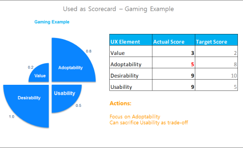
Figure 1 shows a hypothetical example that I’ve drawn from the gaming industry. In this example, desirability has full impact on the overall user experience; therefore, I’ve assigned it a weight of 1. Then in descending order of impact, adoptability has a weight of 0.8; usability, of 0.5. Value is of little importance so has a weight of 0.2. Your team should decide the relative weights of UX elements depending on your specific product category. (See Part III for a detailed explanation of how to determine the relative importance of the UX elements.)
Figure 1—Prioritizing UX elements for a game using a VADU scorecard
Step 2: Set a Target Score for Each UX Element According to Its Relative Importance
To build a VADU scorecard, use a 10-point scale, in which 1 means a UX element is implemented very poorly; 10, very well. Then, to set a target score for each UX element, multiply each respective weight by 10. For instance, in Figure 1, value has a weight of 0.2, so the target score for value would be 2. The target VADU scores appear in the Target Score column.
Step 3: Rate the Product Based on the Strength of Its UX Elements
Next, you’ll rate your product’s UX elements to get the actual VADU scores, which appear in the Actual Score column. There are a number of ways of coming up with the actual scores—for example, through team members’ subjective evaluations, customer surveys, or heuristic evaluations performed by a UX expert. What’s the best way to come up with the actual scores? Having your team synthesize the available metrics and user and market research findings to collectively determine the scores. Please keep in mind that this is not rocket science. A rough estimate of how well your product fares in terms of its VADU scores is just fine.
Step 4: Set Priorities by Comparing Actual VADU Scores with Target Scores
Now, compare the numbers in the Actual Score column and the Target Score column, and you can easily see which elements need more work. Looking at the example in Figure 1, the game receives an actual score of 5 for adoptability, which falls far below the target score of 8, so the team needs to focus on adoptability rather than the other UX elements.
Furthermore, the actual score for usability is 9, far exceeding the target score of 5. That means, even if the team needs to compromise usability to improve adoptability, they should still consider going ahead. For example, creating many more online ads and landing pages to drive user traffic would enhance adoptability, but might undermine usability because there aren’t enough designers to support the ad campaigns.
Let’s look at two more examples to get a better understanding of how this works.
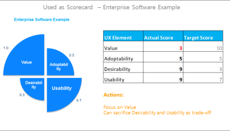
Figure 2 shows the VADU scorecard for an enterprise software product. With the same actual scores as in the gaming-industry example in Figure 1, but different target scores, you can see that value is the one UX element that the team should improve. Thus, the priority shifts from adoptability to value. Why? Because for enterprise software, value is extremely important, and an actual score of 3 falls far below the target score of 10. In contrast, the same score wasn’t a problem for games, with a target score of only 2. Adoptability is less important for enterprise software, so the same actual score of 5 matches the target score, and there’s no need to improve this UX element.
Figure 2—Prioritizing UX elements for enterprise software using a VADU scorecard
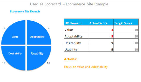
In the VADU scorecard for an ecommerce site shown in Figure 3, the actual scores again remain the same as in the two previous examples, but the target scores change because the business context is different. As I mentioned in Part III, all VADU elements are equally important for ecommerce sites, so all target scores are 10. This time, value and adoptability are the two things that the team should work on, because there is a huge gap between their actual scores and the target scores.
Figure 3—Prioritizing UX elements for an ecommerce site using a VADU scorecard
We’re creating a business context–sensitive scorecard for user experience. Too many UX professionals evaluate user experiences without thinking about what the UX elements mean to the business. For example, if we identify usability issues, we feel that we have to fix all of them. But using the VADU scorecard, we might choose not to fix certain, less important issues depending on the business context. For example, in a particular product category, if usability is not the most impactful UX element, we should prioritize improving other UX elements. In this way, we can connect user experience with business results and prioritize UX-related business initiatives.
Final Thoughts
Here are a few guidelines that can help you to understand why and how to apply the VADU scorecard.
Set the Right Focus
Creating a great user experience that can actually drive business success is challenging because, not only do we need to bring delight and ease of use to users, we must also understand what UX elements we should focus on first to ensure that our work moves the needle in terms of the product’s bottom line. A VADU scorecard can quickly focus your team’s work on the most important aspects of user experience and ensure that you make intelligent business decisions when you must make tradeoffs between the UX elements.
Look at the Bigger Picture
Often, when we’re dealing with s stuff—like moving a button from left to right, rewriting a page’s title to match its content, or making a call to action more noticeable—we lose sight of what really matters to users and fail to consider the business context. Much like personas, the VADU scorecard provides a tool that helps you to quickly look beyond your immediate deliverables and think in terms of how your work impacts business outcomes.
Make Simple, Actionable Decisions
The VADU scorecard is a tool that can help you to make high-level, actionable business decisions. To make the right decisions for users, you need to keep things simple. So, while you need to do due diligence in assigning actual scores and their relative weights, don’t spend too much time resolving small disagreements among your team members. It’s really not that hard to determine the relative weights of UX elements in your VADU scorecard if you have a good understanding of your industry. In fact, it’s pretty easy to determine where your product stands overall, in terms of the UX elements, without much data crunching. Keep things simple and avoid endless debates about small details, then you’ll be able to identify your priorities quickly and move the business-value needle by making targeted UX improvements!
I find the definitions of these elements too confused with each other to really make much sense of any discreet scoring. In any case, would not applying the wrong emphasis to, say, desirability over value be self-evident anyway? (“Why does a call center dashboard look like Candy Crush…?”)
I really like your approach and am already using it in a project. We used it in our roadmap to prioritize coming features. And the next survey will show if it is successful.
But I would like to mention two thoughts on your article:
The scale is relative, and one is allowed to sacrifice existing, extra points to win in the negative area. I think one should consider topics like competitors, customer needs / personas, business goals, and outside view / surveys to really know where your position is and what to aim for.
Say my business app has a usability of 9 and 7 is my goal. But my 9, compared to my biggest rival with a relative weight of 5 (they don’t care too much because they are big)—in total a SUS score of 50 (mine) and 60 (theirs)—is still bad. So it wouldn’t be wise to lose traction in this area, only to be inferior in all areas.
Say my ecommerce shop sells shoes. The overall value and adoptability aren’t great—only a few brands and mostly men’s shoes. But there are a few fans, who are crazy for rare Italian brands, and they are literally reading every Google result to find your shop. They like rare stuff. They aren’t common customers, but special personas. They have money and give you 20% of annual earnings. So for them, the value is 10, and they are an important few. Is it good to forget their special needs and desires—design more brand categories and online ads—to accomplish the overall score?
I think it’s a little more complex if one tries to bring all constraints under one umbrella.
Hi Jonathan, To understand why the four elements are different, please review their definitions and examples in Part I of the series. That might help in seeing why they’re not overlapping.
As to your example: Yes, in this extreme case, it’s self-evident that a call-center dashboard should emphasize Value, not Desirability, so one shouldn’t spend too much time on fancy visual tricks. But in most real business situations, prioritizing across UX elements is not really straightforward. That’s why organizations have had internal struggles between branding, UX design, marketing, and product teams, with each team arguing that their respective area was the most important one and, thus, needed more budget.
@FrankL. Thanks a lot for the comments. Really interesting ones! I agree that, in practice, it’s more complex, given various business contexts. Let’s see how we could apply the model:
As to the first example that you mentioned, even if your product’s usability were not as good as that of your competitors, I’d say that, as long as it exceeds your target score, your usability is fine. Remember, you determine the target score based on how important the element is to users. Anything above that score probably won’t move the needle. Your competitor has better usability, but that marginal superiority, which is already beyond what matters to users, probably won’t make users want to buy their product rather than yours.
The second example is very interesting. I agree that the fans, while they’re the minority of your users, drive lots of business. I think that would call for a segmentation-based refinement of the VADU model. For typical users, you’d have one scorecard and, for the fans, you’d have another. This is very practical, because in most companies, there are different organizations that align to the different, key customer segments. So in each organization, they can prioritize using a scorecard that is suited to their target users.
A well-respected UX strategist and architect, Frank has co-authored a book chapter and published more than a dozen professional papers, covering such topics as advertising, Web promotion, eyetracking, persona development, product strategy, and search results. He has also developed a large body of user-research techniques and UI-design guidelines and trained many in applying them. Recently, at the Human-Computer Interaction International conference, Frank received a best-paper award for a paper that he co-authored. Frank is currently providing UX strategy and design consulting services through his firm, UX Strategized.He set up and led user research practice for Barclays’s iShares business and established foundational digital client insights for the firm. His work had a deep impact on iShares’s digital strategies and shaped the award-winning UI designs of iShares’s Web tools and iPhone app. Previously, Frank established eyetracking as a key research method at eBay. He led advertising research there and published a professional paper on best practices for online advertising. He also led design guidelines research that influenced eBay’s UI design best practices and full-cycle user research for the shipping and seller tools, influencing the tools’ overall redesigns. Prior to joining eBay, Frank conducted design-strategy research at Oracle, influencing the UI architecture of its enterprise software suite. Frank obtained a PhD in cognitive psychology from UCLA, where he conducted extensive scientific research on consumer psychology and taught advanced statistics. Read More