Top

How We Stopped Bleeding Users by Changing the User Experience of Our Signup Process

July 21, 2014

“Early in a startup, you need to acquire your customers for free. Later on, you can spend on customer acquisition.”—Fred Wilson

This statement is true for two reasons: The first is that, as a startup, you are usually short on funding. The second is that not spending money on customer acquisition helps you to be very focused. In a way, spending money may seem to be easy, but when you’re spending your own time—your most valuable asset—you want to make every hour count. So you find yourself measuring each and every effort, constantly making tweaks and improvements to get better results. If you had money to spend, you might be tempted to throw more money at the problem. But when there is no money to throw at customer acquisition, you’re forced to look carefully into all aspects of your customer-acquisition efforts.

Champion Advertisement
Continue Reading…

The best advice, of course, is to maintain this approach as you grow—even though you have more money to spend. At daPulse, this is exactly what we did, and it was this approach that led us to discover that we can reduce our customer-acquisition costs—whether in cash or our valuable time—by changing our product’s user experience alone. This article tells the story of how we did this and offers some advice on how you can do this, too.

Aligning Your Team

When you’re beginning work on a project, it’s essential that you align your team on goals and priorities.

1. Set ambitious goals.

As we were starting to see some significant traction—in our case, this meant paying customers—we decided to put the pedal to the metal. We added a new user-acquisition person, more salespeople, and an additional marketing expert. Then we started a marketing blitz. The best way to do this is set to very ambitious goals that you want to achieve in a defined—and preferably short—timeframe. Our goal was to get five times the signups within a period of twenty days that we had gotten in the prior twenty days. We count a signup only once a user has confirmed it by responding to an email message.

2. Set one list of priorities for the whole team.

Next, we brainstormed some marketing ideas, wrote them all down, and crossed off the ones that we couldn’t fit into the twenty-day timeframe or that just weren’t good enough. Then, we created an “Execution Board,” using our own tool, daPulse. But you can use anything from a whiteboard to Google Docs. This is the one place for everyone on your team to see and work through your priorities. The way we create this board is to create a table comprising

  • lines for tasks—Create a line for every task, and group tasks using subheadings. Create as many groups as you need. We had two groups—one for paid marketing efforts; the other for free marketing efforts.
  • columns for process—Use the table’s columns to document your process by setting owners for each task and deadlines and tracking status.

Oh No! We’re Bleeding Users

You need to understand the impact of changes that you’ve made to your product’s user experience.

3. Measure your efforts.

If you’re making changes and not measuring the results, you’re wasting your precious time. There are many tools that you can use to measure the effectiveness of your efforts. We use Optimizely to run A/B testing on pages and MixPanel to gain insights into process funnels and conversions. As data started pouring in, we noticed that we had a 30% drop between signup and email confirmation. That’s a huge drop! This surprised us because asking people to confirm their email address seemed like a completely technical step. After all, every single service in the world asks you to confirm your email address. Doing the same seemed like a no-brainer. But yet, here we were, bleeding users—and dollars—because of this. What went wrong?

4. Analyze the data.

Measuring is crucial, but it’s useless if you don’t know what to do with the data that you’ve collected. A side note on this: don’t over-measure. Make sure that you know what you’re looking for. Before you start measuring, ask yourself, “If the result were X what would this mean to me?” We thought about some possible reasons for this 30% drop: Were our emails going to spam? Were they going to the Promotions tab in Gmail? Was there some technical problem in our code? The answer to all of these questions was “No.”

5. Go beyond the data.

Sometimes the answer is not in the data. While that 30% drop was an indicator that something was wrong, we now had to look elsewhere for answers. So we did what might sound obvious: we signed up for our own service to see what these users were experiencing.
It’s the User Experience, Stupid!

“If UX design was just common sense, well designed things would be common.”—Joel Marsh, Hipper Element

Analyze the UX design problem that your team must solve, then figure out how to solve it in a way that satisfies users’ unmet needs.

6. Ask yourself what the user is feeling.

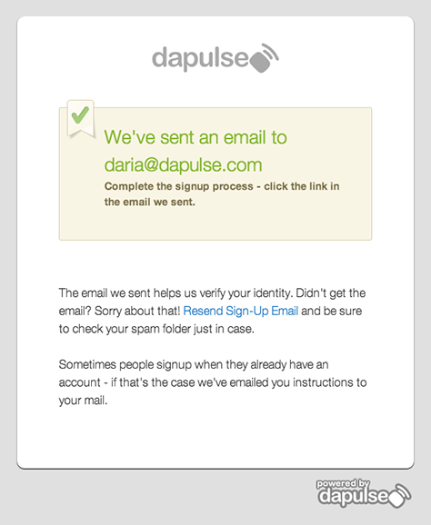
Figure 1 shows what we experienced as we went through our own signup process. Boy was it ugly! It almost looked like a mistake.

Figure 1—Our old signup experience
Our old signup experience

So what should you do when you run into something that’s obviously bad UX design to help you figure out how to improve it—since it’s not “just common sense”? You could do what we did: ask yourself what the user would feel going through your user experience and write down the answers. Our imaginary users asked themselves these questions:

  • Where am I? There was no information about where the user was or what daPulse is.
  • What is this about? The single visual element—the green V in the upper left—gave no indication of what the pop-up overlay was about.
  • What do you want? There was no clear call to action (CTA), but instead, a lot of reading to do.
  • Why should I do what you’re asking? There was no incentive to complete the process.

7. Answer your imaginary users’ questions.

Now, try answering the questions that you’ve written down. At this point, we didn’t know for sure the reason for our drop in confirmed signups, but it was quite clear that this was far from a good user experience. So we tried to give good answers to all of those questions.

In my experience, changes to a user experience don’t have to be dramatic to improve it. In fact, they can be very minor and subtle. But they have to result in a good user experience, which, in this case, meant eliminating any uncertainty and creating a frictionless flow. While there are times when you do want to make users think, this was not one of them.

8. Change your design to communicate the answers.

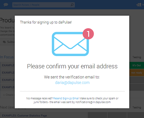
Once you’ve asked your imaginary users’ questions and given your answers for them, make sure to communicate these answers in your design. You can see our design solution in Figure 2.

Figure 2—Our improved signup experience
Our improved signup experience

Here is what we did to improve our signup experience:

  • You are here. To answer our imaginary users’ question about where they were, we communicated that they were in the signup process for a tool called daPulse in two ways: First, by putting a thank you for signing up to daPulse in the first location to which users’ eyes would go—the upper left. Second, we conveyed the fact that daPulse was a tool by showing it in the background, though unavailable.
  • It’s about this. We provided a straightforward answer to the question: what is this about? It’s about confirming your email address. We did this by adding an informative visual element—an envelope—which is now the central element in the overlay.
  • This is what we want you to do. Again, this was straightforward: we want you to confirm your email address. The key here was making the text Please confirm your email address the largest text in the overlay.
  • This is what you’ll get if you do it. Here we had to find a subtle way to create motivation. Since we strongly believe that daPulse’s user interface design is appealing to our users, we thought that a sneak-peek of it would generate the necessary motivation to get users to complete the signup process. This was our other reason for showing the product in the background. But we made it appear dimmed, so users wouldn’t get confused about what to do next. If the product appeared available, users might forget about confirming their email address and start looking for ways to close the overlay.

Next, we moved on to the confirmation email message itself. We added a clear CTA—a yellow button—in addition to the confirmation link. We didn’t touch this long, ugly link because the common belief was that it would establish trust. (We intend to do an A/B test on this assumption next.)

9. Measure, analyze, improve, and repeat.

In one month, the drop in email confirmations went from 30% to only 10%. This reduced our acquisition costs dramatically and optimized our acquisition results. And solving the problem took only making some tiny design tweaks. This is why user experience matters. 

Creative Strategist & Go-to-Market Consultant

Tel Aviv, Israel

Daria ShualyDaria is a serial ecommerce startup founder. She was previously CEO at Sense of Fashion, a VC-backed, international, fashion ecommerce marketplace. She mentors and consults for startups on their go-to-market strategy and creative marketing. She has written for The Next Web and publishes on Medium.  Read More

Other Articles on Design Process

New on UXmatters