Most of us have experienced the struggle of seeking help on a Web site, only to end up in a link-clicking loop that leaves us more confused than we were to begin with.
The goal of self-service sites is to help users find answers themselves, forestalling the need to contact a real person. Take a look at WebMD for a good example of such a site, as described on the Kayako Blog, in “How WebMD Moms Are Shaping the Future of Support.” When such a site is done right, it leads you straight from symptoms to diagnosis to cure. However, if self-service sites are done poorly, they’re hard to navigate and offer no effective way to find the information you need or to learn about next steps. The only thing that’s left to do is to call a customer-service agent, who hopefully will have the information the user needs.
Great UX design can solve this problem. In 2013, the UK Government Digital Services (GDS) team won Design of the Year for its self-service Web site GOV.UK, beating contenders in fashion, architecture, and product development. One of the judges even remarked, “It creates a benchmark … all international government Web sites can be judged on.”
Champion Advertisement
Continue Reading…
So why is this self-service government site so amazing? Simple: it puts the experience of the user first and makes it as easy as possible for users to find what they need quickly.
10 Design Principles
The GDS follows ten design principles on every GOV.UK project:
Start with users’ needs.
Do less.
Design with data.
Do the hard work to make it simple.
Iterate. Then iterate again.
This is for everyone.
Understand context.
Build digital services, not Web sites.
Be consistent, not uniform,
Make things open—it makes things better.
By sticking to these principles, the GDS manages to keep the user foremost throughout their design process, thus enabling GOV.UK users to self-serve. You can check out the full descriptions and examples of these design principles on the GOV.UK site, but I’ll highlight three of them in this article.
The Design Principles in Action
I toured the GOV.UK self-service site to see these principles in action. Some of the GDS’s most transferable design principles include the following:
Do the hard work to make it simple.
Iterate. Then iterate again.
Do less.
Anyone can use these design principles to improve their self-service support user experience.
1. Do the hard work to make it simple.
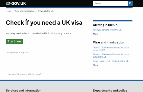
Many of GOV.UK’s articles have evolved into self-assessment surveys and online tools to better direct users to the most relevant pages. Examples include GOV.UK’s maternity-leave calculator and a quiz to “Check if you need a UK visa,” which is shown in Figure 1. Rather than simply listing the rules, the GDS team took the extra steps to help users find and understand the information they need. The visa-check quiz provides a clear example of this.
Figure 1—The visa-check quiz
The GDS team thought about the common situations a visa seeker might encounter and how to guide users through these scenarios. A user’s previous answers appear at the bottom of the quiz, so it’s easy to go back and change an answer.
Once users have selected their answers, they receive the right information for their exact circumstance. This is so much easier for users than scanning through pages of text and trying to work out what information is relevant to them.
Often, the default approach to delivering documentation to users is providing knowledge-base articles. They’re easy to create, and users can read them at their own convenience. To make such articles more helpful, you can improve them by adding screenshots, charts, or images and increase their readability tenfold. While it’s true that tools like the visa-check quiz take longer to create, their benefit to users makes the effort more than worthwhile.
2. Iterate. Then iterate again.
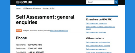
Even though the GOV.UK Web site won an award in 2013, they haven’t stopped improving it. While touring the site, I found several articles and guides in beta. Plus, I was invited to take a survey. The GDS team would never assume that the site is now perfect.
Figure 2 shows an example of the Self-Assessment page in beta. When you label a page as beta, users know they may find something out of place or information that isn’t completely accurate, and the page invites their feedback. Labeling an article as beta ultimately sets higher expectations.
Figure 2—A Self-Assessment page in beta
The key to iteration is the feedback that you can get by looking at visitor data or surveying users. A self-service site is not a set-it-and-forget-it” offering. Self-service pages require constant auditing and improvements to ensure they stay up to date and provide the best possible customer experience, as this article on the Kayako Blog describes: “Help Center Audit Template.”
3. Do less—and check your ego.
“This means building platforms and registers others can build upon, providing resources (like APIs) that others can use, and linking to the work of others. We should concentrate on the irreducible core.”—from the GDS Design Principles
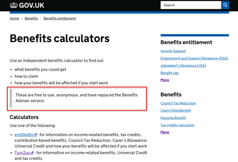
It might seem counterintuitive to provide links to other sites rather than attempting to offer comprehensive information to keep users locked into your site. But the creators of Gov.UK don’t let their ego get in the way of helping users find what they need. If someone else has already created a better answer to their users’ needs, they simply link to it. A great example of this is the Benefits Calculators page, shown in Figure 3.
Figure 3—Off-site links to good tools
Two non-profit organizations have developed benefits calculators that are better than GOV.UK’s original Benefits Advisor service. Therefore, on its Benefits Calculators page, GOV.UK explicitly states that these free tools have replaced their Benefits Adviser service. By not answering questions that could be better answered using a free, online tool, the government saves time and money.
What Can You Learn from GOV.UK?
The GOV.UK Web site blows other self-service Web sites out of the water. The designers take users’ needs into account before diving into design and never assume they’ve got everything right. Making use of external tools means that they don’t have to reinvent the wheel to provide users with the best solutions.
Here are some key UX-design learnings from the GOV.UK site that you can apply to other sites—and not just self-service sites:
Follow the users’ footprints. Evaluate the paths users take when attempting to find information or help. Most users don’t want to make a phone call to get help, so a phone number shouldn’t be the first option you give them. There are many issues that users can better resolve by following a step-by-step process—such as taking the visa-check quiz on the GOV.UK site! Support teams are a valuable resource for identifying knowledge-base articles that drive customers to call. They can point out places where information isn’t easily digestible.
Try different types of content. Not all information requires a quiz or a chart. Following Principle 9, “Be consistent, not uniform,” ensures that each article topic gets the perfect treatment. While the entire GOV.UK Web site uses consistent branding, its creators have used many different page formats to showcase specific information.
Consider all the options before you begin. Yes, knowledge-base articles are commonplace across most help centers. But that doesn’t mean they’re always the best option. Taking the time to develop self-service options that are easy to use pays off later on—for both customers and the support agents whose job is to help them. They provide a great way to scale information distribution.
The SlideShare presentation shown in Figure 4 delves more deeply into the best features of GOV.UK. You can use some of their best ideas in your next self-service design.
Figure 4—“We Went Down the Rabbit Hole: A Tear-down of the British Government’s Magical Customer Support Journey”
Founder & Customer Support Consultant at Supported Content
Vancouver, British Columbia, Canada
Sarah leads a passionate, highly motivated, global team of customer support advocates and customer success managers at Kayako. Their goal is to wow each and every customer by delivering proactive, relational experiences. Sarah’s passion is keeping customers loyal by providing amazing customer service. She is a yoga teacher, a self-diagnosed Twitter junkie, and a recent import to London, England, from Vancouver, Canada. Sarah shares her thoughts on customer experience on the Kayako blog. Read More