The decade is half over—so it’s as good a time as any to reflect on what’s important in UX design. We are fast approaching 2020, the year corporations are holding up as the finish line for the promised land of a digital revolution. What trends are signposts toward the future as we approach 2020? After reflecting on my experiences, working as a designer of corporate Web sites over the past five years, I’ve decided to write a series of articles about trends I think will still be relevant in 2020.
Plenty of trends have hit since 2010: Responsive Web Design (RWD), Big Data, and wearable technology to name just a few. Five years ago, the focus was on adapting Web designs to iPhones and Android smartphones. Since then, we’ve learned to design for tablets, HD wide-screen monitors, and now, the miniature screens of wearables such as Apple Watch, which was introduced in 2015. Technology and device trends will come and go, but simple, clean, well-tested, Web user interfaces, provide the best user experience across platforms.
Champion Advertisement
Continue Reading…
The decade is half over—so it’s as good a time as any to reflect on what’s important in UX design. We are fast approaching 2020, the year corporations are holding up as the finish line for the promised land of a digital revolution. What trends are signposts toward the future as we approach 2020? After reflecting on my experiences, working as a designer of corporate Web sites over the past five years, I’ve decided to write a series of articles about trends I think will still be relevant in 2020.
Plenty of trends have hit since 2010: Responsive Web Design (RWD), Big Data, and wearable technology to name just a few. Five years ago, the focus was on adapting Web designs to iPhones and Android smartphones. Since then, we’ve learned to design for tablets, HD wide-screen monitors, and now, the miniature screens of wearables such as Apple Watch, which was introduced in 2015. Technology and device trends will come and go, but simple, clean, well-tested, Web user interfaces, provide the best user experience across platforms.
While we can’t predict the future, here are five technology trends I think we should continue to focus on over the next five years:
Mobile-first, responsive Web design—It just makes good sense.
Testing Web sites on smartphones—Currently, when doing usability testing in the lab, we prop up smartphones using a rubberized sled with an attached mini-camera, so we can record interactions with documents. We should replace these setups with a more versatile recording device.
Web support via mobile chat—The jury is still out on this method of customer support.
Designing in code—UX teams who support Web projects, but may be afraid of HTML/CSS, would be better off embracing code, using it to make their design process more efficient.
The Internet Of Things (IOT)—IoT promises to be the next big thing in UX design. Will designers have to think in multiple dimensions to account for different types of user-interface surfaces?
Now, let’s look at each of these trends in greater depth, starting with mobile-first, responsive Web design in Part 1 of this series.
1. Mobile-First, Responsive Web Design
Mobile first is an essential approach to designing clean, high-performance Web pages across all breakpoints. It’s a key tenet of both adaptive and responsive design approaches. Even if you’re modifying a page on your desktop site, it’s important to consider taking a mobile-first approach. Why? Because it forces you to consider simplifying all page elements. I jumped on this bandwagon in 2012 after attending the An Event Apart conference. This approach was eye opening to me because everything that I’ve always held important, even critical to successful corporate Web design is what adaptive and responsive design hold sacred.
Strip Down Content to the Essential Elements
If only I’d had a 3x4-inch screen in 1997 to force a life-insurance business lead to answer this question definitively: “What is the one thing you want your users to know about this Annuity?” Or better yet, “Let’s find out the one thing a customer wants to know about this annuity.” When designing the content for a mobile-device screen, there’s no room to say, “Well, there are really three important things.”
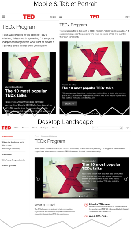
For example, look at how the tedx.com site uses the number one position to keep the homepage simple and communicate that it’s all about the program—that is, the talks, as Figure 1 shows.
Figure 1—Tedx.com homepage
Prioritize a Page’s Sections According to Its Key Purpose
In contributing to Ask UXmatters, “Responsive Web Design for Corporate UX Design,” I wrote about Luke Wroblewski’s “What’s your 1, 2, 3? And only three…” I still ask that question. After identifying a page’s key purpose, determining what section is number one is difficult, but accepting that two and three have to follow in a specific sequential order is even more challenging for some people. This is just basic information architecture. But, to passionate business partners, it’s as if you’re asking them to decide to choose a favorite among their children.
Responsive design should ensure that the section that is of secondary importance keeps its secondary position on a page—no matter the size of the screen on which the content appears. Beware of placing a rotating banner in the number one position. If you look at tedx.com, you’ll see that all of the rotating images focus on the talks and, in doing so, tie the primary theme together. Even rotating promotions should have a central theme—for example, best deals, upcoming events, or games.
Keep Interactions and Navigation Clean and Simple
Good UX design should be device agnostic. A page should look good on any size device or display. I hear this all the time: “That design is really clean.” But what does clean truly mean? I don’t think it means there’s a lot of whitespace on a page. A clean page has well-spaced content—including images, icons, and calls to action—that shows hierarchy and flow. It doesn’t look crowded. Each of the page’s elements is laid out in a way that makes sense. Any page should be easy to read, and its purpose must be obvious. A clean page’s interactions have clear target areas, allowing a user to click, tap, or select by tabbing.
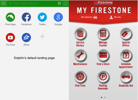
One good example of a clean interaction is a menu-driven landing page that employs iconography. Examples of this approach include Dolphin’s customizable mobile browser and Firestone’s mobile app, shown in Figure 2. While you could argue that this approach is outdated, I think the design pattern is simply the best. The icons are easy to scan, learn, and tap. We could debate the quality of the icons—flat versus dimensional—or what item should hold the first spot, but from a user perspective, these icons just work.
Figure 2—Dolphin’s mobile browser and Firestone’s mobile app
My biggest pet peeve with mobile design today is the trend designers blindly follow of using a stacked menu bar that resembles the navigation bar at the left of a desktop Web page from 1997. The home screen of the first iPhone was not a series of bars was it? No, it comprised the same evenly spaced, easily tappable icons that are still effective today. True, you don’t have to go further than Settings to see a stacked menu bar—and one that is packed a little too tightly for easy navigation. My point is that, even when you go the menu bar route, make the options easy to read and space them far enough apart that they don’t invite mistaps.
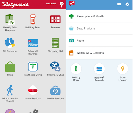
Check out Walgreens recent home page redesign for their mobile app. They’ve ditched the all-icons-all-the-time design pattern, but even their menu bars are big, well spaced, and easy to choose. They get it.
Figure 3—Walgreens homepage redesign
Above all, interactions and navigation must be simple, quick, and easy. When users interact with your site, they demand ease of use. A site’s interactions should drive users to their desired content and deliver your company’s desired outcomes.
So start your next redesign project by visualizing how you can make the essential page elements work on a very small screen. Do you think mobile-first Web design could be just a passing fad? If so, tell me why in the comments.
Next: Testing Web Sites on Smartphones: Ditch the Sleds Now!
In Part 2 of this series, I’ll make my case for why using rubberized sleds when capturing interactions with smartphones in usability labs leads to sterile results that don’t accurately reflect the ways people interact with their phone. The solution for more accurate usability testing already exists in the video-production industry.
In the meantime, please share—in the comments—trends from the last five years you think will carry us toward that enterprise Nirvana—the year 2020.
At present the focus is on adapting Web designs to the new iPhone 7 and, later, iPhone 8, and the miniature screens of wearables such as Apple Watch 2.
Bob is a Senior UX Designer at AT&T, working with the Digital Design and User Experience team. He has focused on corporate Web design since 1997, working with Fortune-200 companies in multiple roles, including Interaction Designer, Producer, Content Writer, Information Architect, Team Lead, and Manager. From 2011–2015, Bob served as a Board Member, Technology Organizer, and Volunteer for TEDxSanAntonio. He offers strategic direction and thought leadership on both interactive-media and Web-project teams, integrating merged experiences into one site, event, or production. Bob and his wife Cheryl have two children, Linden and Graham. They’re crazy about their rescue dog Halas, a Schnoodle, which is a combination of Schnauzer and Poodle. Read More