At UX STRAT 2015, the pre-conference workshops took place on September 8. There were just one full-day workshop and two half-day workshops, so the two of us were able to cover all of them.
Part 1 of this UX STRAT 2015 review provided an overview of the conference.
Champion Advertisement
Continue Reading…
Strategic UX Through Information Architecture
Reviewer: Krispian Emert
Presenters: Andrew Hinton and Dan Klyn
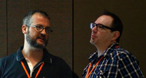
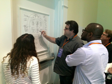
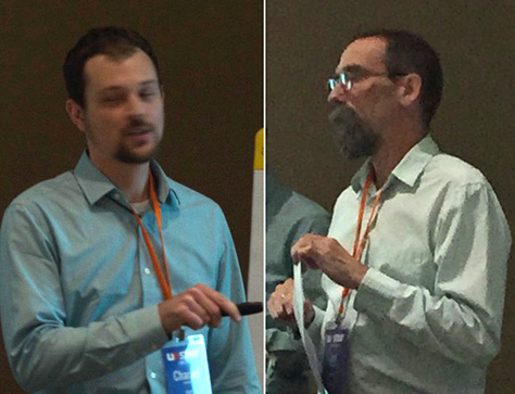
Dan Klyn and Andrew Hinton of The Understanding Group, shown in Figure 1, facilitated a day-long workshop that looked at UX strategy through the lens of information architecture (IA). Their approach is about gaining “big understanding for the long haul” rather than doing “big design up front.” They shared “methods for determining what things are, where they should go, and how they should be connected.”
Figure 1—Dan Klyn and Andrew Hinton
The workshop began with an introductory lecture, in which Dan explained that information architecture is an evolving discipline, and there are many different lenses through which to view the discipline. The Understanding Group’s key influences include
Richard Saul Wurman, who created the TED talks and excels at making the complex clear
James J. Gibson, who pioneered our understanding of cognition and perception and invented the word affordance
Christopher Alexander, the controversial architect and author
Places Made of Information
Dan showed us a photo of a man who had climbed to the top of Mount Kilimanjaro in Africa. Instead of gazing at the view around him, the man was looking at his mobile phone. Since, on average, we spend 40 hours a month in online spaces, Dan explained that “it is important to better understand places made of information.” Such places are also changing the way we use built environments. To illustrate, Dan also shared a photo of a group of students in a museum, looking intently at their phones, while ignoring the paintings surrounding them. He asked the audience, “Are their phones augmenting this museum experience? Probably not.”
Dan posed the question: how can we make these places of information good in a systematic way? After quoting Jorge Arango, “Information architecture is about the structural integrity of meaning across contexts,” Dan added that it also extends across devices, modalities, all expressions, and all channels.
Structure Makes Meaning
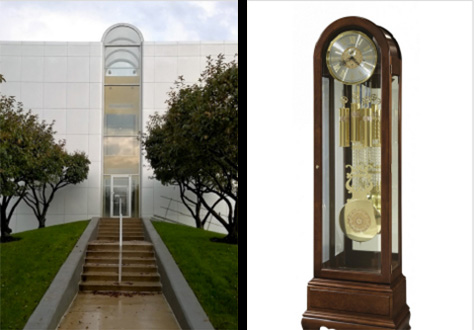
Structure and meaning are key concepts of information architecture. “Can we make a structure that communicates the experience we’re trying to create?” asked Dan. For example, the photo shown in Figure 2 depicts a building whose structure sets an expectation for the type of place it is. Symmetrical halves denote the two names making up the business name and a clock-shaped entrance expresses the type of business the building houses—clock making.
Figure 2—A building whose structure conveys meaning
“If we focus only on the aesthetic delivery of digital products, there is a missed opportunity,” Dan stated. “What if structure helped make meaning coherent? In the physical world, structure reinforces meaning in the built environment.” Next, Dan showed us the Steelcase Office Furniture Corporation’s headquarters, shown in Figure 3, which was built in 1989, in Michigan. It’s an enormous pyramid structure that cost $111 million dollars to build. But 20 years later, Steelcase sold the building for just $2.8 million. Dan’s example made the point that creating structures around what a business is trying to accomplish today works for only a short time. He asked, “What happens after a business changes its mind and the building is still there? Think about digital environments over time. Bricks and mortar should be true, correct, purposeful because they’re hard to dismantle, but this is missing in information spaces. How can we make information spaces good?”
Figure 3—The Steelcase pyramid
What Is Good?
Dan invited us to ponder, “What is good?” He quoted Christian Norberg-Shulz, “Places represent architectures’ share in truth.” Then quoted Trent Reznor, “There needs to be a place… one place. One complete thought around music.” Apple Music promised a place made of information to buy, sell, engage with fans. Apple set itself up for something significant, but Dan thinks it failed.
In answering the question “What makes places good?” Dan said, “It depends.” Showing a photo of the Chapelle Notre Dame du Haut at Ronchamp, by Le Corbusier, shown in Figure 4, Dan explained that this building is a really good place now for different reasons than it was a really good place in 1955. “People making built experiences have to consider usage across time,” stated Dan. He asked the audience, “Has anyone made something digital that’s lasted over two years?” Nobody in the audience had. He told us, “The things we make don’t last.” But Dan and Andrew gave one example of a digital space that has lasted a long time: Flickr, which is an example of a thing became another thing—a game became a photo-sharing application. Dan stressed that, “The reasons for making a thing are not the only criteria for why it’s good.” Something good can transcend its original requirements.
Figure 4—Chapelle Notre Dame du Haut
Examples in the Built World
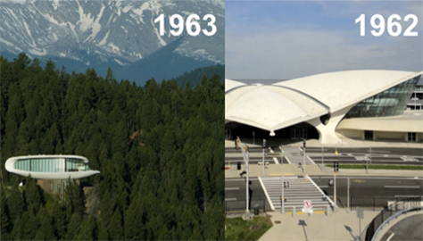
Dan then contrasted two buildings, shown in Figure 5: The Sculptured House, which Charles Deaton did not create for any particular purpose, but “wanted the shape of it to sing an unencumbered song,” and the TWA Flight Center at the JFK Airport, which Eero Saarinen designed, carefully considering its next context—airport to spaceport. Both buildings shared similar lines and their vocabulary of shapes, yet one was conceived seemingly without purpose, while the other’s architect ascribed great meaning to its structure.
Figure 5—The Sculptured House and the TWA Flight Center
“What is good structure?” asked Dan. He showed Peter Merholz’s illustration of the Double Diamond model, saying, “Structure and strategy only happen in the first diamond, but when do you know you’ve completed the structure? Does it have to be in a test environment to be done? How do you know when your structural approach is good?”
“Whose job is good structure? Is it a solo architect versus collaborators?” asked Dan. He gave the example of the architect Lou Kahn, who not only architected his buildings, but also personally oversaw their construction to ensure good structure. Dan continued, “If making buildings good is more than sitting at the drafting table, but also being involved in the construction, then strategy cannot be a PDF attached to an email.” He believes that, for the majority of us, the focus is on shipping.
Defining Strategy
There is a misperception in our industry that understanding the problem is the easy part. Dan would like us to shape information architectures to better ensure the realization of experiences for users that are well aligned with strategy.
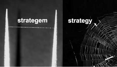
Considering the word strategy, Dan asked the audience, “How many people can define strategy easily?” He uses a spider’s web analogy: “One strand of a spider’s web is a stratagem. That single line is a trajectory that may be correct.” As Figure 6 depicts, “a stratagem is one of the connectors. A spider’s web is the strategy. Is the goal catching flies or creating a straight line?” We make sense of strategy as an ecosystem—it is ongoing. While some tactics may not make sense alone, as part of a structural design they work.
Figure 6—Stratagem versus strategy
On Ontologies
Dan invited us to examine the word ontology—what things are. It describes rigor and the science of meaning. Dan pointed out, “It is hard, in organizations, to go down to the meaning of assumptions.” To illustrate this concept, Dan played a video of Sesame Street Martians demonstrating the process of cognition.
“When we work with meaning and things,” said Dan, “we have to get down to the basic level of what is a thing.” According to Vala Afshar, “By 2020, 57,000 new things will be added to the Internet every 1 second.” Dan asked us to consider, “What do things mean independent of labels? Long, yellow things versus bananas. Understanding basic assumptions and where they come from is the first step to defining a strategy. Pictures and words help—except when they don’t.”
What Are Things?
Taking over the lecture, Andrew clarified what things are. He used his experience working on Lowe’s Web site as an example of when he had to question: “What is a hammer? What is a store?” While these may sound like dumb questions, Andrew made the point that this workshop is about asking dumb questions and dumb things. “It’s all about legitimizing being dumb.” Purportedly, Richard Saul Wurman always said he was the dumbest guy in the room.
Andrew then recounted some of his experiences working on Lowe’s Web site: “Home improvement is hard enough when it is located in a warehouse, but the digital version has metadata wrapped around things and, therefore, asking questions like ‘What is a hammer?’ becomes important. For example, when searching for hammers, what about mallets, ball peen, or hammer-like tools? Seems simple, but how does all this make sense across multiple channels? What do we mean when we say what we say?”
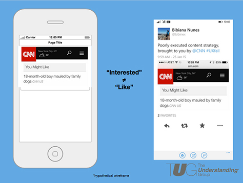
Providing another example, Andrew told us, “If we just drag and drop wireframes without thought, if we just create a like module without considering what the word like means, we may get results such as CNN’s recommendation on its mobile site: ‘You may like… 18-month-old boy mauled by family dogs. #UXFail,’ as shown in Figure 7.
Figure 7—An unfortunate recommendation
Many Types of Information
“Structures exist in environments and ecosystems—and we need to think about where they’re being used and what they’re connected to,” stated Andrew. “Information isn’t just one thing.” There are many types of information:
digital—machine to machine
semantic—person to person
physical—body to environment
Affordance and Wayfinding
“Some of you may have heard of something called an affordance,” said Andrew. “It was popularized by Donald Norman, but the idea originated with a scientist named James J. Gibson, who invented a groundbreaking way of understanding how perception works. … Affordance [means] the properties of objects and surfaces in our environment that afford particular actions for animals, based on the structural relationship between the animal’s body and the environment. The ground affords standing and walking upon. Air affords walking through. A tree branch affords grasping. A frog can grab a fly out of the air with a sticky tongue. There are a lot of affording properties in those objects that allow that to occur. It affords the frog the ability to eat. It affords the fly the ability to be eaten.”
“Wayfinding was a lot easier in the natural world back when everything wasn’t identical and regular,” remarked Andrew. “We are a semantic species. Language shaped the way we evolved. Affordance has to do with how physical bodies deal with physical stuff. We are semantically and culturally enmeshed in how we deal with environment.”
Using the example of flat versus skeuomorphic design, Andrew said, “It’s all simulated in the digital world. Invariance is more important than affordance”—which means things that do not change in the midst of change. Digital information allows us to change physical spaces semantically. For example, if a button does not look like a button, the user must keep tapping stuff until something happens. Something’s semantic function equals its physical affordance. Semiotics is at core of design. Andrew quoted William Gibson, “The future is not evenly distributed.” Andrew stated that the damage of poor design is not widespread.
“Architecture has to do with corporate language,” said Andrew. The base of data architecture extends to business rules, corporate channels, omnichannel experiences; user-facing labels, links, content, interfaces. Information architecture is not limited to User experience. It affects all levels.
“What do we mean when we say what we say?” asked Andrew. He described how the Catholic Church reclassified the capybara as a fish, to accommodate the needs of a remote, traditional culture for which capybara was its sole sustenance. “You can label all you want from the top down, but people have access to the surface where meaning is delivered. If your meaning doesn’t work, users superimpose their own meaning. Pictures do not help.” Andrew illustrated this point with the example of the blue/gold-dress debate that swept the Internet in February 2015.
Andrew concluded his lecture by saying, “Make things be things across channels consistently, in a way that will provide value.”
Workshop Activity 1: What Are the Things?
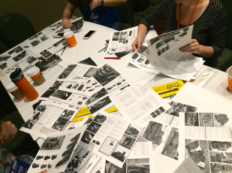
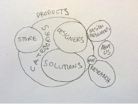
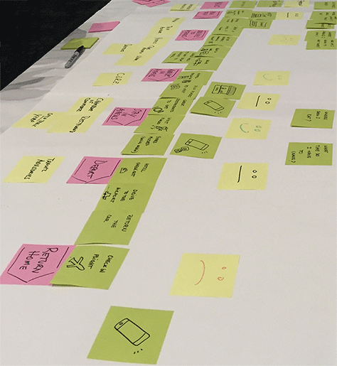
For the first activity, Dan and Andrew asked us to pair off and go through the pages of a retail catalog for a clothing manufacturer, shown in Figure 8. Our goal was to try to understand the basis on which the catalog had been organized. We then created a bubble diagram, like that shown in Figure 9, to differentiate among clusters of more or less related things, finally arriving at a configuration of bubbles that indicated the relative sizes and meanings of the clusters.
Figure 8—Retail catalog Figure 9—Bubble diagram
Next, we received an overview on the ontology of shapes. They asked us not to use squares—because squares cause people to try to sort them into orderly patterns—but instead use circles. We were not supposed to make the bubble diagrams very structured because we were to avoid starting with too many assumptions about structure.
Workshop Activity 2: How Are Things Arranged?
Before we began the second activity, we learned a definition of taxonomy, which is the arrangement of meanings. Dan quoted Patrick Lambe, “Taxonomies provide the lenses by which we perceive and talk about the world we live in.” According to S.R. Ranganathan, “There are many ways of ordering rather than a single, fixed hierarchy. String multiple taxonomies together at once.”
Andrew explained that language is stuff we put into our environment, and it doesn’t all correlate to physical objects. Plus, the world has gotten a lot more complex than just Web sites and brick-and-mortar stores. “As if that wasn’t complicated enough, we now have these information ecosystems that require definition and understanding by customers and users,” said Andrew. He clarified that taxonomy is about sensemaking, and taxonomy is also about placemaking.
For our second activity, we were to propose a taxonomy strategy for our brand, based on the brief of our intended audience, then display our work and discuss our decisions.
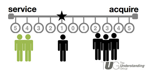
After breaking for lunch, the second part of the workshop began with a quote from Abby Covert, author of How to Make Sense of Any Mess: “Organizing information isn’t the hard part. Agreeing is the hard part.” Dan began his discussion about determining what good means with a quotation from Alfred Korzybski: “Real agreement requires accurate maps.” Dan presented his performance continuums, shown in Figure 10, an approach he derived from a ’70s architecture textbook, which provides a measurable way of determining and discussing what good means with stakeholders.
Figure 10—Performance continuums
Workshop Activity 3: How Things Should Connect
For our third activity, we split our group in half, then combined it with a group working on another brand. We then modeled the new group’s intent for how this merger should play out in terms of experience strategy, as shown in Figure 11.
Figure 11—Modeling an experience strategy
Dan first provided a UX-centric definition of choreography: “Choreography is the together of experiences.” Then he quoted Charles Moore, “Architecture is a choreography of the familiar and the surprising.”
Andrew invited us to think about composition, labels, relationships, and rules, using examples from his book Understanding Context. He told us, “In Understanding Context, there’s a three-part model similar to what we’ve been discussing. It points out that rule sets are what turn labels and relationships into dynamic systems that don’t just sit there statically.”
“Information is multimodal. It isn’t just one thing: digital—machine to machine; semantic—person to person; or physical—body to environment,” said Andrew. “The way we use these modes of information choreographs what people can and cannot do. A tap or click is a physical act in response to semantic prompt and is controlled by digital rules.”
“Products and services are also multimodal,” continued Andrew. “They rely on all these types of information. That’s because no product or service is in a vacuum anymore. A hammer might just be a hammer, but it has a UPC code, and representative information and metadata across thousands of systems. Nearly anything we make is connected and nested within the broader environment—whether we plan it that way or not. Chris Risdon’s example of the Rail Europe journey map explains how customers interact with many kinds of information, as part of a whole travel environment.”
Final Activity
For our final activity, we were supposed to make a concept model to help explain the arguments we’d made in the intention model and the experience strategy in terms of structure, then do a show and tell. However, we ran out of time, so the group elected to instead hear a final lecture about Marsha Haverty’s concept of flow.
Marsha Haverty’s Flow Diagram
At the 2015 IA Summit in Minneapolis, Marsha Haverty presented “What We Mean by Meaning: New Structural Properties of IA.” During her talk, Haverty asked, “What is meaning like? What are its properties?” Meaning is not fixed. The physics of perception may be similar to murmuration: couplings that are constantly changing. Behavior and information are constantly changing—just as string theory is constantly changing.
According to Haverty, meaning is flow and flows have these properties:
viscosity—ease of flow
texture—facets
permeability—subject to influences
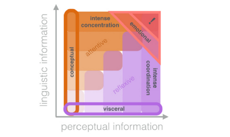
There may be high or low viscosity. Haverty offered a new IA construct to account for viscosity: Some kinds of information are more viscous, while a less viscous meaning would be advantageous. Andrew and Dan shared Haverty’s model, shown in Figure 12, as a way for us to consider flow in our work.
Figure 12—Haverty’s model
This model shows that intense concentration is attentive—how much work is there as opposed to not having to think—while reflexive visceral is intense coordination and emotional. There are properties that are intrinsic to form and do not change, but patterns may have different associations, meanings, and memories. This is semantic.
Conclusion
Dan Klyn and Andrew Hinton presented a very engaging workshop, full of thought-provoking ideas. There was a lot of information to digest, but the concepts I learned in this workshop have already changed the way I approach my work and how I think about information architecture as it pertains to UX strategy. After the workshop, I went out and bought Andrew’s book. I’m hoping Dan will also write a book in the near future. Check out their highly visual presentation on SlideShare, shown in Figure 13.
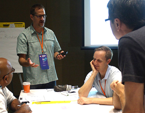
Jim Kalbach, Head of Consulting and Education at Mural.ly and author of Designing Web Navigation and Mapping Experiences, facilitated this half-day workshop in the morning of September 8. Jim, who is shown in Figure 14, began his workshop with a lecture on alignment diagrams, whose purpose is to provide strategic clarity and align an organization around value creation.
Figure 14—Jim Kalbach
In value-centered design, the focus is on the overlap between the needs of individuals and those of the organization. Jim quoted Jess McMullin, “Value-centered design starts a story about an ideal interaction between an individual and an organization and the benefits each realizes from that interaction.”
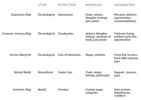
Jim shared some examples of the various types of alignment maps and described their characteristics, as follows:
experience maps—These maps tell a story about the interactions that take place between individuals and an organization—what the customer is doing, thinking, and feeling.
customer-journey maps—These maps depict the touchpoints between customers and a business, which are the means by which value is exchanged and, thus, present business opportunities. They focus on the customer and factors that can make or break a person’s relationship with a business. A customer journey starts before a person becomes aware of a product or becomes a customer. Do not confuse a customer journey with a customer lifecycle.
service blueprints—These blueprints depict the various stages of a specific encounter between a customer and a business’s front-line services and back-office systems. Their focus is on service provision and back-end process rather than the customer. They describe a real-time experience and may include timings for each step.
mental-model diagrams—These hierarchical diagrams model a user’s tasks, feelings, and motivations and a business’s ability to support them.
isometric maps—These spatial maps represent the categories and usage of content and may show the touchpoints between internal and external aspects of a business, as well as with customers.
As you can see in Figure 15, with the exception of mental models and isometric maps, the structure of these diagrams is chronological.
Figure 15—Characteristics of different types of alignment diagrams
Alignment maps are grounded in some common principles, including the following:
holism—They focus on experiences, not products.
multiplicity—They show multiple facets of an activity.
interaction—They depict the touchpoints between people and a system.
visualization—They provide a graphic overview.
self-evidence—They require little explanation.
relevance—They address real business problems.
validity—They’re grounded in investigation.
Alignment diagrams help you to “get an ecosystem view. They show how things relate,” said Jim. Thus, they are useful in defining strategy.
Creating Alignment Diagrams: The Process and Exercises
Creating an alignment diagram is a very collaborative process that comprises four steps:
Initiate
Investigate
Illustrate
Align
This process framed the workshop’s exercises, and we worked through each step of the process as the workshop progressed.
Step 1: Initiate
The Initiate step in the process for creating an alignment diagram has two sub-steps:
Frame the effort by defining the diagram’s perspective.
point of view—Whose experiences should you map? Are there different experiences for different roles? What is the unit of analysis?
scope—Where should you begin and end?
focus—What aspects should you highlight? Back-end? Front-end?
structure—How should you arrange the elements?
use—What will you do with the diagram? It’s important to think about this ahead of time.
Align with business goals. What are your strategic aspirations? How do you want to grow? Are there gaps in your knowledge? You must understand the market from a customer perspective. What are the relationships? Map out all the stakeholders.
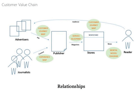
Customer Value Chain
How do you create value for a person? Are there secondary recipients of value? What would be the best diagram for each of these relationships? Figure 16 shows a customer value chain and indicates the alignment diagram that is most appropriate for each part of the value chain.
Figure 16—Customer Value Chain
Exercise 1: Create a Customer Value Chain
Jim presented the scenario that would be the basis for all of the workshop exercises.
Scenario
The Bristol Tourism Office (BTO) would like to improve the overall experience guests have when visiting the city, particularly holiday travelers. They already have some ideas about what to do, but need to see the big picture to prioritize funding and focus on areas that will have the most impact.
First, the BTO is planning to significantly overhaul its Web site. The site has grown organically over the past decade, and there are many complaints about finding information. In particular, the federated reservations system for hotels is incomplete, outdated, and hard to use.
Second, the BTO wants to offer mobile services and apps for travelers. With so many options in the mobile arena, they are not sure where the best place to start would be.
Finally, the BTO believes partnering with key service providers would improve the travel experience of visitors. The BTO already has information kiosks in tourist areas, but they are looking to integrate more with partner services.
You work for a research agency specializing in experience mapping. The BTO has hired you to investigate and identify the most salient ways to bring the most value to visitors. They are also looking for new opportunities previously overlooked. The insight they hope to gain will help structure a multi-year program for improvement.
Jim asked us to break into groups and draw a model of the value chain around travel to Bristol, as follows:
List all of the actors involved.
Place the primary actors in the center.
Arrange the other actors around the primary actors to show relationships.
Show the flow of value from left to right.
Once you’ve drawn the value chain, determine the type of alignment diagram you would recommend creating to model the ecosystem.
Jim advised that this diagram is a way to create meaning, or sense, not provide answers. “Do you have a shared understanding of the ecosystem for this scenario?” asked Jim. “Based on the problems in the scenario, what type of diagram would you start with? It’s the visual component of mapping experiences that’s compelling. It’s a lightweight way to look at relationships and come up with a model. [Map] dotted-line relationships between components of the ecosystem. [Assess] opportunities and parts of the ecosystem not to address. Organizations need perspective in their strategies. How do I create value from the customer perspective?”
Step 2: Investigate
During the Investigate step, you’ll determine what research you need to do to find out what information should go into the map. “An alignment diagram should be informed by some kind of research,” stated Jim. There are “three main areas of investigation:
Gather existing reports, whitepapers, and studies—qualitative and quantitative. Take an inventory of what the organization already knows.
Conduct internal interviews. Start with people in the organization—stakeholder interviews. Start getting a sense of what they know about the experience. Sketch an experience map [representing] your current understanding. Get together in a room and map out the experience as it exists. If you do the diagram, you’re not going to have stakeholder buy-in. What are the key steps in the journey we want to highlight? Identify gaps in [your] knowledge. It’s about sensemaking.
Conduct external interviews—contextual interviews, observation, [and] surveys for quantitative data. The gaps in your knowledge should be the basis for your external research. [Find out] what leaders in your industry are doing. Always bring stakeholders along and involve them in research. Then it’s an easier sell. “Focus your research on specific areas,” suggested Jim. “Dig deep down in areas that are most painful. Create a draft map based on the data.”
“Diagramming is a full-contact sport. It’s not about creating a deliverable,” cautioned Jim.
Exercise 2: Investigate
Conduct interviews. “Who might you want to interview?” List internal interview participants and external interview participants.
Create a discussion guide. “What themes or topics might you include in a guide for interviews, internally at the BTO and externally with travelers?” List internal interview themes and external interview themes.
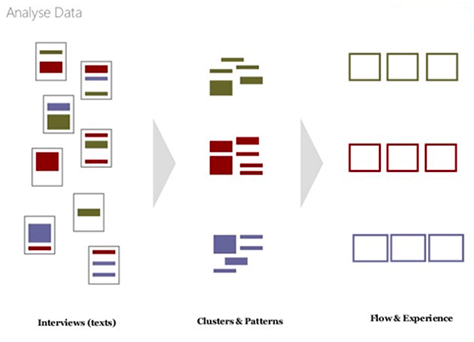
Step 3: Illustrate
In the Illustrate step, you’ll analyze the information you’ve discovered through your research and determine how to map it, as shown in Figure 17.
Figure 17—Analyzing the data
This is the story-writing part of the project:
Analyze the data from the interviews.
Look for themes, clusters, and patterns in the qualitative data from the interviews.
Align the data points into a flow—an experience. Diagram across experiences; across segments of people. What are main patterns? Align them into a sequence.
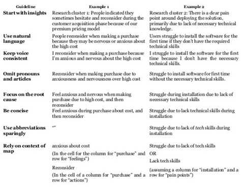
Capture and organize your field notes—either by creating a spreadsheet comprising phases and information types or by discussing themes and clustering notes on a whiteboard. “A spreadsheet is better for teams that aren’t colocated,” recommended Jim. “That’s raw data, so that’s not the end of it. One of the hardest parts is capturing insights. If there’s too much data, it’s not engaging.” He also provided some tips for documenting data, as well as examples, as shown in Figure 18.
Fill out the diagram from your notes, adjusting its structure as you go.
Consider different layouts. Make them as self-explanatory as possible. Jim recommended breaking out “secondary diagrams that are more detailed.” He shared many examples of possible layouts.
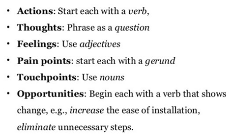
Strive for visual clarity in representing the data. Ensure the elements of the diagram fit in the available space. Don’t create a key and make people go back and forth. Reduce the amount of information so you can fit all of it in the map. Consider font selection, color coding, the use of icons and shapes, consistent text formatting, as shown in Figure 19, and chronology. You can “use shapes to show non-chronological aspects within a chronological map,” suggested Jim. “Chronology is more accessible to stakeholders, but the mapmaker will struggle making everything chronological.”
Figure 18—Documenting the data Figure 19—Formatting text
Exercise 3: Sketch an Outline for a Diagram
Jim asked us to work in groups to create a draft experience map for the BTO scenario, then posed the following question: “How will you tell the story of interaction?” He instructed us to use these phases in structuring the map:
Plan Trip
Travel to Bristol
Arrive in Bristol
Stay in Bristol
Depart
Return Home
Visit Again
He also asked us to include the following elements on the map:
Customer
Actions
Thoughts
Feelings
Painpoints
Touchpoints
BTO
Support
Goals
“Start with a current-state map to understand what the current experience is, then brainstorm the future state,” advised Jim. “Come up with categories that are as universal or independent as possible. Phases focus on fundamental human activities so don’t change between the current and future state. Use other documents—for example, storyboards—to capture the future state.” Figure 20 shows a customer experience map that a team created.
Figure 20—Customer experience map
Step 4: Align
The focus of the Align step is twofold:
Aligning the activities of your organization to the customer experience.
Strategically aligning teams with experience maps.
Collaboration is key. “Hold an extended workshop. Invite a diverse group. Engage in creative exercises,” instructed Jim. Invite participation in correcting the diagram. Iteratively, “empathize, envision, and evaluate. Plan experiments. Align for value. Walk through the map. Look for gaps, weaknesses, [potential] efficiencies, and competitors. Ask for help filling in gaps. Discuss and flag issues.”
Alignment diagrams are “tools UX professionals can use to frame the conversation. Don’t create too many models,” said Jim. “These models can contain or compress a lot of other models.”
When conducting mapping workshops, you can plan a 3-day workshop or a one-and-a-half day workshop, as follows:
Day or Half-Day 1—Conduct the workshop.
Day or Half-Day 2—Create the artifact.
Day or Half-Day 3—Test, or evaluate, the artifact.
You can iterate through this process a few times. “The last thing your company needs is more ideas.
You need decisions,” declared Jim. “In workshops, look for opportunities. This is an opportunity-seeking activity.”
The Ask and Alignment Diagrams
“Solutions that merely please, serve, meet the needs/specs, or delight customers don’t go far enough. They represent yesterday’s marketing and design paradigms. They misunderstand innovation’s real impact—transforming customers.”—Michael Schrage
“At each phase,” Jim suggested, “ask, who do we want our customers to become? Don’t ask people to become something they don’t want to become. It can backfire. Who do customers become at different points in the journey? This is a strategic aspiration. Use metaphors. Reframe the solution space to transform users based on the transformations.”
Exercise 4: Discuss Transforming Customers
Again working in groups, we discussed who we want our customers to become.
Strategy Myopia
This means looking at your business or industry as what it’s always been. Jim shared some choice quotations on strategy:
“You’ve got to start with the customer experience and work back toward the technology—not the other way around.”—Steve Jobs
“Companies … remain trapped in an outdated approach to value creation. They continue to view value creation narrowly, optimizing short-term financial performance in a bubble while missing the most important customer needs.”—Michael Porter
Exercise 5: Discuss Creating Shared Value
Finally, we discussed what business the BTO really is in and how they can create shared value.
Evangelize the Benefits of Alignment Diagrams
Introducing the final exercise, Jim asked, “What are the benefits of alignment diagrams?”
Exercise 6: Discuss the Benefits
List the benefits of alignment diagrams. These benefits include the following:
visualization of a lot of data
longevity of information
diagnosis of problems
indication of where to create value
common big picture
opportunities for growth
informing strategy
Conclusion
I enjoyed Jim’s very practical workshop. Everyone got deeply involved in the collaborative activities. Throughout his talk, Jim showed many excellent examples of various types of alignment diagrams. I suggest that you peruse his slide deck, shown in Figure 21, for inspiration.
Presumptive Design: Using Design Provocations to Reduce Strategy Risk
Reviewer: Pabini Gabriel-Petit
Presenters: Leo Frishberg and Charles Lambdin
Leo Frishberg and Charles Lambdin wrote their book Presumptive Design: Design Provocations for Innovation when they were working together at Intel. UXmatters has published a sample chapter from the book, “Chapter 1: Introducing Presumptive Design.” I suggest you read it for a more in-depth introduction to this new approach to rapid strategy validation. We’ve also published an article by Leo and Charles on this topic, “Presumptive Design: Design Research Through the Looking Glass.”
Leo and Charles, who are shown in Figure 22, built their half-day, afternoon workshop on top of Jim Kalbach’s morning workshop, in which participants had built experience maps for a fictional travel site. The intent was that participants test those experience maps with actual users, using the Presumptive Design (PrD) approach, with which the participants were unfamiliar. “PrD starts with a designed object to provoke feedback,” said Leo. Therefore, participants were initially skeptical about the process, which required them to propose a design solution without first knowing who the intended users were—in contrast to the way they’re accustomed to doing things.
Figure 22—Charles Lambdin and Leo Frishberg
Introduction to Presumptive Design
“PrD is a risk-reduction strategy. It moves the conversation to the front of the funnel—not after the investment has been made,” said Leo.
Design Thinking Models
“Presumptive Design is a design-research method based on Design Thinking,” so Charles began by presenting several Design Thinking models:
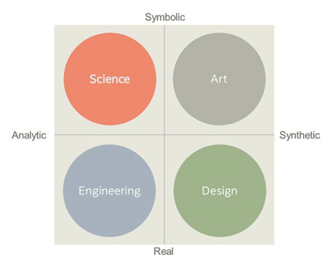
Charles L. Owen’s Design Thinking model—The four-squares diagram shown in Figure 23. Charles characterized Science and Engineering as Finders and Art and Design as Makers; Science and Art as Knowing and Engineering and Design as Applying.
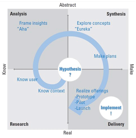
V.J. Kumar’s Design Thinking model—In this model, shown in Figure 24, the journey starts at the center with a design hypothesis and progresses through the quadrants.
Steve Sato’s Design Thinking model—Again, this model, shown in Figure 25, represents Design Thinking as a journey through quadrants.
Figure 23—Owen’s Design Thinking model Figure 24—V.J. Kumar’s Design Thinking model Figure 25—Steve Sato’s Design Thinking model
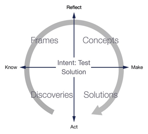
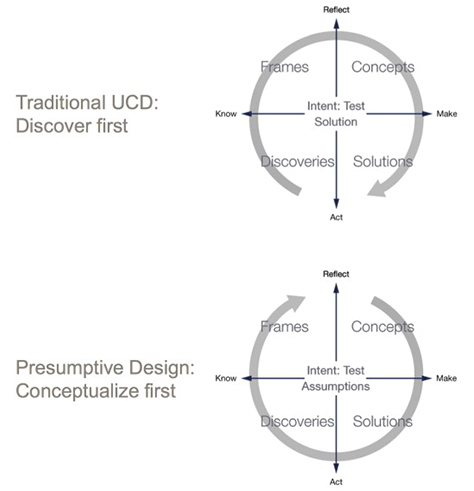
“With traditional user-centered design (UCD), you start with research,” said Charles. “But sometimes you don’t have time or money for research, or the company won’t pay for user research. Sometimes the company thinks it already knows—makes assumptions.” As shown in Figure 26, with UCD, discovery occurs first and the intent is to test a design solution. With PrD, the goal is to conceptualize first and test assumptions.
Figure 26—UCD versus PrD
The Five Principles of Presumptive Design
Charles presented the following principles:
Design to fail.
Create, discover, analyze.
Make assumptions explicit.
Iterate, iterate, iterate.
The faster you go, the sooner you know.
Presumptive Design Components and Timeline
Charles told us, in PrD, it’s essential to “make your internal team’s assumptions explicit, [then] create physical artifacts that represent those assumptions,” and finally, test those artifacts—which will inevitably fail to meet users’ needs.
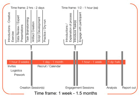
Figure 27 shows the PrD components and timeline, which consists of the following:
Creation sessions—“Get stakeholders in the same room and learn about their assumptions.”
Engagement sessions—“Test assumptions with external stakeholders, or users.”
Analysis—Analyze the test results.
Report out—Report the test results.
Figure 27—PrD components and timeline
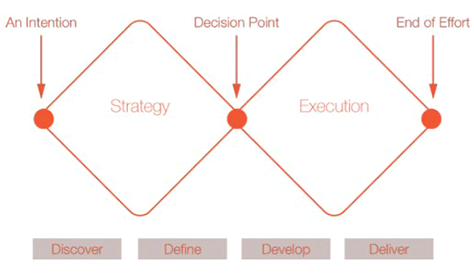
Double Diamond Model
In the UK Design Council’s Double Diamond model, shown in Figure 28, the first diamond focuses on strategy. “What do you plan to build? How do you vet your assumptions?”
Figure 28—UK Design Council’s Double Diamond model
What Is Strategy?
Next, Leo presented a lecture on strategy. “We make a big distinction between prototyping and artifacting,” Leo told us. “An artifact must be magical. It has to represent a technology or situation that doesn’t exist today. External stakeholders must be able to use it. What constitutes an appropriate artifact to discuss strategy? Strategy is about knowing when to say no. ” So, what is strategy?
Strategy answers the questions “What game are you playing and where [and] how are you going to win?”
Strategy is not operational excellence.
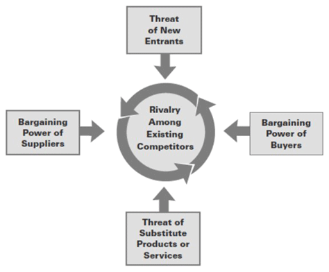
Strategy comprehends Porter’s Five Forces, shown in Figure 29.
Strategy comprises “the choices—implicit and explicit—[you make] to achieve competitive advantage in a market. A basic purpose of strategy is to maximize the value of the capabilities you have that distinguish you from competitors.”
Transient advantage is fluid strategy.
Figure 29—Porter’s Fives Forces
“Companies are trying to build themselves in an agile way, so strategy is a quarter-by-quarter process,” said Leo.
Strategy Validation
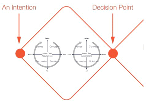
PrD is “a rapid method of strategy validation based on Design Thinking.” In PrD, the period during which a team iteratively tests stakeholders’ assumptions around strategy corresponds to the strategy diamond, as shown in Figure 30, and concludes with a decision point. Thus, Leo told us, “Validation occurs before a company has invested a lot of money” in a solution. “When there are HiPPOs in you organization who know what the solution should be and tell you to build that, the customers blast it.” If necessary, the testing of assumptions may continue throughout the development cycle.
Figure 30—Strategy validation
Charles added, “We talk about vetting assumptions. Lean UX is more about metrics.” PrD answers the question, “Is this the right hill to climb?”
Exercise 1: What Artifacts Embody Strategy? A Brainwriting Exercise
It was almost time to experience Presumptive Design in action. Before the strategy-validation exercise began, we were given some rules to follow:
“Rules for Divergent Thinking:
Defer judgment.
Encourage wild ideas!
First thoughts first.
‘Yes and…’ Build on the ideas of others.
Stay focused on the topic.
Hold one conversation at a time.
Be visual!
Go for ‘quantity over quality.’
Have fun!
Rules for Brainwriting:
Take a sticky note from your stack.
Write as many ideas for an artifact to test strategy as you can. One per note!
Keep your ideas short, and write clearly so others can read them.
When you finish an idea, place the note in the pool—middle of the table.
When you need inspiration, take a note from the pool.”
The facilitators asked us to devise an Athens Travel Office Strategy and provided us with the following “Athens Tourism Office Brief:
The Athens Tourism Office (ATO) would like to improve the overall experience guests have when visiting the city, particularly holiday travelers. They already have some ideas what to do, but need to see the big picture in order to prioritize funding and to focus on areas that will have the most impact.
First, the ATO is planning to significantly overhaul its website. The site has grown organically over the past decade, and there are many complaints about finding information. In particular, the federated reservations system for hotels is incomplete, outdated and hard to use.
Second, the ATO wants to offer mobile services and apps for travelers. With so many options in the mobile arena, they are not sure where the best place to start would be.
Finally, ATO believes partnering with key service providers would improve the travel experience of visitors. ATO already has information kiosks in tourist areas, but they are looking to integrate more with partner services.
You work for a research agency specializing in experience mapping. The ATO has hired you to investigate and identify the most salient ways to bring the most value to visitors. They are also looking for new opportunities previously overlooked. The insight they hope to gain will help structure a multi-year program for improvement.”
They also defined “the key assumptions behind this strategy:
ATO has ideas, but needs to prioritize.
ATO believes it needs to see the big picture.
ATO serves holiday travelers.
ATO believes its Web site needs to be overhauled.
ATO believes it needs a mobile strategy.
ATO believes partnering with service providers is key.
ATO is looking for the most salient ways to add the most value to visitors.
ATO wishes to continue to exist.
ATO is prepared to take multiple years to transition.”
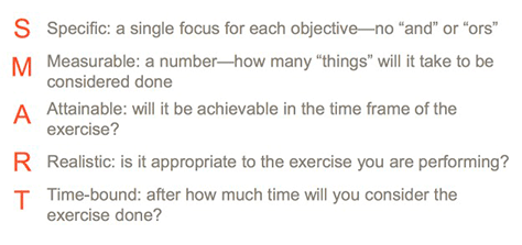
To build the future, we needed a definition of Done that met the SMART criteria, shown in Figure 31.
Figure 31—SMART criteria
“Stakeholders help you craft the objectives, so they own [them].” Our goal was to meet the following “engagement-session objectives:
Validate the top three assumptions behind the ATO strategy.
Identify at least three touchpoints in the diagram [that are] key to supporting the strategy.”
As you can see, this is already quite a lot of preliminary information. But wait, there’s more…!
two pages of fine-print engagement-session procedures
a one-page task definition
a page defining the Presumptive Design roles
a page defining five levels of prompts
four rules for facilitators
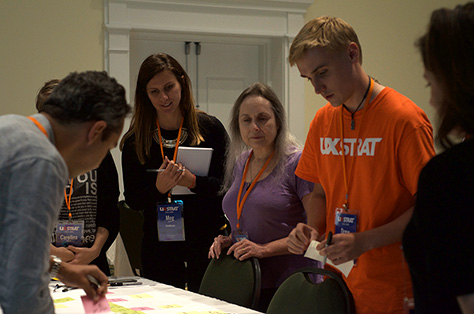
This was way too much information to peruse and absorb in a very limited time frame! The exercise was way too involved for a half-day workshop, so everything felt very rushed. There was way too much time pressure. Leo and Charles should have assessed the feasibility of this workshop exercise using the SMART criteria. I’m thinking back to that timeline slide, shown in Figure 27. Remember that 1 week to 1.5 months timeframe? Nevertheless, participants did their best to complete an engagement session, as shown in Figure 32, then analyze and report their findings. (I know Leo is aware of these issues and has made major changes to the workshop to remedy them.)
Figure 32—PrD workshop
Conclusion
Presumptive Design is an interesting approach that is useful in rapidly validating an organization’s assumptions about its strategy. This workshop had a considerably more academic feel to it than Jim Kalbach’s workshop, but I think that was mainly about the presenters’ style of delivery. Check out Leo and Charles’s beautifully designed slide deck in Figure 33. You’ll find the additional details that I glossed over earlier helpful if you’re interested in putting Presumptive Design into practice.
Figure 33—Presumptive Design Workshop Deck on SlideShare
Founder, Publisher, and Editor in Chief of UXmatters
Silicon Valley, California, USA
With more than 20 years working in User Experience at companies such as Google, Cisco, WebEx, Apple, and many startups, Pabini now provides UX strategy and design consulting services through her Silicon Valley company, Strategic UX. Her past UX leadership roles include Head of UX for Sales & Marketing IT at Intel, Senior Director of UX and Design at Apttus, Principal UX Architect at BMC Software, VP of User Experience at scanR, and Manager of User Experience at WebEx. Pabini has led UX strategy, design, and user research for Web, mobile, and desktop applications for consumers, small businesses, and enterprises, in diverse product domains. Working collaboratively with business executives, multidisciplinary product teams, and UX teams, she has envisioned and realized holistic UX design solutions for innovative, award-winning products that delighted users, achieved success in the marketplace, and delivered business value. As a UX leader, she has facilitated conceptual modeling and ideation sessions; written user stories; prioritized product and usability requirements; established corporate design frameworks, standards, and guidelines; and integrated lean UX activities into agile development processes. Pabini is a strategic thinker, and the diversity of her experience enables her to synthesize innovative solutions for challenging strategy and design problems. She is passionate about creating great user experiences that meet users’ needs and get business results. A thought leader in the UX community, Pabini was a Founding Director of the Interaction Design Association (IxDA). Read More
Information Architecture Instructor at Vancouver Film School
Vancouver, British Columbia, Canada
Krispian has over 10 years’ experience, working at all stages of the User Experience process—from strategy and conception through production and implementation. She has worked at award-winning agencies and for some of the world’s top brands, including Microsoft, Thompson Reuters, ING, and Toyota. Keen to improve the discipline of User Experience, Krispian is the Information Architecture Instructor at VFS and speaks about UX Strategy at conferences, universities, and within Vancouver’s UX community. Read More