Designers have now been building mobile forms for a decade. But, as technology continues to go through metamorphoses and our understanding of users’ needs becomes more refined, good mobile form design is constantly evolving. In this article, I’ll provide eight best practices for mobile form design circa 2017.
Mobile form design presents specific challenges that have, historically, made it difficult for user-interface designers to keep general design best practices top of mind. Challenging factors that pose potential obstacles to creating usable mobile forms include the following:
the constrained screen real estate on a mobile device
data-input fatigue for users
unreliable connectivity
back-end storage problems
unpredictable contexts of use
high costs of interactions
Champion Advertisement
Continue Reading…
Nevertheless, getting mobile form design right can result in big payoffs. For example, according to Jessica Enders, eBay made an extra $500 million annually just by tweaking a button on one of their mobile forms. UX designers live to solve problems, and the limitations of design for mobile have led to innovative ways for users to input data and achieve their goals more quickly. Now, let’s delve more deeply into these best practices for mobile form design.
1. Use a single input field wherever possible.
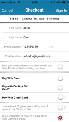
For mobile users, forms with multiple input fields can be a real pain, especially when they have to switch between various input modes—some requiring the use of the keyboard, which obscures much of the screen. Forms that split data into multiple fields unnecessarily increase user frustration and the risk of abandonment. For example, the checkout form for Domino’s Pizza asks for the user’s first and last names in separate fields, as shown in Figure 1.
Figure 1—Domino’s Pizza checkout form
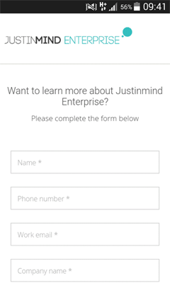
While this user interface may serve the needs of marketers, it doesn’t serve the needs of users. Also, for global ecommerce, separate name fields can be confusing in some cultures. For example, in many Asian cultures, the surname precedes the given name. But in Myanmar, a market of approximately 36 million smartphone users, people have only one name, so two required name fields would be problematic. To ensure your mobile forms are both inclusive and time saving for users, use a single input field for users’ names, as in Justinmind’s mobile contact form, shown in Figure 2.
Figure 2—Justinmind’s mobile contact form
2. Create a conversational, but not overly friendly flow.
As Justin Mifsud pointed out back in 2011, “A form is a conversation, not an interrogation.” The flow of information in a mobile form should have a conversational feel, building a relationship between the user and an organization in a natural way.
Because work-related and informal mobile device use are converging, this advice is truer now than ever. For example, Whatsapp now does double duty for both chats and job interviews. Users have become accustomed to interacting with apps and mobile Web sites informally, and conversational modes of interaction will become increasingly common as mobile forms morph into chatbot conversations. For example, withjack.com does a great job of turning a registration form into a fun experience.
To build trust, you should follow these guidelines for form content and flow:
Base forms on the target user’s profile and prefill values whenever possible.
Place in-depth or personal questions last. Users are more likely to answer them once you’ve established rapport.
Address only one topic at a time.
Allow two-way communication. For example, a Get in Touch or Call button lets mobile users know they can be part of a two-way conversation and helps boost users’ trust in ecommerce apps.
However, conversational does not mean overly casual. When creating eBay’s new ShopBot, the product team found that a slightly more robotic tone increased user efficiency. Plus, users had lower expectations of the bot’s capabilities, so provided better information. Mobile forms should apply the same principle. Either a high-handed or an overly informal tone lowers trust and conversion rates, according to Mifsud.
3. Automatically prefill values in fields.
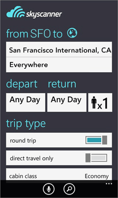
In a 2016 work study with AnswerLab, Google found that mobile users are much more goal oriented (PDF) than desktop users. Therefore, it’s best to cut the fat from forms, automatically prefill values, and allow users to achieve their goals faster. Mobile devices have sensors and user information that you can use to make form-filling less onerous for users. Skyscanner, for example, uses GPS sensors to detect device location, allowing the app to prefill the departure city, as Figure 3 shows.
Figure 3—Skyscanner
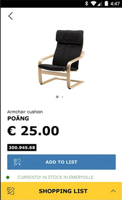
During a checkout process, you could use GPS sensors to provide alternatives to buying online for ecommerce customers. A recent Pew Research Center survey shows that 64% of US users still prefer to buy from bricks-and-mortar stores. Ikea’s mobile site, shown in Figure 4, uses GPS sensors to let customers know whether the item they’re viewing is available in their nearest store
Figure 4—Ikea’s mobile site
Because it’s impossible to guess user information correctly 100% of the time, it should always be possible for users to clear prefilled values. Imagine if Skyscanner let mobile users book flights only from the closest airport. That would be a bad experience for users and even worse for business.
4. Make forms accessible.
Of the people who have disabilities, 91% use a mobile device, according to a 2013 study (PDF) by the Wireless Rehabilitation Engineering Research Center. Advances in mobile technology have brought new opportunities for those with disabilities to connect with the world around them. But their ability to take advantage of these opportunities depends on accessible mobile design.
Users who have visual or cognitive impairments face greater challenges when completing mobile forms. UX designers should reduce those challenges wherever possible by following established accessibility best practices. Many of these best practices help users who are not disabled as well—for example, clear, intuitive designs and logical user flows. However, for visually or cognitively impaired users, it’s important that forms adhere to the following guidelines:
Optimize form controls for screen readers.
Create high-contrast user interface designs.
Enable keyboard functionality for mobile forms.
Support voice input for all form fields, as well as text-to-speech capabilities.
The Web Accessibility Initiative offers a wide selection of resources and papers on accessible mobile design, including form building. While this is a broad topic, I thought the basic best practices of inclusivity were worth mentioning here, if only in brief.
5. Break up lengthy forms into steps or stages.
It’s not always possible to reduce a form to a couple of input fields and a Submit button. For example, online banking, official or bureaucratic procedures, and online purchases require fairly complex forms. For multiple-page forms, let users know how far they’ve progressed toward completing the entire form and what steps are coming up next. A progress bar similar to that at the top of the Autoglass page shown in Figure 5 is an effective way of doing this.
Figure 5—Autoglass progress bar
Step-by-step forms break the task into digestible chunks, not only reducing the risks of users’ missing fields, but also alleviating user anxiety about the task’s difficulty and the time it will take to complete it. Autoglass could have improved their progress bar by including a label for each step—for example, Postal Information or Payment Information.
6. Create minimal forms, but ask the essential questions.
In the context of mobile use—when users may be outside, in crowded places, or surrounded by distractions and have a weak connection—forms have high abandonment and failure rates. The more complex and lengthy the form, the higher the abandonment rate. Therefore, the fewer fields users must fill in, the faster they’ll complete the form and the more likely they’ll be successful.
For the mobile form designer, this means pruning all questions that are not strictly necessary, or just nice to have. Questions such as the following fall into this category: How did you hear about us? How likely are you to recommend us to a friend? But less obvious offenders should be eliminated, too—for example, asking for an alternative email address. While such information may be nice for the marketing team to have, such fields may discourage users from clicking OK. You may choose to keep such fields in the desktop version of the form, but remove them from mobile forms and avoid inflicting unnecessary pain on mobile users.
Similarly, avoid asking form-fillers to create an account before they submit their form, particularly on ecommerce sites. Ask users if they want to create an account later, after they’ve submitted the form.
Even though minimalism is your goal, you should ask for all necessary information. Michael Aagaard of Unbounce provides an interesting example: When he was asked to improve the task-completion rate for a lengthy form, he cut the form back to just three fields, only to find out that there was a 14% drop in form completion. He’d “removed all the fields that people actually want to interact with and only left the crappy ones they don’t want to interact with.” Forms should be minimal in the sense of asking the right number of questions, not the fewest.
7. Display mobile-friendly error messages.
Considering another aspect of conversational forms, let’s look at error messages and form validation. Good error messages can help users to get through confusing moments, reduce user anxiety, keep users in task funnels, and increase users’ chances of successfully completing a form. Confusing error messages can prevent users from successfully completing a task.
Error messages must be clear, concise, and explanatory, whether on the desktop or on mobile devices. Designer/developer Nick Babich has defined some basic principles for error messages for mobile users, as follows:
Use real-time, inline validation to allow users to correct the information faster.
Make error messages clearly visible, and place them in close proximity to the field in error. Error messages that appear in overlays are not a good solution.
Use color to convey meaning—for example, red for error, amber for warning.
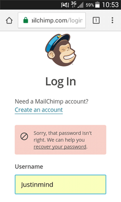
Ensure messages adapt to the error. In Figure 6, MailChimp provides a solution rather than just saying something like “Password not valid.”
Figure 6—MailChimp log-in error message
Because mobile users are often distracted or multitasking, icons and illustrations work well in communicating errors, as long as they convey the necessary information. In Figure 7, Azendoo both explains an error succinctly and builds their brand.
Figure 7—Azendoo error page
Babich advises avoiding vague or dead-end error messages such as: “An error occurred. Please try again later.” This is especially important for mobile users, who are less likely than desktop users to refresh a page, navigate back and forth, or experiment with different browsers.
8. Avoid using drop-down menus and lists.
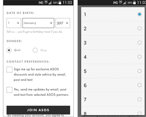
Long drop-down menus and lists are particularly problematic in mobile forms. To prevent users from having to scroll through long pages, some mobile interface designers have used collapsible or drop-down menus or lists to pack many options into a small space, as in the example shown in Figure 8, from the clothing firm Asos.
Figure 8—Asos
There’s a reason why Google’s Luke Wroblewski refers to drop-down menus as “the UI of last resort” for mobile. Users must guess how a menu is organized to locate the information they need. Is it alphabetical? Geographical? Ordered by popularity? Even once they guess correctly, they still have to tap almost as accurately as if their finger were a mouse pointer. The potential of drop-down menus for error and user frustration is high.
There are some good alternative design solutions for mobile form design. For example, a group of radio buttons can replace menus that comprise fewer than five menu items. You can break down hefty menus into categories to improve their usability on a mobile device.
Replace very long menus—such as a menu for country selection—with an auto-complete box, allowing users to type a value, then select a match from a brief collapsible list. For date selection, present users with a large, thumb-friendly calendar overlay instead of using lengthy drop-down lists.
Takeaway
While mobile forms may seem like a prosaic necessity rather than an exciting user-interface innovation, mobile form design often determines user success or failure. Good form design enables both users and businesses to achieve their goals. With poor form design, everyone loses out. By adhering to these eight best practices for mobile form design, UX designers can be more successful in creating usable forms that are effective in today’s world:
Use a single input field wherever possible.
Create a conversational, but not overly friendly flow.
Automatically prefill values in fields.
Make forms accessible.
Break up lengthy forms into steps or stages.
Create minimal forms, but ask the essential questions.
Re: “For date selection, present users with a large, thumb-friendly calendar overlay instead of using lengthy drop-down lists.”
This is great for dates near the current day—such as when making a reservation or buying tickets for an event in the next few weeks. Please don’t use this for birthdates, though. I was born in the ’60s, and it is extremely annoying to have to swipe through the months and years to get there on a standard calendar. In this case a drop-down list is preferable, and a text field with a “MM/DD/YYYY” hint is even better, if you can assume most of your users will be familiar with the same format. For international users, though, this can be confusing as they may be more likely to think in terms of “DD/MM/YYYY.” So again, this brings us to the drop-down menus—with month names spelled out—inelegant, perhaps, but foolproof, which is usually more important.
Hi Marla, This is a great point. Thanks for making it. As far as UI design goes, it would be nice to avoid the drop-down list, but I agree that your suggestion probably makes for better overall usability. It’s always a tradeoff!
Great article on the fundamentals of mobile form design! With more and more organizations using mobile/digital technology to capture and communicate information, the end user—the person completing and submitting the form—is not taken into consideration. If the form designer adheres to the points covered in your article, the end users’ experience and the quality of the data captured will be enhanced.
One point I would add is that the person authoring the form should take into account the devices’ functionality to increase the richness of the data captured—such as mapping functionality and adding media or photographs to the form.
Cassandra, I think that, with the expanding significance of digital transformation in enterprises and in our everyday lives, and the need to work in a way that is all the more naturally adequate, moving endlessly from paper-based structures and agendas is quick turning into the standard for organizations over the globe.
Do you think, when it comes to adopting digital checklists at nSpek we should make sure that we continue to work with the client based off their current designs and keep improving them? Or would you rather prefer that we propose to them a brand new design and spend the rest of our energy on implementation and training?
I ask because there are many inexpensive mobile form solutions out, and our biggest differentiation is the 30 plus years expertise we have in accompanying operational directors and chief information officers with the development of custom based applications and software. A trait and value we don’t really want to compromise unless our sector comes up with some kind of innovation.
Thanks!
Adrian
P.s. I know this is an older article, but it is an ongoing matter for us.
At Justinmind—the maker of a prototyping tool that lets UX designers visualize and test their design solutions for Web and mobile applications before writing a single line of code—Cassandra is responsible for editing marketing content. Before she joined the world of technology, Cassandra was an old-fashioned journalist and communications professional in Cambodia and Taiwan, where she designed campaigns for international humanitarian organizations. She has also written about Asian art and culture for various publications in Asia and the West. Read More

