This is a sample chapter from Luke Hay’s book Researching UX: Analytics. 2017 SitePoint.
Chapter 6: Measuring and Reporting Outcomes
“The greatest value of a picture is when it forces us to notice what we never expected to see.”—John Tukey, American Mathematician
So far, we’ve covered how to check that your analytics is set up correctly, how to use analytics data to identify potential problems, and how to use it for user research. These techniques, along with other UX methods, will help you to identify where you should make changes to your Web site, and what those changes might look like. Once you’ve made the changes to your site, don’t stop there! You should look to measure the outcome of those changes and learn from the results.
Champion Advertisement
Continue Reading…
Measuring the impact of your design changes is crucial. As IBM quality expert H. James Harrington said:
“Measurement is the first step that leads to control and eventually to improvement. If you can’t measure something, you can’t understand it. If you can’t understand it, you can’t control it. If you can’t control it, you can’t improve it.”
Accurate measurement of UX can be difficult, but that doesn’t mean you shouldn’t try. This chapter will help you see the impact of your changes and prove the value of your work.
For ecommerce sites, you should be able to gain an understanding of how much additional revenue your changes have brought in. You may also want to measure other types of impact. For example, an ecommerce site may actually want to ensure there’s no loss of revenue from a change rather than to gain additional revenue. You might also be more interested in increasing repeat custom, or improving non-financial goals.
For non-ecommerce sites, you’ll want to accurately measure the number of additional goal conversions your designs are bringing in, so that you can report on the overall impact to the business.
Whatever the outcome of your changes, you need to be able to measure them so you can learn from them. This will help you make further improvements, or avoid making future changes that could negatively impact the UX of your Web site.
There are two ways to measure the impact of your changes using quantitative data: split testing, and before/after testing.
Split Testing
Once you’ve decided on the changes you’d like to make, the best way to test the impact of these is to use split testing. Split testing is a method of conducting controlled, randomized experiments with the goal of improving your site metrics. It’s a way of comparing multiple versions of a Web page or Web pages to find out which one converts the best.
Split testing is the only way to really distinguish causation from correlation when evaluating the impact of your design changes.
There are three main types of split testing, described next.
A/B Testing
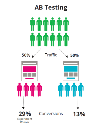
A/B testing is the simplest and most commonly used type of split testing. It’s a method of Web site optimization in which the performance of a page—normally an original—or control—page—and a variation—or variations—are compared to one another using your Web site visitors.
Users are bucketed into one version or the other to prove which variation performs the best. This is often measured by which leads to the highest number of conversions—though behavioral metrics, such as time on site and bounce rate, can be also be used to evaluate performance.
By tracking the way visitors interact with the page they’re shown and subsequent pages they visit, you can determine which version of the page is most effective.
The following diagram shows how a simple A/B test would work.
Figure 6-1—A/B test example
Image source: Amy Cheng
A/B tests often have more than one variation. These types of tests are sometimes referred to as A/B/n tests or A/B/C/D tests.
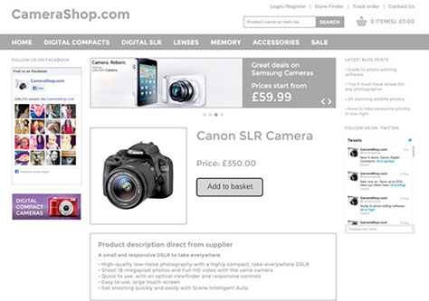
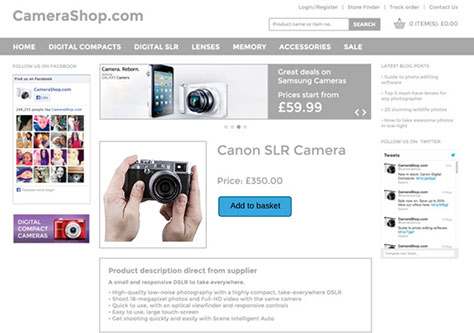
To demonstrate how an A/B test works, I’m going to use an ecommerce Web site that sells cameras as an example. The following screenshot is the original design:
Figure 6-2—Original design
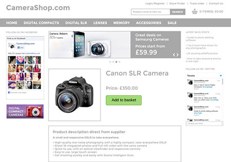
In this example, we want to test whether changing the color of the Add to basket button changes user behavior. The following image shows how the variation design would look:
Figure 6-3—A/B test variation
This is a very simple test, and one which is unlikely to get good results! However, it demonstrates the principles behind A/B testing.
Many of the top split-testing tools report that around 95% of split tests take the form of A/B tests, and as a result, people will often use the term A/B test to describe any type of split test.
Multivariate Testing
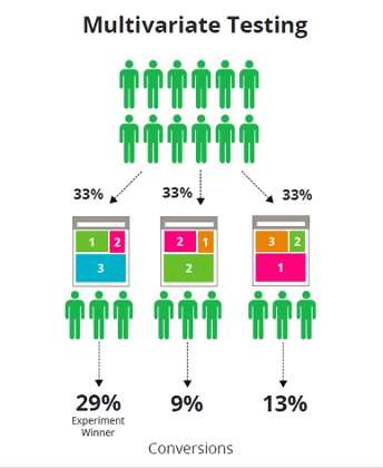
Multivariate testing uses the same comparison idea as A/B testing, but compares a higher number of variables, and reveals more information about how these variables interact with one another.
A multivariate test is run on a single page, but will evaluate changes to different elements. A multivariate test doesn’t test a number of static designs against one another, but instead tests numerous versions of two or more page elements.
This may mean changing the text in a heading, changing a photo and changing the color of a button. For example, you might have three different headings, four different product photos and two different colors for the button. Combinations of these different elements are randomly shown to users until a winning variation is found.
As in an A/B test, traffic to a page is split between different versions of the design. The purpose of a multivariate test is to measure the effectiveness each design combination has on conversions or other performance metrics.
Figure 6-4—Multivariate testing
Image source: Amy Cheng
Once a site has received enough traffic to run the test, the data from each variation is compared—not only to find the most successful design, but also to potentially reveal which elements have the greatest positive or negative impact on a users’ interaction.
Going back to our camera Web site, the following screenshots show examples of how multivariate testing would work. Here we want to test with three different colored buttons, and three different product images, to find the best combination of the three.
Figure 6-5—Original design Figure 6-6—An example variation Figure 6-7—Another example variation
These are just two of the possible variations. In this example, because we’re using three product images and three button colors, there would be a total of nine combinations, meaning nine different variations.
Multivariate testing is used much more rarely than A/B testing. It’s best to approach split testing with a strong idea of what you’re testing, and why. Your user research—and initial analytics analysis—will have given you a clear idea of where an improvement can be made, and what that improvement should be.
If not run correctly, multivariate testing can sometimes seem like a less targeted, almost random approach to split testing. Multivariate testing needs to be set up carefully, and should be based on clear reasoning, rather than just a desire to test as much as possible!
However, if you need to change multiple elements on a page, and have different variations you’d like to try out for each of them, multivariate testing could be the best choice. But keep in mind that, while multivariate testing reveals the interaction effect between multiple changing elements, it does require more traffic than A/B testing for the privilege.
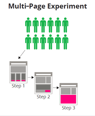
Multi-page Testing
Multi-page testing is similar to A/B testing, except that, rather than making variations to a single page, the changes you make are implemented across several pages of a user journey.
As with A/B testing, site visitors of a multi-page test are bucketed into one version or another.
By tracking the way these visitors interact with the different pages and their subsequent pages, you can determine which design variation is most effective.
Figure 6-8—Multi-page test example
Image source: Amy Cheng
In the example of the camera Web site, we might simply keep the same colored buttons throughout the checkout process. This would be unlikely to have a big impact on the user experience, though.
Multi-page testing is less common than A/B testing, but will naturally appeal to us UXers. We like to consider the entire user experience, so focusing on several pages in the user journey will often make more sense than only changing elements on a single page.
Which Type of Split Test Should I Use?
Table 1 gives an overview of when to use each different type of split test.
Table 1—Split test type
A/B testing
Multivariate
Multi-page
Use
Testing two or more variations of a Web page
Testing different combinations of multiple elements on a Web page
Testing changes to multiple pages on a user journey
Pros
The easiest type of testing to set up and manage
Offers statistically significant results faster than other forms of testing
Can be easily integrated with heatmapping tools
Allows for easy isolation of many small page elements and understanding their individual effects on performance
Measures interaction effects between independent elements to find compound effects
Follows a more conservative path of incremental improvement
Makes an impact across the user journey, and therefore has a bigger impact on the overall user experience
Avoids the inconsistent experience that other types of testing may lead to
Cons
May limit the amount of elements that can be tested
Hard to test the impact of changes in relation to each other
Major layout changes may not be possible
Can take a long time to reach statistical significance
Difficult to set up and plan due to their additional complexity
Hard to report on due to the need to analyze multiple pages
As you can see, each type of test has its own benefits, so think carefully about which one is best for your situation.
What to Consider When Setting Up Split Testing
When you’re ready to set up your split test, you need to pick a split-testing tool. I touched on some of these in Chapter 1, but there are many other options available. I suggest you do your own research to find the right tool for your needs. The main areas to consider when choosing a tool are:
cost
features
support
ease of use
reliability of results
An Up-to-Date Overview
To get a good overview of the tools available, there’s an excellent and regularly updated guide to split-testing tools on Conversion Rate Experts.
Once you’ve chosen the right tool for your needs, you can set up your first split test. The following guidelines will help ensure your tests give you useful and accurate results.
Targeting Your Test
Firstly, consider who you want to be involved in your test. You can target visitors based on several different dimensions. For example, you may only want to include people from a specific country in your test, or you may want to target only returning visitors. Below are some of the common types of audience targeting you might include in your split-testing tool:
location—that is, country or city
language
new or returning
device—that is, mobile or desktop
browser type
platform or OS
traffic source—including referring URL
time of day
You may also be able to set up your own advanced targeting—perhaps based on users’ cookie data.
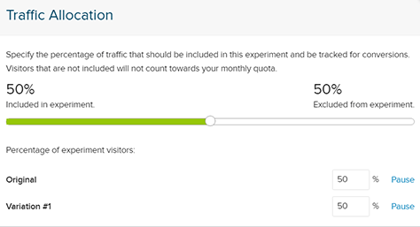
As well as audience targeting, think about how many users you want to include in the test. If you have a Web site that receives a lot of traffic, you may want to limit the test to just a percentage of your audience, rather than including all users. You may also want to experiment with the percentage of users that are shown your variation(s). The following screenshot shows how the split-testing tool Optimizely allows you to choose which percentage of your users are exposed to a test, and what percentage of them will be shown the control or variation(s).
Figure 6-9—Optimizely audience allocation
Choosing who is involved in your test can have a big impact on the results. For this reason, you should be careful about which users you choose to target.
Returning to our camera shop example, you may decide to target a test only at first-time visitors, as you don’t want to risk changing the experience for the regularly returning users.
Choosing Your Goals
Split-testing tools will require you to set up a goal, or goals, to use when reporting on the results of your tests. These follow the same principles as the goals you set up in your Web-analytics package.
For ecommerce Web sites such as our camera shop example, it’s likely that you’ll want to set up goals that relate to purchases. You should set up goals that measure both the number of purchases and the order value. This will enable you to calculate the impact on the average order value and on the number of transactions. It’s possible your changes may not lead to an increase in transactions, but may instead lead to an increase in the amount your users are spending when they make a purchase. In this case, you’ll see an increase in the overall revenue being generated through the Web site.
For non-ecommerce sites, your goals will be similar to those you set up in your analytics. (See Chapter 2.) You may want to set up some additional test-specific goals too, depending on the change you’re making.
Most split-testing tools will allow you to set up multiple goals, though some limit how many you can set up. To keep analysis simple, I recommend only setting up the goals that are important to you. Some split-testing tools can be integrated with your Web analytics, meaning that you’re able to see the impact of the test on a wide range of metrics without needing to set these all up in your split-testing tool. I’ll cover analytics integration in more detail later on in this chapter.
Duration of Test
Knowing how long to run a split test is crucial to getting accurate results. There are several factors to consider when working out how long a test should run. It can be a big mistake to call the results of a test too early. The purpose of running a split test is to accurately measure the performance of two or more different designs. You need to be sure the test is run in such a way that the results are a true reflection of each design’s performance. You need to ensure the data reflects actual design choices rather than factors outside your test or even pure chance.
Before running a test, it’s a good idea to work out roughly how long it will need to run. The first factor to consider is how the running time might impact your results. For example, if your test is only running on the weekend, this may favor a particular design. Also consider which part of the month your test will run. It’s common for people to get paid at the end of each month, and this may impact their behavior on your Web site. For these reasons, it’s often best, where possible, to run your tests for at least a month. This may not always be possible, or practical, but it’s a good rule of thumb.
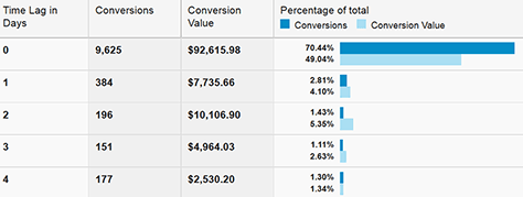
To decide on your test duration, also factor in how long it takes your users to convert. On some Web sites, users visit multiple times over a long period before converting. In this case, you’ll need to work out the purchase path length—the number of days it takes your users to convert. The typical purchase path length can often be gleaned from your analytics package.
To do this in Google Analytics, navigate to Conversions > Multi-Channel Funnels > Time Lag. From here, you’ll be able to see how long it takes your users to convert. The screenshot below shows 70% of people purchasing on the same day as their first visit.
Figure 6-10—Time lag report example
My recommendation here is to calculate how long it takes for at least 80% of your users to convert, and then ensure your test runs for at least this long.
In the case of our camera shop example, users are less likely to convert on their first visit than they would be for an ecommerce Web site selling cheap, everyday products. High-end cameras are likely to cost hundreds or even thousands of dollars, so users will be likely to return to the Web site over the course of several weeks before making a purchase.
Another important factor in knowing how long to run your test is the amount of traffic your Web site receives. If you’re only getting 100 visitors a month, it will take a very long time to see a clear difference in the behavior of the users in your test. It may not be possible to run split tests on your site if you aren’t getting enough visitors. The more visitors you can include in your test, the quicker you’re likely to see a useful result. It’s also important to remember that your test may only be running on a single page of your Web site. If your Web site receives a million visitors a month, but the page you’re testing only receives a couple of hundred, this will mean split testing may not be possible here.
The minimal detectable effect will also impact on the sample size needed. For example, a test that has a 5% increase in conversion rate will need an exponentially higher sample size than one that has a 50% increase. While you can’t predict uplift before you run a test, you can work out a minimum detectable effect based on what’s going to give you a positive return. This allows you to work out a minimum sample size, which will help you estimate your minimum testing time. The A/B testing platform Optimizely has a useful calculator for working out sample sizes.
To produce a valid winner, your tests will need to reach statistical significance. I’ll cover this in the next section on analyzing your results.
Analyzing Split-Test Results
You’ve set up a test and are seeing good results coming in from it, but how do you know when it’s time to declare that test a success? It’s tempting to want to claim that a test has completed as early as possible, particularly if your suggested variation is winning! Ending a test enables you to go on to set up new tests, but it’s important that you wait until your test has a statistically significant winner before declaring it complete.
Agree Beforehand on What a Completed Test Means
People will often pounce on a small amount of data from a split test to back up their preferred outcome. Make sure you agree on what constitutes a completed test before you even set one up. The following information will help you decide the best way to do this, but it’s important you get the agreements of all stakeholders involved in the test, to prevent them from calling the results too early.
There are several factors you need to consider when analyzing the results of your split testing.
Statistical Significance
Probably the most important factor to consider before calling the results of a test is whether it’s reached statistical significance.
Statistical significance is reached when the difference is larger than can reasonably be explained as a chance occurrence. To use a simple example, if you suspect I have a pack of cards containing only spades, it won’t prove anything if the first card I draw is a spade. If I replace the card, shuffle, and draw another spade, this could still be down to chance—although it’s only a 6% chance with a normal deck of cards. If I draw ten spades in a row, chances are much higher this isn’t a normal deck of cards. (The odds of doing so being 1 in a million!)
Most split-testing tools will calculate the likelihood of your results being down to chance. The tool will use all the data available on your site visitors and conversions to calculate how likely the changes you see in your conversions are down to your design changes alone.
Split-testing tools will generally set a default statistical significance level for you. Your statistical significance level reflects how confident you need to be that results are down to your changes and not down to chance. For example, if you run a split test with a significance level of 95%, and you get a statistically significant result, you can be 95% confident that the results are real and not just caused by randomness. It does also means that there’s a 5% possibility the changes are caused by chance alone. I recommend choosing a statistical significance level of 95% for your tests.
A good split-testing tool will calculate statistical significance for you, but you’ll also need to keep other factors in mind, such as those covered in the previous section. You’ll also need to consider statistical power.
Reaching 95% statistical significance will protect against false positives—against finding a winner when there isn’t one. However, statistical power is also needed to protect against false negatives—or not finding a winner when there is one—which is arguably just as important.
Some split-testing tools will include statistical power calculations in their results reporting, in which case you don’t need to worry about it. But some tools don’t include it, and if the tool you’re using just uses statistical significance, then to ensure accurate results, you’ll need to use a separate sample size calculator to ensure you get enough participants and your test isn’t underpowered. Statistician and programmer Evan Miller has created a useful Sample Size Calculator for this purpose.
Segmenting Your Results
When you’re confident your test has reached a significant result, you can begin to analyze the data in more detail. Segment your results by different audiences to see how the test has performed for different types of users.
For example, you may see a 5% increase in conversions as a result of your test, and that’s great. When you segment the results, however, you may discover there’s been a 9% increase in conversions for desktop users, but a 2% drop in conversions for mobile users. This is a really important factor to be aware of, as it means your design has done even better than you thought for desktop users but needs rethinking on mobile.
Ensure Your Sample Sizes Are Large Enough
As you segment the results of your split testing, make sure your sample size is still large enough for statistically significant results. Small segments may be less likely to reach statistical significance.
Integrating with Analytics
Some split-testing tools will enable you to integrate your test data with your analytics package. This means you’ll have access to the full range of metrics and will be able to analyze your results in much greater detail.
You’ll be able to look at the impact on metrics like time on site, which can be very hard to set up as goals within split-testing tools. You’ll also be able to analyze user journeys in detail, to see how your design changes have impacted how users navigate through your site.
As well as integrating with Web-analytics packages, some tools will enable you to integrate with heatmapping tools.
This means you’ll have a heatmap for the original design and one for each of your variations. This will enable you to see where your users are clicking, and how deep they’re scrolling, for all of the designs in your test.
Before/After Testing
It may not be possible to set up a split test to monitor the impact of your changes. Some reasons for being unable to do so include:
No budget for testing tools. (Some split-testing tools can be expensive.)
Not enough traffic to the Web page to reach statistical significance.
There are multiple or large-scale changes making a test setup difficult.
The whole Web site has been rebuilt—though this doesn’t always have to be a blocker!
Lack of any skills/experience in setting up tests. (This can obviously be overcome, but may be an issue if there’s a looming deadline.)
In this situation, you may have to use before/after testing to measure the impact of your changes.
Before/after testing simply means comparing the data from before you made the design change to the data after you made the change. Ideally, you’ll want to have your new design live for a reasonable amount of time. It’s difficult to know how long this should be—but a month is generally a good rule of thumb, as this will cover a mixture of week days and weekends. Once your new design has been live for a month, you’ll be able to compare a month of data for the new design against the previous month’s data for the original design.
This approach is a lot less scientific than split testing, as there are multiple factors that could have caused the changes in behavior with the new design. But it is better than not measuring the impact of a new design at all.
Running Before/After Testing
To set up before/after testing, you can use the date comparison feature in Google Analytics—assuming the data you’re measuring is being recorded there.
Make sure you’re comparing like for like as best you can. This means including an equal number of weekends and weekdays in both the before and the after data. You should also be wary of public holidays or any other events that may have led to a spike or drop in your normal conversion rate. You may be able to shift your comparison dates slightly so that your data doesn’t include these.
When comparing data over different time periods, you’ll also need to consider seasonality. For a lot of ecommerce Web sites, for example, the revenue is likely to increase during the holiday season. Conversion rates may also change around that time. To get around this, you should analyze data from previous years, if it’s available, to get an idea of how seasonality may be impacting your results. This is far from ideal, as there may have been changes to the Web site, industry or user behavior over the course of a year. As mentioned previously, though, it’s better than running no analysis, and should at least give an indication of how your design changes have affected user behavior.
Problems with Before/After Testing
As I mentioned previously, before/after testing is far from ideal. There are lots of variables that can impact the results you’re seeing, and if you’re not careful, this kind of analysis can give inaccurate and misleading results.
If you communicate positive before/after test results to the whole business, and everyone starts using your positive change to inform their work on copy, design and so on, it could have a huge impact on the Web site as a whole. In this situation, you need to be very confident the increase you saw in your results wasn’t caused by anything else that may have changed during that time.
The beauty of split testing is that it does an amazing job of limiting all other variables outside of the one you’re trying to test. It’s not perfect, but it’s a lot better than before/after testing when it comes to giving clear, reliable results.
If you have to use before/after analysis, your aim should be to get as close to a split test as possible, by limiting or normalizing the variables. As well as ensuring you compare a large enough date range, you should also keep these things in mind:
Organic search traffic is normally the most stable—apart from traffic from highly variable sources such as PPC and social media.
It’s best to limit your analysis to users who’ve actually viewed your redesigned page.
It’s important to understand the wider company or market changes taking place, and use this information to normalize your data as best you can.
Analyzing Before/After Testing
As with most types of analysis, it’s important to look beyond the obvious metrics. Conversion rate will be the starting point, but you should also analyze the impact on other aspects of user behavior such as bounce and exit rates. Increases in bounce and exit rates may mean your users are less engaged, which could impact your long-term results. You need to be thinking about more than just the short period over which your changes have been live.
As with split testing, you should segment your results to see the impact on different user groups. This additional analysis can give you insight into exactly how the change you’ve made has altered the behavior of your users.
Before/after testing is far from the ideal way to analyze the impact of your design changes. But if you spend time carefully comparing the data, you’ll often be able to get a sense of whether or not your change has been successful.
Design Changes and Returning Visitors
Whether you choose to report back the results of your changes using split testing or before/after testing, you’ll want to consider how your returning visitors are likely to react to those changes.
Even if you’re confident your new designs will give better results, there may be a downturn for a few days or a week as your existing users get used to the new designs.
A new design may not affect someone coming to your Web site for the very first time, but your returning users—particularly the most loyal ones—may be impacted, as people often struggle to cope with change. Those users may even follow something similar to the Kübler-Ross model of dealing with grief:
denial—People don’t like change and would prefer to stick with the old design.
anger—Your users may be angry at you for changing a system they were comfortable with.
bargaining—Users may try to make the new system work like the old one or ask you at least to allow them access to the old system.
depression—Remembering how much they liked the old design.
acceptance—Realization that the changes have actually improved the Web site.
Every time major Web sites like Facebook or the BBC make big design changes, there’s a lot of anger from their users. This phenomenon, sometimes known as change aversion, occurs regularly. Whether it’s changes to the Instagram logo, Twitter changing from a star to a heart for favorites, or a dramatic redesign of the iPhone UI when moving from one version of iOS to another, design changes can really get people worked up!
If the changes you’re making are major, and you have a lot of loyal, returning users, you may need to run your tests for a longer period, to allow users to come to terms with the change. You may even want to consider targeting split tests only at new users, or at least segmenting your test results by new and returning users. Before you decide your design itself is the problem, just keep in mind that users may take time to adapt to change.
Reporting to Clients or Internal Teams
If your changes have shown interesting results, you’ll want to share them with your clients and colleagues. There are various ways to report on the impact of your changes and share your results with others.
Reporting on the Results of Split Tests
Once you’re confident your split-test results are valid, you can report back to stakeholders. They may not be interested in statistical significance, but they’ll be interested in the predicted impact to their business.
The impact to business should be measured not only in terms of increased conversion rate, but also by increased number of conversions over time, or saved revenue over time.
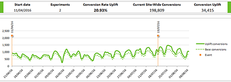
For ecommerce Web sites, stakeholders will naturally be interested in how much additional revenue your change has generated, as well as the likely ongoing increase in revenue it may lead to. Make sure to look beyond the test period, as the increased conversions the design change brings to your Web site won’t stop when the test does—assuming you make the changes live on your site.
It’s difficult to know how long your changes will continue to have a positive impact on conversions. I recommend calculating the predicted impact over the course of a year, but I wouldn’t want to look any further ahead than this. I also recommend erring on the side of caution with your predictions. There’s nothing worse that predicting high and falling short. Predicting low and exceeding expectations, on the other hand, is a great feeling!
Figure 6-11—Sample split-test results report
Where possible, you should also consider retesting big changes, to ensure the results are still valid.
Reporting Before/After Results
Reporting on the results of before/after testing requires the use of the date comparison data in Google Analytics. You should compare significant metrics either side of making the changes and then present these.
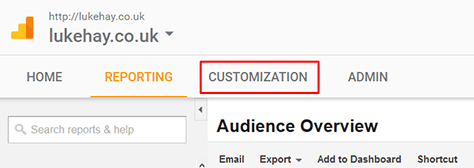
You can make use of custom reports to pull out only the metrics that are important to you. Custom reports can be found in the top-level navigation of Google Analytics.
Figure 6-12—Custom reports in Google Analytics
Custom reports enable you to choose almost any combination of dimensions and metrics from Google Analytics to create a report that exactly matches your requirements. (The LunaMetrics blog gives a good overview of this, along with useful examples of custom reports.)
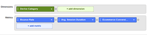
The following screenshot shows the setup for a custom report that looks at the data broken down by device types, including metrics on bounce rate, time on site and conversion rate.
Figure 6-13—Custom report setup in Google Analytics
Once you have the data, you need to consider how to present it. You could just share your custom reports, or you might want to export the data to Excel so that you can create graphs and run additional calculations. How you choose to present your results will largely depend on who you’re presenting it to. Senior stakeholders may just want to see the impact on the bottom line, while members of the UX and Design teams may want to see more detail.
You should also share results outside the UX and Design teams. The learnings from your changes to on-site copy, functionality or designs could be useful to the Social Media, PPC or even Offline teams.
Ongoing Reporting
As well as reporting on the results of individual changes, you should also keep an eye on your data over time, to ensure your Web site is continuing to perform well. This section will cover some useful ways to keep up to date with your user behavior. You probably don’t have the time to do deep-dive analysis of your Web site analytics every day, so the following reports and techniques will help you efficiently maintain awareness of your Web site performance over time, without needing to spend all day looking at your data.
Dashboards
One of the best ways to view the data that’s important to you is to use the dashboard functionality in Google Analytics. Dashboards are a way of visually displaying the most important information needed to achieve your objectives. They provide a way of consolidating your data and reporting on it so key information can be monitored at a glance.
Dashboards in Google Analytics are made up of several different mini reports, known as widgets. Each widget takes one of the following forms:
metric—a single number, such as number of sessions
timeline—data over time, in the form of a line graph
geomap—data shown on a global map, using color to indicate areas of activity
table—one or two metrics based on a single dimension, shown in a table format
pie—data shown in a pie chart
bar—data shown in a bar chart
Dashboards can contain up to 12 different widgets, which means you can see a lot of data in one single page. Each widget can be created from scratch, so you only see the data that’s relevant to your requirements.
Before you create your dashboard, it’s a good idea to write down all the information you’d like to see on it, and how you want to break that down. You may want to focus heavily on ecommerce conversions, in which case you’ll use metrics like conversion rate, number of transactions, average order values and total revenue. You can then think of how you want this data to be displayed, which may mean using metrics like country, device category and time of day.
Once your dashboard is created, you can get it sent to you by email at regular intervals. To do this, you need to click the Email button at the top of the dashboard and choose how often you want it emailed to you.
Don’t forget, you can have several different dashboards. If you have a lot to report on, you may want to create different ones for different types of analysis. Examples of this include an ecommerce dashboard, an engagement dashboard and a technical dashboard.
Custom Reports
The custom reports we discussed earlier are similar to dashboards in some ways. They also enable you to manipulate your data to show you information based on your objectives. As mentioned earlier in this chapter, custom reports enable you to choose almost any combination of dimensions and metrics from Google Analytics to create bespoke reports. This means the reports you create can be as simple or complex as you need them to be.
Another advantage of custom reports is that you can use some metrics that aren’t generally used in the standard reports. One area not currently represented in the standard reports is the time of day when users access your Web site. This dimension can be an important aspect of your users’ behavior, but you’ll need to create a custom report to make use of it.
Google Sheets
To gain even more flexibility in your data reporting, you may want to export your data. Data can be exported from within Google Analytics as .csv files, which can then be opened in Excel for further manipulation. Another option currently available is to import your data directly into Google Sheets. This functionality is available as an add-on to anyone with a Google account.
The add-on gives you a simple way to use the Google Analytics API without needing any coding skills. Using the add-on, you can:
Pull data from Google Analytics directly into a Google spreadsheet.
Filter and segment your data.
Compare data from different time periods.
Schedule automated reports and dashboards.
Create custom visualizations of your data using the chart functionality of Google Sheets.
To find out how to set up Google Sheets analytics integration, read the official Google guide.
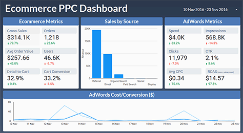
Google Data Studio
Launched in late 2016, Google Data Studio is a tool that allows you to turn your analytics data into informational, easy-to-understand reports using data visualization.
As mentioned in Chapter 1, Google Data Studio enables you to pull in data from multiple sources. As well as integrating with Google Analytics, Data Studio makes it easy to import data from platforms like YouTube and AdWords. You can also set up your own custom data sources.
Figure 6-14—Example Data Studio report
While some effort is required to learn how to create reports with Google Data Studio, it’s a great tool for generating reports truly customized to meet your needs.
Intelligence Events
So far, we’ve covered how to set up bespoke reporting. Google Analytics also attempts to identify important data trends automatically, using Intelligence Events. Intelligence Events reports monitor your Web site’s data to detect significant statistical variations, and generate alerts when those variations occur. An example might be if your conversion rate was 50% less yesterday than the day before. This would generate an event that could be viewed in the Intelligence Events section of Google Analytics.
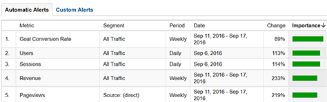
Intelligence Events reports can be found in the main, left-hand navigation of the Google Analytics interface. The Intelligence Events section is made up of alerts that relate to unexpected changes in your data. There are two different types of alert—automatic and custom. Automatic alerts are created by Google Analytics based on any unexpected changes to your data. These are listed in order of importance, and an example of the automated reports table can be viewed in the following screenshot.
Figure 6-15—Google Analytics Intelligence Events
As the screenshot shows, Google Analytics has noted that my conversion rate has risen by 89% week on week. It considers this to be the most important event that has occurred on my Web site during the last 30 days.
I don’t often use the automatic alerts feature. While it can be useful for identifying big changes in your data patterns, the reports have no context, so won’t be able to report accurately on the changes most important to you.
An alternative to using automated alerts is the Custom Alerts feature. As the name suggests, custom alerts enable you to create alerts based on the data that’s most important to you. Custom alerts can be set up to email you when your data reaches a threshold you’ve specified. For example, you can set a custom alert to appear when traffic from the UK decreases by more than 25%. You can be alerted to changes in a wide range of metrics. Another example would be setting up an alert for when your daily revenue drops below a set figure.
Custom alerts mean you’ll be alerted to significant changes in your data without having to log into Google Analytics. They give you a way of staying on top of your Web site performance with zero effort. Be careful, though, not to rely too heavily on these alerts. Continue to keep a close eye on your analytics to maintain a good understanding of how your users are behaving on your Web site.
Using Analytics for Continuous Improvement
However you measure and report on your data, you need to be thinking long term. If you have a successful result from your changes, don’t just stop while you’re ahead. Keep going, and aim for continuous improvement.
Sometimes you’ll see big increases in performance as a result of your changes, while some changes will have a much smaller impact. Small increases add up, though, and you shouldn’t overlook these marginal gains.
The term marginal gains was popularized by Dave Brailsford, Performance Director for Team Sky and Team GB. His vision was to improve all aspects of his team’s performance by just 1%, leading to an aggregation of marginal gains that would add up to something big. He was right. Bradley Wiggins won the Tour De France for Team Sky, and Brailsford’s Olympic team won a staggering 70% of the cycling gold medals at London 2012—before bringing home a similar haul in Rio 2016. Interestingly, marginal gains stems from the Japanese principle of Kaizen, which came about after the Second World War and is used by brands like Toyota to achieve ongoing excellence through continual change.
Whether your gains are significant or marginal, it’s crucial that you’re able to assess the impact they’ve had on the performance of your Web site.
Measuring and Reporting Are Crucial
In this chapter, we’ve covered two ways to measure the impact of your design—split testing and before/after testing. It’s vital that you’re aware of the impact your changes have made so that you can learn from them.
As well as split testing, you should also use qualitative methods to further back up your results. Running user testing on new designs will add some qual to your quant—and, hopefully, give you confidence in your results.
Reporting the outcomes of your changes is a good way to show the value of your work, and also a good way to get others involved. Sharing a big win from your split test is a good way to show the impact design changes can have, and is likely to encourage others to offer input into future tests.
Conclusion
This concludes our look into using analytics to improve UX. There’s a wealth of information available in your data to tell you what is happening with your Web site. You can use your analytics data to find issues with your Web site and to improve your user research. You can then use analytics techniques to evaluate and measure the success of your designs.
Thanks for reading this book. I hope it’s inspired you to take an analytics-first approach to your UX process. Remember, quantitative analysis shouldn’t replace qualitative research methods. Instead, the two should work in tandem to give you the best possible results for your UX methods.
Next Steps
We’ve covered a lot in this book, but don’t be overwhelmed! I’ll end with some ideas to get you started with integrating analytics data into your UX process.
Sign up for a Google Analytics account if you don’t have one already. You can get an account for free, and getting set up is as easy as adding a line of code to your pages.
Once you’ve got your account, you’ll need to check that it’s working as expected. Use tools like GAchecker.com to ensure the code is running correctly on all pages of your site.
Set up custom configuration for your analytics. Look into setting up goals, events, internal search, content grouping and demographics reports. Also add filters to remove visits from spam/bot sources and your own IP address.
Once you’ve customized your account, familiarize yourself with the interface and get comfortable with the key reports.
To begin identifying where you should focus your UX efforts, identify underperforming areas using a range of reports. Remember to segment your data to see if any of your different user groups are experiencing issues. At this stage, also consider using data from heatmapping tools to give you even more insight.
Next, use your analytics data to help with your user research process. Your analytics package will tell you where your users are coming from, the languages they speak, and their demographics such as age and gender. You’ll also be able to analyze the behavior of your different user groups, in order to further inform your research.
You can use this research to help you to create personas, and you can recreate these personas in your analytics package to see how they’re behaving on your site.
If you make changes to your Web site, use your analytics data to monitor how they’ve impacted user behavior, particularly in relation to conversions. You may want to use split-testing tools to help measure this too.
Finally, consider how you’re going to report back the results of the changes you’ve made. Using custom reports and dashboards can help you here.
Luke Hay is a UK-based UX consultant who has been working on Web sites since the 1990s. He prides himself on taking a user-centric, analytical approach to the design, development and optimization of Web sites and apps. Currently, Luke splits his time between working at integrated digital agency Fresh Egg and as a freelance UX and analytics consultant and trainer. Always involved in his local digital community, Luke has helped organize and curate events for UX Brighton and is one of the organizers of UX Camp Brighton. Read More
 So far, we’ve covered how to check that your analytics is set up correctly, how to use analytics data to identify potential problems, and how to use it for user research. These techniques, along with other UX methods, will help you to identify where you should make changes to your Web site, and what those changes might look like. Once you’ve made the changes to your site, don’t stop there! You should look to measure the outcome of those changes and learn from the results.