Information designers must manage all aspects of a communication-design project. But graphic designers’ primary concern is the design of graphics, so they would not typically edit text. In contrast, writers focus on writing text, so would not typically design graphics. However, as information designers know well, a failure to manage all aspects of a project can lead to designs that do not work well.
As someone with no formal training in writing, I hoped reading Harold Evan’s book Do I Make Myself Clear? Why Writing Well Matters would answer these questions: Would this book help me to write more clearly? What is the author’s definition of clear, and what type of clarity does his book promote? Would this book help me solve practical writing problems and maybe provide some before-and-after examples? Would I be able to understand the book’s content and get what he is saying? Would he discuss plain English practice and doing research or testing information with people?
Champion Advertisement
Continue Reading…
Sir Harold Evans has written a number of best-selling histories, was a journalist and the editor of the Sunday Times and the Times in the UK, and is now editor-at-large at Reuters. He holds the British Press Awards’ Gold Award for Lifetime Achievement of Journalists, and in 2001, British journalists voted him the all-time greatest British newspaper editor. He was knighted for his services to journalism in 2004.
Content Review
Let’s take a look at the book’s content.
Part I: Tools of the Trade
Chapter 1, A Noble Thing, is mainly about how notable people in the media and history use or do not use clear writing. Evans says, “We see more words, more speed, less clarity, and less honesty….” What is the author is getting at? What people typically experience on the Web tends to be a quick hit. This is something I have felt for a while now. Web content seems to lack references to any other work and gives you a quick hit rather than exploring issues in the necessary detail.
In Chapter 2, Use and Abuse of Writing Formulas, the author discusses the work of Lucius Adelno Sherman (1847–1933), who spent much of his 47-year academic career investigating how the sentence developed clarity over a century. Evans comments, “He has the nerve to apply metrics to art.” The chapter deals with readability formulas such as Flesch and Flesch-Kincaid. However, the chapter is too short, so does not describe how these readability formulas work or how to evaluate text in enough detail. There is wide-spread caution in using readability formulas.
As Caroline Jarrett and Ginny Redish point out: “No formula can answer the following critical questions:
Is the content what your readers want and need?
Is the key message near the beginning?
Do meaningful headings help make the content manageable?
Does the content flow logically from one point to the next?
Are sections and paragraphs short enough to engage readers?
Are there lists, tables, pictures, and charts where they can help—especially in content that people would skim and scan?
Is the page or screen layout inviting and useful?” [1]
Chapter 3, The Sentence Clinic, provides quite a few examples of lengthy sentences and is interesting to read through and analyze. Here is an example:
“Whenever the Commission shall be of opinion that any change, classification, regulation or practice of any carrier or carriers is or will be in violation of any of the provisions of the chapter, the Commission is authorized and empowered to determine and prescribe what will be the just and reasonable charge or the maximum and minimum charge or charges to be thereafter observed, and what classification, regulation or practice is or will be just, fair, and reasonable to be thereafter followed, and to make an order that the carrier or carriers shall cease and desist from such violation to the extent that the Commission finds that the same does or will exist, and shall not thereafter publish, demand, or collect any charge other than the charge so prescribed, or in excess of the maximum or less than the minimum so prescribed, as the case may be, and shall adopt the classification and shall conform to and observe the regulation or practice so prescribed.”
The author suggests this improvement:
“The Commission has the authority to act against any violation of the provisions of this chapter. It may prescribe charges and practices it judges to be fair and reasonable.”
While I agree that this is simpler, less demanding, and easier to understand, it is still not totally clear. Is the word provisions widely understood? I will leave it to you to decide.
In Chapter 4, Ten Shortcuts to Making Yourself Clear, the author discusses active and passive voice, saying: “More insidious is the passive voice that so often sneaks past usage sentries. It robs sentences of energy, adds unnecessary words, seeds a slew of wretched participles and prepositions, and leaves questions unanswered: It was decided to eliminate the coffee break. Which wretch decided that? Vigorous, clear, and concise writing demands sentences with muscle, strong active verbs cast in the active voice.”
The author uses the word fifty rather than the Arabic number 50. It would have been nice for the author to at least discuss some editorial issues around the use of numbers. Is writing numbers using letters clearer or less clear than using Arabic numerals? Does any research exist about these issues or test results? What about punctuation? What is people’s literacy regarding typical punctuation marks? Do they understand all of them or just a few?
Chapter 5, Please Don’t Feed the Zombies, Flesh-Eaters, and Pleonasm, provides before-and-after examples, which I would like to expand on and discuss. Here is one of the author’s original examples, unimproved:
“The problem is of considerable extent.”
In other words, the problem is not simple and solving it would require a lot of effort.
Here is the author’s suggested improvement to make the statement clearer and easier to understand:
“It’s a big problem.”
Granted that Evans has simplified the statement. However, he has also changed the meaning. Plus, his revision has lost this additional description from the original statement: “considerable extent.” Maybe it does not matter and his revision says almost the same thing, but maybe the difference does matter.
In Chapter 5, the author also discusses pleonasms. This term was unfamiliar to me, but means using unnecessary words. Here are some examples from the author, with the unnecessary words, or pleonasms, in italics:
collaborate together
more preferable
in the city of Manchester
not generally available everywhere
Part II: Finishing the Job
In Chapter 7, Care for Meanings, the author lists over 19 pages of words that sound similar, but are actually different. Here are some examples:
affect/effect
continual/continuous
lay/lie
viable/feasible
This list is useful for writers and is interesting to study.
Conclusions
Evans wrote his book for directors of organizations, people in official or government organizations, people who write complicated texts such as directives and terms-and-conditions documents, and very formally trained, confident, academic writers. The book includes many examples of very complex writing. While the author does clarify and simplify the examples, I am sure the majority of people would not write such complex, difficult texts in the first place. However, it is not always these people who actually write such texts, especially in formal or organizational environments.
I found the book frustrating, albeit in a positive and challenging way. Many people, including myself, may think they have a clear idea and understanding of what plain English or clear writing means. However, this book and some recent research I’ve read about plain-English best practices, invalidates this common understanding. Let me explain. Here is Kate Harrison Whiteside’s definition of plain English:
“Plain language editing is the process of making information readable, accessible and actionable by the readers. Plain language editors use clear writing guidelines and user-friendly design criteria to ensure the message really connects with the audience.” [2]
However, Evans himself uses very complex words that are not commonly known, when he easily could have used simpler, more widely known words. Sometimes authors—even experts—claim that they have written something in plain or clear English, but have actually used complex words that are not widely known and created complex sentences. This observation leads me to think that we need a new term for truly clear, widely usable writing. This new term would describe text that
uses the simplest, most widely understood words
people across many age ranges and literacy levels would understand
communicates clearly and precisely
minimizes misunderstanding
Maybe usable writing, inclusive writing, universal writing, widespread writing, or text-for-most people would be a starting point.
Just because someone says something is written in plain or clear English or has been evaluated as plain English, do not automatically assume that the text is going to be easy for most people understand.
Caroline Jarrett and Ginny Redish offer the following useful advice:
“Write for the people who read what you write.
“The definition of plain language has moved away from writing short sentences and using simple words to focusing on the people who read what you write. As plainlanguage.gov says:
“Don’t write for an 8th-grade class if your audience is composed of PhD candidates, small business owners, working parents, or immigrants. Only write for 8th graders if your audience is, in fact, an 8th-grade class.” [3]
This leads me to another issue that received no obvious attention in Evans’s book. Arthur Shulman and David Sless say:
“Inappropriate information: people may understand the information provided on a label, but it may not be the information they need for appropriate action within their everyday routine.” [4]
Their point: While information can be crystal clear and easy to understand for all, if it does not answer people’s questions, tell them how to respond and what to do, or give them what they need, it is going to fail—regardless of any effort to achieve clarity. The information won’t give people what they need, and they’ll go elsewhere or do something else, abandoning the information on offer.
Kate Harrison Whiteside uses an interesting term: actionable, which highlights the problems information designers must deal with—typically those user requirements that graphic designers, writers, organizational directors, technical suppliers, best-practice guidelines, regulatory organizations, and clients do not automatically deal with. [5]
Do I Make Myself Clear? needed to provide some information about how editorial style has an impact on the clarity of text. Examples include the use and style of measurement and mathematical information and issues regarding the use of spelled-out numbers versus Arabic or Roman numerals, and words for symbols—such as percent—versus the actual symbol %. Also, are abbreviations and contractions—which, for better or worse, are so popular and widely used—a good idea for clarity? Is displaying data and information as an infographic or in a complex table clearer? There being no discussion or mention of these types of issues in the book—perhaps because the author thought they are somehow separate or not relevant to text content—is a real deficiency.
The author’s suggested rewrites throughout the book seem to be based on his personal, subjective expertise. While a lot of these are improvements, I would have liked to see some objectivity in regard to his choices. Why not add references to and discuss academic papers that investigate what he recommends? Why not do some testing with actual people or analyze data from tests that other people have conducted? However, the author does include a paragraph on the work of John Sutherland, professor emeritus at the University College London, who tested 2,000 parents who were confused by the language the younger generation picks up on social-media sites and by texting.
There is almost nothing in the book about plain English, but the author includes a paragraph on the Braley Plain Writing Act that the U.S. Congress passed in 2010, which requires the United States federal government to write “new publications, forms and publicity distributed documents in a clear, concise, well-organized manner that follows the best practices of plain language writing.” [6]
While on first inspection, the editing, rewording, rewriting, and simplification of texts seem straightforward and easy, it turns out to be difficult, requires a lot of skill and knowledge, and takes a lot of time. It is clear to me that creating clear information is expensive, and it takes a lot of time to design it well and to a high standard. Reading this book is just an introduction to learning how to writing more clearly.
Book Design and Printing
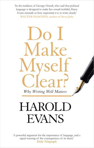
The book-cover design has a mass-market, highly commercial style. While the paperback cover initially seemed okay, after the book had been sitting on my desk for a few days, the front-cover paper curled up. My best guess is that the cover-paper grain is running horizontally across the spine, when it should run vertically down the spine. [7] This should never really happen and is the fault of the book manufacturer—printer and binder. The paper on which the book was printed is a cream shade, and there is little show through, which is a positive.
The interior book design employs a cartoon illustration below each chapter title—similar to those in newspapers. This is very refreshing and adds much fun and character to the otherwise demanding text content.
The main body text uses a good amount of leading and is in an easily legible typeface, which makes the book easy to read. The pages are not too densely packed full of information, so I was able to make progress through the book’s pages quickly.
On the pages of the book—other than the first pages of chapters—the part title appears centered in the headers of left-hand pages; the chapter title, on right-hand pages. This is good. However, these part titles do not include the Roman numerals that appear in the Contents, nor do the chapter titles include their Arabic numerals. Including them would have made the book much more usable by enabling readers to see what chapter they are in. This is a common error, mainly a result of publishers being stuck in outdated style and practice beliefs. [8]
The typesetter hyphenated words, allowing them to be split across two-page spreads, which is not good practice.
Book Specifications
Title: Do I Make Myself Clear? Why Writing Well Matters
[4] Shulman, A. and David Sless. “Designing Information for People. Product Labelling Regulation. Can It Lead to Good Information Design?” In Designing Information for People. Proceedings from the Symposium. Robyn Penman and David Sless, eds. Canberra, Australia: Communication Research Institute, 1992.
At User Design, Illustration and Typesetting, a graphic communication design, illustration, text editing, and production service, Thomas helps book publishers, organizations, and businesses to design and communicate with their users better by focusing on graphic communication design. In the UK, he studied graphic communication design at BTEC, Leicester College, and earned his Bachelor of Arts at Norwich University of the Arts. Thomas occasionally does self-initiated research, writing, and publishing projects and has published papers in Baseline, Slanted, Boxes and Arrows, Typography.Guru, Information Design Journal, and Usability Geek. He has won international design awards and is a Fellow of the Communication Research Institute. Read More
 Information designers must manage all aspects of a communication-design project. But graphic designers’ primary concern is the design of graphics, so they would not typically edit text. In contrast, writers focus on writing text, so would not typically design graphics. However, as information designers know well, a failure to manage all aspects of a project can lead to designs that do not work well.