Alerts indicate hazards in products’ hardware or software functions. Symbols are useful in displaying such alerts more effectively, but their use is not limited to alert functions. You can also use symbols in conveying any kind of information that is complex, hard to remember, or difficult to express using words or abbreviations. Using symbology is a convenient way of keeping track of many similar functional details in hardware or software products. Therefore, it is important to understand how to design these functions.
Using Alerts
The use of alerts is inevitable in all product design. From simple lifestyle applications to military avionics, alerts play a significant role in updating users about background activities or warning them about major errors or failures that require their attention. However, users can ignore most of the alerts in lifestyle applications and expect no major consequences. For example, while a security update might be essential, the user can attend to it at a later time.
Champion Advertisement
Continue Reading…
However, in many situations, users must pay close attention to alerts. In fact, some alerts could even indicate life-threatening situations—for example, a blood-pressure monitor in a healthcare application or a pressure failure in machinery. Such alerts are time critical. In such conditions, alerts play a significant role and should be prominent in a user-interface design. When you’re designing an alert function, ensure that it is reliable, recognizable, and immediately noticeable.
The human brain takes cues from the color, shape, dimensions, and position of objects in their surroundings. Universal standards exist for designing all of these characteristics in alert functions. Following them helps you communicate alerts to users more effectively, while requiring less thought on their part.
Standardization for Color Displays
When users encounter unforeseen situations in stressful environments such as aircraft, marine, or emergency healthcare, it is important that they stay calm so they can attend to any functional issues or other alert conditions. If users had to evaluate every insignificant alert signal on the spot, it would cost them time and might distract their attention from crucial alert signals and the more important issues they indicate. Color standardization plays a vital role in distinguishing the severity of alerts.
According to the Wright Theory of color psychology and color harmony, each color evokes different emotions in the human brain. Many organizations have empirically tested and applied this theory. To use colors effectively in alerts—in accordance with the properties of the human brain—apply the Wright Theory in categorizing alerts as warning, caution, and advisory alerts, depending on their urgency.
Warning Alerts
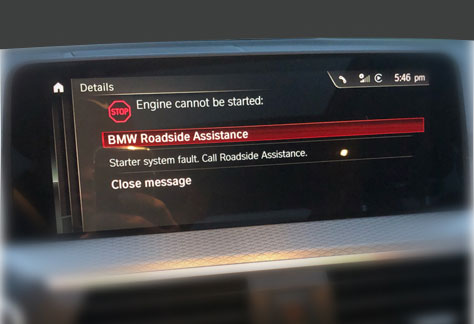
Use the color red for any warning alert where a situation is urgent, such as a life-threatening situation or one from which major property damage could result, as in the alert shown in Figure 1. Users must attend to such alerts immediately. According to Angela Wright, red evokes aggression, strain, survival instinct, physical courage, and energy, as necessary to handle any stressful situation. In some alert conditions, you can use flashing red alerts to emphasize the criticality of a situation.
Figure 1—A warning alert on a car dashboard
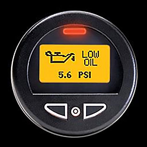
Caution Alerts
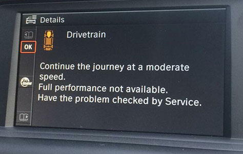
For conditions in which a fault or failure is imminent, use a caution alert such as that shown in Figure 2. While users must attend to such alerts, they need not do so with urgency, so there is no need to create unnecessary panic. According to Wright, using amber or yellow for caution alerts can trigger the instinct of cautiousness in the human brain.
Figure 2—A caution alert on a car dashboard
Advisory Alerts
Use advisory alerts for creating user awareness, such as that shown in Figure 3. For this type of alert, you can use any color other than green, red, amber, or yellow.
Figure 3—An advisory alert on a car dashboard
Standardization for Monochromatic Displays
It is much easier for users to identify the criticality of a color-coded alert on a color display—especially when alerts conform to color standards. However, when designing for monochromatic displays or in designs that use only two colors, you must rely on the shape, dimensions, and position of an alert to ensure its accessibility and convey its meaning. Use these parameters to categorize the alerts and make them noticeable under any circumstances.
By Shape
The human brain reacts differently to different shapes. A research report by Moshe Bar and Maital Neta found that the human brain has distinct reactions to curves and sharp objects. Their study proved that sharp objects triggered a feeling of threat in the human brain, while curved objects conveyed warmth. Therefore, you can use angular shapes such as triangles and octagons for warning signs, as shown in Figure 4, and round shapes for advisory alerts. You can observe the use of these shapes in your day-to-day life: No-parking and one-way signs use rounded shapes; while critical warnings such as those for accident-prone zones, landslide areas, and hairpin turns use triangle shapes.
Figure 4—Alerts whose shapes distinguish them
By Dimensions
You can differentiate alerts by their dimensions, using smaller icons for less critical issues and larger icons for more critical issues to make them more noticeable to users. You must determine the dimensions of these shapes relative to other elements in the user interface, as shown in Figure 5.
Figure 5—Alerts whose dimensions distinguish them
By Position
It is important to be consistent in the placement of alerts. Inconsistencies in the positioning of alerts would increase the chances that users might miss or misunderstand them. If you decide to display warning alerts at the bottom of a user interface, always display them there, regardless of the context. Figure 5 provides an example of the positioning of different alerts.
Figure 6—Alerts whose positions distinguish them
False or Nuisance Alerts
It is important to recognize and avoid the use of false or nuisance alerts in your designs. Such alerts impair the salience of the alert function itself.
False Alerts
Once the user is working to remedy a state that triggers an alert or has resolved it, if that alert recurs, it is a false alert. For instance, if a car gets too close to another vehicle and the alarm goes off, alerting the driver, and the driver quickly manages the situation, the alarm should immediately subside, so the driver can relax. If the alarm were still wailing, the driver might erroneously think something is still wrong and he cannot see it. This stressful situation could be dangerous for both him and fellow travelers. False alarms can be very dangerous. They are deceptive and induce unnecessary panic. In such cases, the alert signal should be suppressed as soon as the user takes action to resolve the situation. If the alert is not suppressed, the signal could give the false impression that there is a new alert condition or that the issue has not yet been resolved, leading to unnecessary chaos in the user’s mind and potentially causing further error.
Nuisance Alerts
Nuisance alerts occur when an unimportant alert keeps popping up. They can cause users to become insensitive to even critical issues. In cases where unimportant alerts recur, users may miss more important alerts among the many other alerts. Therefore, it is necessary to prioritize alerts. Make alerts persistent only if they need immediate attention.
Allow users to suppress unimportant alerts or deal with them later. Never permit such alerts to recur or pin to a position. Although the recurrence of unimportant alerts is annoying, users must still deal with such alert conditions. Use caution when designing alert functions to avoid users’ falling prey to the habit of suppressing such alerts, and make sure the status of the user’s actions are visible, allowing the user to revisit alerts at any time.
Using Symbols
You can use coded symbols to convey information, functions, or processes. This is one of the quickest and simplest modes of communication with users, so symbols are in extensive use on every platform. Each symbol can represent a complete idea that users can recognize in seconds, unlike explanations in words. For example, rather than providing a button that is labeled Open New Document, using a plus (+) sign lets users quickly recognize the function for creating new documents. Similarly, instead of using a Fire Alarm label, using a fire icon effectively triggers urgency in the human brain, saving time and screen real estate.
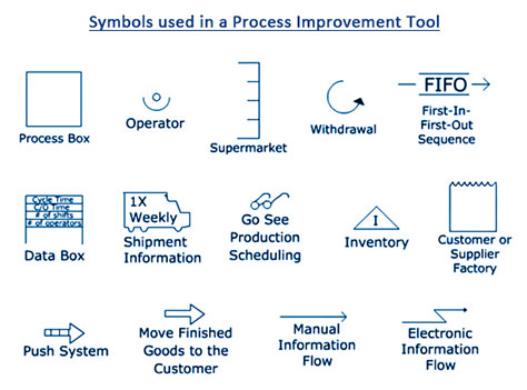
Using symbology is the preferred strategy for communication in various industries—such as the healthcare, automotive, chemical, and manufacturing industries. For example, traffic symbols are consistent across a country, so any citizen would recognize them. Similarly, each industry has its own symbology. Figure 7 provides an example. Symbology eliminates language barriers as well, because symbols are easily identifiable regardless of a person’s language. Symbols use less space, so may allow you to add more features to a compact user interface.
Figure 7—An application’s symbology
When using symbols, take the following factors into account:
Use only universally recognized symbols. For example, for the aviation industry, the FAA has established a set of symbols and authorized their use across all platforms. Similarly, every industry has its own symbology. Learn these symbols before working on a product design for a domain with which you’re unfamiliar.
The use of symbols should be consistent across all applications and devices. Using different symbols for the same function creates confusion and increases users’ memory load, in turn increasing the likelihood of their making errors.
Each symbol must convey a distinct message that does not conflict with the others. Using the same symbol for different functions in the same application would confuse users, causing them to mistake one function for another.
Regardless of a symbol’s dimensions, it should have the same shapes and curves.
The placement of symbols must allow suitable spacing, preventing any overlaps and ensuring they are easily recognizable.
Interpreting Symbols
The criticality of an alert always depends on the application or hardware, so define criticality with a given product in mind. For example, an open-door alert might be dangerous for an aircraft, but not for a printer or refrigerator. However, any type of alert could be critical depending on functional constraints.
There might be nuances in standards for alerts, depending on the region, culture, service, or industry. Bear in mind that none of the standards I’ve described communicate the intended meaning by themselves. Together, a symbol, a label, and perhaps a secondary object such as an exclamation point or additional graphic details within a symbol communicate an alert’s meaning.
In conditions that could cause two or more issues at once, generate alerts for each type of issue and call for multiple user actions. On monochromatic displays with less screen real estate—such as on a multimeter or a remote-control display, using symbols might not always be the best solution. In some cases, plain text or codes might best convey a fault or failure, as shown in Figure 8.
Figure 8—A refrigerator’s error display
Along with the parameters I’ve already discussed, you can use additional behaviors such as blink or glow or aural alarms to enhance the efficiency of alerts. By understanding the various factors that come into play in designing alert functions for systems, knowing the user’s context, and defining clear use cases, you can design alert functions that are effective and efficient.
Betina has more than eight years of professional experience as a UX designer, working on digital media for various services. Her broad range of experience lets her create visually compelling, highly usable designs. She optimizes products by creating designs that meet user needs and address business challenges. Betina cares about both design details and discovering new possibilities. She enjoys working with developers to build out her ideas. Read More

