Designing for accessibility means designing for people with diverse abilities to ensure that they have equal access to opportunities, services, and user experiences. In today’s digital era, the design of inclusive experiences has become a focal point of innovation. It is essential that our digital spaces are welcoming and accessible to people with diverse abilities.
In this article, we’ll explore effective redesign strategies that acknowledge accessibility challenges and ensure the design inclusive digital experiences for everyone. We’ll consider how best to understand the varied needs and capabilities of users and how to leverage technological advancements that facilitate accessibility and the reimagining of user interfaces for diverse populations of users.
Champion Advertisement
Continue Reading…
Types of Disabilities and Assistive Technologies
Let’s take a quick look at some of the disabilities that might hinder users’ effective access to digital platforms, along with the technologies that are available to assist users in overcoming them. We’ll explore chronic disabilities that are permanent, situational disabilities that cause temporary disability, and the various assistive technologies that are available on the market to aid people facing these challenges.
Vision Disability
This category of disability pertains to people with restricted vision or complete blindness. Limited vision may include age-related visual decline, color-deficient vision, or disabilities caused by conditions such as glaucoma, cataracts, and various other factors.
Situational Disabilities—These may include a person’s temporarily misplacing their prescription glasses, someone working in extreme lighting conditions that lead to glare or dim vision, or a person multitasking.
Assistive technologies—These include screen readers, braille displays, magnification software, virtual assistants, and high-contrast display settings.
Hearing Disability
People might experience either partial or complete hearing loss, which could result from factors such as hereditary conditions, aging, damage to the auditory nerve, or disability of the inner ear.
Situational Disability—These include people being affected by ear infections, wax buildup, and exposure to high noise levels in environments such as industrial sites, construction sites, pubs or concerts, or busy traffic.
Assistive technologies—These include closed captions and subtitles, live transcription services, and assistive listening devices that work with hearing aids.
Cognitive Disability
People might experience memory loss, learning disabilities, or difficulty concentrating, recognizing things, or making decisions. These challenges could result from brain injury, stroke, dementia, or other conditions.
Situational Disability—These include people coping with stressful environments; who are distracted, multitasking, traveling, under the influence of medications or alcohol; or who are experiencing various other common situations that cause cognitive challenges. Thus, everyone likely falls under this category at some point in their lifetime due to various everyday circumstances.
Assistive technologies—These include speech-to-text software, voice-recognition software, and interactive learning platforms.
Physical Disability
These people face limitations in bodily functions or movement. Among them are people who have lost limbs or mobility due to accidents and people dealing with medical conditions such as diabetes, arthritis, or neurological disorders that affect muscle coordination.
Situational Disability—These include people with fractures or dislocations, as well as someone who is carrying a baby or shopping bag, assisting an elderly or disabled person, or eating or drinking.
Assistive technologies—These include speech-to-text software, voice-recognition software, screen readers, eye-gaze technology, switch-access systems, head-tracking systems, and accessible gaming controls.
Benefits of Designing for Accessibility
Prioritizing accessibility in design enhances readability, findability, decision-making, motivation, and recognition for people with disabilities, as well as for the broader audience of users. Accessibility positively impacts search-engine optimization (SEO) performance and contributes to improved search-engine rankings and broader online visibility. Prioritizing accessibility drives innovation, ensures market relevance, and builds a positive corporate reputation.
Best Practices for Designing for Accessibility
Throughout the design process, it is crucial to develop inclusive designs that prioritize accessibility for every user. In the early stages of my design career, accessibility seemed to be an advanced topic, with which beginners, who were just entering the field of UX design, hesitated to engage. Initially, many of us failed to realize that there is no true usability without accessibility. Since UX professionals have greater gained confidence, their pursuit of accessibility has become prevalent. But, while inclusion is a common topic of conversation, accessibility too often still goes unmentioned. Inclusion is impossible if we neglect the prioritization of accessibility. Considering accessibility from the outset of the design process should be a typical, common-sense practice rather than a specialized approach.
I’ll now outline a set of accessibility principles that I have found beneficial and now incorporate into every product-design project, along with some tips for achieving accessible design seamlessly and effortlessly from the initial implementation.
Create Depth Through Visual Hierarchy
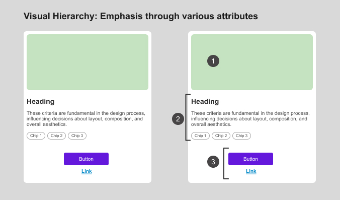
Visual hierarchy is an effective way for designers to create depth within their designs, by providing cues that help people effectively identify which screen element to process first, second, and so on. A clear visual hierarchy for content greatly benefits people who rely on screen readers. Plus, for all users, it facilitates the effortless scanning of content and reduces the cognitive load that arises when the user’s eyes must actively search for each piece of information. To express visual hierarchy, you can emphasize design attributes such as size, color, style, shape, space, position, alignment, consistency, or use a combination of these attributes. Figure 1 provides an example of using these attributes to emphasize elements and create a visual hierarchy.
Figure 1—Visual hierarchy
Avoid Relying Just on Color
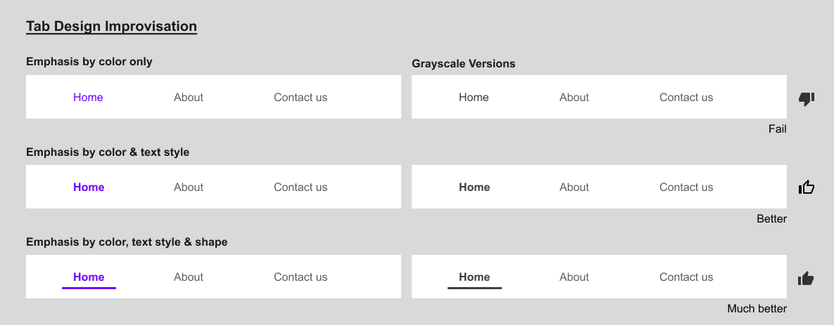
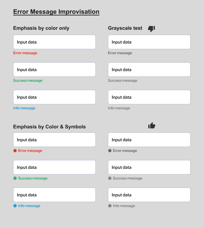
When visually formatting functional components, do not rely only on color. Instead use various attributes such as shape, size, position, elevation, and style. Users can easily perceive such formatting when you apply it to components within specific groups of components such as a stepper, a card, a modal dialog box, or even an entire screen. To create accessible designs, always use a combination of attributes, ensuring that all users would be able to perceive at least one of them. Use a simple grayscale test to help you determine whether your design is accessible. Figures 2 and 3 show examples of adding attributes to make a design more accessible.
Creating microcopy is a highly impactful aspect of user-experience writing, especially for people with a cognitive disability. The words you use in a design can guide people on the next action to take or decision to make, can be engaging, and feel inclusive. Microcopy is typically necessary for components such as button labels, link text, alt text for images, alerts, validation information, and ToolTips.
Providing appropriate signifiers to guide users’ actions eliminates the need to provide explicit directions or instructions on what to do or how to proceed—whether in Help documentation or by providing poor labels such as Click here. Users are smart enough to know that they must click a button to take an action. Plus, considering the variety of devices that people use, they might need to click, tap, press, or use any other interaction, so asking the user to click would not make sense. Also, Click here does not provide any context, especially for people who use a screen reader, which would simply read a list of links that repeatedly said Click here, which would be meaningless. This is why you should always couple a clearly labeled link such as an article or page title with such links. Plus, unless someone searched explicitly for Click here, the destination page would not show up in a search engine. This guideline applies to all vague links such as Click here, Learn more, Read more, Visit, or any links that use the URL itself as its anchor text.
Tailor Designs to Users’ Needs
An element or design that works for one audience might not work well for all people, so the best solution might not be a common solution for all users. Consider, for example: a floating action button (FAB). While a FAB can be helpful just by virtue of always being available for immediate interaction, you must take care in using them on small screens. Make sure that they don’t hide other content on the screen—especially action buttons. One problem with a FAB is that the user must make the extra effort to scroll to access the content behind it.
Make Graphics Accessible
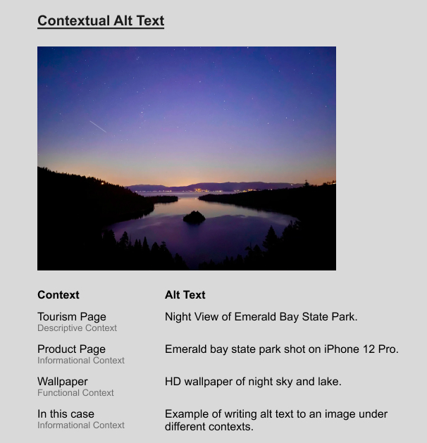
While users can ignore any purely decorative graphics in the content, supporting graphics must be accessible and engaging. Make sure that the graphics you use display clearly to all viewers. For example, when using text over an image, maintain sufficient contrast or use a background that provides enough contrast. Providing alt text, or alternative text, can also help users of screen readers to access the graphics. Screen readers read alt text that describes the graphics to users. Search engines can read such alt text as well. Therefore, it is advisable to provide precise, contextual descriptions, using keywords that could impact SEO performance as well. Figure 4 shows an example of contextual alt text.
Figure 4—Contextual alt text
Use Microinteractions to Connect with Users
Microinteractions are simple signals, or feedback, that a system generates in response to the user’s interactions with a user interface, or triggers. They can enable people with cognitive disabilities or color-deficient vision to complete their tasks with ease.
Microinteractions assure users that an element is interactive and that the system is working properly and receiving their interactions—for example, displaying a hover or pressed state on a button. When on hover, a button glows or changes color, that lets the user know that it is interactive. On a payment screen, if a button had no pressed state, the user might become insecure and repeatedly click or tap the button because of their confusion or frustration, or in some cases, even corrupt the payment process.
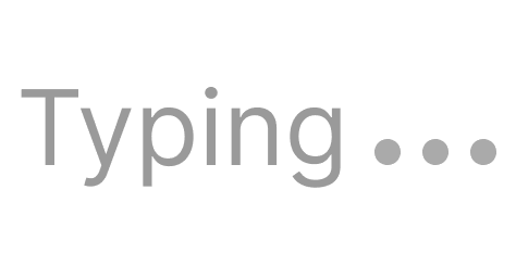
Other examples include loading indicators and progress bars. For example, in a chatbot or voice-assistant app, when users are typing in a text box, a listening animation similar to that shown in Figure 5 would reassure them that the system is listening and they can relax while the system is working or they’re waiting for a reply.
Figure 5—Microinteraction in a chat application
As long as they are subtle, sounds can also constitute microinteractions and aid users with hearing disabilities. An example of the use of a sound microinteraction would be generating a swish sound when the user clicks Send in an email application, indicating that the message just flew out of the user’s outbox.
Determine When Consistency Matters
Consistency matters, but not in all cases. For instance, I was working on a multiuser healthcare application for both university students and faculty, at multiple universities. I chose a neutral color scheme for the home page, landing pages, and log-in screens, but provided a personalized experience to each user who was logged in, changing the color scheme based on the ID for the user’s university.
Google provides another example, using different colors and themes for their products, while sharing the same overall branding concept. Another example is using a contrasting color or button design for the primary action button on a screen. However, unless there is a significant design reason for using unique formatting, be consistent.
My Design Approach
When designing the pages or screens of a user interface, I initially create designs that are based on my own understanding of the requirements, considering diverse approaches that would enhance accessibility and perceptibility. Then, after completing my initial designs, I engage in analysis and conduct peer reviews to assess their perceptibility and identify potential design improvements. Finally, I seek inspiration by observing how other designers have approached similar features or functionalities. Therefore, I am not unduly influenced by other designers before first giving thoughtful consideration to a design problem myself. Instead, I leverage my comprehensive understanding of my product and its requirements, ensuring that my design process remains grounded in the specific needs for that product. I also focus deliberately on prioritizing usability and accessibility over aesthetic considerations.
More Accessibility Considerations
Now, let’s broaden our lens on what constitute accessibility issues and ways in which we can address them.
Design for Combinations of Disabilities
Some people might have multiple disabilities that combine the above-mentioned conditions. So provide various options for accessing content. People should be able to access the content we offer in any way they can.
Consider Accessibility from the Start
Accessibility design is a process. Promoting accessibility does not start with the design of a user interface. It starts with first step of a product-development project: understanding users and the marketplace. You not only need to create an inclusive user interface, but an inclusive product.
Create Empathetic User Stories
Creating user stories that are based on the real-world experiences of users who have disabilities helps us empathize with them better. These user stories also provide guidance that ensures inclusive, unbiased design decisions. Plus, the real-world experiences of users with disabilities are a persuasive means of convincing stakeholders to prioritize accessibility. Through continuous improvement, they can also help designers refine their solutions during iterative design.
Ensure Legal Compliance
There are many country- and industry-specific laws and policies. Among these, the Web Content Accessibility Guidelines (WCAG) offer international standards that are widely recognized. Knowing and adhering to these standards is essential to avoid any legal issues relating to discrimination or noncompliance. Ensuring legal compliance is especially important if you are working for a public-sector or government entity. The consequences for noncompliance could include financial penalties, disqualification from future projects, or long-term legal battles.
Design for Different Devices and Orientations
When designing a Web application for accessibility, it is crucial to consider user groups who are using different devices. While mouse users are the typical focus, we must also give attention to keyboard users who navigate applications without using a mouse. Plus, we must address the needs of people relying solely on small devices such as mobile phones and tablets for accessing content and services. Working on a kiosk provides yet another user experience, especially because of their use in a public environment. When designing for a kiosk, there are a lot of things to consider: the busy environment, extreme lighting, alternative input and output controls, the need to consider people with any type of disability, all the standards and regulations to which it must adhere, and understanding the hardware itself and the assistive technologies around it.
Focus on Demographics
While I’ve already discussed the predominant standards for accessible design, you must align content and optimize it for the specific needs, preferences, and cultural contexts of the audience. For example, you would lay out and align content differently on a global Web site versus one that is specific to an Arab-speaking audience because of their different navigation and reading direction. Depending on location, local accessibility standards and regulations may vary. Plus, colors and symbols carry different meanings in different cultures.
Usability Testing is Key
Do not rely just on accessibility-compliance tests and world norms. There are always unexplored areas that needs improvement and exceptions to the norm. So, if your design passes all tests and audits, but fails usability tests, you need to think about how you can improve the design. Iterate and adapt your design to your target audience’s needs.
Coming Up in Part 2
In Part 2 of this series, I’ll take you through a guided exercise to analyze and redesign a mock screen for accessibility. I’ll also outline some evaluation methods that you can use to test the accessibility of your designs, as well as some current trends and upcoming technologies.
Web Resources
Here are links to some valuable accessibility resources on the Web:
Betina has more than twelve years of professional experience as a UX designer, working on digital media for various services. Her broad range of experience lets her create visually compelling, highly usable designs. She optimizes products by creating designs that meet user needs and address business challenges. Betina cares about both design details and discovering new possibilities. She enjoys working with developers to build out her ideas. Read More