In Part 1 of this series, I described the types of disabilities and their corresponding assistive technologies, highlighted best practices for designing for accessibility and their specific benefits, and covered some additional factors to consider when working on an accessible product design.
Now, in Part 2, I’ll outline some tools and techniques for evaluating the accessibility of screen designs and consider some industry trends and future technologies that could greatly impact accessibility. Then, we’ll dive into a guided exercise that demonstrates how we can analyze and improve a screen design.
Champion Advertisement
Continue Reading…
Evaluating Designs for Accessibility
In addition to usability testing, there are some simple tests that we can use to check the accessibility of our designs.
Visual Accessibility
The most common methods of assessing visual accessibility are as follows:
grayscale test—A method of evaluating a design’s layout, hierarchy, and structure.
color contrast checker—A tool for assessing the color-contrast ratio of text with its background for legibility.
color blindness simulator—A tool that simulates color-deficient vision.
screen reader test—A technique for assessing whether a design works as intended with screen-reader software.
keyboard navigation test—A test for assessing whether a design is thoroughly accessible for keyboard-only users.
magnification test—Tools for testing whether content is readable and accessible at different zoom levels.
responsive design test—Tools for testing whether a design adapts appropriately to different devices and screen resolutions.
Auditory Accessibility
Methods of assessing auditory accessibility include the following:
auditory response test—A technique for testing the auditory responses in a design—such as feedback, alerts, and responses to interactions.
checker for closed captions (CC), subtitles, transcripts, audio descriptions—Tools for checking their synchronization and accuracy.
checker for compatibility with assistive devices—Tools for checking whether an application supports the necessary assistive devices, including hearing aids, cochlear implants, and assistive learning devices.
Cognitive Accessibility
Evaluating error prevention and recovery is a significant factor for people with cognitive challenges. Methods of assessing cognitive accessibility include the following:
legibility test—Testing to verify the readability and clarity of the content in a design.
terminology check—A tool for assessing whether the terminology an application uses is understandable and in line with the user’s mental model.
consistency check—A tool for assessing whether maintaining or deviating from consistency makes a design more accessible.
Physical Accessibility
Methods of assessing physical accessibility include the following:
keyboard navigation test—A technique for determining whether a design is thoroughly accessible for keyboard-only users.
voice command test—A test for assessing compatibility with voice-command tools and their accuracy and efficiency in a voice-controlled user interface.
compatibility with assistive devices—A method of assessing whether an application supports all required assistive devices—such as voice-command software, eye-gaze systems, and alternative input devices such as joysticks, trackpads, or trackballs.
Keeping Up with Industry Trends and Future Technologies
Be aware of the industry trends and technologies that impact accessibility and aim for solutions that will remain relevant over the long term. Inclusive technologies are shaping the ways in which we interact with them by adding controls, enhancing adaptability, and addressing various physical and cognitive barriers. For some of these technologies to be effective, we must follow certain rules or ways of designing them. Therefore, understanding them before building a product is essential to unlocking their ultimate benefits. Now, let’s look at some emerging technologies on the market.
artificial intelligence (AI)—AI makes learning and reading with a voice-based user interface easier, thus enhancing accessibility for people who rely on screen readers and voice interactions.
extended reality (XR)—Although immersive technologies such as artificial reality (AR), virtual reality (VR), mixed reality (MR), and other related extended realities pose accessibility challenges, they are evolving technologies that would benefit from a set of requirements from the World Wide Web Consortium (W3C).
machine learning (ML)—This technology can be helpful for people with cognitive disabilities because it recognizes user’s cognitive patterns and adapt content to be compatible with them.
wearable technologies—These assistive devices can help users overcome various barriers. They are used in various industries such as healthcare, military, sports, entertainment, and fashion.
gesture recognition—This technology helps us understand human gestures and movements, translating them into engaging experiences for people with physical disabilities.
haptic feedback—This capability enhances touch-based interactions—especially for people with visual disabilities—enabling the experience of touch through force, vibration, and motion.
brain-computer interfaces (BCI)—This technology translates brain signals into commands to control user interfaces and could greatly assist people with restricted movement.
Analysis and Redesign: A Guided Exercise
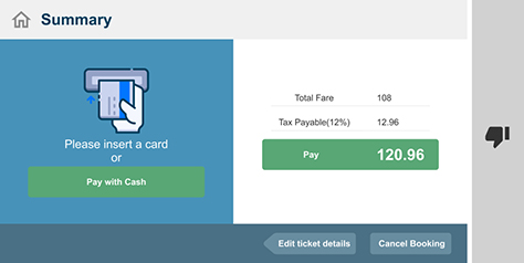
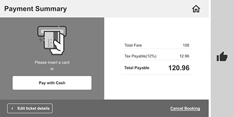
Now, let’s dive into a guided analysis and redesign exercise. Figure 1 shows an example design for a simple kiosk screen from a ticketing system. (This screen is not from an actual application, but is my design, incorporating some of the accessibility flaws that are commonly found in various applications.) Start by analyzing the design yourself, then try to redesign it before reading further.
Figure 1—Example design of a kiosk screen
Analysis
Here’s my analysis.
Color
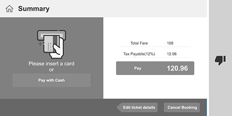
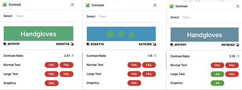
Figure 2 shows the results of a grayscale test, which shows how the screen would look for people with limited vision. Did all the elements pass the color-contrast test with their background? No. The Home icon in the upper-left corner; the text on the right, on the green background; and the green button on the left have failed the contrast test. Even the labels of the buttons at the bottom of the screen did not pass. The Home icon looks like it is unavailable, but it is not. Figure 3 shows some sample results from a contrast checker.
Figure 2—Grayscale test of contrast Figure 3—Color-contrast test of key elements against their background
Shape
How many buttons do you see? If your answer is four, the design has failed the shape test. On the left, the screen asks the user to insert a credit card. On the right, it shows payment details. The user’s immediate action is expected to be inserting a card, following which the system might process the payment. If not, the user could pay using cash by tapping the Pay with Cash button. What looks like a button on the right is not a button but just emphasizes the amount the user is to pay. This is an example of a false signifier. The Edit ticket details button has a different shape from the rest. This is unnecessary. The only justification might be that the designer wanted to indicate that the arrow-like button navigates the user to the previous screen. But we could emphasize this in a better way.
Space
The image and the text and button beneath it are crowded into the center of the blue container on the left—although there is plenty of empty space around them.
Position
The Home icon on the left looks like it’s associated with the page title, but it’s not. Plus, the two buttons on the button bar at the bottom of the screen could be in a different position—unless there is some reason for them to remain next to each other.
Alignment
The content on the left is centered, which is perfect. The content on the right is also centered, but in this context, is a failed design. What is the difference between the two contexts? The content on the left comprises independent elements that have different purposes. Centering the element makes this more perceivable than left alignment would. The labels and data elements on the right need to be right or left aligned, respectively, to be legible.
Redesign
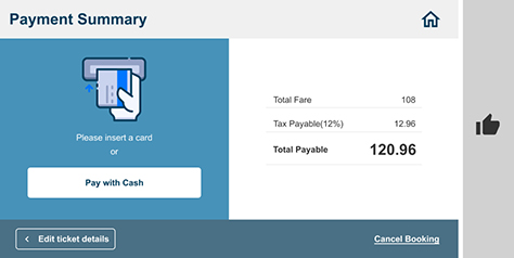
I have redesigned the example kiosk screen, as shown in Figure 4. Does the redesign fare better in the grayscale test in Figure 5? Let’s look at what has changed.
Figure 4—Redesign of kiosk screen to improve accessibility Figure 5—Grayscale test of the redesigned screen
Header
The Home icon now uses the blue of the title, which provides enough contrast, and I’ve moved it to the right. Thus, the title and the Home icon each has its own space and purpose.
Content on the Left
I’ve allowed more breathing space between the content elements, which has enhanced legibility. Plus, the white background of the button now provides enough contrast with the blue label. This button acts as a primary action button.
Content on the Right
I’ve right aligned the digits for legibility. I’ve removed the green button-like emphasis and now use only bold and an increased font size to emphasize the total amount payable. The copy Pay had read like a verb, so is now Total Payable, which no longer conveys an action.
Buttons at the Bottom
I’ve moved the Edit ticket details button to the left side of the button bar. The little, left-pointing arrow within the button indicates that it links to the previous page, thus providing enough of a clue regarding its action. The button now has a standard rectangular shape and looks like a secondary button, as it should. Cancel Booking is now a link, so looks like the equivalent of a tertiary button. The labels provide sufficient contrast. Remember, inconsistency can be good if there is a significant reason for it. In this case, all three buttons have different designs to signify their differences.
Key Takeaways
When redesigning a screen for accessibility, do the following:
Consider accessibility from the very first step of a project.
Understand your users, their types of disabilities, and the technologies that could assist them.
Adhere to international and country-specific standards to avoid legal complications.
Accessibility not only benefits people but also the business because it affects major aspects of the user experience such as engagement, reputation, and SEO (Search-Engine Optimization) performance.
Create accessible designs by using combinations of attributes rather than relying just on colors.
Make graphic content accessible to ensure an engaging user experience.
Stay informed about current design trends and future technologies to remain atop the digital marketplace.
Leverage the valuable insights that you’ve gained from usability testing.
Betina has more than twelve years of professional experience as a UX designer, working on digital media for various services. Her broad range of experience lets her create visually compelling, highly usable designs. She optimizes products by creating designs that meet user needs and address business challenges. Betina cares about both design details and discovering new possibilities. She enjoys working with developers to build out her ideas. Read More