By offboarding process, we refer to the procedure that users must follow to delete their personal account for an online service permanently. Because no design patterns or best practices exist for offboarding user experiences, we decided to conduct a comparative usability study, during which we evaluated the usability of design solutions for the account-deletion processes of four major Web sites: Google, Apple, Facebook, and Amazon.
When we analyzed each company’s design choices, we found that Amazon has the least usable offboarding experience while Google provides the most usable solution. Our study also suggested some positive and negative design strategies for offboarding users that have their basis in the usability criteria we evaluated for each of these processes.
Champion Advertisement
Continue Reading…
The Offboarding Process
The offboarding process belongs to a special class of digital user interfaces for taking negative actions that interrupt a user’s relationship with an online service—for example, unsubscribing from a newsletter or canceling a subscription plan. The offboarding process presents a peculiar design problem for three reasons, as follows:
Lack of design patterns—There are no established design patterns for UX designers to replicate.
Conflicting business goals and usability goals—These conflicting goals are difficult to resolve.
Legal constraints—Regulations impose certain constraints on the design of these user interfaces. However, because of the lack of design patterns, different companies have produced different user interfaces with varying degrees of usability.
A Lack of Design Patterns
The solutions that UX designers apply to human-machine interaction problems have become relatively standardized because designers follow certain universal heuristics that have their basis in a body of scientific research findings on human psychology and cognition. A leading example of such usability heuristics are those that Jakob Nielsen, of the Nielsen Norman Group, proposed in the early 1990s, which led to the relative standardization of many user-interface elements and patterns. From a graphic user interface (GUI) design perspective, this phenomenon has given birth to design languages such as Google’s Material Design. At a procedural level, many digital interactions also follow relatively similar patterns. This is the case for common tasks such as creating an account, making payments, and filtering search results.
This standardization is a consequence not only of the industrialization of user-interface (UI) design but also an adaptation to users’ habits that have formed over time. But most UI design patterns have focused on positive user actions. Even error handling has long been a neglected dimension of UI design.
However, unlike most standardized processes and interactions on the Web, which follow relatively stable design patterns, one design problem for which there are no heuristics, universal design patterns, best practices, rules, or legal requirements is the offboarding process. Because this gives companies and UX designers a high level of freedom in their design, we’ve observed that every Web site approaches their offboarding process in a unique way.
Conflicting Business and Usability Goals
There can be an inherent conflict of interest between business goals and usability goals because a design solution’s usability and effectiveness for users might at odds with a Web site’s commercial goals.
From a business standpoint, we can assume that account deletion—as opposed to user acquisition—would have a negative impact on any online service. No company wants to lose its customers. As any person receiving promotional newsletters can observe, even an email account that is not in active use still has high value to Web companies because it provides data and a marketing channel and can fuel the network effect that is necessary for many online services to be useful or profitable. Therefore, it is logical for companies to want to devise strategies for retaining users by influencing their behavior at critical moments such as account deletion.
Companies have put significant UX design effort into design solutions that attract and retain users who are interacting with products or services. Their goal is to make the user experience as pleasant and efficient as possible. For example, one highly efficient solution is the Buy now with 1-Click button on Amazon. In extreme cases, retention strategies can enter the realms of persuasive design or addictive design, using techniques that UX designers refer to as dark patterns. Nevertheless, the focus of most UX designers is on designing usable offboarding user experiences that are efficient, effective, and satisfactory to users. Designing the process of deleting an account according to these criteria could create conflict with business goals.
Legal Constraints
Legal constraints, or requirements, are a factor that increasingly influences UX design. The nature of legal and security requirements dictates the inherent complexity of certain processes—for example, the design of an online payment process. Since the introduction of General Data Protection Regulation (GDPR) laws in European Union (EU) countries, businesses have a legal obligation to allow users to delete their personal information from a digital service. Article 17 of the GDPR regulations sets a framework for removing personal data from a company’s database that has repercussions on the design of user interfaces. The design community has explored and commented on these repercussions —for example, InVision and Design Modo.
Objectives
What interested us in conducting our study of the usability of the offboarding user experience were the solutions that UX designers have devised to resolve conflicts between business interests, usability criteria, and legal obligations. We chose four major sites for this study because of their popularity, large user bases, and relative importance in the current technological and economic landscape.
Evaluation Criteria
For this study, we evaluated the following three usability factors:
Effectiveness
Efficiency
Satisfaction [1]
We assessed relevant quantitative and qualitative variables for each of these three factors, as shown in Table 1. [2]
Table 1—Quantitative & qualitative variables for usability evaluation
Effectiveness
Efficiency
Satisfaction
Task abandonment
Abandonment time
Number of user interactions before abandonment
Number of user interactions
Task-completion time
Need for external help
Ease-of-use score
Dominant reaction and expressed feelings and impressions
Effectiveness
Definition: The accuracy and completeness with which users can achieve specific goals.
Since there were no right or wrong outcomes or errors in these user paths, the only way in which participants could fail to complete the task was to abandon it. We asked participants to tell us if they wanted to abandon the task. However, once participants stated they wanted to abandon the task, we asked them to continue anyway so we could gather additional data and evaluate efficiency and satisfaction. To measure effectiveness, we used abandonment rate, which represents the percentage of participants who, at some point during their experience, stated that they wanted to abandon the task. For abandoned tasks, we took the following variables into account:
number of interactions before abandoning
time spent before abandonment
Efficiency
Definition: The resources participants used in relation to the results they achieved. [1]
These resources constitute time and interaction costs, so we measured the following variables to determine the efficiency of each experience:
number of user Interactions (NUI)—We measured the number of interactions necessary to complete the task in mouse clicks, counting them from the moment participants began the task. However, we did not include scrolling or typing as interactions.
task-completion time (TCT)—We measured time in seconds.
number of users needing external aid—This is the percentage of participants who needed to leave the Web site to seek help in completing the task.
Satisfaction
Definition: The extent to which participants’ physical, cognitive, and emotional responses that resulted from the use of a system, product, or service met their needs and expectations. [1]
In the context of this study, we derived satisfaction from subjective human feedback, therefore:
We asked participants a series of standard questions to evaluate their experience.
To determine the dominant, observed user feedback, we described global user satisfaction by synthesizing participants’ reactions.
To complement this metric, we asked participants to provide a personal ease-of-use score for each experience—on a scale from 0, very hard, to 10, very easy—on the basis of how easy it was for them to complete the task.
Comparative Global Results
Deleting an account requires two basic subtasks:
Finding the relevant page on which to request an account deletion—Overall, finding the relevant page was the most time-consuming task for all paths. At the beginning of their experience, the majority of participants chose to navigate to find the appropriate pages and buttons. In design terms, choices regarding information architecture and navigation design determined participants’ paths.
The actions necessary to delete an account—Once participants found the relevant page, they needed to take additional actions to complete the task. In design terms, the nature of the interactions—for example, sending an email message, signing in, or clicking a button—and GUI elements—for example, menus, links, and forms—had the greatest influence on this subtask.
Each of the Web sites we evaluated offers a different experience because of the particular combination of different design solutions for each of these subtasks.
Effectiveness
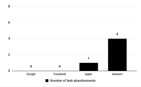
As Figure 1 shows, no participants chose to abandon the task on Google or Facebook. For Apple’s onboarding process, there was just one case of abandonment. This data was too insignificant to draw a meaningful conclusion, so we excluded it from further analysis.
On Amazon, half of all participants chose to abandon the task at some point. Participants abandoned the task after 22 interactions, on average, and after spending 6 minutes and 25 seconds on the task. This result is interesting because, on Google and Facebook—for which there were no abandonments—the number of interactions and task-completion times were significantly lower. This suggests that there might be a limit to users’ tolerance in terms of the effort they’re willing to invest in the task. But a comparison with Apple shows that clicks and time are not the only important factors.
Figure 1—Number of participants who chose to abandon the task
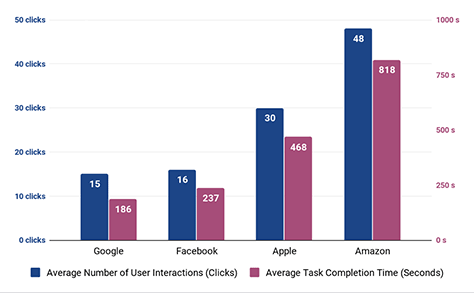
Efficiency
To obtain an accurate idea of the efficiency and complexity of the paths, you should consider the number of clicks and time spent in relation to one another, as well as in comparison to the other measured variables. As you can see by comparing Figures 1 and 2, a clear relationship exists between the abandonment rate, which is shown in Figure 1, and the efficiency of the experience, which is depicted in Figure 2.
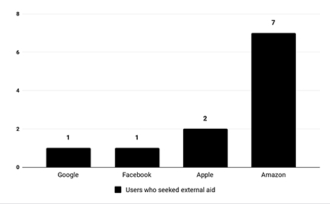
The complexity of the task made some participants seek external help by searching for guides or instructions, including textual instructions and video tutorials. For Amazon, seven of eight participants needed to seek external help. This behavior had a dramatic, negative impact on efficiency. For example, it required participants to juggle several browser tabs while following the instructions.
Figure 2—Average number of interactions and task-completion times Figure 3—Participants who needed external help to complete the task
Google
Google’s user experience was the simplest and most straightforward. We observed no major usability issues or complications. Participants took an average of three minutes and six seconds to delete a Google account.
However, we also noticed that participants were not initially sure how to access the Google account-management page. The majority of participants associated their Google account with Gmail and began their search from the Gmail page.
Facebook
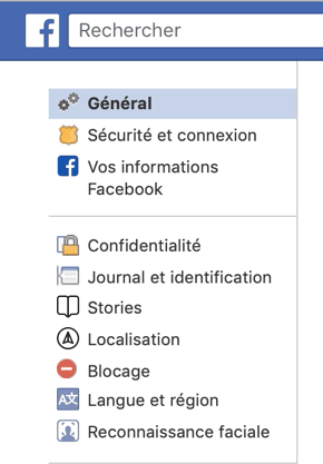
All participants completed the task in an average of three minutes and 57 seconds, and no abandonments occurred. The only major difficulty participants encountered was finding the relevant page on which to delete their account using the account page’s navigation menu. None of the participants found the delete action on their first attempt. Participants spontaneously checked out Security and Login before clicking Your Facebook Information. This indicates a semantic inconsistency between participants’ expectations and labeling design. Once participants found the right option, the rest of the process was easy and fluid.
Figure 4—Navigation menu on Facebook’s French user-account page
Apple
Apple has the second least efficient offboarding user experience. However, the major frustrations that participants expressed were not in relation to findability—as was the case with Amazon—but to the time-consuming process. It took an average of seven minutes and 48 seconds to delete an Apple account.
Causes of Difficulties
Participants had the following difficulties in attempting to delete their Apple account:
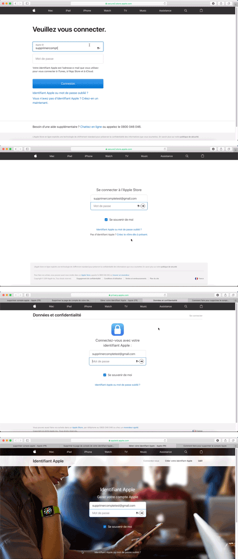
Participants encountered multiple login requests that required a password, as shown in Figure 5. At different points during the task, participants had to enter their user name and password between two and four times, which they found particularly frustrating.
Participants had to answer two secret security questions to access the account-management page. We had provided the answers to these questions in advance. However, some participants expressed that they would have abandoned the task in real life if they had forgotten their answers to the security questions.
Participants needed a security code for future support. One participant said, “I’m not sure I would have written it down in real life.”
There were multiple instructional pages with lots of textual content that participants didn’t want to read.
Figure 5—Apple’s multiple login screens on one path, in French
Amazon
Amazon presented the most complicated, confusing, and time-consuming path to all participants. Seven of eight participants needed external help to complete the task, so they performed a search on Google and followed the instructions on another Web site. It took participants an average of 13 minutes and 38 seconds to delete an Amazon account. Deleting an Amazon account requires the user to contact customer service—by either phone or email—and make the request personally.
Causes of Difficulties
Participants had the following difficulties in attempting to delete their Amazon account:
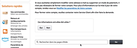
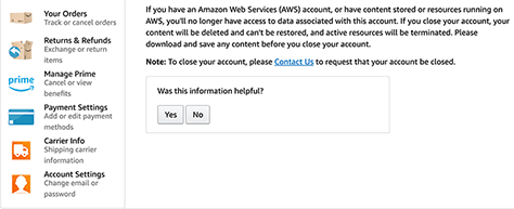
On the French version of the Amazon Web site, the instructional page for deleting an account, which is titled About deleting your account, does not provide a direct link to the page that allows the user to make their account-deletion request, as shown in Figure 6. Therefore, once participants understood the instructions, they had to locate the contact page themselves. Interestingly, finding the page was one of the most complex subtasks for the majority of participants. We noticed a difference between the English and French versions of the Amazon Web site that radically impacted the user experience: the English site provided a link to the contact page, as shown in Figure 7, while the French page did not.
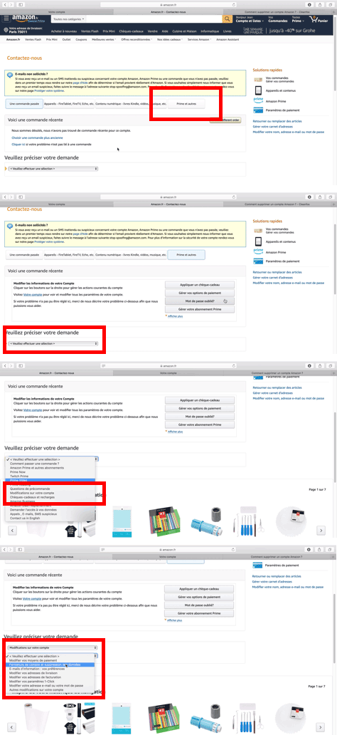
Multiple layers of opaque navigation tabs and menus separate relevant pages and actions at every level. Participants found the Contact Us(Contactez-nous) page, shown in Figure 8, particularly problematic and time consuming. They could access the action only through the Prime et autres tab, after choosing two options from two different drop-down menus.
Participants were reluctant to contact customer service. They wanted to delete their account autonomously. From a design point of view, this technique proved to be an effective deterrent.
Figure 6—No link to page on which users can request account deletion Figure 7—Link to page on which users can request account deletion Figure 8—Amazon’s Contact Us page
Satisfaction
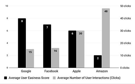
The ease-of-use score that participants gave to each of these Web sites was consistent with their subjective reactions, as shown in Table 2. A comparison of these results and the observations we described earlier shows a consistent drop in participants’ level of satisfaction with lower efficiency paths, as shown in Figure 9. However, participants’ satisfaction also depended on the nature of the actions they had to take to complete their task, as we’ve explained. What was interesting about evaluating participants’ level of satisfaction was that they expressed clear, consistent emotions during and after the experience. Plus, they were not indifferent to these positive and negative effects.
Table 2—Ease-of-use score & dominant, observed user feedback
Site
Google
Facebook
Apple
Amazon
Average ease-of-use score
8
7
6
2
Dominant, observed user feedback
Positive surprise
Indifference, appreciation
Frustration, unpleasantness
Confusion, frustration, shock
Figure 9—Ease-of-use score
Google
The relative ease of completing this task on Google came as a surprise to most participants, who had different expectations. Most participants expected this task to be more complicated. At the end of the process, some participants were not sure whether they had completed it.
Facebook
Participants were surprised by the ease of this task on Facebook. They had a positive response to the option to download their personal data that they were given during the offboarding process. Participants’ also noticed and appreciated the alternative deactivation option that Facebook provided during the offboarding process.
Apple
Participants found that the path on the Apple Web site was too complicated and took too long. Most participants interpreted this process as being dissuasive by design.
Amazon
Participants found the experience on Amazon to be frustrating and too complicated. Some participants were surprised by the complexity of this task because they perceived Amazon to be a user-centric company. Almost all participants thought that Amazon’s offboarding process was designed to be dissuasive.
Additional Findings
Our usability study generated some data and feedback that fell outside the defined usability-evaluation variables we used for the study. However, they provided some valuable insights into user behavior, as follows:
Users do not spontaneously think about deleting their accounts. They need a reason to do so. Generally, the idea of having a dormant account does not bother users. However, there is one trigger for deleting an account that participants mentioned quite often: newsletters.
Participants’ general tendency was not to read any long, textual content—even on instructional pages that they looked for themselves. They systematically skipped long texts and looked for action buttons. Other studies have already observed this phenomenon in regard to users’ accepting terms and conditions. [4]
Study Conclusions
Our study found that Amazon had the least usable offboarding user experience, while Google provided the most usable solution. A Web site’s offboarding experience affects users’ decision to delete their account. Users also internalize certain impressions about a company because they make hypotheses about the design intent for this process.
We concluded that the design of an offboarding experience requires UX designers to choose between usability and the business goal of user retention because it is difficult to meet both objectives simultaneously. According to the criteria of this study, Google and Facebook chose usability while Amazon and Apple chose user retention.
Based on our observations, we can categorize the design strategies for these four Web sites into two groups:
Negative strategies
Positive strategies
These strategies are applicable to similar design problems—such as subscription cancellation.
Negative Strategies
Negative design strategies include the following:
making navigation opaque and overly complex by burying the relevant actions in a deep hierarchy and using ambiguous wording
including lots of textual content such as detailed instructions and legal texts
creating a time-consuming user experience by requiring complex steps—such as for email validation or multiple-factor authentication—or by forcing users to call customer service or write an email message
making action buttons inexplicit because of their low affordance
Positive Strategies
Positive design strategies include the following:
providing alternatives to account deletion—such as the temporary deactivation of an account—which could prevent uncertain users from deleting their account
giving users reasons to change their mind—for example, by reminding them of the services they would lose if they deleted their account
Testing Methodology
The following sections describe our testing methodology in detail.
Participant Sample
We conducted usability tests with eight participants. Because of our small sample size, we tried to limit the impact of bias from participants’ personal conditions and background by considering the following criteria in defining the candidate participant population and verified that each participant met these criteria during a phone or email interview:
generational usage behavior and digital maturity—We limited the ages of participants to between 20 and 35 years of age.
professional bias—We excluded people working in digital, product, marketing, and interaction-design roles.
past experience bias—We chose participants who had never deleted their accounts from the selected Web sites prior to their test session.
an existing personal account—All participants possessed personal accounts on the selected Web sites.
Biases relating to the gender of the participants were irrelevant, and we took no specific cultural biases into account. We recruited all participants in Paris, France.
Test Structure and Protocol
Each usability-test session comprised an interview, followed by usability testing and a second interview to gather participants’ feedback, as well as their impressions and evaluations of the offboarding process for each of the four Web sites.
We asked participants to delete a fake account on each of the four Web sites, beginning at the default start page of the Safari browser. We had created the accounts specifically for this study. We also provided each participant with a Gmail address that was associated with a Google account that we created for the study.
We placed no restrictions on participants’ interactions with the Web sites. We encouraged them to interact with these Web sites as they ordinarily would. We allowed them to navigate freely on the Web and use other devices and any means necessary to complete the assigned task.
We told participants that they could choose to abandon the task, which let us collect data about this decision. However, once participants had communicated this decision to us, we asked them to continue the task to enable us to gather complete data about the task. We are aware that this might have introduced some bias to participants’ behavior in comparison to real-life conditions. (Participants who chose to abandon the task form a sub-sample, and we represented the data we collected separately.)
We recognized that doing comparative usability tests to assess similar functionality on different Web sites with the same participants could bias them, making the results of their satisfaction assessments unreliable. For example, participants who had gone through Amazon’s offboarding process before going through Google’s or vice versa, might have different expectations because the first experience could create expectations. Therefore, to limit the impact of any bias relating to conscious or unconscious comparisons between participants’ experiences on different Web sites, we asked participants to interact with the sites in a rotating order, as shown in Table 3.
Table 3—Testing order
Participant
Site #1
Site #2
Site #3
Site #4
Participant 1
Google
Apple
Facebook
Amazon
Participant 2
Apple
Facebook
Amazon
Google
Participant 3
Facebook
Amazon
Google
Apple
Participant 4
Amazon
Google
Apple
Facebook
Participant 5
Amazon
Facebook
Apple
Google
Participant 6
Facebook
Apple
Google
Amazon
Participant 7
Apple
Google
Facebook
Amazon
Participant 8
Google
Amazon
Apple
Facebook
Testing Conditions
Each participant used the Safari Web browser on a 15-inch MacBook Pro notebook computer, and we provided a mouse device. Participants began each task on Safari’s default start page. We gave all participants the credentials they needed to use the accounts we had created for the purpose of this study. We had already signed onto all the accounts before participants began the test task. We conducted all test sessions with participants at Ekino’s offices in Paris, in French. All participants were French speakers, and we tested the French versions of all the Web sites.
The user interfaces that we tested were the versions that were live between September 2019 and December 2019. We did not observe any revisions to the processes we were studying were during that period. However, the processes that we tested on those sites may have changed subsequently.
Recommendations for Future Research
The data that we obtained through this study could be useful in analyzing users’ actual performance using any offboarding user experience. However, it would be necessary to compare the data from this study with actual task-completion rates or abandonment rates. Companies could track user behaviors to obtain this data. We did not have access to this data so were unable to make such assessments.
It would also be possible to conduct a more precise study of the positive strategies that we mentioned in the study’s conclusions, evaluating their efficiency in making users change their mind once they are in the process of deleting their account.
Acknowledgments—We would like to thank the Ekino Design team and other Ekino staff who helped us recruit participants for this experiment; Orianne Trouillet, Head of Design at Ekino, for supporting this initiative; and our study participants, for dedicating their time to this experiment.
[2] Bevan, Nigel, Jim Carter, Jonathan Earthy, Thomas Geis, and Susan Harker. New ISO Standards for Usability, Usability Reports, and Usability Measures. In M. Kurosu, ed., Human-Computer Interaction: Theory, Design, Development, and Practice. HCI 2016. Lecture Notes in Computer Science, Vol. 9731. Cham, Switzerland: Springer International Publishing, 2016.
[3] Official Journal of the European Union. “Regulation (EU) 2016/679 of the European Parliament and of the Council, of 27 April 2016, on the protection of natural persons with regard to the processing of personal data and on the free movement of such data, and repealing Directive 95/46/EC (General Data Protection Regulation).” Official Journal of the European Union, April 27, 2016. Retrieved June 5, 2020.
Exploring the intricacies of offboarding UX is crucial for businesses looking to enhance user experiences holistically. By optimizing the offboarding process, they can ensure seamless transitions for users, leaving a lasting positive impression that fosters loyalty and advocacy! Here’s an article on the offboarding UX that you might find interesting. It delves into the importance of offboarding experiences in user journeys and provides insights into creating seamless transitions for users.
At Ekino, Alex specializes in the design of enterprise and industrial digital tools. He also teaches UX design at École de l’Image Gobelins, in Paris. Read More
Laetitia leads user-research activities at Ekino, conducting qualitative and quantitative user research, trend and market analysis, and product-usability testing. She believes in integrating customer knowledge with the business’s strategic vision. Prior to joining Ekino, Laetitia worked as a strategy consultant in the cultural sector and for a marketing-research institute. Read More