People make mistakes and commit errors; it’s a fact of life. Nobody is perfect. Designers of digital technology have to live with that fact. Actually, good designers do more than live with it; their designs take it into account. They avoid designs that make it likely for users to make errors (Norman, 2014). They create digital products and services that help people avoid and recover from errors.
Mistakes Versus Slips
When categorizing the types of errors people make, the first distinction is between mistakes and slips (Norman, 1983a; Reeves, 2010).
Champion Advertisement
Continue Reading…
Mistakes are errors of conscious decision. A choice presents itself and a person considers the alternatives, weighs the pros and cons of the alternatives … and chooses the wrong one. Don Norman calls mistakes “errors of intention”—the person intentionally decides to do something that turns out to be incorrect or to have an undesirable result. Examples of mistakes:
You shop online for a flash memory card for your camera, but the one you order turns out to be incompatible with your camera.
You take the freeway route to a concert, expecting traffic to be OK, but encounter a huge traffic jam.
You vote for someone because you believe the policies they propose will help you, but after they are elected, you learn that those policies actually harm you.
People make mistakes either because they have an incorrect understanding of the choices or because they have inaccurate or incomplete information. Don Norman calls this “having a faulty mental model” (Norman, 1983a). Since mistakes are the result of intentional choices and actions, we detect them only afterward, when their ramifications become apparent. In engineering terms, we say mistakes can be detected only with feedback.
Slips, the other main type of error, are unintended. A person does something they did not mean to do. Think of a person slipping and falling on a wet floor and you will understand where the term slip comes from. Examples of slips:
You turn your oven ON to let it heat up before baking something but forget to check first to see whether there is anything already in the oven.
You try to say “she sells seashells by the seashore” quickly, but your mouth won’t say the right words.
You send a text to the wrong person.
The same action can be either a mistake or a slip depending on whether it was done on purpose. For example, if you receive a company email that was sent to a group of people, you may decide that everyone on the list should get your reply, so you click Reply All. Later you learn that replying to everyone was a mistake—for example, because your reply contained company proprietary information, and some recipients of the first email don’t work at your company. In a different scenario, you receive a group email and intend to click Reply, but don’t look carefully and accidentally click Reply All, which is right next to Reply. That’s a slip.
Slip or Mistake?
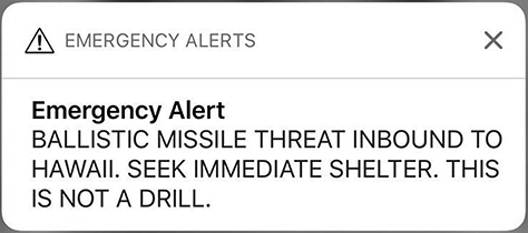
On January 13, 2018, at 8:07 a.m., an emergency alert went out over television, radio, and cellphones in the US state of Hawaii. According to the alert, a ballistic missile was headed for Hawaii and expected to arrive within minutes. The alert urged residents to “seek immediate shelter” and ended with “This is not a drill,” as shown in Figure 15.1.
Figure 15.1—A false alert sent to mobile phones in Hawaii in error
On television, the alert, displayed in a scrolling band across the bottom of the screen, was more detailed:
The US Pacific Command has detected a missile threat to Hawaii. A missile may impact on land or sea within minutes. THIS IS NOT A DRILL. If you are indoors, stay indoors. If you are outdoors, seek immediate shelter in a building. Remain indoors well away from windows. If you are driving, pull safely to the side of the road and seek shelter in a building or lay on the floor. We will announce when the threat has ended. THIS IS NOT A DRILL. Take immediate action measures.
Hawaii’s outdoor civil defense sirens remained silent, but the alert nonetheless alarmed many Hawaii residents because North Korea was known to be developing nuclear-armed ballistic missiles, the leader of North Korea had recently boasted that those missiles would soon be able to reach the US, and threats had recently been exchanged between the US president and North Korea’s leader. Some people in Hawaii panicked and tried to find shelter; others tried to confirm the truth of the alert (Wikipedia, 2019).
In fact, there was no incoming missile. About a half-hour later, a second alert was issued, describing the first alert as a “false alarm.”
Was this incident a mistake or a slip? That is unclear. What is clear is that state emergency officials planned to conduct a drill, so from their perspective, what happened was a slip—an unintended action. However, an investigation found that the employee whose job it was to “push the button” did not realize it was a drill and so intentionally clicked the on-screen button to issue a real missile alert, then intentionally clicked Yes on the confirmation screen. The employee was subsequently fired. From his perspective, sending the alert was a mistake.
It is also noteworthy that the US Federal Communications Commission criticized Hawaii’s alert software for (1) not distinguishing between drills and actual alerts—both had the same user interface and confirmation sequence and language—and (2) being designed so that a single employee could both issue and confirm the posting of a real alert. So even if the January 2018 incident was a mistake, the design of the software was such that it could easily lead to slips. The alert software and procedures for issuing alerts have since been revised (Park, 2018).
Types of Slips
Slips are categorized based on what causes them (Norman, 1983a).
Capture slip—The sequence being executed is similar to another more frequent or better-learned sequence; the person absent-mindedly switches to the other sequence. Examples:
The first day going to a new job, you find yourself halfway to your old workplace.
You click the CLOSE button on a document you’ve been editing for an hour. A confirmation dialogue box pops up asking if you want to close without saving. Without thinking, you click Yes.
Description slip—The right action on the wrong object. Examples:
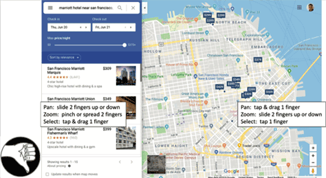
You do a two-finger swipe to scroll the screen on your laptop, but you’re in Google Maps, so it zooms in. As shown in Figure 15.2, panning and zooming in Google Maps’ map area uses different gestures than everywhere else, causing users often to zoom when they meant to pan and vice versa.
You absent-mindedly say “Hey Siri” to your Amazon Echo device, which is listening for “Alexa.”
You intend to open the calendar app on your phone but unintentionally open the calculator app because its icon looks similar.
Figure 15.2—Google Maps’ different panning and zooming gestures
Data-driven slip—External data interferes with attention. Examples:
You are trying to read an online news article, but flashing ads next to the article keep distracting you.
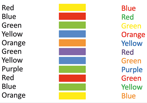
You try to quickly name the colors of the words in Figure 15.3, but find yourself reciting the words instead. Try to quickly recite the words in the left column. Quickly state the colors in the center column. Quickly state the colors—don’t recite the words—in the right column. This phenomena is called the Stroop effect, after the psychologist who published an article describing it.
Figure 15.3—The Stroop effect
Loss-of-activation slip—The goal lost from short-term memory. Examples:
You go into your kitchen to get something, but when you get there, you can’t remember what you came for.
You open Facebook to post vacation photos but spot an interesting post from a friend and spend several minutes reading and responding to the comments, then close Facebook without remembering to post your vacation photos.
Closure slip—The final steps of a task are prematurely dropped from working memory when goal is achieved. Examples:
You use a public computer to check your bank account and walk away without logging out, unintentionally allowing the next user to access your account.
You copy your resume using an office copier, take the copy, and leave the original on the copier.
You finish filling out a long online form and close the browser without submitting the form.
Mode slip—The right action, but wrong system status (Norman, 2014). Examples:
You press the accelerator on your car to go forward, not noticing that the transmission is set to reverse.
You set a copier to magnify a document, then forget to reset it to normal for the next document, so it magnifies a document you didn’t want magnified.
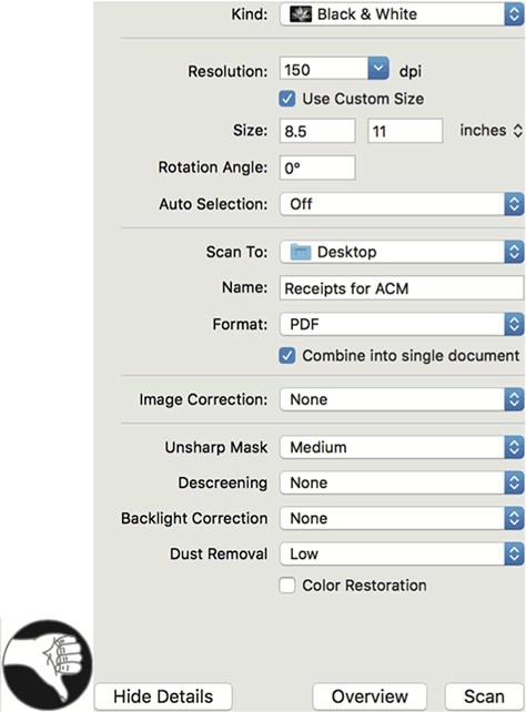
You scan a document using the macOS Image Capture app, but discover afterward that it saved the scanned image with the filename used for the previous scan. As shown in Figure 15.4, the macOS Image Capture app’s scan controls retain the filename used for the previous scan; users often forget to change the filename, resulting in frequent errors.
Attention slip—Missing an important feature of the information presented. Examples:
You go online to reserve a hotel room for yourself and your spouse but don’t notice until after you’ve completed the booking that the quoted price is per person, not per room.
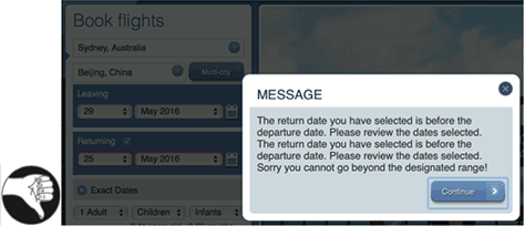
Making online flight reservations for a trip, you select May 29 for your outbound flight, but when you choose your return date, you don’t notice that the date-chooser is still set to May, so you accidentally set your return date to May 25, and the Web site scolds you for setting a return date before your departure date. As Figure 15.5 shows, the South African Airlines Web site allows users to set their return date earlier than their departure date, then scolds them for making the error. Twice!
Figure 15.5—An error on the South African Airlines Web site
Motor slip—The user’s fingers, mouth, or legs don’t do what was intended. Examples:
You intend to type the, but your fingers actually type hte.
You drag a document on your computer’s screen to the trash but accidentally drop it, and it disappears into a nearby folder.
You accidentally click a link next to the link you meant to click.
Design to Prevent Mistakes—Provide Clear, Correct Information
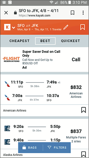
The main way to help people avoid making mistakes—errors of intention—is to provide accurate information in a form they can easily understand. The decision support systems mentioned in Chapter 12 are examples of software applications that give people accurate information and help them avoid mistakes, whether buying a house, planning a vacation, or planning the most efficient route for a snowplow through a city. Flight booking Web sites are another sort of decision-support system: you enter your requirements—origin, destination, dates, times, and desired class of service—and they show you flights matching those requirements, with information about how the flights differ to help you choose the one that best meets your needs. As shown in Figure 15.6, on Kayak.com, flight reservation sites help people avoid mistakes when booking a flight.
Figure 15.6—Flight reservation sites on Kayak.com
How do you ensure that information is presented in a form that people can easily understand? Follow the design guidelines presented in previous chapters—for example, provide visual structure and hierarchy, use color carefully and sparingly, support reading—both legibility and comprehension—respect the limitations of human attention and memory, support learning and the development of habits, and respect human time requirements.
Data visualization methods, described in Chapter 12, are especially useful for ensuring that people understand the information presented. Such methods harness the automatic processes of the human perceptual system—part of system one—to provide information to support rational decision-making—system two.
Design to Help People Avoid Slips
Poor user-interface design—that is, design mistakes—can cause users to make slips. An example is text autocorrect. It is intended to help people avoid typing errors, but if designed poorly it can increase the chances that users will send texts or emails containing unintended words. Similarly, many of the examples of slips listed earlier in this chapter are made more likely by poor design decisions.
Fortunately, there are design guidelines for preventing or reducing the likelihood of each type of slip mentioned in the previous section. The guidelines presented below are adapted from work by Norman (1983a). When a designer of a digital product or service does not follow these guidelines, they are making a mistake that increases the chance that users will make the corresponding type of slip.
Capture slips—The sequence being performed is similar to another more frequent or better-learned sequence; person absent-mindedly switches to the latter sequence. Guidelines for avoiding:
Make steps for different tasks noticeably different so no one is confused about which action sequence they are executing. (See the earlier sidebar about Hawaii’s alert emergency.)
Avoid overlapping paths—design so different operations have no steps in common.
Prompt users to confirm actions.
Description slips—The right action on wrong object. Guidelines for avoiding:
Consistency—same operations apply to all objects.
Clearly distinguish objects or areas having different actions or gestures.
Data-driven slips—External data interferes with attention. Guidelines for avoiding:
Guide users toward their—and your—goal. Provide a process funnel (van Duyne et al., 2002). Once you know the users’ goal, keep them on a straight and narrow path to that goal; don’t distract them from it.
Loss-of-activation slips—The goal is lost from short-term memory. Guidelines for avoiding:
Provide memory aids and a clear display of system progress and status.
Closure slips—The final steps of a task prematurely dropped from working memory when goal is achieved. Guidelines for avoiding:
Warn users of incompleteness—for example, engine left running or document left on copier.
Complete tasks automatically—for example, modern cars turn headlights OFF automatically when user exits vehicle; people don’t have to remember to do it.
Mode slips—The right action, but wrong system status. Guidelines for avoiding mode slips (Johnson, 1990):
Indicate system status, a mode, clearly and strongly.
Revert to normal mode after a timeout of more than 10 seconds—the average unit task duration—or when the user quits and later reenters the app or Web site.
Make modes spring loaded—users have to physically hold the system in the exceptional mode; letting go reverts to normal mode—for example, the keyboard Shift key.
Avoid moded designs—some controls or gestures have different effects depending on the system mode—by having separate controls or gestures for every function, but realize that doing that may increase the likelihood of description slips: using the wrong control or gesture for an intended action (Norman, 1983a).
Attention slips—Missing an important feature of the information presented. Guidelines for avoiding:
Direct the user’s attention to important details using visual hierarchy, perceptual pop, movement, vibration, or sound.
Design interactions to prevent nonsensical commands or requests.
Motor slips—The user’s fingers, mouth, or legs don’t do what was intended. Guidelines for avoiding (Johnson and Finn, 2017):
Make click, tap, and swipe targets large. When buttons or links have graphics as well as labels, make both clickable to maximize the clickable area.
Put space between click and tap targets so users are able to click the intended target.
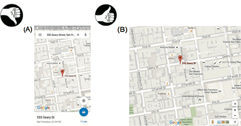
In user interfaces that make use of complex gestures like click-drag, pinch-spread, double-tap, and tap-and-hold, provide simpler alternative gestures for users who have trouble executing complex gestures reliably. As shown in Figure 15.7, the Google Maps mobile version (A) requires two-finger spread/pinch gestures for zoom, but the desktop version (B) allows zoom by two fingers or ± buttons.
Avoid multilevel menus—sometimes called pull-right menus.
Regardless of how well designed a digital product or service is, it won’t be perfect. Even if it were perfect, people are not. They will make errors, both mistakes and slips. To be successful, digital products and services should help their users recover from errors. The following are design guidelines for doing that. They apply to any digital product or service regardless of whether users interact with it via keyboard and pointer, touch screen, voice, or anything else.
Make Actions Reversible by Making Them Two-way Rather Than One-way
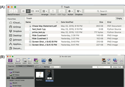
An example is apps or devices that provide a trash can or trash folder where deleted items are stored temporarily until either they are moved back out of the trash—reversing the original delete operation—or the user explicitly empties the trash. Moving deleted files temporarily to trash cans or folders lets users recover files if necessary. For example, the Apple Photos app and the Voila screen-capture app provide trash folders where deleted images and videos go until retrieved or finally deleted. Figure 15.8 shows in (A) the macOS trash folder and in (B) the Voila trash folder, which should require confirmation.
Figure 15.8—Trash cans or folders let users recover files if necessary
Airlines and hotels often allow customers to cancel reservations with no penalty up to a specified number of days before the booked date, and some ecommerce sites allow customers to cancel purchases before the product ships. This allows people to reverse transactions that they did not intend—that is, slips—or after further consideration decide they don’t really want—or mistakes.
This design guideline—making operations reversible whenever possible—also applies to digital products and services that have voice-operated user interfaces (VUIs). Obviously, if you tell Alexa to play a song, you should be able to tell Alexa to stop playing the song or play a different song. Perhaps less obviously but just as important, if you order movie tickets or a shirt online using a VUI, you should be able to cancel the order within some reasonable time limit.
Make Actions Reversible with UNDO
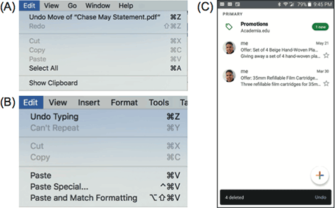
Beyond providing reversible operations, apps and Web sites can provide UNDO for many or most operations. This allows users to undo actions even in cases when they may not even be sure exactly what they did or how to reverse it. For example, while dragging a file from one folder to another folder in a list of folders, you may experience a motor slip and drop the file. If it disappears into another folder, you may not know where it went. For such file operations, macOS provides UNDO Move, as shown in Figure 15.9A. Without UNDO, you would have to open nearby folders one by one, scan their contents, find the file, and drag it back out. Similarly, most text editors provide UNDO for reversing recent editing actions. For example, Microsoft Word lets users undo edits, as Figure 15.9B shows. That allows you to edit the text, see if you like the result, and if not, easily revert to what you had before without having to reverse all the separate edits. Finally, some email apps provide UNDO for restoring just-deleted emails. For example, Gmail allows users to undo message deletions, as shown in Figure 15.9C.
Figure 15.9—Users can undo in (A) MacOS, (B) Word, and (C) Gmail
Voice-operated systems can keep track of recent user commands and allow users to simply say their wake-up word followed by “Undo” to undo the last command, probably after confirming that that is what they want to do. Alternatively, they can respond with “What should I undo?” followed by a short list of recent commands from which the user chooses one.
Make Risky, Error-prone Operations Hard to Do
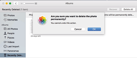
The likelihood of errors during potentially dangerous operations can be reduced by requiring confirmation or even requiring multiple steps. As shown in Figure 15.10, Apple’s Photos app requires confirmation to delete a photo permanently. Before executing a user’s request for a transaction, most ecommerce Web sites show a summary of the transaction and allow the user to cancel it or confirm it.
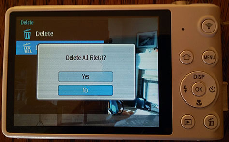
However, a simple one-keystroke confirmation may not be enough. Most of the time the action will be OK and users will confirm it. The confirmation will soon be burned into system one as an automatic process, increasing the probability that users will confirm without thinking (Norman, 1983a). That is a capture slip, and it defeats the purpose of the confirmation.
A common way to avoid that problem is to design the confirmation dialogue box so Cancel is the default choice—the one invoked by clicking Enter—and OK or Continue requires an extra keystroke. On Samsung pocket digital cameras like that shown in Figure 15.11, to delete all photos, users have to (1) click the Menu button, (2) select the Delete item, (3) move the selection to Delete All and press OK, (4) click the pop-up confirmation and press the UP key, or DISP, to change the confirmation choice from No to Yes, and (5) press OK. Because deleting all photos requires confirmation and defaults to No, the extra keystrokes necessary to confirm the deletion make it unlikely that a user will accidentally confirm the deletion of all photos.
Figure 15.11—Deleting all photos from a Samsung pocket camera
In mission-critical applications, where errors would be very costly, even multistep confirmation may not provide enough safety. One solution is to design important operations so one person initiates them and a different person approves or confirms them. Large purchases in many organizations are designed that way, as are grade changes in universities.
Another way to guard against errors in mission-critical applications is to require potentially dangerous operations to be executed by two or more people acting in concert—maybe even in separate locations. For example, in the sidebar “Slip or Mistake?” earlier in this chapter, the US Federal Communications Commission suggested that Hawaii’s Emergency Alert System should require that two separate staff members must coordinate to issue a real alert.
Voice-Recognition Failure and Misrecognition Are Not User Errors
When a voice-controlled system does not understand or misunderstands what a user says, the user has neither slipped nor made a mistake. The user did not make an error. The system made the error, and it is the system’s responsibility to correct or work around the error (Pearl, 2018a,b).
What should happen is more or less what happens when people talk and one does not understand what the other says. If you and I are talking and I say something and you don’t understand me, you tell me you don’t understand or give me a quizzical look, and I repeat or rephrase what I said. If I say something and you misunderstand me, the conversation may continue until the misunderstanding is exposed, then both of us work to correct the misunderstanding.
Most voice-controlled systems nowadays rate the confidence that they understood a user utterance. If the system’s confidence that it understood a user command is below a certain threshold, the system should say something like “I’m sorry; I didn’t get that. Could you repeat it?”
Even if the system estimates with high confidence that it understood a user, it can repeat what it understood before continuing. That allows misunderstandings to be caught and corrected quickly.
Important Takeaways
Errors can be classified as mistakes or slips. Mistakes are conscious errors—you make an intentional choice that turns out to be wrong. Slips are unconscious errors—you do something you didn’t intend to do.
Slips are categorized into several types depending on what causes them:
Capture—while doing one thing, you absent-mindedly switch to doing another.
Description—your action is appropriate for an object different from the one you are working with.
Data-driven—while doing a task, something else distracts you.
Loss of activation—you forget what you were doing or why.
Closure—you forget the last step of a task.
Mode—your actions have a different effect than intended because the system you are using is in a different mode than you thought it was.
Attention—failing to notice important information and so doing the wrong thing.
Motor—Your fingers, mouth, or legs don’t do what you intended.
Design to prevent mistakes by providing clear, complete, accurate information.
Design guidelines to prevent slips depend on the type of slip. For example:
Capture slips—make paths for different actions noticeably different.
Data-driven slips—guide users toward their goal with a “process funnel.”
Loss-of-activation slips—provide memory aids and progress indicators.
Mode slips—clearly indicate the current system mode.
Attention slips—direct the user’s attention to important details.
Motor slips—make click/tap/swipe targets large with space between them.
Design guidelines to help people recover from errors:
Make actions reversible by providing UNDO or by making all actions two-way.
Make risky, error-prone operations hard to do.
Don’t treat voice-recognition failures as user errors. They are system errors.
Assistant Professor, Computer Science Department, at University of San Francisco
San Francisco, California, USA
At Wiser Usability, Jeff focuses on usability for older users. He has previously worked as a user-interface designer, implementer, manager, usability tester, and researcher at Cromemco, Xerox, US West, Hewlett-Packard, and Sun Microsystems. In addition to Jeff’s current position as Assistant Professor of Computer Science at the University of San Francisco, he has also taught in the Computer Science Departments at Stanford University, Mills College, and the University of Canterbury, in Christchurch, New Zealand. After graduating from Yale University with a BA in Experimental Psychology, Jeff earned his PhD in Developmental and Experimental Psychology at Stanford University. He is a member of the ACM SIGCHI Academy and a recipient of SIGCHI’s Lifetime Achievement in Practice Award. Jeff has authored numerous articles on a variety of human-computer interaction topics, as well as the books Designing User Interfaces for an Aging Population, with Kate Finn (2017); Designing with the Mind in Mind: Simple Guide to Understanding User Interface Design Rules (1st edition, 2010; 2nd edition, 2014); Conceptual Models: Core to Good Design, with Austin Henderson (2011); GUI Bloopers 2.0: Common User Interface Design Don’ts and Dos (2007), Web Bloopers: 60 Common Design Mistakes and How to Avoid Them (2003), and GUI Bloopers: Don’ts and Dos for Software Developers and Web Designers (2000). Read More
 People make mistakes and commit errors; it’s a fact of life. Nobody is perfect. Designers of digital technology have to live with that fact. Actually, good designers do more than live with it; their designs take it into account. They avoid designs that make it likely for users to make errors (Norman, 2014). They create digital products and services that help people avoid and recover from errors.