One of the few industries that continues to thrive, despite the chaos of 2020 and 2021, is the mobile-app sector. Statista reports that the sector’s revenues exceeded $581 billion (USD) in 2020. According to eMarketer, users spend over 90 percent of their mobile time using apps.
Now is a great time to develop a mobile app, but you need to ace your app idea, design, and performance. The modern consumer doesn’t accept anything less than perfection! Only you can come up with an app idea that is relevant to your target audience and worth the investment of your effort. However, there are some universal laws of mobile-app design that you can follow. In this article, I’ll consider five mobile-app design laws that can help you level up and attain a higher standard.
Champion Advertisement
Continue Reading…
1. Knowing Your Users
Unless you know who would be using your app and what they need, it is impossible to create a design that satisfies their needs. Begin your app-design journey by identifying and understanding your users. You can employ the following strategies in doing so:
Create your ideal user persona. Who is your target audience? What are your users’ interests, likes, dislikes, and aspirations? What are their struggles? Conduct user research through interviews, surveys, or focus groups to answer these questions and create a profile of the ideal user of your app. This would enable you to know your target audience and create a design solution that would best meet their needs.
Predict user behaviors through scenarios. Once you know who your app’s users are, you need to predict their behaviors and interactions with your app. For instance, if a user wanted to complete a payment process, would she click the Cart icon in the upper-right corner or click a Check Out Now button? Design each user-interface element to meet your users’ needs.
Map the user journey. Create experience maps. Map all the potential user journeys that the user could take to complete an interaction. For example, in Facebook, a user could choose to post his status directly from his feed or from his profile. He could share something he likes right from the feed or first click the post, then click the Share button.
2. Hick’s Law
According to Hick’s Law, the more options you give to people, the longer it takes them to make a decision and choose an option. Giving people too many choices or adding too many features to your app just confuses and slows down users. An excellent app design is one that embodies a firm understanding of the basic function of the app.
Hick’s Law reinforces the need to focus on that basic function. Thus, simple designs that eliminate all unnecessary steps, options, buttons, and pages triumph over complicated apps with a plethora of options. In fact, the more complicated the choices users must make at each step of a process, the greater the likelihood that they would abandon your app.
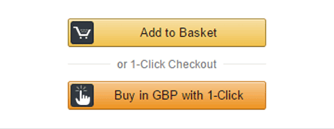
To level up your app, aim for simplicity in design. Simplify both the app’s navigation, as well as its visual design. Break down processes into easy-to-follow steps. At the same time, provide shortcuts for those who want a quick way of completing an interaction. The Amazon app’s purchasing features provide a great example of this, as Figure 1 shows.
Amazon offers two options for initiating a purchase: a one-click payment method for users who have already saved their credentials and payment method and a simple, step-by-step purchasing process, comprising easy-to-navigate screens for the shopping cart and payment and delivery information.
3. Combining the Known and the Unknown
Learn from the mobile apps that already reign in the marketplace—as well as from those that fail. Identify what works and what doesn’t.
While some mobile-app design trends turn out to be fads, others have prevailed over the years, including slide-out menus and tabs, buttons, or toolbars at the bottom of the screen. These elements have persisted because they take users’ needs into account. Also, look at the designs of failed apps to discover what you ought not to do.
While Spotify was once criticized for its complex navigation and users’ inability to quickly find the songs of their choice, their app now does a good job of balancing the familiar and innovative design elements. Spotify revamped its design and emphasized user playlists rather than album and artist lists. They also supplanted labeled buttons and with icons.
Combine design insights from other apps with your own innovative design elements to give your app a unique identity while also offering familiarity that makes users comfortable.
4. Fitts’s Law
For mobile app users, navigating through a screen that is cluttered with calls to action and tappable objects that are too tiny and too close to one another is the ultimate nightmare. Anyone would be frustrated if tapping a button didn’t have the intended result because their fingers were too big for the user interface!
According to Fitts’s Law, the time it takes to acquire a given target depends on the size of the target and the distance to be traversed. For positive actions, minimize this time. To better understand this concept, think about a popup ad with a tiny close box at the top of the popup. The time it takes to get rid of the ad depends on just how far the close box is from the user’s general finger placement, as well as the size of the close box.
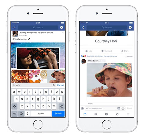
Fitts’s Law reminds designers to create easy-to-detect, large call-to-action buttons that users can easily reach. Making sure an app’s interactive objects are easily tappable ensures user friendliness.
As Figure 2 shows, on iOS, laying out the Facebook app’s key tabs across the bottom of the screen minimizes the time users’ interactions take.
On the other hand, to help ensure that users take the path you want them to take, you can make any distracting objects smaller in size.
5. Ensuring Accessibility
According to WHO, over a billion people globally suffer from some form of disability. Research by Deque shows that people with blindness abandon two-thirds of their transactions online simply because the online solutions don’t accommodate their needs! Overall, the ecommerce industry faces losses of over $9 billion (USD) annually because of such issues.
Ecommerce apps are just one of many types of apps that are marred by accessibility issues. Considering the vastness of this market sector and the world’s awareness of the need to champion inclusivity for all, it is imperative that you make your app accessible, regardless of its industry niche.
To make your app accessible for all, do the following:
Offer multiple ways of navigating through the app and make them distinct from any textual content.
Ensure the app is compatible with assistive technologies, including screen readers.
Make the app usable in a variety of resolutions, with an option to zoom up to 200 percent.
Opt for clarity in design and content through the use of alt text, appropriate levels of value contrast, and conscious font choices.
One common example of a Web-accessible app is Google Maps. Their voice-assistant technology tells users when to make each turn along a route, helping people with visual impairments to navigate easily through cities by foot. Plus, the icons that let users start a journey are large and images have good contrast.
Conclusion
A well-designed mobile app should follow the design laws that I’ve outlined in this article. To attract users, you must first understand them. To engage your users, simplify your app’s design, combine familiar and innovative features, place controls in convenient locations and make sure they’re tappable, and create accessible designs. An app that offers a solution that people need and has a killer value proposition has the best chance of success in the marketplace.
As CEO of MindInventory, a software-development company that provides Web and mobile app–development solutions to startups and enterprise-level companies, Mehul heads operations relating to business and delivery. He is also responsible for strategic planning and defining the company’s roadmap for the future/ Read More