To get work as a professional designer, whether as an in-house designer or an independent consultant, the first thing you need to have is a good design portfolio. If you want to win design projects, your design portfolio must impress your prospective clients. Your portfolio showcases your design skills, creativity, and talent and helps clients to envision what they can expect if they hire you. Your portfolio can help you to make a great first impression, which is essential in today’s competitive design industry.
How can you create a brilliant, eye-catching design portfolio? First, you must decide what goals you want to achieve through your design portfolio and what information it should include. Your design portfolio should be a virtual gallery of your best designs. It should tell a well-crafted story about your work and give your future clients a sneak-peek into the design processes and methods you use in overcoming design challenges.
Champion Advertisement
Continue Reading…
Because of the pace at which the UX design industry is evolving, your design portfolio should accord with the latest UX design trends. Otherwise, your design portfolio might become dated before the year is over. By reading this article, you can make yourself aware of some modern portfolio-design trends that will dominate in 2022 and beyond.
1. A Minimalistic Aesthetic
Don’t overwhelm your visitors by placing too many visual elements on your portfolio’s pages. Instead of immediately pushing your designs into your prospective clients’ faces, you should adopt a more interesting and straightforward approach for your design portfolio and direct visitors’ attention to your design work using progressive disclosure. If you pay the proper attention to value contrast, a minimalistic aesthetic can work as well on darker backgrounds as it does on lighter backgrounds.
2. An Interactive Portfolio
Static Web sites are a thing of the past. Today, we live in a dynamic world in which people demand interactive experiences. This is exactly what designers can deliver by creating an interactive portfolio that is loaded with animations and cool effects such as color shifts on mouse-over or performing different actions on click or on scrolling. Interactivity can give your design portfolio a unique look and feel. Don’t be afraid to experiment with different interactive elements, especially if your visitors are not interacting with your current design portfolio. Make changes to your interactive design portfolio to enhance its effectiveness.
3. A Stylish User Interface
Just because minimalistic designs are all the rage these days does not mean there is no place for ultra-chic user-interface designs. Creative UX designers and digital agencies are fusing simple designs with stylish user interfaces to create magical effects for their portfolios. A perfect balance of simplicity and complexity can instantly catch the eye of visitors who have been sifting through multiple design portfolios to select the best ones. Want to see this concept in action? Check out Louis Ansa’s portfolio, which is shown in Figure 1, to see how different elements glide by on scrolling.
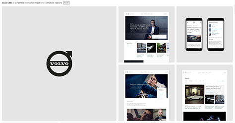
Page layouts that are inspired by magazine layouts will be a big hit for portfolio designs in 2022. Designers can showcase different types of projects in different blocks on a page, assigning a separate area to each project. As Figure 2 shows, Antoine Barres, art director and product designer, has adopted a magazine layout on his design portfolio, showcasing his creative work in its full glory.
The use of white gridlines and gray blocks gives his design portfolio a classic, minimalistic look. If you prefer a classic look, you might want to adopt this magazine-inspired layout for your design portfolio.
5. Muted Colors and Bold Typography
Because humans’ attention span is at an all-time low, it can be challenging to keep visitors interested in your portfolio. You need to create an instantly engaging experience for your portfolio’s visitors. Try using subtle colors and backgrounds in conjunction with bold typography. You can play around with changing the colors to give your portfolio a multicolored look. The use of subtle colors will find other applications in 2022. Some designers use them to show their creative side to the world. Remember, the primary goal of using subtle colors is to grab your visitors’ attention instantly. There are many design tools that can provide guidance on how to choose colors, text sizes, and fonts.
6. Simplicity
Many designers take inspiration from minimalistic design aesthetics and adopt simplicity and minimalism as their approach for their design portfolio. Expect to see more clean, simple design portfolios in 2022. The best thing about simple design portfolios is that uncluttered pages make room for your designs to shine. You can ensure that your prospective clients focus on the elements you want them to focus on. Clients can better appreciate your design projects when they see them in a clean, clear layout that lets them focus on your design work. If you already have a complex design portfolio, you could consider redesigning it by adopting a simple design approach.
7. A Prominent Profile
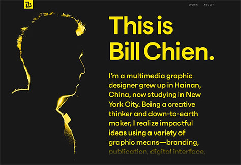
What is the first thing clients want to see when they land on a new designer’s design-portfolio Web site? The designer’s profile. Gone are the days when the designer’s profile appeared at the end of a design-portfolio page. Today, some designers are moving their entire profile to the home page of their design portfolio, while others are adding a short profile to the home page, as shown in Figure 3, and keeping a more comprehensive profile in their site’s About section. Choose whichever of these approaches works best for you—or get creative with your designer profile.
Figure 3—Bill Chien’s profile
8. Strong Typography
Two typographic trends that are gaining popularity among designers in 2022 are the use of strong typography and modern fonts. Using bold fonts in large sizes can help designers to make a statement, while using new typefaces can give your design portfolio a modern touch. Strong typography helps you to set the right tone from the start, then build upon it. Such fonts are becoming a regular feature of the home pages of most design portfolios. Rather than overlooking typography as a design element, use bolder fonts to ensure that your portfolio makes an impression.
9. Animated Navigation
To add greater visual interest to your design portfolio, try animating navigation. More and more multipage projects are now ditching traditional navigation for an animated approach to progressive disclosure. In fact, animated navigation often becomes a full-screen affair, allowing designers to deliver a more immersive, visual experience throughout their design portfolio. Animation can enhance the user experience by creating smoother, multipage transitions. It can also make page-load times more bearable for visitors by engaging them through microinteractions and animations.
10. Split-Screen Designs
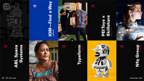
One portfolio-design trend that has been around for quite some time now, but is likely to see wider adoption in 2022, is the split-screen design. Figure 4 provides an example. Using the split-screen pattern for your design portfolio can give your visitors the urge to explore until they’ve viewed everything in your portfolio. This design pattern makes it more likely that visitors will give some attention to each project in your portfolio.
Figure 4—A split-screen design
Xavier Cusso, creative director and lead designer at the Xavier Cusso Studio, uses a split-screen design to good effect on his own portfolio Web site. The elements in the middle of the page differentiate the portfolio’s design elements from his project designs, and the split-screen pattern reflects his unique identity.
11. Merging Bright Colors and Illustrations
Some people think that using a minimalistic design and subtle colors for a design portfolio is boring because the designer is relying on their projects to hold visitors’ attention. Others use crazy, bright colors to grab visitors’ attention. Bright colors can make your design portfolio pop, helping it to stand out and instantly grabbing the maximum number of eyeballs. More importantly, this style might reflect your design philosophy for your project work, making it easier for clients to decide whether they should hire you.
12. Color Overlays
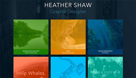
One of the most challenging aspects of designing a great portfolio is designing the home page. You need to decide how to display your projects so you’ll entice visitors to click and explore further. One tactic designers use is obscuring previews of their design work behind color overlays, as shown in Figure 5. This technique evokes visitors’ curiosity, prompting them to click the previews of designs to view an entire design solution. One benefit of using color overlays on your home page is that it gives your design portfolio a consistent look. This design solution can also prevent the longer page-load times that would result from displaying multiple projects on the home page, which would hamper the user experience.
Figure 5—Obscuring designs using color overlays
13. Life-size Headshots
Another design trend that is becoming more popular for design portfolios is displaying a strong, life-size headshot that portrays the designer on the home page. This can help boost the designer’s image. Combining the big headshot with bold fonts clearly conveys to visitors that a Web site is a design portfolio. Place all the important information above the fold to encourage visitors to move through the portfolio. Avoid forcing your portfolio’s visitors to scroll to the bottom of a page to find the information they’re looking for, which can be off-putting to many visitors and negatively impact their user experience.
14. Large Modular Grids
Designers often prefer modular grids for showcasing their design projects. What makes the modularity of a grid unique is its ability to float images from various projects on a single canvas. Large modular grids allow designers to combine horizontal images, which is a huge departure from using smaller blocks to highlight your design portfolio’s projects, as is common.
With oversized grids, your potential clients get a much better view of each project. If you use spacing correctly, this can make your design portfolio easier on the eyes, which might be a pleasant surprise for your visitors, who may be accustomed to seeing a flashy design portfolios.
15. Whitespace Between Elements
To avoid cluttered designs and instead create minimalistic layouts, designers have started adding more whitespace between various design elements and images. In addition to putting less strain on the eyes, adding whitespace can improve readability and understanding.
Plus, you can immediately draw visitors’ attention to different elements in your design portfolio. Highlight key elements that you want prospective clients to focus on by surrounding them with a lot of whitespace. Getting them to focus on your work can prevent your audience from becoming confused or overwhelmed by too much information or clutter.
16. Sleek Project Exhibits
If you are a relatively new designer who has fewer projects to show off in your design portfolio, you would be better off adopting a streamlined showcase of your projects. This format can give you better control over your design portfolio and empowers you to showcase only those projects you want your clients to focus on. To prevent visitors from getting distracted by clutter, avoid putting too many elements in a small area. Give your design portfolio a more refined, polished look that some people might prefer over a simple, minimalistic design.
17. Making Layers Pop
If you’re not afraid to play around with CSS, you can add some cool effects to make your portfolio pop. For example, adding animations and parallax scrolling to your layers can turn them into something extraordinary. Sophie Doukhopelnikoff uses layers to add transparency to her design portfolio, as well as to create depth effects and evoke visual interest by placing type on both the front and back of images, instantly drawing visitors into the design. Throw some serif fonts into the mix to give your design portfolio a more traditional look.
Irfan is an experienced digital-content manager who is currently working at Branex. He has worked with various and created value for them. Irfan has been a guest contributor on various Web sites. He holds a Bachelor of Commerce, Marketing, from Karachi University. Read More