The architect Louis Kahn once said, “Architecture is the thoughtful making of space.” I read this quotation 20 years ago, and it has stuck with me ever since. The idea of the thoughtful making of space is something that we, as UX designers, strive to achieve when creating digital products. Just as architects create physical spaces, in digital design, we have a canvas that we need to define and design in a specific way that tells a story and provides the user with an amazing user experience.
My career aspirations shifted from architecture to the design of digital experiences. But when I was studying architecture, I learned three things that I use almost every day in designing digital products.
Champion Advertisement
Continue Reading…
1. Playing with Lego Blocks
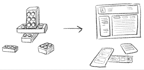
In my first year in architecture school around 2003, while doing an architecture design assignment, I came up with the idea of using Lego blocks to try different compositions within a given space. The varying sizes of Lego blocks simplified my understanding of the constraints of the space and inspired me to play around with their layout accordingly.
Cut to 2022 in the digital space, I often use block diagrams to define the space requirements, sizes, and priorities of the information blocks at hand, as Figure 1 depicts. These information blocks are very similar to the Lego blocks I used. They let me try out various compositions to determine the optimal flow of information and understand how the user should navigate through the product. The things I must consider are very similar to those that determine how a person moves through an architectural space.
Figure 1—Moving from Lego blocks to block diagrams
2. Adding Layers to Make Things Interesting
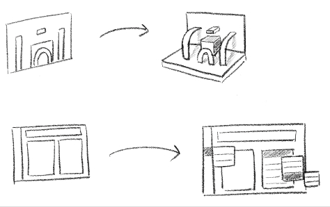
During my second year in architecture school, we completed an exercise during which we traced an interesting space on a city map, limiting that space to a 2-inch by 2-inch square. We needed to find an interesting area within the space that we traced, then create a composition based on it using cardboard and Polystyrene sheets. I started by creating a flat composition of the area that I had selected. This did not work out well initially. But the moment I added different layers to it that space, the composition came alive. It made the structure that I was trying to build dynamic.
Now when I design a digital product, I follow the same process. I have realized that adding layers to an information block motivates the user to drill down. It enables users to understand the information and make better-informed decisions. For example, a user might click a card to reveal more details or open panels that layer on top of the main screen in which they can perform various actions. As Figure 2 shows, layers do make things more interesting and intriguing. However, in a digital product, it is important to avoid adding too many layers—especially layers that might send users down a rabbit hole.
Figure 2—Moving from flat compositions to layers
3. Looking at Designs from Different Perspectives
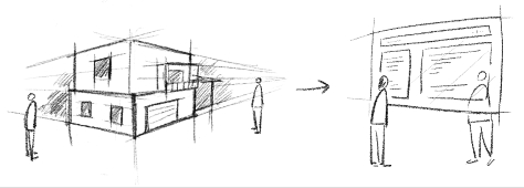
I would not be doing justice to my days in those architecture classes if I did not discuss how those lessons helped me to learn about perspective. These courses did not just teach me about creating sections and orthographic views but made me aware of both one-point and two-point perspective. Learning how to draw using perspective is crucial for people who want to visualize the user experience and identify design opportunities within a structure that would not obvious from floor plans or elevations.
When I design digital products, I return to these lessons on perspective to discover different user perspectives and glean insights from them. I question whether the information these perspectives have provided makes complete sense. Does this interaction work, or is it too complex? Could I remove some things, or should I add more? Or is there a completely different way in which I could design the product experience that might better meet users’ needs?
Looking at something from different perspectives gives a deeper understanding of a structure, similar to the ways in which it gives deeper meaning to the information spaces we are designing for users, which they will eventually consume on flat digital screens, as Figure 3 depicts.
Figure 3—Looking at something from different perspectives
Some Final Thoughts
Over time, I have realized that there are many similarities between architecture and UX design. In this article, I’ve discussed just a few of the architecture-based approaches, methods, and concepts on which I draw when creating digital software products. During my years in architecture school, I learned to do a lot of sketching, drawing design details with pen and paper. Today, I often start with sketching long before I jump into using software tools to design products. These sketches help me to understand more clearly how to proceed. It is fascinating to see how the techniques I learned years ago have become invaluable in my work today when I’m crafting digital product experiences that users will love to use.
Chinmay is a National Institute of Design, Bangalore, alumnus and has worked with companies such as Yahoo, Cognizant, and Globant. Over the last decade, Chinmay has developed expertise in product strategy, creative conceptualization, and building engaging user experiences. He has worked with both large enterprises and early and growth-stage startups. Read More