To some, user-interface (UI) design or Web design might seem like work that relies solely on creativity and seeking innovative ideas. However, you should always base your design solutions on a few rules that optimize the entire design process—such as Ben Shneiderman’s eight golden rules of user-interface design.
Shneiderman pioneered the concepts behind his eight golden rules after conducting fundamental research in the field of human-computer interaction. Although Shneiderman defined his eight golden rules back in 1985, their timelessness has ensured that they are still in use by application and Web designers all around the world.
In this article, we’ll discuss Shneiderman’s eight golden rules, and supplement them with practical tips and examples to help you apply these universal principles in your daily work as a UX designer.
Champion Advertisement
Continue Reading…
1. Strive for Consistency
Shneiderman’s first principle is “Strive for consistency.” This means using the same design patterns and sequences of actions in similar situations throughout an application user’s workflows and includes the proper use of colors, typography, and terminology. Plus, you should remember that your application does not exist in a vacuum. It is not the only product your users know. They’ll draw ideas and expectations from many other applications and build their mental models accordingly. It’s important to create consistent, predictable user interfaces that let users navigate an application more easily and achieve their goals much faster. User-interface elements that work in the same way, look the same, and use the same vocabulary everywhere result in predictability—the good kind.
How Can You Apply This Design Rule?
The best way to keep your user-interface designs consistent is to create a design system that collects all the graphic user-interface and design guidelines for a brand, ensuring their consistent use. A design system should include the following:
style guide—This is the source of knowledge about the use of colors, fonts, and logos and the ways in which an organization communicates with users.
pattern library—This documents specific examples of user-interface elements and their behaviors—for example, contact forms—and describes their use in applications.
component library—This is a library of components and templates that are implemented in code for developers to use when coding the individual elements of an application.
A design system organizes all of this information in a way that enables its users to understand and use it. Plus, it provides clear guidelines that you can use in creating your designs to maintain that golden rule of consistency.
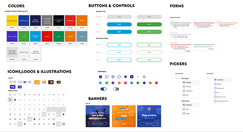
Figure 1 shows an example of a style guide in a design system for a specific brand. It depicts a palette of colors, buttons, logos, icons, and other components that designers can use when creating a user interface for a particular company.
The second principle “Seek universal usability”—means you should not limit yourself to considering the needs of just one target user group when designing an application. We can consider a user-interface design to be good only when all new users can find their way through the application without any problems and can quickly achieve their goals. Keep in mind that both new and returning users will use a Web site. These users may be of different ages or from different cultures.
How Can You Apply This Design Rule?
Adding ToolTips to your user interfaces is a good practice. This graphic UI component appears whenever a user hovers over an element in the application and provides a description or explanation of a specific UI element. This form of contextual Help makes it easy for new users to find their way around an application or site.
Figure 2 presents an example of a well-designed ToolTip in the Slack application. Such information lets someone who is using Slack for the first time know exactly what these channels are and how to use them.
A well-designed user interface should keep users informed about the results of their actions. The feedback should take into account even seemingly insignificant or infrequent actions. Users want to be sure that they understand what has happened once they’ve performed a given action.
How Can You Apply This Design Rule?
The system should respond to every action the user performs in a way that the user can understand. If users must wait for something, inform them how long and why. If users do something wrong, display an alert. If a site map is complex, help users to find their way around the site by providing breadcrumb navigation.
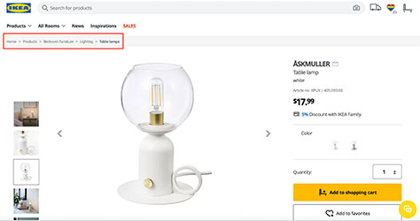
Figure 3 provides a good example of breadcrumb navigation. Notice how each subsequent element narrows down the categories for users: Products > Bedroom Furniture > Lighting > Table Lamps > ASKMULLER lamp. Because Ikea’s Web site is so elaborate, it’s certainly worthwhile to inform users exactly where they are. What’s more, the various breadcrumb navigation elements should be links so the user can easily go to those locations.
If the user must complete a specific task—especially one that consists of several steps—make sure that the user sees an appropriate message or maybe even receives some kind of reward at the end of the whole process. This ensures that users know they’ve completed a process and gives them a sense of satisfaction on completing the task.
How Can You Apply This Design Rule?
Here are some of the different types of messages that we can include in this group: thank-you messages, validation messages, and summary messages. You can display these messages as a group, so users know when they’re at the beginning, in the middle, and at the end of a process. Good messages should be as short as possible, devoid of technical jargon, and clear. Also, remember to avoid blaming the user for mistakes or using negative words. So, rather than You entered the wrong address, display the message Please enter the correct address.
Figure 4 shows an example of a message that informs users that they’ve successfully connected their account and how to complete their registration.
The ideal application user interface is one in which the user makes no mistakes. You want to guide your users through an entire process, smoothly and seamlessly. Because of the diversity of users—especially for Web applications that many thousands or even millions of people use—this is difficult to achieve. But you have to try!
How Can You Apply This Design Rule?
Instead of just validating the data that users provide and displaying messages about any information that they’ve entered incorrectly, try to make tasks easier for them—thus, minimizing the risk of errors happening in the first place.
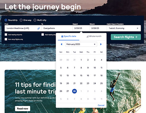
For example, if users must provide a date, don’t trip them up by allowing them to enter February 30—a date that doesn’t exist—then displaying an error message. Instead, let users select a date by a clicking a date in an accurate calendar. Figure 5 shows an example of a calendar that lets users select any actual date.
When using your application or Web site, users should feel at ease and have a sense of control over their actions. This includes the ability to cancel a current action or go back and undo and redo their actions. Actions that users can’t undo are very frustrating to them—sometimes to the point that they’ll simply stop using your application or site.
How Can You Apply This Design Rule?
Here is a set of time-tested links or buttons that you should use to help users control their actions:
Back—Returns the user to a previous page or screen.
Cancel—Lets the user quit a task or a multistep process
Close—Lets the user close the current view.
Undo—Lets the user undo the most recent action.
Redo—Lets the user redo the corresponding action. Together, Undo and Redo let the user successively backtrack on their changes, then if they go too far, redo them.
Our own blog on Pretius.com provides a good example of this rule, in which every blog post provides a backlink that takes the visitor to the blog’s main page, as shown in Figure 6. (Feel free to check out our blog if you’re interested in software-development tutorials and case studies.)
Figure 6—A link enabling the visitor to easily go to the main page
As users navigate through your Web site or application, they should feel in control and be aware that they are using it of their own free will. Give users the ability to use your site or application in whatever way they want to use it and enable them to customize the user interface to suit their needs.
How Can You Apply This Design Rule?
If a user-interface element is not absolutely necessary to the use of an application, let the user disable it temporarily or remove it completely. A good example of this is the ability to mute or eliminate pop-up notifications. (The Internet is saturated with messages that appear from everywhere, but are not necessarily relevant to us.)
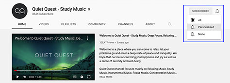
In Figure 7, you can see the options the YouTube application provides to give users control over alerts. Users can decide whether they want to receive notifications about new videos appearing on the channels they watch. If they do, they can also specify the extent of these notifications.
People’s ability to process information in their short-term memory is not great, so avoid requiring overly long sequences of actions. Don’t make your users remember any information except what’s absolutely necessary. Instead, display the information or options that they need. Don’t be afraid to tell the user what to do and deliver whatever information they need on a platter.
How Can You Apply This Design Rule?
A great way to relieve the user’s memory load is to textually and visually prompt specific behaviors, as follows:
Provide implicit help. For example, prompts could indicate what the user should type in a given field
Use visual aids. Use arrows or other signs to catch the user’s eye and help users perform a given action.
Fill out form fields for the user. Don’t make the user enter the same data twice in different forms. Once you already have the data, fill in the corresponding fields automatically for the user.
Rely on recognition over recall. Don’t make users enter their password every time they log in. Provide a Remember me check box.
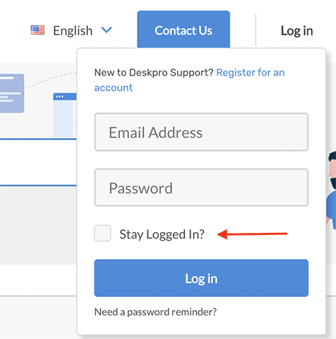
In Figure 8, you can see an example of a page that implements the recognition-over-recall rule. Instead of typing their user name and password every time they want to log in, users can simply select “Stay logged in.”
Figure 8—A helpful check box keeps users logged in
As you can see, Shneiderman’s golden rules have not lost their value over the decades. Using them is a good starting point for improving the usability and quality of your user-interface designs, as well as eliminating most user errors. Remember, Shneiderman formulated these rules as general, theoretical principles, so you must properly interpret them and adapt them to the contexts in which you work. We hope that the practical examples we have provided in our article will help you to apply Shneiderman’s principles in your daily practice of user-interface or Web design.
Anna has a strong background in designing Web applications for well-known international brands such as Philip Morris International and T-Mobile. Previously, she gained her first design experience working as an interior designer for over ten years. Read More
Dawid has 15 years of experience as a UX designer, working for over 50 well-known companies. He graduated from the Academy of Fine Arts. Dawid has specialized in product design and usability. Read More


