In the wake of a global digital shift away from landlines, 83% of the world’s population now own a smartphone. As new services, products, and experiences move into online realms, more consumers are tapping into digital realities on a mobile device than ever before.
From the proliferation of social-media platforms to the post-pandemic ecommerce boom, smartphone devices now play a key role in the digital native’s daily life, making them the hotspot for marketers who are eager for success.
The competition to win over smartphone-based consumers is becoming fierce, so modern-day marketers must prioritize a mobile-first approach to their Web site’s design, tone, and functionality if they want to stay on top of industry trends.
Champion Advertisement
Continue Reading…
Stick with me as I explore what the future of mobile-first marketing could look like in 2023 and reveal why a device-adaptable UX design strategy could be the key to achieving a high return on investment (ROI) in 2023.
A Mobile-Focused Future for UX Designers
As the marketing industry moves into a mobile-focused future, let’s take a closer look at the role UX designers can play in a new era of Web-site optimization.
A successful UX strategy is the backbone of any online-marketing campaign and can improve site speed, accessibility, and the user’s overall experience when interacting with a brand or business.
These principles remain the same for any mobile-marketing campaign. From Web-site design to on-page search-engine optimization (SEO), all elements of a business's Web site should be easily accessible and highly responsive to smartphone users. In fact, mobile-based consumers are twice as likely as desktop users to bounce off of a poorly designed Web site, with the average user retreating in just three seconds.
Brands that want to perform well in the post-pandemic ecommerce landscape can no longer ignore their mobile users. If they want to achieve high conversion rates, their Web site must be simplistic and responsive and provide quick calls to action for users with low attention spans.
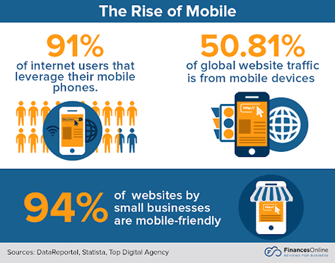
As Figure 1 shows, 94% of small businesses have already optimized their Web sites to appeal to mobile users in our modern-day marketing landscape.
If you want to stay in the competition for demographic engagement in 2023, it’s time to make sure that you’re prioritizing a mobile-friendly user experience as a key part of your campaign strategy. Read on and we’ll delve into the mobile must-haves for a device-based design plan and discuss how you can transform your Web site’s success in just a few simple steps.
Exploring Mobile Must-Haves for a Modern-Day UX Design Strategy
From responsive touch design to speed optimization, you can tweak your UX strategy to prioritize winning smartphone traffic. The key to impressing a mobile consumer is personalization. Taking the time to customize a Web-site experience for a mobile device reduces bounce rates, improves consumer click-through rates, and of course, boosts conversion potential.
Among Web-site impressions, 94% are made on design alone, with over half of them coming from smartphone users. As the demands for mobile ecommerce increase, so does the need for a well-optimized Web site.
For a mobile-first future, implement the following four site-saving tips.
1. Responsive Touch Design
With more devices on the market, there is a greater need for device-adaptable design. To maintain high levels of user satisfaction, UX designers must make sure that their graphic user interface (GUI) design approach is responsive and adjusts effortlessly to numerous screen sizes.
Applying media queries and sizing elements in relative units (%) ensures that a site design can adapt automatically to a given browser space and remain consistent across all types of devices.
Prioritizing a design strategy that adjusts the size of text, images, and tappable buttons is the key to reducing bounce rates on mobile devices because consumers can quickly read content and identify calls to action without needing to zoom in to perform a manual action.
For smartphone users in particular, optimizing finger-touch responsiveness is essential. Buttons should have larger sizes in mobile designs so users can successfully and effortlessly tap them. Reinforcing tapping actions with audio or haptic feedback can also enhance responsiveness by alerting the user that an action has actually occurred and guiding the user to the next step.
2. Accessible Navigation
While it is important to prioritize a visually aesthetic site design, smart UX designers should always focus on perfecting their navigation system first.
Modern-day mobile users are impatient when they’re searching for a product or service, and they’ll be quick to bounce off a page that doesn’t immediately answer their search query. Mobile site design must have a simple flow strategy and a simplistic navigation system that offers the smartphone user a fast track from landing page to shopping basket.
The key here is to simplify the user journey from first impression to checkout. Center your navigation system around a highlighted search bar. Offering mobile customers the chance to search for a product or service they want is much more likely to result in conversions than making them sift through endless drop-down categories.
3. Short-Form Copywriting
While a detailed, visually crowded site may look fantastic on a desktop or notebook computer, it’s important to take a step back to view your site’s layout in a mobile format. On a much smaller screen, simple lines of text can become chunky paragraphs, leaving mobile consumers overwhelmed and unlikely to read your content.
The key here is to get creative with your copywriting strategy. Combining your UX design and content teams or even reaching out to a copywriting agency could significantly improve your mobile UX design. Introducing short-form copy that is snappy and entices with a quick call to action can reduce bounce rates and speed up the user journey from the landing page to checkout.
Optimized copy can quickly and effectively guide users through a site and should provide answers to search queries. Better still, why not backlink keywords within your copy that quickly send consumers to the right page?
In a smartphone-centered online arena, sound has become one of the key elements of a successful UX strategy. As consumers demand a more immersive online experience, UX designers must focus on improving their audio feedback and adapting their sound design to serve mobile devices.
“It’s never before been more possible to use sound in creative ways to give people a better, clearer experience and help them accomplish their goals,” Director of Adobe Design, Khoi Vinh, states. “I think [there are] a lot of people doing interesting work in sound, and there’s just not enough attention paid to the people who are doing that work.”
Audio optimization can benefit the mobile user experience in a number of ways, from preventing action-based errors using warning sounds and haptics, to drawing attention to site content and guiding the user across a page.
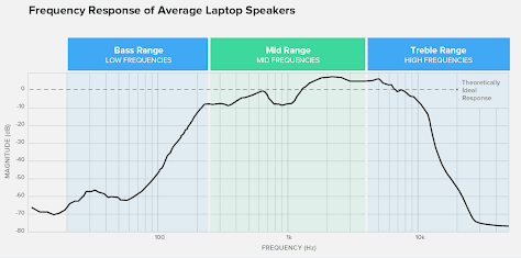
To optimize sound for mobile, UX designers must focus on tweaking audio frequencies for device adaptability. Mobile devices, in particular, emit sound through not-so-hi-fi speakers, meaning they favor mid--to-high frequencies rather than the lower bass range.
Figure 2—Notebook-computer speaker’s frequency response
The key here is to listen closely to your audio on mobile devices and detect whether the sound is either too muffled or reproducing a squeaky signal. This could mean its frequency response needs fattening. Sticking with middle-range frequencies is your safest bet because they’re most adaptable to a wide range of devices.
The Key to Success Is to Test, Test, Test
Mobile marketing trends are constantly changing. As users’ demands evolve, mobile-based design must adapt to conform to users’ needs.
To ensure a Web site’s continued success, UX designers should constantly test their strategies and compare their traffic analytics across a range of devices. As we move into a future of mobile-first marketing, design trends will continue to become more immersive, visually impressive, and consumer dominated.
Taking the time to tweak sound design, optimize short-form copy, and improve device-based responsiveness is just the start for modern-day UX designers. The future of mobile marketing will demand more creativity and push for more immersive design solutions as the industry continues to adapt to the global shift online.
Rebecca is an experienced marketing executive with a passion for UX design, data-driven outcomes, and digital creativity. She has worked on all aspects of marketing, from UX design and creative copywriting to search-engine optimization (SEO) and pay-per-click (PPC) advertising. She is interested in all things digital and can’t wait to see how the future of technology shapes the corporate world. Read More