A poor user experience always leads to lower search-engine rankings. Conversions fail far too often simply because of poorly designed Web forms. Many are so confusing and complicated that the user’s cost-benefit calculation just doesn’t add up. Users don’t want to fill out a form that doesn’t appeal to them, asks for unnecessary data, and thus, takes too much time. When this happens, it’s time to optimize the user experience.
Analyzing the User Experience
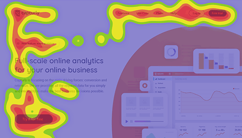
In the title of this article, data-driven analytics refers to the information and sometimes the tool you’re using to gather information about the user experience. Data analysis lets you make sense of the data you’ve gathered using analytics tools—some of which you can also accomplish using the tool. For example, Figure 1 shows a heatmap.
The term user experience describes the experience of the user when using a Web site or application. The goal of every Web site or application should be to provide a positive user experience by delivering a high level of user friendliness, an aesthetic appearance, and depending on the project, its being fun to use or even delightful. Thus, the user experience comprises the following: Usability + Look & Feel + Joy of Use = User Experience.
UX Design Tips
If you want to improve your Web site’s visibility and attract more visitors, the first thing you should do is to improve its UX design and rethink your content strategy. Here are 13 proven tips to help you reach your goals for your site or application.
1. Know Exactly How Users Interact with Your Site or Application
A user journey is the series of steps that a user goes through when interacting with a Web site or application. It begins when the user visits a Web site for the first time. Subsequently, the user’s process might involve such steps as the following:
The user explores different pages.
Checks pricing information
Reads testimonials from customers
Finally makes a purchase
The final phase of the user journey is the post-purchase phase. This is the moment when the user visits a Web site to leave a review or make a repeat purchase.
Using session replays and heatmaps might be helpful when your goal is to improve your Web site’s ranking in search results, better understand user behaviors, improve the user experience, and drive better conversion rates.
You should determine what kinds of content to offer users at different stages of their journey. If you improve only one page, user engagement won’t improve much. However, if you improve the entire user journey, you can take your Web site to the next level.
2. Use Effective Headlines
Headlines are usually the first things visitors see when they land on a Web page. A headline lets you pack your entire sales pitch into a single bold sentence. It should pique the visitor’s curiosity, answer a question, solve a problem, or be instructional. Keeping this premise in mind, the following types of headlines have proven effective and promoted better lead generation:
command headlines
direct headlines
question headlines
problem-solving headlines
instruction and guidance headlines
It is important to point out that, without a properly constructed headline, you risk losing many potential leads, and your site’s user experience might suffer. Be smart and make use of all these types of headlines!
It’s important to know that small changes to the headlines can have a huge impact on improving the user experience. After all, everything stands or falls with the headline, which either encourages visitors to click and perhaps read an article or fails to engage them, causing them to turn away.
Since headline writing is a specialized art, sit down with your team for a few minutes to talk about the title of each post. There are some obvious requirements such as brevity, clarity, and consistency. However, I’m sure we can agree on one thing: uniqueness comes first.
How do you write unique headlines? Imagine that your readers have an area of interest—which, luckily, is your product—and therefore, read a lot about it. Think about whether they would click an article’s title if it were the same standard headline they see everywhere. The answer is no. If they thought they’d already read about a topic, they’d just skip it.
This is why brainstorming about headlines is worth doing. The more versions of a headline that you can write down in a list, the more unusual ideas you’ll have at the end of the process.
3. Create Strategic Calls to Action
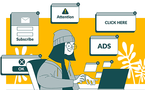
A landing page has a single purpose: getting your audience to do something. By creating a Call to Action (CTA) such as a button, popup, or pricing table, as Figure 3 depicts, you are promoting that purpose and directing your visitors to act in a certain way. Using strategic CTAs and positioning them appropriately can be the deciding factor in whether your number of visitors improves.
Where should you place your CTAs? Research from Google has shown that the most visible position for a CTA is immediately above the fold—not at the top of a page.
Popups
Popups can be controversial when it comes to usability and effectiveness. When a visitor lands on a Web site, a form pops up within a few seconds, prompting the visitor to take an action. These pop-up forms could engage visitors and help increase social awareness and subscriber acquisitions, promote discounts, and make visitors aware of upcoming offers.
Most research shows that pop-ups work very well. Plus, they don’t affect bounce rates as much as you might think.
Buttons
Buttons are very effective CTAs. Many landing pages employ Buy Now buttons as CTAs. But you should experiment and create buttons that are tailored to your specific landing pages. These buttons could vary in size, use more engaging CTA text, or employ a unique color combination.
Research from one company found that the color orange increased their conversion rate by over 32.5%. Also, the color red increased conversion rates by 21%—more than green.
Pricing Tables
Pricing tables are considered to be CTAs because they let you market different services in one table and promote a specific package in comparison to others.
4. Simplify the Navigation
Navigation is a key factor in generating a better user experience. Although you may not realize it, the direct traffic that gets visitors to your landing page is not the only traffic you should be serving. In fact, the easier it is to navigate your Web site, the more likely it is that visitors exploring your site will return to your landing page and be prompted to take action. You should also think about your marketing strategy and decide whether you should place navigation links on your landing pages. Figure 4 depicts users engaging with the links on a site.
Page-load times play an important role in your site’s conversions. In 2022, no one is patient anymore. We all expect pages to load in no time at all and, if they don’t, the first thing people do is hit the Back button. The faster your Web site is, the faster your conversion rates generally rise.
Tip—Test the speed of any Web site to see how it is currently performing!
6. Verifying Payment Systems and Trust Seals and Offering Free Shipping
Building relationships relies on establishing trust between individuals. Sales organizations have implemented this principle, and it has proven to increase sales both online and offline.
A fantastic way of improving conversion rates online is to build trust. One way of doing this by displaying verification tags, trust seals, and images of your payment systems. These small details can make a big difference in building trust with your leads and prospects.
Free shipping can also have a big impact on your site’s user experience. A survey found that high shipping and handling costs are the top reason for shopping-cart abandonment.
Most people are looking for the best deal from the most convenient source, and a free-shipping policy can boost your site’s convenience to your leads. These days, people expect to see the total shipping cost when they check out.
7. Imposing Time Limits
The longer it takes people to think about a decision, the greater the chances they’ll change their mind or be distracted by other offers. The goal of improving your user experience is to limit the time it takes an individual to make the decision to click your CTA. This creates a sense of urgency. An incredibly successful means of accomplishing such a feat is imposing a time limit on your offer. For example, “Get 50% off all purchases within the next 48 hours!”
8. Limiting Quantities
An approach that is similar to time limits is offering only limited quantities. This creates a sense of scarcity. When something is not in abundance, the time it takes people to decide to buy it is significantly lower because of their fear of missing out. This scarcity makes your leads feel the need to make a purchase as soon as possible. This technique can lead to dramatic improvements in your sales and conversions. Get creative with this! Instead of just showing the remaining stock, create a CTA to go with it—for example, “Quick, only 1 left!”
9. Optimizing for Mobile
Today, a user-friendly Web site is one that is mobile friendly as well. Because people use mobile devices to search for information on the Internet, it has become essential for you to find out how your business Web site appears on mobile devices and how users navigate it if you want to develop a better user experience for your customers.
10. Providing Testimonials and Letters of Recommendation
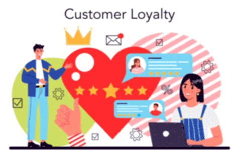
Another useful way of building trust and driving sales is through testimonials and recommendations. These typically appear right after the details and benefits of a particular offer. They prove that everything in an offer is true. According to research, 92% of people trust a peer recommendation, and 70% of people trust a recommendation from someone they don’t even know because their existence demonstrates how committed other people are to using your site. Building this level of customer loyalty and trust is essential, as Figure 5 shows.
A key characteristic of human nature makes customer referrals important: If other customers are satisfied with your product or service, new visitors are more likely to become customers themselves. In most cases, no matter how convincing your Web site is, your visitors will still hesitate and tend to postpone their final decision. However, persuasion by showing other customers’ opinions can help make your argument irresistible: your product or service matches what they’re looking for perfectly!
Let’s consider some reasons why customer testimonials are so effective.
Turning Hesitation into Conviction
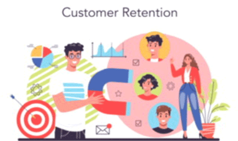
Even if you are an expert in the art of persuasion, you must maintain sales practices that convince your visitors of the exceptional value of your product. Visitors are flooded with content that aims to sell them something by any means. But this situation can change instantly if a hesitant visitor hears another voice after reviewing your perfectly written arguments: the voice of another customer who has already tried what you want your visitor to try. This social proof can defeat the uncertainty of your future customers and persuade them to become your customers and, ultimately, keep them as your customers, as Figure 6 shows.
Whether you post just three or 25 customer testimonials on your Web site, you can be pretty sure that someone will mention some specific value that your service provides and your visitors will recognize as the answer to their own needs. People love to hear and read about the success stories of others, and they’ll feel relieved after reading about how another customer was blown away by your service.
Providing Comparisons of User Experiences
Most customers don’t like to switch providers very often—if at all. They just find it too complicated. Switching usually happens when customers are dissatisfied. They’ll do a lot of research before switching to another provider to avoid another potential setback. Reading about what other customers experienced with their previous provider can help them compare their current situation to what you’ve described. This is also the most practical reason for making the user experience better.
11. Using Complementary Colors
Using colors that not only encourage certain emotions and actions but complement each other in your site’s design, encourages visitors to stay on your Web site or landing page much longer. Use the principles of color harmony to give visitors a feeling on contentment in remaining on your site. The longer you can hold your leads’ attention, the greater the chance of converting these potential leads into paying customers or subscribers.
12. Create Distraction-Free Landing Pages
Don’t forget about your landing pages! The main priority for a landing page with calls to action is selling your product or service. Anything that distracts your leads from that key goal is an absolute no-go. Create landing pages that hide any sidebar, don’t include any unnecessary text or media, and exclude anything that would draw visitors’ attention away from your calls to action. Just removing links from your landing pages can increase their conversion rates.
13. Ensuring the Quality of Your Content
Last, but not least, provide high-quality content! Even though your goal is to sell your products, don’t make your blog articles look like promotional flyers. Instead, you must both educate your readers about your products and business and include interesting stories, useful advice, and proofs of value. Don’t forget to tell your visitors what you do in every post. Some readers might not have the slightest idea, especially if they’ve gone directly to a post from a search engine or somewhere else and haven’t seen your main page.
Conclusion
Improving your Web site or application’s user experience is a never-ending process. If you implement all the proven tips I’ve outlined in this article, you’re likely to see a rapid increase in your sales or leads. One of the best pieces of advice I can give you is to keep testing new ideas and see which ones perform better for you.
Kinga is a third-year student at the University of Szeged where she studies Business Administration and Management. She is also an experienced content writer and social-media marketer. Read More