Zara is a global brand that is based in Spain, has a broad audience, and offers its customers an unparalleled shopping experience. Since its inception, Zara has been at the forefront of the online-shopping space. In this article, I’ll share my analysis of the Zara Web site, examining its functional capabilities and design features to better understand how the brand achieves ecommerce success and caters to the needs of modern consumers. Is the Zara Web site truly as convenient and stylish as its clothing? Let’s dive in and find out!
The Zara Home Page
The unconventional home page has both advantages and disadvantages. So before you consider how to implement a similar approach on your Web site without compromising on usability, it’s important that you understand your users and know whether they’ll be able to grasp this design concept. Implementing a unique layout could be appropriate for gaming or fashion-related sites, among others, but it would be odd to see such a layout on the Walmart or Bank of America site.
Champion Advertisement
Continue Reading…
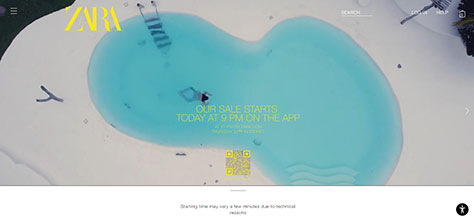
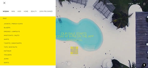
The Zara home page features a downward-scrolling slider with vibrant photos and video content in the background, as shown in Figures 1–5.
Figure 1—Zara home page Figure 2—Zara home page
Everything would be fine and dandy, but there’s one catch: the sparkling content distracts the user from the site’s navigational elements. The user could easily get lost because of the excessive cognitive load this imposes. Has Zara resolved this issue as elegantly as their clothing looks? Partially.
Figure 3—Zara home page slider
In the pursuit of stylish design, Zara’s designers have paid more attention to the appearance of the Web site rather than its usability.
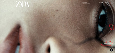
The slider section with its unclear navigation and nonclickable elements gives rise to one of the biggest usability issues, which occurs when the user clicks an element, but nothing happens. If you immediately found the New Collection label, you can congratulate yourself on your attentiveness.
Figure 4—Zara home page slider
The same issue occurs with the slide about clothing recycling: When changing the background video to the video with a white background, the user can’t see the Search box, Log In link, or shopping bag. In such cases, it would be better to either use a contrasting background color for the menu or collapse all the elements into a hamburger icon.
Figure 5—Zara home page slider
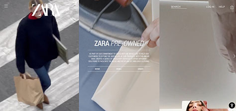
One notable feature of the Web site for people with disabilities is shown in Figure 6. The user can access this feature by clicking a button at the bottom of the page. The company genuinely cares about people with disabilities and makes shopping more accessible to them. Kudos to the developers and designers for this commendable effort.
Figure 6—Accessibility feature on Zara
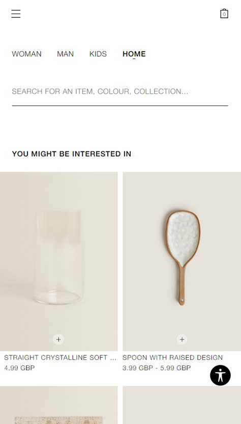
Zara does well with responsiveness. All sections neatly collapse on mobile devices. Figure 7 shows the mobile home page. However, the issue of nonclickable elements remains unresolved. Labels such as Join Life, New Collection, and others fail to transport me to the world of new collections or subscription pages upon clicking them.
Figure 7—Mobile home page
The menu conveniently collapses and expands, both on the mobile and desktop versions of the site. Figure 8 shows the desktop menu. However, I was slightly disconcerted by the placement of the Home button in the mobile version. Because of its unconventional positioning, it took me some time to locate the Home button, which is at the bottom of the menu. The traditional positioning is near a Home icon or the company logo. Of course, any decisions regarding changes in a button’s typical position or design should be based on data and testing. Therefore, if users are not complaining, it may be acceptable to leave the Home button in its current position.
Figure 8—Menu on Zara
Search Feature
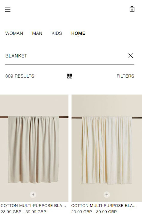
I wanted to search for a new blanket because my dog destroyed my old one, so tried this research task: finding a new blanket. On clicking the search box shown in Figure 9, a new page opens, displaying a set of products that might interest me. Nice try to sell me something, Zara, but not this time.
Figure 9—Search bar on Zara
As soon as I started typing the first few letters, I immediately noticed several good practices for optimizing the Web site’s search bar, as follows:
The Search box should have focus—highlighting or underlining—as soon as the user clicks it.
Search suggestions make life easier for users and drive traffic to the relevant page for the Web-site owner.
Compact search results on the same page, shown in Figure 10, help reduce bounce rates and increase user engagement.
These practices contribute to an improved user experience and enhance the effectiveness of the search functionality on the Web site.
Figure 10—Search results
To make Web-site search as comfortable as possible, it’s also necessary to set up automatic error correction and display a 404 page if the search does not find the product the user is searching for.
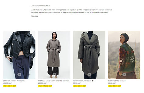
Product-Category Page
The product-category page, shown in Figure 11, greets the user with a large product photo that is centered on the page. Empty space on both sides of that photo could give the impression that the page has not fully loaded. For a moment, I instinctively waited for the rest of the page’s content to appear. Unfortunately, these are all the elements on this page.
Figure 11—Product-category page
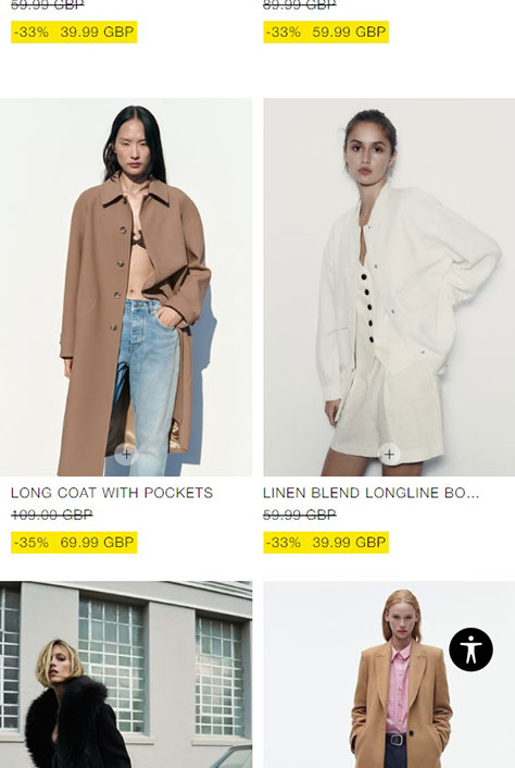
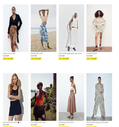
Scrolling further down by a screenful, the actual product grid, shown in Figure 12, and the category description appear.
Figure 12—Product grid
From a search-engine optimization (SEO) standpoint, the arrangement of elements on the page could be beneficial because search engines scan pages from top to bottom and assign rankings based on the position of the elements in the ranking algorithm. However, I have a number of questions for Zara’s developers and UX professionals regarding the product showcase:
Why use the + symbol to indicate available sizes? It is not clear and appears more like an Add to Cart
How can I quickly view the colors in which the product is available?
Why are there no sorting options for products—such as by price or novelty?
Why is finding the filter button in the desktop version so challenging? It is in a fixed position in the upper-left, transparent, and small, so it is difficult to notice. Plus, the filtering function lacks attributes for effective searching.
Zara could take inspiration from its colleague brand H&M, where the Web-site filters have been implemented with many useful options that genuinely assist users in selecting clothing according to their preferences. For example, it would be helpful to add jacket types (coats or blazers), jacket lengths (long, short, or medium), styles, discounts, and promotions to the filters.
Taking note of some good usability features: the presence of a button to expand the product grid to its full width is commendable. However, without data from Google Analytics, it is challenging to determine the effectiveness of this feature or the user’s utilization of the feature.
I want to call attention to the excellent responsiveness of the page on mobile devices, shown in Figure 13. The product grid collapses compactly into tiles, letting users view four products on a single screen. This reduces the struggle when the user scrolls vertically through the entire category of products.
Figure 13—Mobile product-listing page
Product Page
The product pages on Zara not only focus on following fashion trends but also keep up with the trends in the IT world. As a result, all pages on the Web site are adapted for mobile devices and display well on screens of any size.
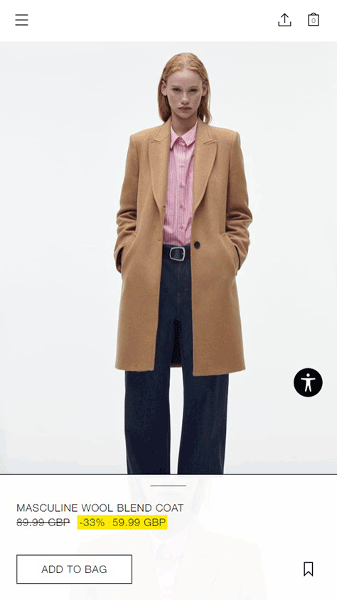
On mobile devices, the Web site resembles an application more than a typical Web page. When a product page appears, the user’s attention is drawn to the product gallery, shown in Figure 14. The social-media sharing icon, in the top menu next to the shopping bag, could be misleading because the icon’s imagery resembles a file-download icon more than a social-sharing icon. It would be better to replace the icon with one that is easier to understand. Users shouldn’t have to guess what function is hidden behind such an image.
Figure 14—Mobile product page
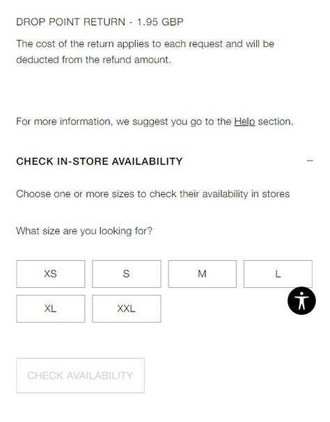
Whenever I land on a product page, I immediately want to see the available sizes, especially if there is an attractive price. You can imagine my disappointment when my size is not available.
Plus, I felt the lack of user onboarding on this Web site. If a Web site introduces new features to the user, it is important to explain how to use them. Therefore, it would be helpful to have floating ToolTips or hints on how to navigate the page, such as “Swipe this block upward to see the full product description.” This would enhance the user experience and make it easier to interact with the page.
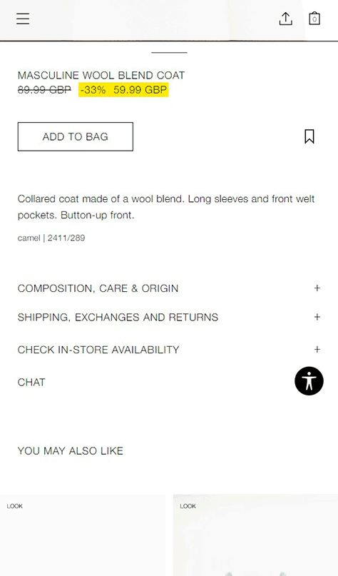
As shown in Figure 15, the product description appears in an accordion, which saves significant space on the page. When clicking the accordion tabs, I accidentally came across the product’s available sizes, shown in Figure 16.
The price, sizes, and an Add to Bag button are the three main parameters that should be easily accessible to the user. Users shouldn’t have to search for them throughout a page. Therefore, from a usability standpoint, this design has significant drawbacks. Perhaps an online-shopping consultant could partially improve the situation.
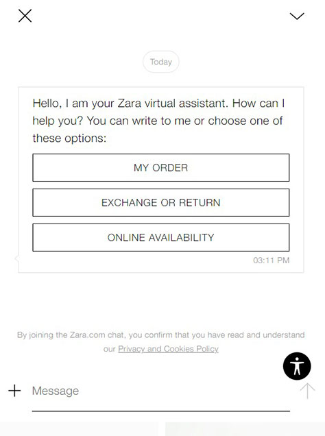
On a Web site, a chatbot can be a powerful marketing tool and assist customers in selecting clothing, finding similar items, and creating outfits in a desired style, and ultimately, convert those interactions into sales. The reason why Zara has implemented the raw, dull chatbot in Figure 17 remains a mystery.
Figure 17—Help bot
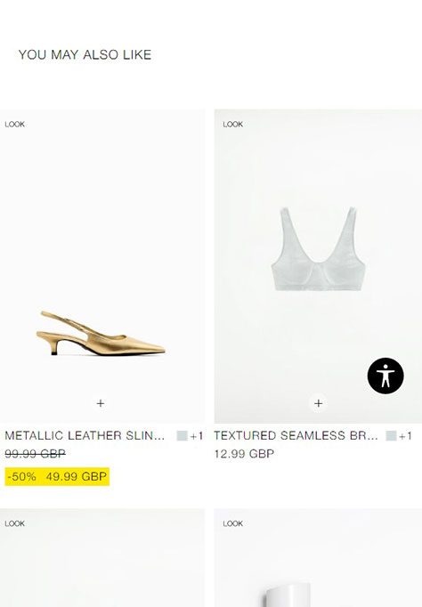
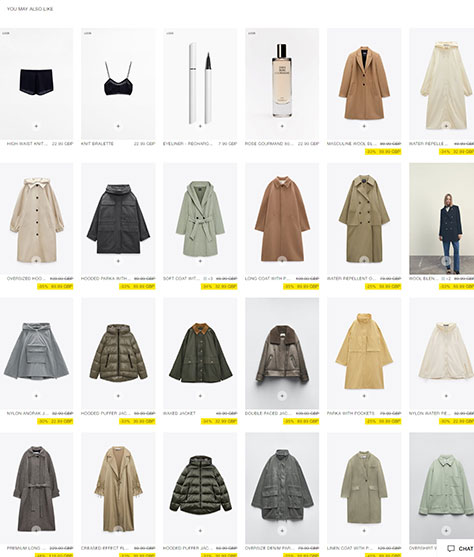
For cross-selling, it is considered a best practice for online clothing stores to add items that the models wear in the See Also section, shown in Figure 18. This increases the potential for conversions because shoppers perceive the overall image as presented in the product’s photo gallery. They don’t need to put together outfits themselves; instead, they can simply purchase the items from the cross-selling section. Why would someone be interested in buying sandals when they’re buying an autumn coat?
Figure 18—Cross-selling products
The desktop version of the product page, shown in Figure 19, is cognitively loading and unreadable because of its numerous elements: an inconvenient gallery, a logo that constantly obstructs useful content and cannot be closed; a small, monotonous font; and a huge cross-selling gallery that is shown in Figure 20.
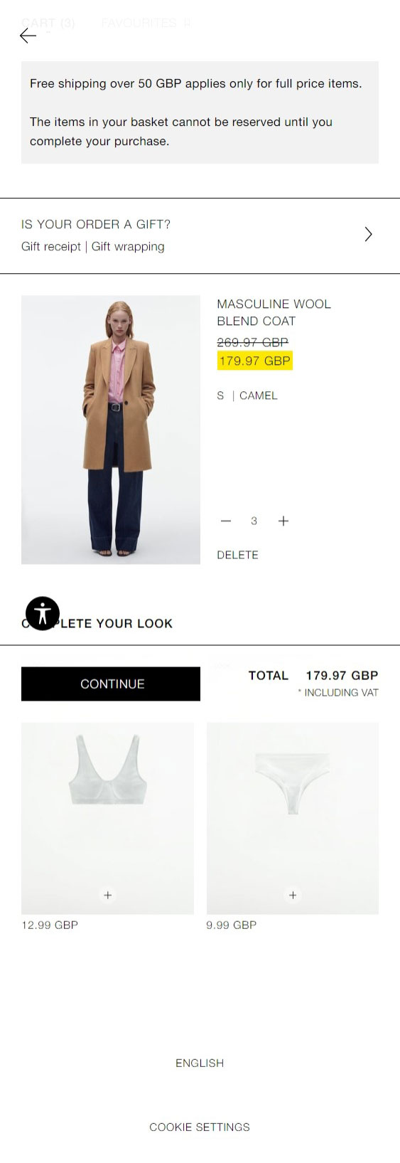
As for the shopping bag and the purchasing process, once the user clicks the Buy button, the store informs the user that the item has been added to the shopping bag. Users can then choose to continue browsing the Web site or proceed to the shopping bag, shown in Figure 21, depending on their preference.
Figure 21—Shopping bag
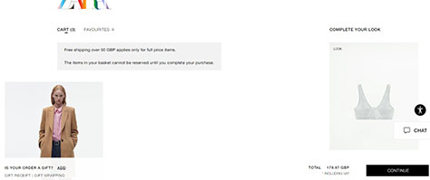
The shopping bag is designed concisely. It includes the items the user has added, provides the option to adjust the quantity of each item, and lets the user remove items from the bag. The cross-selling items are placed awkwardly at the right side of the page, and there is a large empty space in the middle, as shown in Figure 22.
Figure 22—Shopping bag
It appears that the developers have focused primarily on the mobile version of the shopping bag, shown in Figure 23, and neglected the desktop version.
Figure 23—Mobile shopping bag
Registering or Logging In
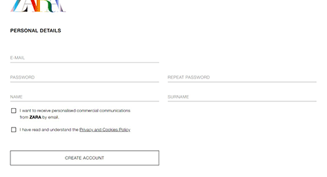
Furthermore, users are prompted to register—or log in if they already have an account. During the registration process on the account-creation page, shown in Figure 24, all required fields are highlighted, and there are helpful hints for filling them out, which is good UX practice. However, there is no Back button on the Web site to return to the previous step. For example, if users change their mind about registering, the site doesn’t give them that option. Instead, the user must look for the browser’s Back button.
Figure 24—Create account page
For the user’s convenience, it would be good to implement a fast-track option such as registering through social-media APIs (Application Programming Interfaces) or Gmail. The target audience for such a store typically consists of active social-media users. Moreover, this would make it more convenient for customers to track their purchases and share their experiences on social networks, which would further boost the brand’s ratings.
Checkout Page
After entering the customer information, the user is greeted with a concise checkout page, with options for payment and delivery methods, that is optimized for mobile devices. Figure 25 shows the checkout page. But the ability to go back to the previous step is again lacking.
Figure 25—Checkout page
Usability Test Task: Purchasing a Leather Miniskirt
To understand how users navigate through a Web site, it is important to provide test participants with a standard task and observe their experience in completing it. Let’s see how easily a user can make a purchase on Zara.
Test task: Purchase a women’s leather miniskirt in size S, black, with a budget of £50.
The user would begin by accessing the Web site’s menu and looking for the Skirts category. A familiar page, displaying a wide variety of skirts, then appears, as shown in Figure 26, but the user’s desired item is not among them.
Figure 26—The task of looking for a skirt
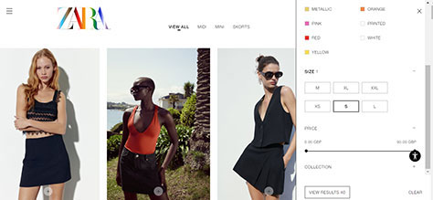
Therefore, it would be necessary to utilize filters and sorting options, applying the desired size and color filters, as shown in Figure 27, to expedite the product-search process. Unfortunately, on the desktop, the accessibility assistance button overlaps the price slider.
Figure 27—Completing the usability-test task
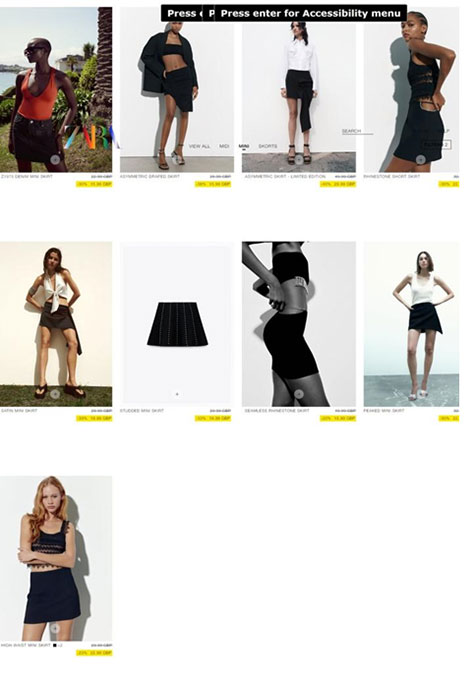
After the search, the user would ideally want to sort and review the results shown in Figure 28. Unfortunately, there doesn’t seem to be an option for sorting the search results. Instead, the user would have to embark upon a journey through the world of miniskirts by selecting Mini at the top of the page to view only miniskirts, then search for the desired leather miniskirt. But there weren’t many items available, and they didn’t include a leather skirt. Plus, it was necessary to go through and reread all the product descriptions to learn what material they were made of.
Figure 28—Filtered product-listing page
Imagine how much time it would take to find a product with the specified characteristics if there were no filter option for fabric type. How much patience would the user need to have to keep scrolling down the results page?
In Conclusion
What learnings from this article could you apply to a Web site?
Positive aspects to consider:
mobile responsiveness—Do mobile-first design to ensure that all components of a Web site are adequately responsive. Good conversion rates rely on this.
accessibility—Show that you care about users with disabilities and special needs.
well-designed search—Focus on the search bar’s clickable functionality and provide search suggestions.
SEO-optimized content—Pay attention to the positioning and content of the text on category pages.
Negative aspects to avoid:
overemphasizing the mobile version—Remember, people still use desktop and notebook computers, so give them a chance to easily make purchases.
insufficient filtering options—Identify important product characteristics and add them to the filtering options.
lack of sorting options—Make searching and purchasing products as easy as possible for users. Sorting is one way to achieve this.
easy-to-understand buttons—Ensure that all buttons have a clearly identified purpose—for example, social-media sharing buttons.
chatbot functionality—If you implement a chatbot, give it a specific function such as material calculation or clothing selection. Remember, the chatbot should serve as a salesperson, and the Web site should provide a usable, real-world experience.
ability to go back a step in the shopping bag—Include a Back button in the shopping bag for user convenience.
The Zara Web site still has a long way to go in terms of improving its usability and enhancing the user experience. However, with the necessary improvements, it could become a role model for both style and usability.
Ielyzaveta, or Elisa, is a UX researcher and data analyst who is passionate about her profession. In addition to her two years of experience as a UX specialist, she has a strong marketing background, with five years of experience in that field. She holds degrees from Chernivtsi National University. She also volunteers with Unbroken Kharkiv, which is a charity that helps people in the deoccupied territories of Kharkiv. Read More


