Have you ever found yourself collecting much more data than you need during a usability study? I think we are all likely familiar with the concept of scope creep as it applies to building products. Research scope creep occurs when you collect too much data during usability testing.
The Scope/Time Tradeoff
One of the biggest challenges I have encountered in my nine years as a UX researcher, conducting usability tests on prototypes, is handling the tradeoff between
scope—Trying to figure out the breadth of the data you’ll focus on collecting is challenging.
time—Collecting and analyzing large volumes of data from research sessions can be time consuming.
Champion Advertisement
Continue Reading…
These two dimensions are in natural contention with one another. If you decide you’re willing to drink from the proverbial firehose and collect and analyze data on every single aspect of a design during a test session, you may encounter the following issues:
Analysis will take longer.
You may miss your deadlines for deliverables.
Stakeholders may become frustrated and, ultimately, disengage from the research process.
Your research might be irrelevant by the time you complete it!
On the other hand, if you decide to target specific design elements and focus only on what you need to learn from participants, you might be able to reduce the amount of time it takes to collect and analyze your data, which will enable you to do the following:
Deliver your insights on time.
Keep stakeholders engaged in the process.
Most importantly, you’ll have more time for future iterations of research on the same or other features.
Can you overcome this tradeoff between scope and time?
Visual Data Collection
Working as a UX researcher for a large Human Resources (HR) software company, I have developed a very simple method of collecting data during early-phase usability testing. (We call this concept testing within my organization.) I call this method visual data collection, and it enables UX researchers to maintain sufficient scope, while at the same time reducing the amount of time it takes to collect and analyze data.
The Benefits of Visual Data Collection
Visual data collection has the following benefits:
creating focus—Visual data collection establishes a very clear focus on what kinds of data you need to collect, allowing you to easily get at the what and the why.
making analysis easier—It allows quick and easy analysis, comparing apples-to-apples issues across participants.
saving time—It minimizes the need for you to revisit video and screen-share recordings.
shortening research cycles—It minimizes the time between analysis and your reporting out results to stakeholders.
The 3 Key Elements of Visual Data Collection
Visual data collection involves three key elements, all of which you can include in a Word document or any other tool you use for creating an interview guide:
Visuals—Capture screenshots of the prototype up front, then, during a test session, you can record all user interactions as they happen.
Predefined questions and responses—Along with the visuals, add predefined questions and responses that reflect potential actions a participant might take during a session, as well as topics and themes that come up during a session.
Annotations—These are symbolic notations that you can use to support and connect participant responses and interactions to the visuals. They reflect the actions participants take, as well as those they did not take.
A Working Example: Putting It All Together
Imagine that you are a UX researcher and a designer has given you an early-phase prototype of a fictional HR portal to test with several participants. Participants’ task will be to find a specific employee’s office location using the prototype. Let’s look at the steps you’ll need to complete to create and use the three key elements of visual data collection.
Step 1: Create a table in your interview guide.
Within your interview guide, create a two-column table for the visuals and the predefined questions and responses. Visuals go into the column at the left and align with the questions and answers on the right, which helps keep the visuals and questions in sync. This makes it easy to jump between the two columns on the page while you are collecting data during a test session.
Step 2: Capture all of the relevant screen flows.
Using your favorite screen-capture software, capture the screens for the flow users would ideally take in completing a task, then paste them into the left-hand column of the table. (Applications such as SnagIt are ideal for capturing screenshots that you can use for these visuals.) The dimensions of the screenshots should be small enough that they fit into the left-hand column, but their text should still be big enough to read. If they’re too small, this will negatively impact your ability to annotate them properly during sessions. A good rule of thumb is that the screenshots should take up 50–60% of the table width, while the remainder is for questions and answers.
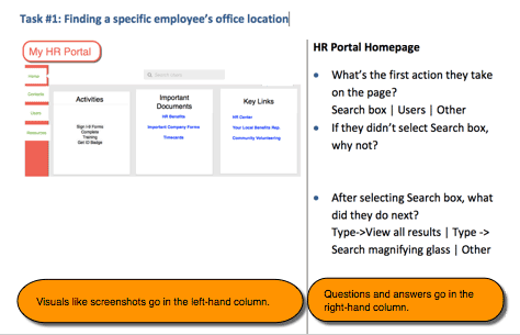
Ideally, you should capture all of the content in a scrollable browser window. SnagIt lets you auto-scroll through a page while taking a screenshot, which lets you capture all of the content on a page—even the content below the fold. If a page is unusually long, so your screenshot would be illegible in the table, consider splitting the page in half, then pasting the top and bottom halves into your interview guide. See Figure 1 for an example of a table for visual data collection. The two-column table contains the screenshots in the left-hand column, while the questions are in the right-hand column. Use section headings to group questions. This makes scanning for the right question during a session much more efficient and reduces the likelihood of your losing your place.
Figure 1—Example table layout for visual data collection
Step 3: Ask the right questions.
What questions you should include in your interview guide really depends on your overall goals for a task. This is where the value of this scope creep–reducing method really shines through. Asking specific, targeted questions about how a participant is interacting with a design solution makes your data collection and analysis much easier. For example, if you asked a participant it find a specific employee’s office location on the home page of an HR portal, the first question you might reasonably want to ask in the interview guide—adding it to the right-hand column, adjacent to the first screenshot—might be: What is the first action the participant took on the page?
Answers to this question might vary from participant to participant. However, the variety of answers is limited enough that you can prepare answers that either previous research results support or you believe might be the first thing a participant would do on the page, based on the page’s design and your knowledge of design principles. The latter approach is more common, especially for an early round of prototype testing, when there is insufficient existing data to know what a participant might do first.
In case the first action a participant takes does not match any of the canned answers, you should have an Other option, which would let you elaborate on what happened in detail. Because people are predictably unpredictable, you should also ask participants probing questions about why they made the choices they did. Be sure to include open-ended, follow-up questions about why they made those choices. Figure 1 shows a series of questions and both closed and open-ended answers in the table. The answers let you better understand the way participants are interacting with the prototype.
Asking specific, highly focused questions is really only half the battle in ensuring that the data you collect is easy to analyze across participants. Using a common vocabulary for data collection lets you compare something you write about one participant against comments about the others. Without this consistency, analysis quickly becomes complicated.
Step 4: Create an annotation key.
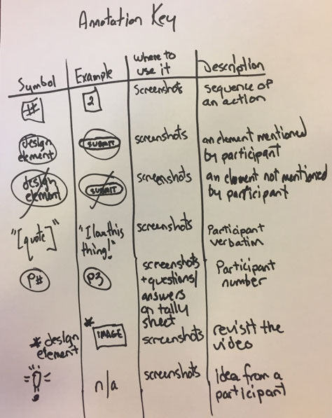
When you are collecting data, using a common vocabulary for annotations—such as simple symbols and characters—allows more efficient notetaking. Figure 2 shows a list of annotation symbols that I have found easy to use. Feel free to come up with your own set. Keeping your notations simple and using standard conventions makes them easier to remember. Write each of these annotations near the visual element to which it refers.
Figure 2—Example annotation key, with all the symbols for a study
Keep the annotation key handy during sessions, in case you need to refer to it. Annotate the screenshots and the questions—both to record the order of participants’ interactions and to highlight participants’ specific suggestions for improving the experience. Annotations can also remind the notetaker to go back and review a specific aspect of a session. Given the myriad things you might want to annotate, I suggest including no more than a dozen symbols in your annotation key. If there are too many, you’ll have trouble keeping track of the purpose of each symbol, and your notes will be confusing.
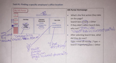
Figure 3 shows an example of the use of annotations for visual data collection. Note the use of leader lines that point to specific elements on the page. In this example, a participant made a comment about the Community Volunteering link. The asterisk on the Resources link indicates the need to revisit this particular part of the video.
Figure 3—Example of annotations in visual data collection
Step 5: After conducting the test sessions, tally up your data.
Once you have annotated all of your interview guides and have completed all of your test sessions, it is time to tally up and aggregate all of your data. To more easily compare results across all participants, I find it extremely helpful to aggregate all of the results in one place. Adding them to a blank copy of the interview guide is a great way to do this. I call this a tally sheet. Ultimately, you’ll use the tally-sheet results as supporting evidence when presenting your insights to stakeholders.
Go through each of the participant interview guides, adding data from each session to the tally sheet. Switching back and forth between each session’s interview guide and the tally sheet can be cumbersome. Losing track of which participant did what can become challenging as you fill in the tally sheet. But it is important to ensure that you can trace each participant’s data to the original interview guide from each session. Doing this is especially helpful for stakeholders, who may want more detail about specific participants’ behaviors during the sessions.
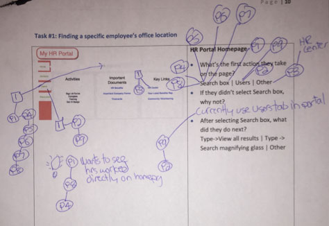
Try using a P plus a participant number enclosed within a circle to annotate each participant’s data, as shown in Figure 4. This ensures that every data point you’ve collected is traceable to its respective participant. The use of annotation leader lines in the tally sheet indicates the relationships between each of the screen elements and their annotations. Leader lines connect boxed numbers to actions on specific elements within sequences of actions. Lines also connect sequences of actions to participants. Lines even connect participants to other participants! For example, in Figure 4, just by looking at the visual side of the tally sheet, you can see that, for most participants, the initial action on the page was clicking the search box. Lines connect the boxed number 1—which indicates the order of the interactions—with the search box and the participant numbers. The connected participant numbers indicate that all of those participants had the same experience.
Another great use for connecting participants is when common themes, suggestions, or topics come up during sessions. As Figure 4 shows, some participants expressed a need to see the hours they worked directly on the home page. This information would be extremely useful to stakeholders who are interested in finding out what other features users might want on that page. Product stakeholders might want to consider building that feature.
Figure 4—Example tally sheet, showing all participant data in aggregate
Step 6: Analyze the data.
Once you’ve consolidated all of your data onto the tally sheet, it’s easy to analyze the data from your sessions. The tally sheet in Figure 4 indicates that most participants began the task by using the search box. But some participants stated that they initially went to the Users link to begin the task because that was the way they did this task using their current HR portal. The visuals, simple annotations, and focused questions that aligned with research goals made it easy to identify these insights. It would also be easy to put these insights into a slide deck or Word document, depending on how you prefer to communicate your research insights to your stakeholders.
Conclusion
The visual data–collection method enables you to overcome the tradeoff between data scope and time, making data collection, analysis, and reporting much more efficient. This method pays dividends that include the approval of future research studies and an increased research velocity that lets you keep up with agile Scrum teams. Stakeholders will value your discipline and acumen when you deliver your research results in a focused, efficient manner, without sacrificing the depth of your insights. Feel free to use and adapt this method of data collection for your own research needs.
Michael has worked in the field of IT (Information Technology) for more than 20 years—as an engineer, business analyst, and, for the last ten years, as a UX researcher. He has written on UX topics such as research methodology, UX strategy, and innovation for industry publications that include UXmatters, UX Mastery, Boxes and Arrows, UX Planet, and UX Collective. In Discovery, his quarterly column on UXmatters, Michael writes about the insights that derive from formative UX-research studies. He has a B.A. in Creative Writing from Binghamton University, an M.B.A. in Finance and Strategy from NYU Stern, and an M.S. in Human-Computer Interaction from Iowa State University. Read More