This is an excerpt from Chapter 5 of Jessica Enders’s new book Designing UX: Forms. 2016 SitePoint.
Chapter 5: Flow
Paper forms are static. Immobile, unresponsive, fixed. Forms come alive when they’re on the Web: questions can appear or hide, errors can be flagged and corrected, and the experience can be tailored to users and their needs.
In this chapter, we’ll see how to best design all these user interactions and more. Because we want the total user experience to feel smooth and painless—like gliding down a river—we’ll call this aspect of form design flow.
Champion Advertisement
Continue Reading…
Order
To begin, I want you to imagine you’re at a party, which is being hosted by your friend Samira. Samira introduces you to her friend Leo. Leo asks: “How do you know Samira?” You tell Leo you went to the same school and share some of your adventures together. Before you know it, you’re all laughing and swapping stories about Samira, as shown at the left in Figure 5-1.
Samira then introduces you to another of her friends, Max. Max asks: “Do you believe in God?” How do you react? Chances are, you’re a bit thrown by Max’s question, as shown at the right in Figure 5-1.
Figure 5-1—Conversations that flow—or don’t
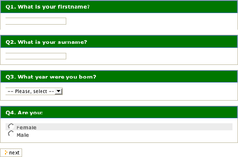
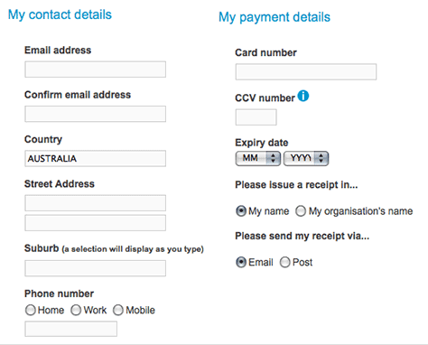
The same sort of thing happens in forms. Have a look at Figure 5-2.
Figure 5-2—This form starts with very personal questions
In both the form and the conversation with Max, the order is wrong. We expect to start with light, non-invasive questions. Very personal questions are usually reserved for later, when a relationship is established.
Having things in the wrong order completely throws the exchange and leads to discomfort. In both cases, you’re likely to pause and hesitate, you may decide to give a vague answer or a non-answer, or you might even walk away. None of these things is good at a party, and they’re downright failures when it comes to forms.
Putting things in the right order will do more than almost anything else to create an experience that flows. Unfortunately, the right order is often a matter of art as much as science. This is because the right order depends so much on context, as well as user preference. The best we can do is understand some foundational principles and then try to implement them as much as possible.
Question Order
I used the analogy of a conversation deliberately. It helps to think of your form as a conversation. Imagine your form user is actually meeting face to face with someone from your organization. What order of questions makes sense in that exchange?
The form partly pictured in Figure 5-2 went on to ask for my feedback on the organization’s activities—which centered around advocating for the environment. Perhaps, then, my feedback is the first topic they should have asked me about?
This brings us nicely to our principles for deciding question order.
Principles for Deciding Question Order
Here are six principles for determining the order of questions in a form:
Follow how the user thinks
Core before supplementary
Easy before difficult
Related together
Be consistent
Principles, not rules
Follow How the User Thinks
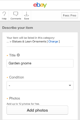
The order of questions in your form should, as closely as possible, match the way things flow in the user’s mind. When selling an item online, the user expects to enter details about the item first, before details like price and postage. eBay has matched this order in their selling form, shown in Figure 5-3.
Figure 5-3—eBay selling form
Unless you’re the one person on earth with genuine psychic powers, this means you need to do some careful research with your users.
Core Before Supplementary
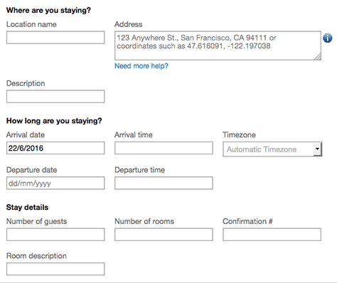
Collect the information that’s central to your form’s purpose first, before collecting any supplementary information. That way, the most relevant and important data is provided when the user is freshest and most engaged with the form. As Figure 5-4 shows, when adding accommodation to a journey on the travel-planning Web site TripIt, the user enters core details like the name and location first, before supplementary information like number of rooms.
Figure 5-4—Adding accommodation to a journey on TripIt
Easy Before Difficult
Ask simpler and less intrusive questions before complex and more intrusive questions. This eases users into the process instead of bombarding them with hard stuff up front. It also ensures users are more committed before being presented with questions that may otherwise have tempted them to turn away. As depicted in Figure 5-5, a progress indicator from a personal loan application shows that easier questions—like contact details—are asked before more challenging questions—like financial details.
Figure 5-5—A progress indicator for a loan application
Related Together
Remember our principle of proximity from Chapter 4? It stated that related elements should be near each other. The same principle applies to question order. The more related questions are, the closer they should be to each other in the form. On the donation form shown in Figure 5-6, all questions about how to contact the user are near each other, and all payment-related questions are near each other.
Figure 5-6—Donation form groups contact details and payment details
Be Consistent
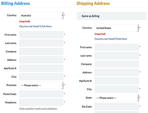
Try not to change the order of questions from one part of the form to another. In the example shown in Figure 5-7, the order of address parts doesn’t change between Billing and Shipping.
Figure 5-7—Consistent order for Billing and Shipping
This applies to answer fields, too. For instance, if you have a number of yes/no questions, try not to swap the order of the Yes and No fields partway through.
Principles, Not Rules
You probably won’t ever be able to apply all of these principles at the same time, in the same form. For this reason, these are principles, not hard-and-fast rules.
For instance, think about a bank-loan application that collects the following information:
specifics of the loan being requested—borrowing amount and repayment period
who is requesting the loan—identification
the applicant’s income, expenditure, assets and liabilities—information for assessing the request
employment status and other demographic details—supplementary information for marketing and possibly also for assessing the request
Should we put identification first—following the easy before difficult principle—or should it go near the end, to ensure we collect core before supplementary? Using the principle of related together, do we put income and assets together, because they’re about money coming in, or do we put income and expenditure together, because they’re two sides of the same coin?
As you can see, a number of different—but all seemingly logical—orders can be used. But none implements all of the principles together.
This example also nicely demonstrates the value of user research. After all, what matters most is not what order works for you, but what works for your target audience. The only way to find this out is by conducting research with them.
Tab Order
Some people will fill out your form using only the keyboard to navigate around it. This includes people who
don’t have a mouse with them—for example, are using a tablet device
just prefer not to use the mouse much—for example, developers
are using assistive technology—for example, people using a screen reader
Make sure your form works for these people, too, by setting the tab order to match the visual order in which questions, buttons and other elements are presented. There’s nothing worse than clicking Cancel because the Buy button was skipped in the tab order!
Screens
Once you’ve ordered your questions, you’ll want to decide how many screens to show them on.
Three Different Ways to Split over Screens
At one extreme, you can put all the questions on one, possibly long, screen. At the other extreme, you can show just one question per screen. In between is the option of having multiple screens, each with multiple questions.
The three quick-quote forms for different health-insurance companies that are shown in Figures 5-8 through 5-10 illustrate these three different approaches.
Figure 5-8—All questions on one screen Figure 5-9—Only one question per screen Figure 5-10—Multiple questions on multiple screens
Between the other two extremes, in Figure 5-10, we see one screen from a quick-quote form that is broken up across several screens.
Deciding the Number of Screens
Each approach has a number of advantages and disadvantages, which I won’t go into here. Instead, I’ll offer this simple formula:
Find out the most common screen sizes—including mobile and tablet—for your target audience—that is, the sizes that are used by at least 60% of people who’ll use your form.
If the form can fit on three or fewer screenfuls of the most common sizes, leave it as one screen.
Otherwise, break the form up into separate screens, one step per screen.
Avoid having more than seven screens.
This approach optimizes the user experience for the majority, while saving you from investigating how your form will look on the thousands of different resolutions, operating systems and devices on the market.
Multi-Step (Screen) Forms
If you have multiple screens, you’ll have one step of the form on each. How do you decide what constitutes a step? You should let the questions tell you.
Working with the questions in their proposed order, look for natural groupings and divisions. These give you a good starting place for steps.
For example, in our bank-loan process, these might seem like sensible steps:
Identification
Income
Assets
Expenditure
Liabilities
Loan request
Supplementary information
In this structure, the most related questions always appear in the same step. For example, name, address and phone number all appear in the Identification step.
But will users find it weird that some information about the person requesting the loan is collected in the first step, and the rest is collected in the last step? User testing is the only way to know.
It might actually be wise to test a slightly different set of steps:
Loan request
Income and assets
Expenditure and liabilities
Identification and supplementary information.
This second approach not only puts together all the information about the person requesting the loan, it has fewer steps so may seem less daunting to users. (Longer screens are the trade-off for fewer steps.) This order of steps also looks like a better fit with the principle of core before supplementary. But again, only testing with users will confirm what works. It’s also very likely that there’s more than one suitable way.
Keep it Together
The principle of natural groupings may lead to a change in the number of screens. For instance, even if the income section of our bank loan process contains more than three screenfuls of questions, we probably won’t want to split the section up over two screens/steps.
Don’t feel that you’re stuck with the number of screens you landed on when looking at common screen sizes. This technique should flex to fit natural question groupings.
One Question per Screen
Recently, there’s been a minor resurgence in designing forms to have only one question per screen. (I say resurgence, because this is how wizards work, and wizards were very popular in the early days of personal computing.) Figure 5-11 provides an example.
Figure 5-11—A form with one question per screen
One question per screen can help users focus on the task at hand, especially those with low digital literacy or people using a small screen. Conversely, they can make performance and completion times worse, especially on mobile, as more pages need to be loaded.
All in all, we’re only at the beginning of understanding how this approach impacts on user experience, especially for longer forms.
If you have the resources, you may wish to test your form designed with one question per screen. If you do, please share the results with the community! Otherwise, designing your form to have multiple questions per screen is going to create a user experience that’s at least no worse than those of the last few years. Plus, the lion’s share of Web forms currently do have multiple questions per screen, so this approach will be familiar. Familiarity goes a long way toward a positive user experience.
Progress Indicators
Until now, it was a given that a form with multiple steps should have a progress indicator, like the one shown in Figure 5-12.
Figure 5-12—Progress indicator from a car-insurance form
After all, wouldn’t users want to know where they’re at, what’s to come, and what’s behind them?
Some recent research suggests that progress indicators may not be as necessary as we think, and may even detract from the user experience. This research is very new, and more is needed before we throw out our progress indicators. But if you have the resources, you may like to test your form without a progress indicator, and see what happens. (If you do, be sure to measure both objective and subjective indicators of user experience, like completion time and satisfaction respectively.)
If you include a progress indicator, at a minimum it should:
indicate which step the user is currently on
indicate the total number of steps.
So your progress indicator may be as simple as the one shown in Figure 5-13, which gives a sense of the user’s current and overall position.
Figure 5-13—Progress indicator showing current and overall position
This is a particularly good approach for mobile forms, as it doesn’t take up much space.
If you want to flesh out your progress indicator—perhaps only on large screens—then visually distinguish between three different types of steps:
Steps the user has completed
Step the user is on
Steps ahead of the user
Figure 5-14 shows an example of a progress indicator that has steps in three different states: past, current—Delivery—and future.
Figure 5-14—Progress indicator with steps in three states
If you show the name of each step in the progress indicator, make sure the wording exactly matches the heading shown on the respective screens, as shown in Figure 5-15.
Figure 5-15—Step headings and labels in the progress indicator match
You may be tempted to indicate progress using percentages, as shown in Figure 5-16.
Figure 5-16—Percentage progress indicator
Alas, on forms, percentage-based progress indicators are a terrible idea. They seem to offer greater precision and thus be more informative. Yet the reality is they have less information. And for the form user, this vagueness is a problem.
Is the percentage a calculation of time, steps, questions, or effort? What if one step has a particularly large number questions compared to the others, or a new step appears because of answers given in earlier steps? Even if the interface gives the user clarity around these points, you’ll find it difficult to resolve them yourself. Instead, stick with step-based, labeled, progress indicators, combined with up-front eligibility questions.
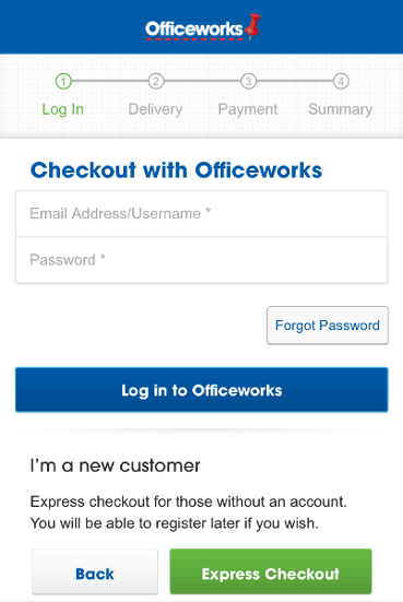
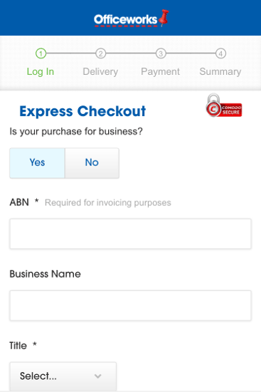
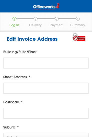
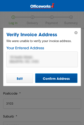
Finally, your progress indicator must be honest and transparent. For instance, don’t pretend there are three steps when there are actually five. Figures 5-17 through 5-19 show three distinct screens presented to the user, all under the heading of a single Log In step.
Figure 5-17—The first screen presented for the step Log In Figure 5-18—The second screen presented for the step Log In Figure 5-19—The third screen presented for the step Log In
Have we logged in yet?! Misleading or deceptive progress indicators may be a tempting way to draw more users into your form, but they’ll only lead to greater abandonment, dissatisfaction and distrust.
Modal Windows
Modal windows are windows that pop up on top of other windows. Figure 5-20 shows an example.
Figure 5-20—A modal window on a mobile form
In your forms, it’s best to keep modal windows to a minimum, because they
can make it hard for users to know where they are and what’s going on, especially those with cognitive disabilities
often don’t work well on mobile
may disappear off screen, particularly if the screen is small
may not be seen by people using screen magnifiers
may not be announced by screen readers
Before and After
At this point, we’ve settled the structure of the form, by deciding on
the order of questions
the number of screens
the content of each screen
what progress indicator to use, if any
Our form is really coming together. Nevertheless, what happens just before your form starts, and just after it finishes, is as important as the form itself.
We manage the just before via a gateway screen, and the just after via a confirmation screen. Let’s have a look at these.
Gateway Screen
Many Web forms don’t actually need a gateway screen, because they’re so small and typical. This includes:
search
sign up or log in
contact us
simple ecommerce checkouts
The form shown in Figure 5-21 is such a short, familiar form, it doesn’t need a separate gateway screen. Figure 5-21—A form that needs no gateway screen
On such forms, a gateway screen would be overkill. For most other forms, however, the only entry point should be a single gateway screen on your Web site.
The gateway screen should briefly
explain what and who the form is for
warn users of any external sources of information they’ll need—for example, their passport or driver license
warn users of any equipment they’ll need—for example, a printer or a credit card
share the average time to complete the form—if known—so the user can make an informed decision about when to fill it out
let users know whether they’ll be able to save when part way through and resume later, if the form will take more than 5–10 minutes
provide a summary of any legal considerations, including privacy, terms and conditions, with links to more detailed information
The gateway screen should also
include a prominent call-to-action button—for example, Start Now or Begin Application
be indexed and appear in search results—the form itself should not
be part of the Web site’s navigation
be the page that all references to the form point to, regardless of whether those references are internal or external to the Web site
not be included in the progress indicator—because it’s before, not part of, the form
In my experience, gateway screens rarely meet all these criteria. They often do some things well—like a prominent call to action—but are missing other important components—such as a warning to users about external sources of information.
Figures 5-22 through 5-24 show some examples of gateway screens that have at least some of the necessary features. The gateway screen shown in Figure 5-22 prepares the user well, but the call to action isn’t positioned well.
Figure 5-22—Gateway screen with a poorly positioned call to action
Figure 5-23 shows another example with nice brief introduction and a prominent call to action. This gateway screen also warns the user about external sources—reminder letter and its alternatives.
Figure 5-23—Gateway screen with a brief introduction and call to action
The gateway screen shown in Figure 5-24 lives on the main Web site, can be found via search, and sits in the navigation. There’s a nice big call to action. The screen also explains what the form is for, warns that card payment and proof of identity are needed, and includes a legal summary.
Figure 5-24—Prominent gateway screen with an effective call to action
Having said that, with more complex forms it often becomes necessary to ease the user into the process, rather than overload them with too much information up front. Remember how we talked about easy before difficult earlier? The idea is to gradually draw the user into the form-filling experience. The equivalent with gateway screens is to spread information over a few initial steps. If you think your form may fit into this category, it’s crucial that you test with users to find out exactly when the different pieces of information are needed. Figure 5-25 shows an example of a gateway screen combined with the start of the form, so that information can be given progressively. It includes a prominent call to action, the legal summary, and an indication of the form’s length—via the progress indicator at the top—albeit without an indication of the time the process will take.
Figure 5-25—Combination of gateway screen and form fields
Confirmation Screen
The confirmation screen lets users know
that they have finished filling out the form (Yay!)
that submission of their answers was successful (Double yay!)
what their receipt or reference number is, if relevant
whether confirmation or a copy of their filled out form has been emailed to them
what’s going to happen next
how to track the processing of the form or get further information
what further actions, if any, the user has to take
where they might want to go next—so it’s not a dead end
This may seem like a lot of information, but it can be provided succinctly, as the example confirmation screens shown in Figures 5-26 through 5-29.
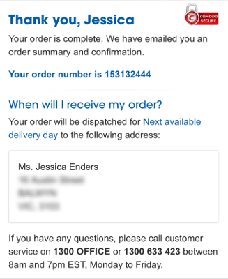
Figure 5-26—A confirmation screen at the end of an ecommerce form
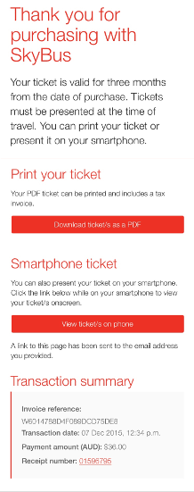
Figure 5-27 shows another great confirmation screen, also from a mobile transaction.
Figure 5-27—A confirmation screen on mobile
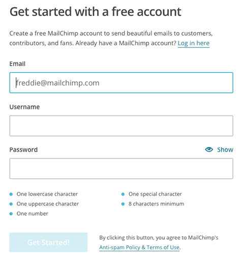
The confirmation screen is also an opportunity to thank the user for their efforts and create a sense of reward. MailChimp is well known for having confirmation screens that do just that, as shown in Figure 5-28.
Figure 5-28—This confirmation screen makes the user feel like a star
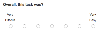
Finally, the confirmation screen is also a good place to collect feedback on the form-filling process. A simple yet effective way to do this is by asking the Single Ease Question (SEQ), developed by Jeff Sauro and Joe Dumas, which is shown in Figure 5-29.
Figure 5-29—Single Ease Question
Answering the SEQ should be optional. If you want to know a bit about what’s behind the ratings that users give, add an optional comment field.
Email Confirmation
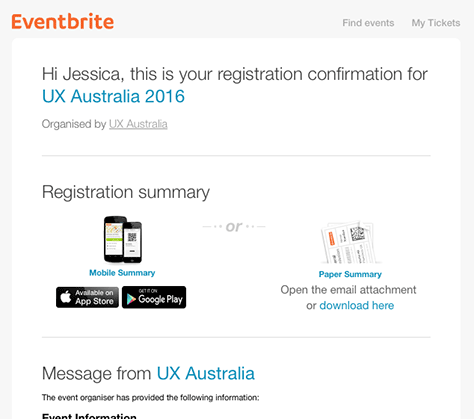
If your form collects the user’s email address, also send them a copy of the confirmation like that shown in Figure 5-30. This gives them something they can refer to permanently.
Figure 5-30—Email confirmation of a successful event registration
Review Screens
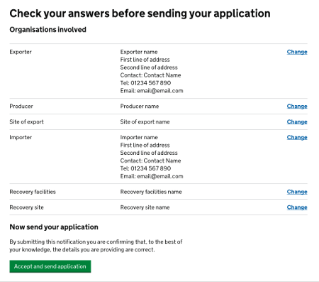
If submitting your form will have a significant impact—such as deducting money from the user’s bank account—or the form is multi-step, consider having a review screen. Figure 5-31 shows an example of a review screen from the UK Government Digital Service.
Figure 5-31—Example of a review screen
The review screen is the last screen of the form, appearing just before the confirmation. As the name suggests, it provides users with a chance to review their answers, all in one place, before submission.
Review screens should present back the form questions, sections and steps, and the user’s answers to them, in the same order as they appeared in the form. If you can, include a link to Change or Edit, against each step, section or question, so the user can quickly jump to the relevant part of the form.
Jessica is one of those rare folks who have a passion for forms. She realized the extent of this passion after spending 10 years as a statistician, survey methodologist, and market researcher. Since then, she has added interaction design and user experience to her skill set. In 2007, Jessica established her own business, Formulate Information Design, which focuses solely on form design—for both paper and digital forms. Through Formulate, she provides form design, research, and training services to government agencies, not-for-profit organizations, and large and small companies, both in Australia and the United States. Jessica regularly writes articles about good form design on her Web site. Read More


