Top

Improving User Workflows with Single-Page User Interfaces

November 20, 2006

Over the last two years, Rich Internet Applications (RIAs) have been a hot topic of discussion. While the sheen has already begun to wear off the buzzword Ajax a bit among Web application designers, RIAs are bigger than ever with our clients and their customers. Everyone seems to love slider-based filtering, drag and drop, fisheye menus, and auto-completion for input fields. Web application designs that include none of these typical Ajax features are not well received. Sometimes, one gets the feeling that Web developers implement richness just for the sake of making a Web site and the company that commissions it look cool. Obviously, user experience design should be about a lot more than creating cool controls.

Having said this, I believe RIAs are here to stay, but not so much because of their cool controls as because richness can improve the way Web applications support complex, non-linear user workflows.

Champion Advertisement
Continue Reading…

Multi-Page Versus Single-Page User Interfaces

One of the most exciting aspects of Ajax is the single-page user interface, in which all interactions with a Web application take place on one page. Only relevant controls and information appear on the page; those that a user does not currently need are hidden. As necessary, an application can readily display new information or functionality by partially refreshing the page. Highly interactive features like real-time error feedback, inline editing, within-page calculations, and filtering and sorting of tables are similar to those you’d find in desktop applications. Single-page user interfaces allow users to work in an intuitive, non-linear way.

Web applications weren't always like this. In a lot of ways, early Web applications seemed to be a step backward, requiring us to trade usability for connectivity. Web sites were multi-page environments in which users went from page to page. This model sufficed for many user tasks like reading news articles. Reading news usually begins with a user’s clicking a headline or preview text, which displays another page containing the full article. When an article is lengthy, it may be broken up and displayed over several pages. A user navigates between these pages by clicking Next and Previous buttons. Since the process of reading is rather linear anyway, the linearity of this navigational model poses few problems to users. It seems completely appropriate to click a Next button to view the next page.

Traditional, multi-page Web application design works well for these kinds of simple, linear user workflows, but single-page user interfaces support complex, non-linear user workflows much more effectively. To demonstrate this, I will use the example of a travel booking Web application.

Booking Travel Online

Customers booking a holiday online are looking for value, which generally means the best combination of price and an experience that meets their expectations. When you book a holiday, you are buying something you can’t see or try out. The only thing you can do is try to assess the various components that make up your holiday—for example, by looking at information about flights, accommodations, and things to do and see at your destination. The content on online travel booking sites is getting better and more extensive all the time, with new types of content like video, reviews, ratings, categorized attributes, and so on, in addition to textual descriptions and images. With so much content, the findability and usability of information have become crucial. And, because travel booking can be a very complex user workflow, that’s where Rich Internet Applications come in. What is it that makes travel booking complex?

A Complex User Workflow

While travel booking has its peculiarities, it’s essentially a purchasing process that comprises six basic steps:

  1. Define your needs.
  2. Search for products that meet your requirements.
  3. Evaluate and compare alternatives.
  4. Decide which alternatives best match your needs.
  5. Complete your purchase.
  6. Re-evaluate your purchase.

Now, that looks straightforward and linear. So why is this workflow complex?

The answer is: It’s not always complex. Depending on the type of holiday, the available offerings, and the personality and needs of the customer, it can be simple indeed.

It’s clear that the type of holiday makes a lot of difference. Is it a short getaway or a longer holiday? Is your destination close to home or far away? If you’re going hiking for the weekend in nearby mountains, all you need to do is book a refuge for a couple of nights. So that’s not complicated. However, if you’re taking a two-month-long roundtrip to Australia, you’ll probably need flights, a car, reservations at a series of hotels, and perhaps some excursions. Complexity rises with the number of components you must consider.

For some types of holidays, the number of available offerings is huge, but for others, your options are limited. There are thousands of holiday package offerings if you want a typical beach resort holiday. On the other hand, if you’re planning a roundtrip through Uzbekistan, you’ll probably have fewer options, so making choices might be easier.

Much depends on the personality and needs of the customer. Some people go to the same place every year, staying in the same hotel, perhaps booking their reservations directly with that hotel. Other people may not know where they want to go, but decide on the very first special offer that catches their eye, without bothering too much about it. Business travelers often have very specific requirements with regard to location, the class of service, and dates and times that prevail over all other considerations, making it easier for them to decide. All these types of people can be fast bookers for whom the purchasing process is not complex.

However, while some people know exactly what they want, many people don’t. Suppose you want to go on a summer holiday with your family for a couple of weeks. You might define your holiday like this: We want to go to a sunny place where beach weather is certain. We want to stay in comfortable accommodations, with a swimming pool. We prefer a quiet location, but without being totally remote from shops and restaurants. The surroundings should offer some cultural sights to see. This picture seems clear enough, but in Europe alone, tens of thousands of holiday packages to destinations around the Mediterranean fit this description. Even narrowing down your destination to just one country like Spain, Greece, or Turkey leaves you with thousands of possibilities.

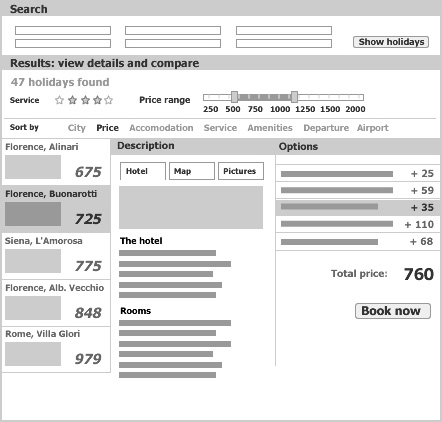
So how do you make a choice? You must compare search results, as shown in Figure 1, which involves looking at detailed information about each of the main components a holiday comprises: your destination, lodgings, transport, prices, and travel dates and time, as well as extra options like events, excursions, and meals. Booking your lodgings alone requires looking at the different types of accommodations that are available—for example, hotel, bungalow, or campsite—their class, surrounding scenery, amenities, and so on.  You may even be close to a decision when doubts creep in: The pictures of the hotel look nice enough, but you’ve read comments on a review site that complain about the food. The location seems excellent, but isn’t it too close to noisy bars and clubs? You may need to redefine your requirements and do some new searches—again looking at lists of search results and comparing detailed information about selected options. If you’re a so-called maximizer (1), who looks for perfection in every aspect of a holiday package, you’re bound to spend many evenings at your computer without being able to decide.

Figure 1—Complex multi-page clickflow that evaluating just a handful of search results requires
Multi-page clickflow

It makes sense that this type of customer rarely makes a purchase on the first visit to a travel booking site. Marketers can easily overlook this fact, thinking that they can convert every visitor to a customer right away. The facts speak for themselves though. A recent study of online travel transactions in the UK showed that only 10% of visitors booked their reservations during their initial search session. After four weeks, 45% had completed their bookings, with the remaining 45% taking even more time—up to 90 days after their initial search session (2). In this respect, online shopping isn’t different from shopping in a bricks-and-mortar store. People want to look around, compare, get advice, and so on. They often do not decide right away, but come back later and make their bookings.

Booking Travel in a Multi-Page Environment

The potentially tiresome experience of repeated online searches is worsened by the linear, multi-page user interfaces that most travel sites still offer. These user interfaces force customers to follow a predefined, linear path, going straight from a search to a form page for booking. While this may suit the fast bookers who know what they want, it does not suit those who still want to look around.

In a multi-page environment, there are likely to be separate pages for almost every task in the purchasing process, including a search page, a page listing search results, pages displaying detailed information about individual search results, some options pages, pages showing pricing and availability, and booking pages. It’s difficult to make sense out of such dispersed information. When customers are looking at a page showing details about a particular search result, they can’t see the list of search results, making it difficult to compare and rank different results. When they are looking at a list of results they can’t see the search criteria that produced them, making it difficult to adapt their search criteria and come to grips with all the different offerings.

Customers who need to assess a great many search results must visit and revisit a lot of pages. In doing so, they often lose track of the big picture and waste a lot of time clicking back and forth and waiting for the server to deliver pages. They may become disenchanted with an online travel site that seems to punish them for not knowing exactly what they want.

Multi-page travel sites don’t support customers well in searching, evaluating, comparing, or deciding. Frustration might result in customers’ quitting halfway through the purchasing process. Studies show that 60 to 80% of customers leave a Web site after having a poor user experience. In many cases, they never return—for the simple reason that they have gone to a competitor who does a better job of offering what they are looking for.

Booking Travel Using a Single-Page User Interface

Using a single-page user interface greatly improves the user experience on an online travel booking site. Such a single-page user interface should comprise at least steps 2, 3, and 4 of the purchasing process—searching, evaluating, and deciding. Figure 2 shows a concept for a single-page user interface for a travel booking site. The main functional modules that support these steps are search, search results, detailed views, and a summary showing a customer’s selected options and their prices. Customers should be able to view and use these modules simultaneously. Since the available real estate on a single page is limited and unchanging, displaying all of this requires showing and hiding information and functionality as appropriate. At the beginning of the purchasing process, you allocate more space to the search module; later, to detailed views; and in the end, you may want to focus on a summary view. Modules, therefore, can have various states. For example, after a customer clicks a search result, the list of search results partially collapses to make space for a detailed view, but remains in sight, showing basic information about each result—such as location, name, and price—and allowing comparisons.

Figure 2—Single-page user interface concept for a travel booking site
Travel booking site

Spatial adjacency of all key components makes it easier to search, adapt searches, understand the available offerings, recognize patterns, evaluate and compare options, and make a decision (3). Ajax technology supports real-time connections between these components, so customers can sort or filter search results and immediately see their lists of search results change. As soon as customers add options or upgrade to a higher level of service, they see the effect on their total price. Combining spatial adjacency with immediacy creates very powerful applications. For example, slider-based filtering lets customers easily reduce a list of hundreds of options to a couple of holidays that really match their requirements. Customers can look around and play with different options, giving them much greater control over the purchasing process.

This feeling of control is further increased by a forgiving application that makes it easy to try out a lot of possible combinations while staying on the same page and getting immediate error feedback. The user interface supports your every whim and doesn’t punish you for not knowing what you want.

Once you accept the fact that some customers need time and prefer to come back next week rather than making a purchase right away, user recognition becomes key. Users don’t like having to provide the same information all over again. User recognition should be an integral part of an online travel booking application. The application should use the information in user profiles and retain information about previous trips or searches, updating dates as necessary, but leaving all other information unchanged. Doing all of this decreases the repetition of tedious tasks and enhances the user experience. 

All of these characteristics contribute to the creation of a user interface that doesn’t unnecessarily interrupt customers with error messages or make them wait—in other words, a non-intrusive user interface that lets users focus on their tasks and reach a state of flow, or immersion (4). In such a state, it’s much easier to reach decisions and feel good about them.

Conclusion

Single-page Web applications are much better at supporting complex user workflows than multi-page Web applications are. Booking a holiday can become an easy and fun thing to do. And it’s not just customers who benefit. A better user experience can only increase your site’s conversion rate and customer satisfaction and loyalty.

Just having a single-page user interface is not enough, of course, if it’s not well designed. Both a Web application’s overall layout and its controls require special attention, because users may not be familiar with the characteristics and functionality of advanced Web applications. To give just one example, when showing and hiding different parts of a page, it’s important to subtly animate their appearance and disappearance to avoid disorienting users.

Perhaps the most important challenge for designers of single-page Web applications is the tradeoff between flexibility and usability. As an application’s flexibility increases, its usability decreases. The reason for this is its signal-to-noise ratio—that is, the ratio of relevant to irrelevant information on a page. If this ratio is high, an application is more usable. However, a Web application that is very flexible may offer too many possibilities and thus raise the level of noise in the ratio (5). So the challenge is to keep an application page as simple as possible. Packing a page with loads of cool controls is technically possible, but it’s not a good idea. Show only what is relevant to the task at hand and offer other functionality as needed. 

References

  1. In The Paradox of Choice: Why More Is Less (2004), Barry Schwartz distinguishes two basic personality types when it comes to people making choices. Satisficers settle for something that’s good enough, choosing the first option that more or less meets their needs, whereas maximizers look for the very best choice, scrutinizing all possible options in detail. Even if maximizers make objectively better choices in this way, they’re less happy with them, because they can never be sure they haven’t missed an even more perfect option.
  2. A press release from comScore Media Metrix, Media Contacts, and Yahoo! Search Marketing, on July 25, 2006, reported the study results.
  3. The importance of spatial adjacency is a recurring motif in the works of Edward Tufte—for example, see the conclusion of the chapter “Sparklines: Intense, Simple, Word-Sized Graphics,” in Beautiful Evidence (2006).
  4. Mikail Csikszentmihalyi popularized the concept of immersion, or flow, in his book Flow: The Psychology of Optimal Experience (1990).
  5. For a description of the flexibility-usability tradeoff and signal-to-noise ratio, see Universal Principles of Design: 100 Ways to Enhance Usability, Influence Perception, Increase Appeal, Make Better Design Decisions, and Teach Through Design (2003) by Lidwell, Holden, and Butler.

UX Designer & Information Architect at Joost Willemsen | Concept & Interactie

Amsterdam, The Netherlands

Joost WillemsenJoost has been an interaction designer since 2000. Working with Lost Boys, he designed successful solutions for clients like KLM, Postbank, and Nuon. His initial focus was on information architecture, with a preference for big, complex projects. Over the years, his expertise has expanded to encompass interaction design and user experience design. Joost joined Backbase—a leading provider of Ajax software, in Amsterdam—to be in the forefront of Rich Internet Application design. At Backbase, Joost is developing prototypes for RIAs. Clients include ABN AMRO, D-Reizen, and KPN. Joost loves his work as an interaction designer, because it combines analysis, creativity, and client contact.  Read More

Other Articles on Web Application Design

New on UXmatters