Organization
With the User Interface (UI) 11 Conference already behind it, UIE has had considerable experience organizing conferences, and it shows. In producing the UIE Web App Summit, the organizers brought us a great conference experience. UIE planned the conference with great attention to every detail.
Day 1: Tutorials
The first day of this 3-day event comprised full-day tutorials on quite diverse aspects of Web application user experience:
- Deconstructing Web Applications—Hagan Rivers
- Designing Web Applications Using RIAs and Ajax—David Malouf and Bill Scott
- Usage-Centered Application Design—Larry Constantine
- Measure Twice, Cut Once: Product Strategy and Planning Tools for Web Applications—Peter Merholz and Brandon Schauer
People registered in advance for the tutorial of their choice, and according to demand, the tutorials were held in meeting rooms that were configured to accommodate the registered attendees.
Day 2: Web App Foundations
The second day opened with Jared Spool’s keynote address. Throughout the remainder of the day, two sessions ran at a time, each having a duration of an hour and a quarter. This day’s sessions gave attendees a good grounding in the basics of Web application design, showing them the state of the art for today’s Web applications, and included some unique approaches to Web application design that I’m sure encouraged designers to think outside the box.
Day 3: The Latest Perspectives in Web Apps
Day 3 featured talks by designers of some very successful Web applications, as well as sessions on specific categories of Web applications. Again, two sessions ran concurrently throughout the day.
Content and Presenters: Highlights
At the UIE Web App Summit, there were many superb speakers with something interesting to say, and the conference covered a great diversity of topics pertaining to Web application design. What more could one want?
The organizers did a good job of programming the conference sessions. So, in most cases, I was able to follow my interests to decide which session to attend, without feeling terribly conflicted about missing a parallel session. In a few cases, I chose sessions because I wanted to hear certain speakers I hadn’t heard before.
Day 1: Tutorial: Deconstructing Web Applications
Presenter: Hagan Rivers
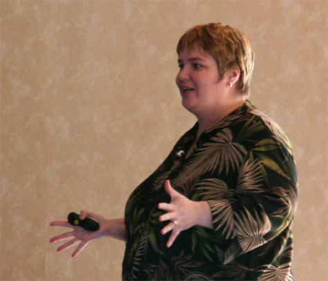
I spent most of the day in Hagan Rivers’s tutorial, “Deconstructing Web Applications.” I decided to check out this tutorial, because I’d heard Hagan is a great speaker, and she was the only presenter giving a tutorial I hadn’t heard speak before. Hagan Rivers (Figure 1) has a very engaging style and encourages dialogue with her audience. I enjoyed her talk a lot—as well as the comments of designers in the audience.
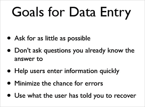
Hagan deconstructed a wealth of Web application design solutions—in all, about 600 screen shots—analyzing the pros and cons of each design approach for
- interviews
- hubs
- navigation
- data entry
- lists and list management
- filtering and searching
- visual design
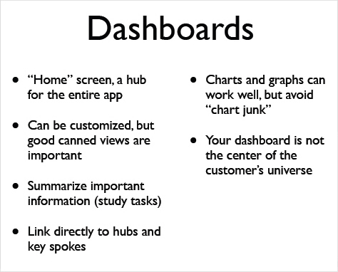
- dashboards
Hagan has coined the terms interview and hub to describe “two basic forms of application structure designers use repeatedly.” In The Designer’s Guide to Web Applications | Part I: Structure and Flows, she said, “The most common structure is a hub. … In a Web application, a hub is a center of activity—a place from where all activities radiate, like spokes. … The hub allows us to group functionality into a logical structure.” A list in which a user can select an item and perform various actions on it is a good example of a hub. About interviews, Hagan wrote, “The interview follows a step-by-step workflow, collecting information a little bit at a time from the user.” E-commerce purchasing process funnels and wizards are examples of interviews.
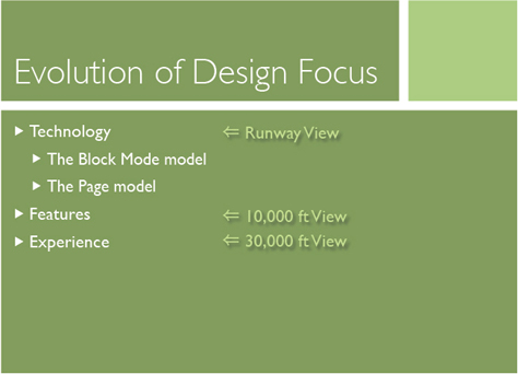
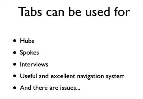
Hagan’s discussion of common forms of navigation covered links, bread crumbs, tabs, menus, tab menus, trees, and windows in depth. As the slide in Figure 2 shows, tabs are a versatile device, but “God Help you if you use tabs where it’s going to grow to 25 tabs,” she warned. In addition to using too many tabs, other issues with tabs include using more than two levels of tabs and the need for care in designing content spokes.
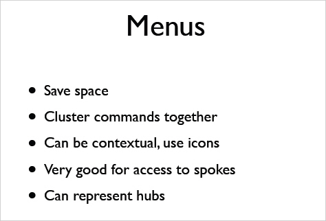
About menus, Hagan said, “This is a very robust widget.” As Figure 3 shows, menus have many virtues, but present problems as well, including scalability and “serious accessibility issues.” “We’re not robots. We lose menus when we move our mouse,” Hagan declared. Menus hide commands. “Hierarchical menus are tricky. Most of the time, they’re not necessary.” Good labeling is essential. “Ambiguous verb/nouns can trip people up a lot.”
Tab menus like those on Amazon.com® and Netflix® “are a new navigation concept that is worth watching,” Hagan said. “I like tab menus a lot.” When discussing tab menus, she told us, “Hover really annoys me. Menus popping open when people move their mouse to read. Boxes appearing and disappearing. I don’t like it.”
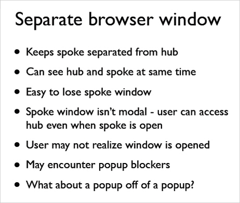
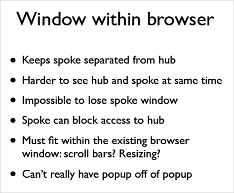
“I try to make people forget they’re in a browser. What does the user want to get done here? If you design navigation well, users start to forget they’re in a browser,” said Hagan. Finally, she discussed the pros and cons of displaying a separate browser window versus a pop-up with a browser window, as shown in Figures 4 and 5. “Sometimes when we try to save users steps, we confuse the hell out of them,” she said. “For the most part, users don’t care what our navigation system is. They just care about getting where they want to go. What they really care about is the stage”—the workspace or content area. “The stage and the navigation are always in competition for screen real estate.”