Top

Conference Review: UIE Web App Summit 2007: Part II

March 6, 2007
Champion Advertisement
Continue Reading…

Content and Presenters: Highlights

Day 2: RIA Patterns: Best Practices for Common Patterns of Rich Interaction

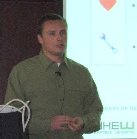
Presenter: Bill Scott

Bill Scott (Figure 12) presented the great work Yahoo! has done on its Design Pattern Library (Figure 13), which represents the state of the art in rich, interactive Web applications and is freely available online. I’ve heard him present this material twice before. He very effectively evangelizes the mission at Yahoo! “Bring about sane design.” “The business reason behind open sourcing the pattern library,” Bill told us, “It’s good for PR, feedback, and clarity. … Patterns are great for forming a design vocabulary.”

Figure 12—Bill Scott
Bill Scott
Figure 13—Yahoo! Design Pattern Library
Yahoo! Design Pattern Library

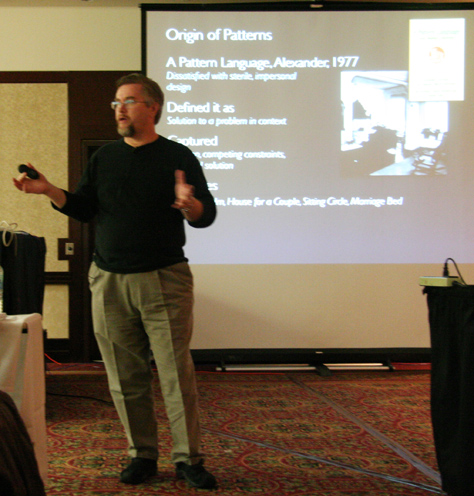
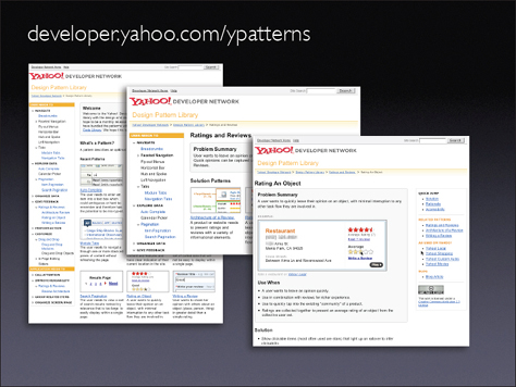
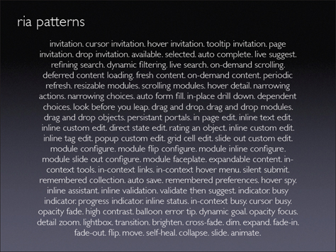
Figure 14 shows the evolving collection of RIA (Rich Internet Application) patterns Yahoo! has created.

Figure 14—RIA patterns
RIA patterns

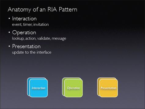
Bill said, “You can dissect a pattern into a framework,” as shown in Figure 15. According to Bill, “What’s changed with Ajax is: You can have a pipeline of just-in-time information delivery. How you manage the flow of information into a page is very important to keeping the user in the flow.”

Figure 15—Anatomy of an RIA pattern
Anatomy of RIA patterns

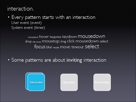
As Figure 16 shows, one example of a pattern is the invitation pattern, which lets a designer “cue the user that an interactive feature exists, because we have such a learnability issue on the Web." One type of invitation pattern is the hover invitation. With hover, “the user’s not safe to explore, because something’s always popping up on them. It comes up with hover, but the user must click a close box to close it. It’s extremely annoying to have something fly out at you when you’re moving the mouse around.”

Figure 16—Interaction
Interaction

There are two selection patterns: object selection and item selection. “As soon as you put selection into an application, you must be consistent. Use either object selection or item selection. If you mix those two things together, you cause problems, … especially with drag and drop.” said Bill. “With check boxes and drag and drop, there’s confusion in my selection model. … For selection models, the state of the art is pretty low right now.”

Another example of a pattern is the drag and drop pattern. “Interesting moments happen in a drag and drop interaction. Moving a ghost object should not move other things on the screen,” said Bill. To represent such interactions, Bill creates an “interesting moments grid, which is good for communicating fine-grained interactions to remote teams.”

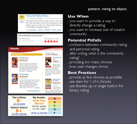
Figure 17 shows the rating an object pattern. Bill told us, ratings “made more people into creators.”

Figure 17—Rating an object
Ratings

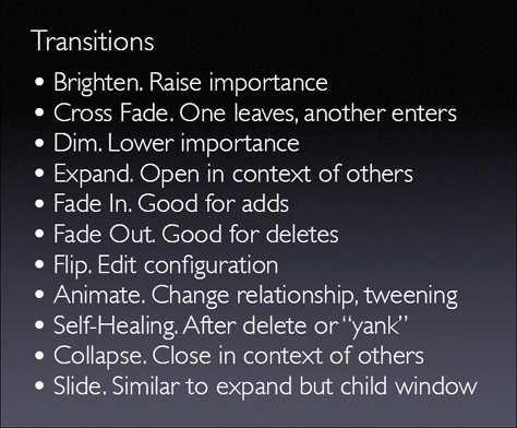
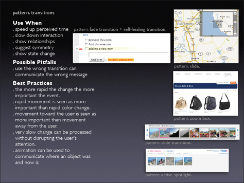
The transitions shown in Figure 18 “are all cinematic effects. With these techniques, you can slow down time, change states, redirect attention.” Figure 19 shows the transitions pattern.

Figure 18—Transitions
Transitions
Figure 19—Transitions pattern
Transitions

Day 2: Communicating Concepts with Comics

Presenter: Kevin Cheng

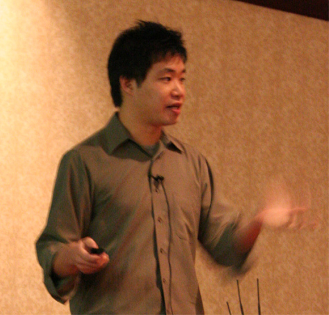
I finally got to see Kevin Cheng’s (Figure 20) presentation on “Communicating Concepts with Comics” and really enjoyed it.

Figure 20—Kevin Cheng
Kevin Cheng

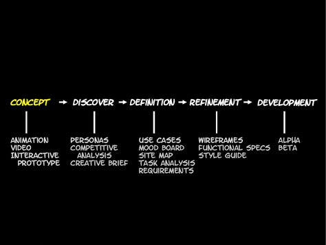
Rather than relying solely on the many more conventional design deliverables shown in Figure 21, Kevin uses comics to communicate “the core concepts behind a design’s intended user experience.” Most of these deliverables “focus on the interface instead of the user’s actual experience.” As Kevin said, “Comics are more expressive than words. A picture is worth a thousand words.” So, I’ll let Kevin’s images speak for themselves.

Figure 21—Design deliverables
Deliverables

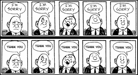
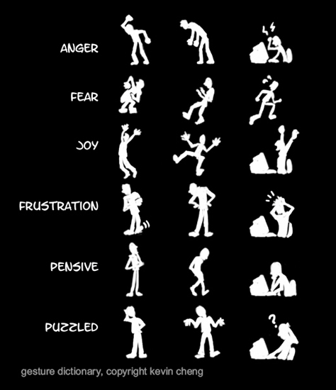
As shown in Figure 22, “Expressions bring more meaning to the words,” Kevin told us. “Body language does, too.” Figure 23 shows the emotions that various gestures communicate.

Figure 22—Facial expressions add meaning
Facial expressions add meaning
Figure 23—Gestures
Gestures

Comics can communicate motion and elapsed time. They let you “iterate rapidly and change things quickly,” said Kevin. “They connect at a very visceral level.” Figure 24 shows the broad palette of emotions you can express through comics.

Figure 24—Expressions
Expressions

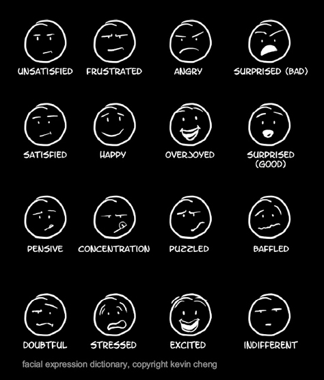
Figure 25 represents a variety of templates for panels in comics. Kevin told us, the panel in the upper-right corner “is the most useful. It’s the one I use the most. It just shows a bit of the user interface. I never show the whole screen, just a list or radio buttons. … You gain abstraction in using comics.”

Figure 25—Templates for panels in comics
Panel templates

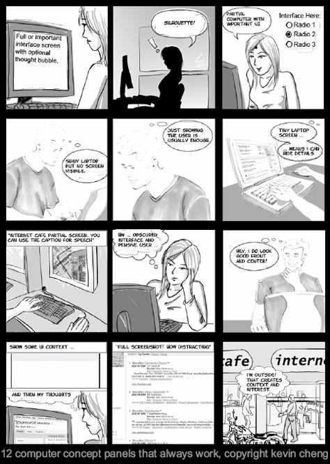
“Comics are good for conceptualizing. They let you iterate and solicit feedback. Animation is better for pitching, or getting an idea across to management,” said Kevin. “The suggested length for comics: 10 to 12 panels are very easy to digest. Don’t put captions below them. Instead, use speech bubbles for words and thoughts. All dialogue should be within the comic. Right at the beginning, you’re focusing on the people you’re building for—the stories around them. One of the best things about comics is people will actually read them. They’re a great first step to get on the same page.”

Day 2: Best Practices for Form Design: Bridging the Gap with Your Customers

Presenter: Luke Wroblewski

Luke Wroblewski (Figure 26) presented two back-to-back sessions on Day 2 of the conference: “Best Practices for Form Design: Bridging the Gap with Your Customers” and “Web Application Page Hierarchy.” I’ve heard Luke speak on many occasions, but this time he really kicked it into high gear. He delivered two great talks, and I hadn’t seen him present the majority of this material before. During his talk on forms, Luke showed numerous examples of Web forms, illustrating the various principles and guidelines he presented throughout his talk.

Figure 26—Luke Wroblewski
Luke Wroblewski

Luke told us, “Forms are … part of the conversation between companies and online customers.” As shown in Figure 27, they play an important role in e-commerce, access to information and services, and data input. Figure 28 shows some of Luke’s basic design principles for forms. He said, “We want to make things as easy as possible.”

Figure 27—The importance of forms
Importance of forms
Figure 28—Design principles for forms
Design Principles

The slides in Figures 29–31 cover the pros and cons of different alignments for labels in forms. “Top-aligned labels” that are left-aligned above input fields offer the best performance, followed by right-aligned labels. Left-aligned labels result in the poorest performance. Luke recommended using

  • top-aligned labels—for forms comprising familiar data, because of their “reduced completion times”
  • right-aligned labels—when vertical screen real estate is constrained
  • left-aligned labels—for forms comprising unfamiliar, extended, or complex data
Figure 29—Labels above input fields
Labels Above
Figure 30—Right-aligned labels
Right Aligned
Figure 31—Left-aligned labels
Left Aligned

Luke showed some of the eyetracking data from Matteo Penzo’s article “Label Placement in Forms.”

Figure 32—Matteo Penzo’s eyetracking data on forms
Eyetracking data
Figure 33—Required fields
Required fields

Luke made the following recommendations in regard to indicating whether fields are required or optional:

  • “If most fields are required, indicate optional fields.”
  • “If most fields are optional, indicate required fields.”
  • Preferably, use instructional text to indicate required or optional fields, but asterisks also work for required fields.
  • “Associate indicators with labels.”

Figure 34 shows Luke’s recommendations for field lengths. He told us, “Content relationships provide a structured way to organize a form.”

Figure 34—Field lengths
Field lengths

Luke described how visual noise from excessive use of content groupings, dividing lines, or boxes impairs “the way people scan through a form.” However, he also said, “Dividing a page into sections becomes more and more important the longer a form is. Use relevant content groupings to organize forms.”

“What to put in what order?” Luke asked. “Put in stuff they can fill out easily first, so they’re invested in the form by the time they have to fill out stuff they have to look up like credit card numbers. Differentiate the primary action in a form from secondary actions. The visual presentation of actions should match their importance. Avoid secondary actions if possible.” Luke also provided some guidelines for user assistance within forms, as shown in Figure 35. He said, “Excessive Help and tip text can really overwhelm a form … [and] obscures what you’re trying to do.”

Figure 35—Providing Help
Help

Luke provided the following guidelines for designing user interactions with forms:

  • “Provide a clear path to completion. … Every input requires consideration and action, so remove all unnecessary data requests and enable flexible data entry and smart defaults. Too many choices can paralyze people.” If a form is long, being able to save it and showing progress in the overall form is helpful.
  • Support tabbing. “Many users interact with a form by tabbing between fields. Multi-column form layouts may conflict with expected tabbing behavior.”
  • Use progressive disclosure to give people additional options when they’re appropriate. “Map progressive disclosure to prioritized user needs.” Progressive disclosure is “most effective when its user initiated. Maintain a consistent approach. People build up an expectation of where things will appear in a given form.” With gradual engagement, a registration form is not the first thing a user sees.
  • Expose dependencies—selection-dependent inputs—among form fields.

He also discussed providing the following forms of feedback:

  • inline validation as a user enters data
  • user assistance to suggest valid input
  • data validation “to ensure all required data is provided and valid”
  • error messages
  • progress indicators
  • confirmation of successful completion

About error handling, Luke said, “Clearly communicate an error has occurred. When errors occur, the key thing is to give people a way to correct it. Provide clear resolution in as few steps as possible.” Luke provided this final tip: “Let users know if difficult to obtain information is required prior to sending them to a form.”

Day 2: Web Application Page Hierarchy

Presenter: Luke Wroblewski

In his second talk, “Web Application Page Hierarchy,” Luke spoke about using hierarchy to

  • illuminate actions and guide users
  • organize information
  • communicate brand messages

He said, “Use the power of visual organization to guide users.” First, Luke analyzed what makes a great presentation, as shown in Figure 36. Then, he covered some basic principles of visual communication. I’d seen him present some of that material before. Throughout this presentation, Luke’s approach was similar to that Hagan Rivers used in her tutorial. He showed many Web pages to illustrate various points.

Figure 36—Presentation
Presentation

Luke described the principles of visual hierarchy shown in Figure 37. Visual hierarchy communicates the relative importance of different elements on a page. “Page hierarchy should reflect business priorities,” said Luke. He provided a 4-step process for building an effective hierarchy, as shown in Figure 38.

Figure 37—Visual hierarchy
Visual hierarchy
Figure 38—Building a hierarchy
Building a hierarchy

Luke analyzed the visual hierarchy of many example Web pages. 

Photographs by Ron Yoder, for User Interface Engineering, and Pabini Gabriel-Petit.

Read more

Principal Consultant at Strategic UX

Founder, Publisher, and Editor in Chief of UXmatters

Silicon Valley, California, USA

Pabini Gabriel-PetitWith more than 20 years working in User Experience at companies such as Google, Cisco, WebEx, Apple, and many startups, Pabini now provides UX strategy and design consulting services through her Silicon Valley company, Strategic UX. Her past UX leadership roles include Head of UX for Sales & Marketing IT at Intel, Senior Director of UX and Design at Apttus, Principal UX Architect at BMC Software, VP of User Experience at scanR, and Manager of User Experience at WebEx. Pabini has led UX strategy, design, and user research for Web, mobile, and desktop applications for consumers, small businesses, and enterprises, in diverse product domains. Working collaboratively with business executives, multidisciplinary product teams, and UX teams, she has envisioned and realized holistic UX design solutions for innovative, award-winning products that delighted users, achieved success in the marketplace, and delivered business value. As a UX leader, she has facilitated conceptual modeling and ideation sessions; written user stories; prioritized product and usability requirements; established corporate design frameworks, standards, and guidelines; and integrated lean UX activities into agile development processes. Pabini is a strategic thinker, and the diversity of her experience enables her to synthesize innovative solutions for challenging strategy and design problems. She is passionate about creating great user experiences that meet users’ needs and get business results. A thought leader in the UX community, Pabini was a Founding Director of the Interaction Design Association (IxDA).  Read More

Other Columns by Pabini Gabriel-Petit

Other Articles on Conference Reviews

New on UXmatters