Top

PDF Manuals: The Wrong Paradigm for an Online Experience

User Assistance

Putting Help in context

A column by Mike Hughes
November 17, 2008

Let me describe a familiar user assistance experience. A user installs a new application, and when the user wants Help, the application directs her to the user documentation on a Web site or CD-ROM. What the user finds there is a PDF file containing the manual—or a collection of PDF files, representing a library of manuals, including a user guide, configuration guide, troubleshooting guide, and various references. And the layout of each of these PDF manuals is exactly the same as if it were a printed book. This raises an interesting question: If we’re giving manuals to users to read online, why do we design and write them for paper?

I’m not down on every use of PDF files online. Campus maps, article reprints, and my aunt’s Christmas letters all work quite well as PDF files. What I want to challenge in this column is the use of PDF files for distributing user assistance online, in the form of large books.

Champion Advertisement
Continue Reading…

Use the following checklist to see if I’m talking about a kind of document that is near and dear to your heart:

  • The online document includes small topics—often called covers. Sometimes, these topics, though brief, use a very large font, so they convey about the same amount of information you could present in a single heading in a traditional online document. We call this kind of topic a front cover.
  • The document comprises pages—those arbitrary boundaries that determine how much of a topic’s content a user can view at once. What is on a page depends on how much of that content fits within an 8.5 x 11-inch rectangle—even though this boundary in no way approximates either the size or the aspect ratio of a computer screen. So, topics sporadically interrupt themselves, requiring a user to manually intervene by scrolling to continue reading the same topic. We call these sudden interruptions to the reader’s flow page breaks.
  • Topics are grouped into sequentially numbered sections called chapters. The chapter numbers that appear at the tops or bottoms of all pages further reinforce their sequence. The sequencing of chapters usually corresponds to the order in which a writer expects users will need each topic—or intends users to read them.
  • Some of the pages identify themselves with Roman numerals and others with Arabic numerals as page numbers. This can prove helpful—once a user realizes Roman numerals designate topics with no useful content whatsoever—which we refer to as frontmatter.
  • When a document switches from using Roman numerals to using Arabic numerals for page numbers, it often starts counting over again from 1—while the document viewer’s Print dialog box does not. Therefore, printing a particular range of pages requires users to do math in their heads.
  • Those little page numbers seem to jump around—sometimes appearing on the right of the screen and sometimes on the left.
  • The placement of text on alternate pages also shifts left and right, with a close correlation to whether those little numbers are odd or even. On the insides of the pages of print books, gutters allow space for the binding. To online readers, gutters are simply annoying.

If this checklist identifies the characteristics of online documents you’ve experienced, you’re probably starting to see what is driving my desire to move away from PDF manuals. None of these characteristics has any logical justification in the context of finding and reading topics online. If you were creating online documentation from scratch, would you have identified any of these characteristics as requirements? If PDF manuals are the answer, what was the question?

Why Do PDF Manuals Still Abound?

The PDF manual was born when a software product manager asked, “Why am I paying good money to print documentation users don’t read, when I could instead provide the same documents electronically for them not to read?” I am sure it was not a technical communicator—wedded to the myth that users were reading the manuals—who discovered this principle of economy, but we did acquiesce too easily. Maybe creating PDF manuals seemed like an easy transition into the scary world of online information, while still remaining grounded in the familiar skill set of conventional book design. Here are some dialogues that show possible rationalizations for PDF manuals:

  • “Users want hard copy. So, we should give them hard copy.” “Too expensive” is the rationale, “Users won’t pay for hardcopy.” Then, the real truth is users don’t value hard copy.
  • “Users can search the PDF file online, then print just the relevant sections.” If that is our assumption, printing should be easier than printing a PDF file is. Users should be able to designate what they want to print by topic, not by ranges of page numbers. If a topic spills over several pages, why should the user have to figure out what pages, then do the page number math? If the last page continues onto another topic, why should a user have to waste ink on a topic that is of no interest. Once again, the PDF realities just do not match any logical requirements.
  • “Books fit a metaphor users are comfortable with.” Most users don’t use real books all that well. Why should we think they’ll suddenly get it when a book is online? The hard reality is that books are a metaphor writers know well. It has little to do with what users are comfortable with. Books are simply what writers are comfortable writing.
Replace PDF Manuals with What?

The real solution to online documentation is—and always has been—HTML and its advanced sibling XML. If one of the attractions of PDF files was the ubiquity of PDF readers, what is more ubiquitous today than the browser?

So, let’s start from scratch. What do we want users of online documentation to be able to do? Here are the tasks a reader of online documentation must be able to accomplish:

  • navigate from a single table of contents to all of the information a user needs
  • search by keyword or plain text—Search results should span the entire library of information a user might need. However, a user should also be able to limit the scope of a search. A user should be able to scan search results easily to find relevant topics.
  • read topics online—Topics should flow for easy readability within a browser and behave like other online Web experiences for users.
  • select topics or groups of topics to print

So, there are four essential requirements for online documentation:

  • easily navigable across an entire set of information
  • easily searchable across a user-designated scope
  • easily readable topics
  • easily printable by topic or topic clusters

There are many ways of meeting these requirements that get the job done better than PDF files do. Even a simple Microsoft Compiled HTML Help (CHM) file can meet most of them. Personally, I have come to favor an XML-based solution that uses DITA (Darwin Information Typing Architecture) and delivery through Eclipse, an open-source development environment. This solution lets me distribute content with the product itself—either as a Help file or on a CD-ROM—or deploy it on a Web server, letting users view it with a Web browser.

Let’s compare a user’s online experience using an example Eclipse solution with a traditional PDF experience. (Such a solution does not have to be based on Eclipse. I’m just using an example of a solution with which I’m familiar.) How well does each solution meet the requirements I’ve identified?

Easily Navigated Across the Entire Collection of Information

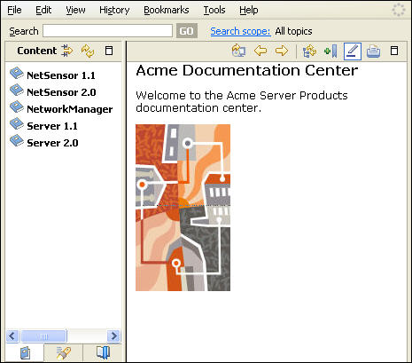
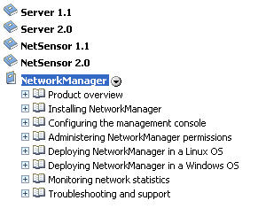
Figure 1 shows a documentation center that includes five major books. Using a traditional approach, each of these books might be a separate PDF file. In Eclipse, you can create each book as a plug-in, and add or remove plug-ins merely by adding or removing their folders from the Eclipse plug-in directory. In our example, each book documents a component that could be installed on a user’s system. Therefore, the documentation is complete. It includes all of the information a user might need—including documentation for multiple supported versions of some components.

Figure 1—An example documentation center
Example documentation center

Figure 2 shows how a user can easily scan the contents of all of the books in the documentation center, using the Content navigation pane on the left. A user would not be able to do this as easily if this information were in five separate PDF files. Instead, the user would have to open each file separately, then view each of the five documents’ table of contents.

Figure 2—Viewing each product’s table of contents
Viewing tables of contents

Searchable Across a User-Designated Scope

Although a user can search multiple PDF files simultaneously, the files have to be in a single folder—either on the user’s computer or on a server. This is not a convenient solution for users who are opening PDF files by clicking links on a Web site, as they need them. But when documents are HTML pages, a user can easily search across the entire scope of a browser-based documentation center.

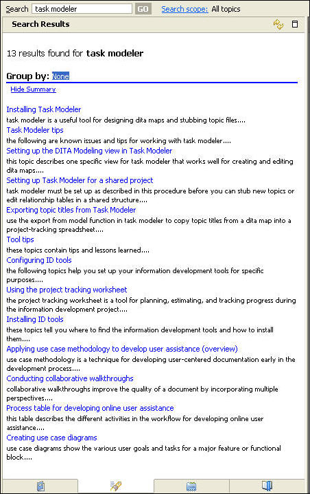
PDF search results typically show all occurrences of the search term in the context of a sentence. This can make a list of search results quite long—especially if there are multiple occurrences of the word on a page. As Figure 3 shows, search results in Eclipse appear in the context of the topic titles, and the results are annotated with a short description of each topic—a standard DITA component.

Figure 3—Search results by topic title, annotated with short descriptions
Search results by topic title

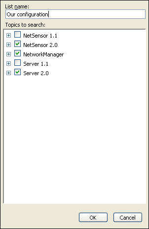
Plus, a user can easily limit the scope of a search. Figure 4 shows how users can limit a search to just the products in their configuration. A user can also limit the scope of a search to whatever topic granularity the table of contents shows.

Figure 4—Limiting search scope to specific books
Limiting search scope

Easily Read in a Browser

When Help topics are HTML pages that appear in a user’s Web browser, they behave in ways the user is accustomed to online documents behaving. Gone are the artifacts that belong to printed pages—such as headers, footers, and arbitrary page breaks—which while useful in print documents, add no value online. Relevance determines how individual topics are linked rather than some predetermined sequence. In other words, the design of the documentation reflects the way users typically look for information—in small chunks and as it’s needed rather than what’s next.

Printable by Topic or Topic Cluster

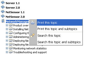
Perhaps the least satisfying aspect of the user experience with PDF manuals is printing a range of pages. Online solutions should allow users to focus on topics, not pages. Most navigation systems for online solutions let users print a specific topic or a cluster of topics. Figure 5 shows how a user can print an individual topic or a topic and its subtopics. The user can use the same popup menu to define ad hoc search constraints.

Figure 5—Selecting topics to print
Selecting topics to print

The capability of printing topics or subtopics in online documents gives us yet another way of accommodating users’ needs. We can visualize a user as someone who wants to print a custom book—and wants only selected topics in hard copy. Part of an information design effort should be to structure a table of contents to provide logical clusters of topics for printing.

Conclusion

PDF manuals have outlived their usefulness. Yet they’re still hanging around like sports fans whose home-town team has moved to the West Coast. PDF manuals are hard to use, expensive to translate, and have nothing to recommend them as online solutions for meeting users’ information requirements. In Gladiator, Quintus says, “A people should know when they’ve been defeated.” Someone needs to give companies who are still producing PDF manuals a heads-up. 

UX Designer at TSYS

Atlanta, Georgia, USA

Mike HughesIn his role as User Experience Architect for IBM Security, Mike’s professional focus is on designing usable user interfaces that accommodate the user as learner. Previously, as User Assistance Architect at IBM, Mike identified tools, methods, and standards for integrating the content and delivery of user assistance, including documentation, Help, elearning, and training. He was formerly Lead UX Designer for CheckFree Corporation, where he instituted their User Experience Research and Design Center. Mike has a PhD in Instructional Technology from the University of Georgia and a Masters in Technical and Professional Communication from Southern Polytechnic State University. He is a Fellow with the Society for Technical Communication and a Certified Performance Technologist through the International Society for Performance Improvement.  Read More

Other Columns by Mike Hughes

Other Articles on User Assistance Design

New on UXmatters