UX writing involves designing copy for user-interface (UI) elements that users employ in interacting with applications. This copy includes labels for menu items, commands, buttons, and form controls; error-message text, alert text, and other instructional text.
To ensure a good user experience, it is essential to design user-interface text to be accessible to users with different abilities, regardless of how users navigate the software—whether using speech, keyboard, or mouse device—or if users have color-deficient vision. UX writing must serve all types of users and help them interact with a user interface successfully. In this article, we’ll provide some guidelines for effective UX writing.
Champion Advertisement
Continue Reading…
Use Simple Tenses
Use simple present or past tense for actions. Generally, avoid using future tense to describe the way the user would perform an action. When you need to write in past or future tenses, use simple verb forms.
Do: Message sent.
Don’t: Message has been sent.
Write in Active Voice
Use active voice to make your writing clearer and more concise.
Do: Click Search to look for an article.
Don’t: The Search button should be clicked to look for an article.
Address the User Directly
Do not address the user as “the user” in writing messages. Doing so conveys a less personal tone. Write in the imperative mood to convey a more direct tone and engage the user.
Do: Save your changes before proceeding.
Don’t: The user should save the changes before proceeding.
Use First-Person Pronouns
Use I when the initiative for taking an action rests with the user. This conveys a feeling of personal interaction with the system and makes the user feel more responsible for that action.
Do: By clicking here, I agree to the system update.
Don’t: By clicking here, you agree to the system update.
Write Minimal Text
Ensure that every word you use is deliberate and useful. Strip out any unnecessary words that could distract the user or do not clarify the meaning of the text.
Do: Remove the downloaded book?
Don’t: Are you sure you want to remove this downloaded book? You won’t be able to access it unless you’re online.
Eliminate Redundancy
Redundant text creates noise in a user interface without adding any value. Review your text for any redundant words or phrases and, if necessary, rewrite the text to eliminate any redundant words.
Avoid Technical Jargon
Users might not be aware of the meaning of technical jargon, so could find text that includes such terms difficult to understand . Replace technical terms with easy-to-understand words.
Do: Employee payroll application server is down.
Don’t: Dell 1950 (1U) Rack Mount Server is down.
Use Action Words
In message boxes, use action words for button labels that connect clearly with the message text whenever possible, so users can understand the impact of their action.
Do: Discard draft? Discard | Cancel
Don’t: Discard draft? Yes | No
Use Numerals
Write numbers in digits instead of writing them in text—that is, 1, 2, 3 instead of one, two, three—unless the text mixes different uses of numbers—for example, “Enter two 3s.” Numeric values are easier for people to scan.
Do: You have deleted 5 records.
Don’t: You have deleted five records.
Be Positive
Use positive language. Emphasize what a user can do instead of calling out what the user cannot do. Using negative words can set users on edge unnecessarily, so avoid phrases including do not or cannot. Instead, tell user what they can do.
Do: Subscribe to the channel.
Don’t: You cannot unsubscribe from the channel.
Do: You can save attachments with extensions such as JPEG, JPG, and GIF.
Don’t: Do not save attachments with the extensions PNG.
Be Polite
Be polite and humble when conveying an error that the user has made. Otherwise, you might discourage the user from using the application again. Provide a way for the user to get out of a difficult situation gracefully.
Do: Please type your name.
Don’t: You didn’t enter your name.
Be Consistent
Use consistent language and terms across all features of a user interface. This helps users quickly understand and perform the necessary actions, without needing to interpret the instructions.
Do: Remove Photo. Remove photo?
Don’t: Remove Photo. Delete Photo?
Refer to UI Elements by Their Label
Labels identify what a control or element does. They should appear either on or beside the control—for example, the label on a button or beside a check box. Do not refer to the UI elements in their labels.
Do: Click Continue.
Don’t: Click the Continue button.
Be User Centric
Make sure your communications with the user are clear, without any ambiguity. Avoid vague messages that do not provide any useful information to the user.
Do: Login failed. Your user name does not match.
Don’t: Login failed. You cannot log into the application.
Avoid Using All Caps
Text in all caps is difficult to read and scan. Also, it seems to shout at the user.
Do: Your user name and password do not match.
Don’t: YOUR USER NAME AND PASSWORD DO NOT MATCH.
Separate Text from Images
A screen reader cannot read text in an image. Avoid embedding text in interactive images. Instead, create clickable text that is separate from an image and place the text over the image so screen readers can read it.
Write Appropriate Calls to Action
Calls to action are essential content. Users with visual impairments use a keyboard to move between headlines, links, and buttons. Ensure that you write descriptive text for each of these elements so users can understand what is on a page—even if a screen reader reads the text.
Do: Learn more about the Value Adoption Board.
Don’t:Learn more >>
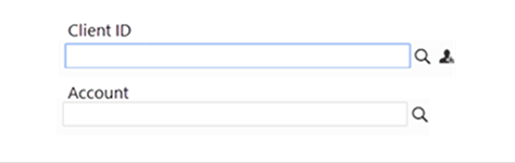
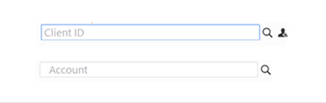
Avoid Using Placeholder Text in Form Fields
Add labels or instructions, as appropriate, for a better user experience. Provide clear labels for fields instead of putting placeholder text in fields, as shown in Figure 1. Placeholder text is usually low contrast and harder to read, as shown in Figure 2. Plus, it disappears when a user clicks a field, and the user might not remember what to fill in. Screen readers usually skip non-label text, which could present problems to users with vision impairments.
Figure 1—Fields with labels Figure 2—Placeholder text in fields
Do Not Refer to the Positions of UI Elements
Don’t write directions in a way that assumes the user can see the screen. This would detract from the experience of visually impaired users. Instead refer to the containing UI element by name.
Do: Select an option on the Console menu.
Don’t: Select an option from the Console menu in the upper-right corner.
Conduct Research
Before you start writing the text for a user interface, always conduct user research to ascertain the terminology of an application’s users. Also, do a comparative review of similar applications to learn what labels, terms, and messages they use. There is no point in reinventing the wheel when there are already established industry norms. Use existing standards rather than inventing terms that would be unfamiliar to users. Performing such research helps you to construct user-friendly UI text. Users enjoy using designs that meet their requirements and adhere to industry standards.
Conclusion
UX writing is an important and interesting aspect of UX design. Designers should give UI text the same importance as UI images because text has a big impact on users. A user interface whose language is difficult to comprehend discourages users from using an application. Every element in a UI design should have a purpose and make it easy for users to understand and navigate a user interface.
Punam has been active in the field of technical communication for more than 13 years, as a writer, Help author, usability analyst, and certified ScrumMaster. She is passionate about learning new technologies and improving existing systems within organizations. She has received recognition for her quality-driven, customer-centric approach to creating documentation. She teaches the principles and techniques of technical communication, writes articles, and shares her learnings at various conferences. Punam holds a Master’s degree in Information Technology. Read More
As an experienced technical writer, Samiksha has skillfully developed comprehensive documentation across diverse industries, including service and operations management, telecommunications, media and entertainment, banking and financial services, and healthcare. With a Master’s degree in Computer Science, Samiksha not only possesses a deep understanding of technology but also possesses the ability to effectively communicate intricate details to both technical and nontechnical stakeholders. Beyond her professional endeavors, Samiksha is an avid trekker and passionate traveller, seeking adventure and exploring new horizons whenever possible. Read More