Top

Choosing the Right Search Results Page Layout: Make the Most of Your Width

Search Matters

Creating the ultimate finding experience

A column by Greg Nudelman
March 9, 2009

Page layout forms the foundation in presenting search results. Your layout decisions for search results pages will have tremendous impact on the user experience for your entire site. Choosing the right width for search results is important, and the optimal width for search results may be a great deal narrower than some people using big monitors would believe.

To see for yourself the narrow divide between great and barely usable search results layouts, take a look at Figure 1, which shows the primary gateway to the Starbucks shopping area. When it comes to page layout, this Starbucks search results page shows very poor design choices. At a screen resolution of 800 x 600 pixels, most of what you see is the left margin of the layout and a large logo.

Champion Advertisement
Continue Reading…
Figure 1—Starbucks search results
Starbucks

Although there are many ways of using horizontal space on search results pages, we can generally distinguish between liquid and fixed-width layouts. Each style of layout offers a unique set of challenges and opportunities.

Using Liquid Layouts

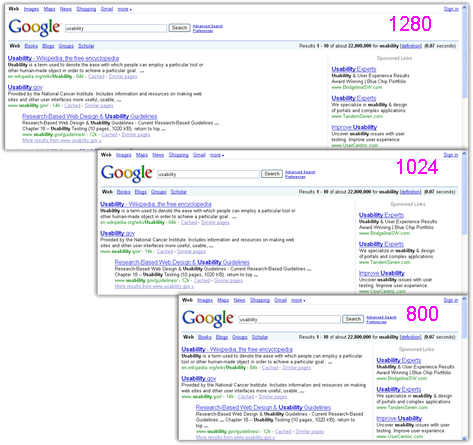
In a liquid layout, the width of the search results on a Web page shrinks and expands to fill the available space as a user changes the screen resolution or the width of the browser window. Not surprisingly, many top sites like Google utilize liquid layouts effectively to create top-notch user interfaces that perform well at any screen resolution or window width, as shown in Figure 2.

Figure 2—Google uses a liquid layout
Google

On search results pages, it really pays to spend the extra time optimizing your HTML and CSS so your search results flow into the available space. My recommendation: Always use a liquid layout for your search results pages. Unfortunately, very few sites follow this recommendation. Why? The reason I’ve heard cited most often is that liquid layouts are harder to achieve in such a way that the search results maintain visual consistency. The reality is that creating liquid layouts is not that difficult.

Unfortunately, most product managers do not see the value of investing in creating this functionality, and most designers don’t take the time to specify or even to consider how their search results would look at different screen resolutions or window widths.

This is really unfortunate, because I know of no better way of generating additional revenues from fairly simple HTML/CSS modifications. All search results pages on a Web site use the same basic HTML structure and CSS styles, so once you’ve optimized a liquid layout for your search results, all search results pages across your entire site should behave consistently across various screen resolutions and window sizes. Using a liquid layout is the best practice for search results pages.

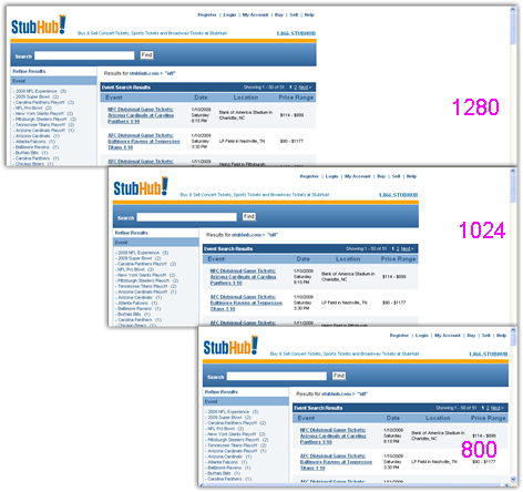
Using Fixed-Width Layouts

If, for any reason, a liquid layout is not feasible, the other option is to use a fixed-width layout, and the majority of consumer Web sites—including top ecommerce retailers Amazon and Staples—do exactly that. To use a fixed-width layout effectively, you must understand your audience well and be aware of the screen resolutions your customers use. One of the best examples of search results pages that have a fixed-width layout is on Staples.com, pictured in Figure 3.

Figure 3—Staples fixed-width layout
Staples

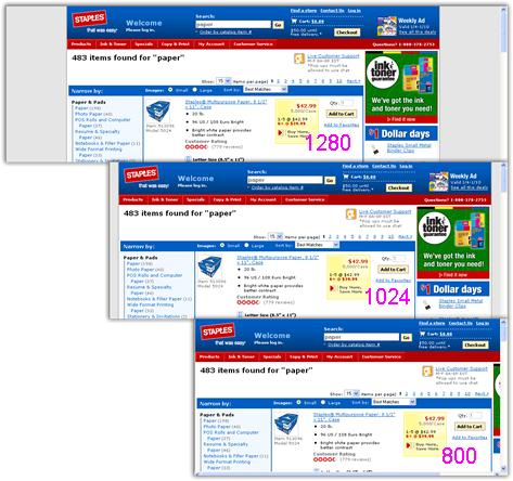
Many Staples.com customers work for large enterprises, which continue to use older desktop monitors or small notebook computers with an 800 x 600 resolution. As a result, the hardest working pages on the Staples.com site, the search results pages, are unapologetically optimized for the lowest common denominator—800 x 600 screens.

In addition to displaying search results, Staples wants to make sure the ads in the column on the right are visible to all customers. With a fairly extensive filtering system in a navigation bar on the left, you get one of the narrowest search results spaces on the Web. It’s only 560 pixels wide! This, of course, makes it necessary for each search result to comprise several lines to provide sufficient information for users to avoid unnecessary pogosticking—that is, successively clicking links to view item details, finding they’re not the right item, and returning to the search results page again and again.

Compare the narrow, fixed-width layout on Staples.com to the much wider search results layout on Amazon.com. As you can see in Figure 4, Amazon customers on 800 x 600 screen have to scroll from side to side quite a bit. Even customers using the most popular 1024 x 768 screen resolution have to scroll search results pages from side to side to see entire items!

Figure 4—Amazon requires horizontal scrolls
Amazon

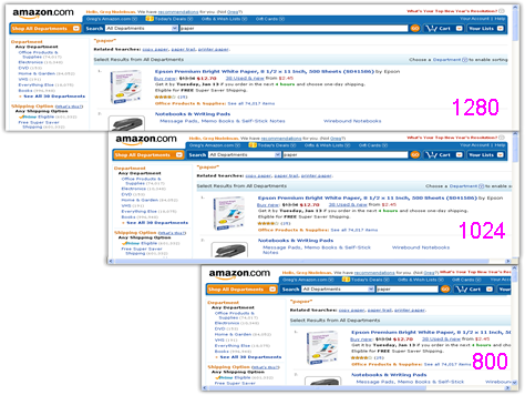
Horizontal scrolling results from the fact that Amazon.com affords a royal fixed width of 815 pixels for its search results—a whopping 45% more space than Staples! Partly as a result of using such a wide layout, Amazon results comprise fewer lines.

Why is this significant? At a 1024 x 768 screen resolution, Staples can display only three products, while Amazon can display four products—33% more. Having fewer search results on a page affects both the available showroom floor and the customer’s perception of the overall relevance of search results on a site.

Does this mean Amazon is better than Staples? Not necessarily. Both sites offer excellent potential for a great finding experience. However, the page-layout dimensions do indicate that each site’s fixed-width layout is optimized for their best customers—those that make the company most profitable. And, simply put, optimizing for your best customers is the best practice for a fixed-width search results page layout.

Optimizing for Your Best Customers

The take-away here is that only you and your customers can determine the best fixed-width layout for your site. If your site is like most ecommerce or content sites, the overall share of 800 x 600 page views is anywhere between 1 and 5%. Can you ignore these customers and optimize for higher resolutions? That depends on your business model.

If you are a content provider, you may want to ignore that 1%, because you get paid by page impressions. However, if you are a retailer, you may discover that those 800 x 600 page views are coming from large enterprise companies that buy often and in large bulk orders. So, that 1 to 5% of page views may actually be responsible for a whopping 5 to 20% of your sales! Thinking about optimizing revenues, it makes perfect sense that Staples has made its search results narrower, for 800 x 600 screens, while Amazon search results pages are wider, for screens with widths of 1280 pixels and above. Presumably, Amazon has discovered that their biggest profits come from affluent consumers who have wider screens with higher resolutions.

It’s really up to you what fixed-width layout you choose, but make sure the metric you use fits your revenue model and optimize for your most profitable customer base. Of course, you can alternatively do what Google does and choose to invest in a good liquid layout that is optimized at every screen resolution that is important for your customers.

Handling Margins in Fixed-Width Layouts

When choosing a page layout, it is important that you ensure your pages behave gracefully on all popular screen widths. Liquid layouts like that shown in Figure 2 are usually left aligned and handle extra width gracefully by increasing the white space between columns or increasing the width of the primary column on a page. Fixed-width layouts, on the other hand, are generally centered and absorb any extra space by adding neutral margins or panels at the left and right of a page’s fixed-width main content area.

For a usable, fixed-width search results layout, there are only two optimal choices: centered or left aligned. A centered layout, like the one on Staples.com, divides the extra space at the margins in half, as shown in Figure 3. In contrast, sites with left-aligned, fixed-width layouts—such as the StubHub Web site pictured in Figure 5—put all of the extra space on the right side of the screen.

Figure 5—StubHub has a single large white margin on the right
StubHub

At first glance, a left-aligned, fixed-width page layout might seem like a logical choice. The search results start at the upper left on each page, which seems desirable, because in the West, we read from the upper left to the lower right. However, in fixed-width layouts, the margin on the right quickly becomes disproportionately large in comparison to the rest of the page.

In my field research, I’ve observed people’s reactions to the large, empty spaces that appear on the right in fixed-width layouts. All that space devoid of content causes what I can only describe as pixel agoraphobia. When that space first opens up, people usually grimace and attempt to reduce the width of the window to remove some of the empty space. Most Windows users who have maximized their browser window do this by clicking the Restore Down button on the window title bar. This sometimes results in a window size that is too small for a site, so users must then adjust the window size manually. When your customers are busy fiddling with the width of the browser window, they’re not shopping or looking at ads on your site. In fact, they’re usually becoming more and more irritated—and that’s before they’ve even begun interacting with your Web site’s fabulous functionality!

In contrast, a centered layout—especially one that uses a neutral or darker color for its margins or side panels—divides the blank space into two halves, thus reducing the effect of pixel agoraphobia. So, if you insist on using a fixed-width layout, I generally recommend opting for a centered layout for your search results pages, with darker or neutral-colored side panels, especially if a significant percentage of your customers have wide, high-resolution screens.

In Summary

When deciding on the layout for your search results pages, clearly define the appropriate page behavior at all screen sizes your audience uses. Design your search results using a liquid layout if your visual treatment and level of technical expertise allow it. If you are forced to choose a fixed-width layout, be sure to study and understand the traffic and revenue metrics for different screen resolutions. A good middle-of-the-road solution is to make the main content area on your site 1003 pixels wide, so there is no horizontal scroll bar at the most popular 1024 x 768 screen resolution. If a large percentage of your customers use wider screens, opt for a centered layout for your search results pages, with darker or neutral-colored side panels. Whenever possible, do usability testing on your search results pages at the various screen sizes that are appropriate for your audience. 

Bibliography

Budd, Andy. CSS Mastery: Advanced Web Standards Solutions. London: Friends of ED, 2006.

Griffiths, Patrick. “Elastic Design.” HtmlDog, January 2003. Retrieved March 6, 2009.

Koblentz, Thierry. “One Clean HTML Markup, Many Layouts.” TKJDesign, October 2005. Retrieved March 6, 2009.

Olsson, Tommy. “Relatively Absolute.” AutisticCuckoo, December 2004. Retrieved March 6, 2009.

Shea, Dave. The Zen of CSS Design: Visual Enlightenment for the Web. Berkeley: Peachpit Press, 2005.

—— Zen Garden. Retrieved March 6, 2009.

Weakley, Russ. “Liquid Layouts the Easy Way.” MaxDesign, December 2003. Retrieved March 6, 2009.

Head of UX Research / Senior Director of User Experience

Principal at DesignCaffeine Inc.

Pleasanton, California, USA

Greg NudelmanFounder of the San Francisco Bay Area UX design consultancy DesignCaffeine, Greg is widely recognized as an experience design and user research expert, specializing in search, social networking, business dashboards, and process redesign for mobile and Web platforms. Greg has published over 30 articles and speaks regularly to audiences around the world about how to design intuitive and elegant systems that improve the quality of people’s lives while creating abundant ROI. He has led design projects for Fortune 500 companies and creative startups.  Read More

Other Columns by Greg Nudelman

Other Articles on UX Design

New on UXmatters