Top

Making $10,000 a Pixel: Optimizing Thumbnail Images in Search Results

Search Matters

Creating the ultimate finding experience

A column by Greg Nudelman
May 11, 2009

In search results, the old adage a picture is worth a thousand words rings true. When it comes to making your search results more efficient to use, more relevant, and more attractive, images reign supreme. There is simply nothing else on your search results pages that can come close to offering the same potential as thumbnail images for dramatically increasing your conversion rates and revenues.

While your Web site’s image requirements are likely unique, there are some common pitfalls you might encounter in using images in your search results. The good news is that you can easily avoid most of these mistakes with awareness and a little foresight.

Champion Advertisement
Continue Reading…

Best Practices for Thumbnail Images

Why do most Web sites use thumbnail images in search results? There are two very good reasons:

  • helping users identify relevant search results
  • reducing pogosticking—that is, customers’ bouncing back and forth between search results and the items at their links’ destinations

Research consistently shows that well-crafted images make excellent use of the limited screen real estate on search results pages and play a crucial role in providing the information scent people need to navigate search results effectively. Simply put, pictures sell content.

Are thumbnail images in search results appropriate for every Web application out there? Not by a long shot! The majority of the information on the Web is still text, and for text-based pages, it’s better to display search results as text-only summaries or keyword metadata. Some search results are just so varied, it’s difficult to predict whether a thumbnail image would be appropriate—as for Google Web search. However, if good thumbnail images would better communicate your search results’ relevance or make navigation easier, they’re worth including.

When including thumbnail images in search results, there are basically two layout choices:

  1. list view—flush left at the beginning of each search result
  2. gallery view—two or more images appearing side by side in each row on a page

While there are guidelines that are specific to each image layout, general best practices include the following:

  • Make thumbnail images big and juicy.
  • Include supporting text.
  • Go easy on the borders.
  • Keep the focus on the image content.
  • Help customers judge an item’s actual size.
  • Be creative in choosing informative images.

Let’s explore each of these best practices in more detail.

Make Thumbnail Images Big and Juicy

When search results pages feature thumbnail images, the key to their success is making sure the images are big enough to carry sufficient detail so customers can easily tell items apart. Unfortunately, most images on search results pages are way too small.

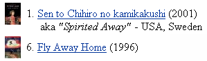
Book covers and the packaging for CDs and DVDs are basically marketing collateral that helps people tell items apart quickly. In addition to their title and the name of the author or artist, they usually carry rich clues about style, genre, intended audience, and likely content. To take full advantage of such rich image content, you have to choose an image size that’s big enough to get the job done. On IMDb, the images shown in Figure 1 are simply too small for anyone to be able to distinguish between “Spirited Away” and “Fly Away Home.” People can’t reliably tell these movies apart.

Figure 1—IMDb images are too small
IMDb

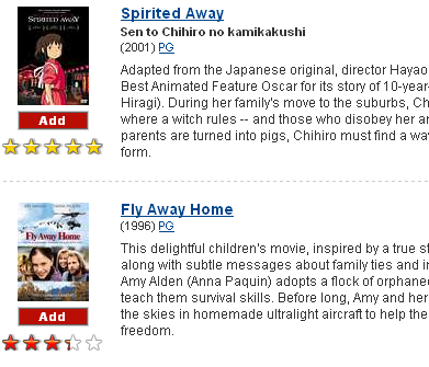
Contrast the small images on IMDb with the big, juicy images on Netflix. In Figure 2, can you tell which movie is about birds; which movie is in the style of a Japanese anime? Yes!

Figure 2—Big, juicy Netflix images
Netflix

If the items you are showing in search results are fairly large or have a lot of detail, you must make your images even larger. Unfortunately, most sites do exactly the opposite. Looking at Figure 3, we can guess, with some degree of certainty, that IronPlanet.com sells heavy industrial equipment.

Figure 3—Aggregate Screen versus Terex Telehandler
Aggregate Screen versus Terex Telehandler

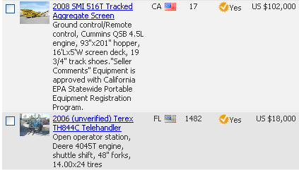
However, based on these pictures, can you tell what an Aggregate Screen is or how you might use one in your building project? Probably not. Then, what about a Terex Telehandler? Small images make it impossible to tell the two machines apart, much less enable customers to guess their functions.

Small thumbnail images are not just useless. My qualitative research makes a convincing argument that small thumbnail images are actively harmful to your customers’ search experience and very possibly your bottom line. If your images are too small, people waste a lot of time squinting and staring at the page, trying to squeeze some information out of the images. Ultimately, they fail to do so and end up clicking images anyway, at which point they realize they’ve clicked the wrong items. So, the consequence of overly small images is pogosticking, which wastes customers’ time, reduces their success in finding what they need, and on an ecommerce site, reduces revenues. Small images, therefore, act like false advertisements, teasing and frustrating your customers with what look like the right items, but actually are nothing of the sort.

Include Supporting Text

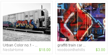
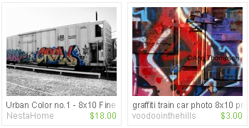
In some cases, thumbnail images contain the bulk of items’ information scent, so it makes perfect sense to use a gallery design like the one on Etsy. Just make sure you show enough supporting text to ensure customers can make sense of what a thumbnail image is portraying. In the example shown in Figure 4, without the item’s complete title, we just can’t tell whether Etsy is selling a photo, framed graffiti, or the entire scrumptious caboose.

Figure 4—What’s for sale at Etsy—Graffiti or Caboose?
Etsy gallery

To make matters even worse, titles sometimes seem to get cut off randomly. While including an ellipsis at the end of any cut-off text is a widely recognized best practice, it can eat up space that might have shown two or three more characters of a title instead. As shown in the redesign in Figure 5, good visual design can help improve the appearance of text when screen real estate is limited.

Figure 5—Fading out a title
Fading out a title

In this redesign, not only have I extended the title text all the way across the bottom of each photo, I have also used a fade-out effect instead of an ellipsis at the end of the text to indicate that the title’s full text is not visible, while making full use of the space. If a title exceeds a certain character count and must be cut off, you can easily achieve this fade-out effect by assigning different styles to the last two or three letters of the title, using progressively lighter colors for successive characters.

However, you can’t always count on visual design alone to bail you out. If the text of titles in your search results is consistently getting cut off, it might be time to consider an interaction design solution. For example, artists posting their items on Etsy could be alerted, if they exceed a certain character count, that their title would be cut off. Alternatively, it might be appropriate to have a short title for search results and an additional, longer description field for display on item detail pages. Finally, if a single line of text just does not provide enough information, search results can show several lines of text, as necessary.

Go Easy on the Borders

Most business people and designers have figured out that images with heavy borders do not convert as well as those surrounded by simple white space. In fact, I was hard pressed to find a good example of thumbnail images with heavy borders—though they were pretty common until just a few years ago.

I recommend removing borders completely as a best practice, using only white space to separate items on search results pages. If you absolutely must have thumbnail borders, in the words of Jennifer Stone, “go easy and, if you can’t go easy, go as easy as you can.” As Edward Tufte has so eloquently advocated, a very light gray border is usually okay and does not detract unduly from an image.

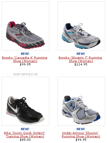
If you do use borders, be sure to center your images—both horizontally and vertically—within them. Otherwise, you might end up with a strange effect like that shown in Figure 6, which shows Nordstrom search results for shoes. On this page, each shoe appears to be perching on the bottom edge of its box, like a bird on a window sill. If the designers simply took away the borders, there would be no distracting perching effect.

Figure 6—Perched shoes on Nordstrom
Nordstrom

Keep the Focus on the Image Content

When showing thumbnail images on search results pages, strive to provide an actual, detailed picture of each item, and keep the images simple. While a small, light-gray drop shadow might be appropriate, it’s usually best to ignore the temptation to add funky backgrounds and distracting visual effects.

In search results, the primary goal of thumbnail images is to provide clear pictures of the items, so customers can determine which item to click. Anything that does not contribute to their success in reaching this goal simply does not belong in a thumbnail image.

Figure 7 shows two examples of thumbnail images from ecommmerce sites. On the left, an image from JCPenney’s Gift.com has a background that may distract shoppers from clicking Fit Flops, while the image from REI, on the right, provides powerful information scent with unadorned, high-quality images of a shoe shown at different angles. It’s hard to believe both thumbnails occupy virtually the same amount of screen real estate!

Figure 7—Fit Flops versus NorthFace Ultra Gore-Tex XCR
Fit Flops versus Northface

When REI took these pictures, they took the extra trouble to turn one of the shoes in such a way as to show its sole. This image is a great example of the effective use of real estate to improve an item’s information scent. As Jared Spool reported his CHI 2007 lecture, high-performance athletic shoes just plain sell better if the image shows the sole of the shoe, as well as the traditional side view. If it helps lead your customers to the right item, provide multiple views of each item if the image real estate allows it.

Help Customers to Judge an Item’s Actual Size

It’s very helpful to depict an item in a way that indicates its actual size. I have personally observed many people struggling with the purchase of a digital gadget online, because they were looking for something small that would fit in their pocket, but couldn’t judge size from the images. Unfortunately, most etailers do not make it easy to determine the size of gadgets based on their thumbnail pictures. For example, the search results from BestBuy, shown in Figure 8, feature two digital cameras of completely different sizes, but the two pictures do not convey this information.

Figure 8—Which camera is bigger?
BestBuy

Looking at the search results, there is simply no way to tell that the camera on the right would easily fit in a jeans pocket, but the one on the left would not fit in a large purse! Showing pictures of many similar-looking electronic gadgets without indicating their size tends to confuse people, who often walk away from the purchase saying, “These all look the same. I guess I just need to go to the store to hold them in my hand before I can decide.”

Fortunately, there is an easy way to solve this problem. In thumbnail images of products for which size does matter, show an item that has a known size—like a coin, a dollar bill, or a soft drink can—next to each item to make size comparisons easy. This will remove any confusion your customers might have about size and help them make the right purchase.

Be Creative in Choosing Informative Images

Sometimes, an actual image of an item is just not that helpful. Take bags of coffee beans, for example, as shown on the Pete’s search results page in Figure 9. Can you spot the difference between Sumatra and French roast? Probably not.

Figure 9—Can you tell the difference?
Pete's

In fact, each picture showing a generic coffee bean bag reveals hardly anything about the products. In this case, a map of a coffee-growing region, a close-up of a single bean, or even a Tufte-style, color bar graph of flavors, sweetness, color, and acidity might do a better job of reducing the amount of navigation it takes to find the right item. So, if literal images don’t work, go ahead—get creative!

In Summary

When considering your thumbnail image strategy for search results pages, always keep in mind that the purpose of your images is two-fold:

  • improving search results’ relevance
  • reducing pogosticking

To optimize your use of pixels for images, provide images that are big enough so customers can easily tell items apart, while balancing image size against space for text elements. Keep your visual treatment of images simple, avoiding borders, backgrounds, and other non-information-carrying elements. If size is an important factor in comparing products in search results, incorporate a standard-size object in images, so customers can judge the products’ relative sizes. Finally, if literal images of items are not helpful, think of creative ways in which images can communicate relevance and help customers tell items apart.

Of all the elements on a search results page, thumbnail images are your most valuable real estate. If you give thumbnail images the attention they deserve and optimize them in all the ways this column has suggested, your images can really be worth $10,000 a pixel—or at the very least, a thousand words! 

References

Armitage, Linda H., Enser, Peter G.B. “Analysis of User Need in Image Archives.” Journal of Information Science, Volume 23, Number 4, 1997.

Fogarty, James, Desney Tan, Ashish Kapoor, and Simon Winder. “CueFlik: Interactive Concept Learning in Image Search.” PDF Proceedings of the SIGCHI Conference on Human Factors in Computing Systems CHI 2008, Florence, Italy, 2008.

Hu, Jianying, and Amit Bagga. “Categorizing Images in Web Documents.” IEEE MultiMedia, Volume 11, Issue 1, January–March 2004.

Lam, Heidi, and Patrick Baudisch. “Summary Thumbnails: Readable Overviews for Small Screen Web Browsers.” PDF Proceedings of the SIGCHI Conference on Human Factors in Computing Systems CHI 2005, Portland, OR, USA, 2005.

Maekawa, Takuya, Takahiro Hara, and Shojiro Nishio. “Image Classification for Mobile Web Browsing.” PDF Proceedings of WWW 2006, Edinburgh, Scotland, 2006.

Miller, Andrew D., and W. Keith Edwards. “Give and Take: A Study of Consumer Photo-Sharing Culture and Practice.” PDF Proceedings of the SIGCHI Conference on Human Factors in Computing Systems CHI 2007, San Jose, CA, USA 2007.

Vaughan, Misha W., and Marc L. Resnick. “Best Practices and Future Visions for Search User Interfaces.” PDF Journal of the American Society for Information Science and Technology, Volume 57, Number 6, April 2006.

Woodruff, Allison, Andrew Faulring, Ruth Rosenholtz, Julie Morrison, and Peter Pirolli. “Using Thumbnails to Search the Web.” PDF Proceedings of the SIGCHI Conference on Human Factors in Computing Systems CHI 2001, The Hague, The Netherlands, 2001.

Woodruff, Allison, Ruth Rosenholtz, Julie B. Morrison, Andrew Faulring, and Peter Pirolli. “A Comparison of the Use of Text Summaries, Plain Thumbnails, and Enhanced Thumbnails for Web Search Tasks.” PDF Journal of the American Society for Information Science and Technology, Volume 53, Number 2, January 2002.

Head of UX Research / Senior Director of User Experience

Principal at DesignCaffeine Inc.

Pleasanton, California, USA

Greg NudelmanFounder of the San Francisco Bay Area UX design consultancy DesignCaffeine, Greg is widely recognized as an experience design and user research expert, specializing in search, social networking, business dashboards, and process redesign for mobile and Web platforms. Greg has published over 30 articles and speaks regularly to audiences around the world about how to design intuitive and elegant systems that improve the quality of people’s lives while creating abundant ROI. He has led design projects for Fortune 500 companies and creative startups.  Read More

Other Columns by Greg Nudelman

Other Articles on UX Design

New on UXmatters