Top

Designing Tables 101

User Assistance

Putting Help in context

A column by Mike Hughes
September 21, 2009

Tables get a bad rap—especially in the Web world where, once upon a time, Web developers misused them for HTML layout. But tables are still very useful for the purpose for which they were originally intended—a way to show relationships among discrete data points. From a user assistance perspective, we deal with tables in two contexts:

  1. user assistance—Tables can present information or instructions in our documentation.
  2. user interfaces—Tables can display information within a user interface itself.

In this column, I’ll review some of the basic principles of good table design from an information developer’s perspective, then discuss their visual design and interactivity. These principles and my examples provide the bare essentials of table design. When designing tables, a key information design objective is keeping them simple, so if you start needing more than this column provides, you might be making things unnecessarily complicated for your users.

Champion Advertisement
Continue Reading…

The Structure

A table is a two-dimensional array in which data appears in cells, taking its context from the intersection of a column and a row. The spatial orientation and placement of the data encodes the information. Thus, you should be aware that tables can present potential accessibility problems. While adaptive technologies can process simple tables that have been properly coded, complex tables can be a barrier to sight-impaired users if they are not implemented correctly—even if they are well designed like the examples I’ve shown in this column. Seek the advice of an accessibility expert when putting complex tables into an application or user assistance document.

Figure 1—Basic table
Basic table

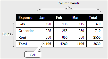
Figure 1 illustrates the essential components of a table. Each cell’s data takes its meaning from its respective row stub and column head. For example, the captioned Cell indicates that the rent for January was $850. In instances where every cell has the same unit of measure—dollars for example in Figure 1—each row and each column could have its own total. In the case of Figure 1, this makes it easy to see both the total amount spent on rent and total expenses for January.

The first decision an information developer must make is which items should go into the columns and which should go into the rows. A general guideline: Let users compare like items by scanning horizontally across a row and aggregate unlike items by scanning vertically down a column.

Note—Reference tables, which I’ll discuss later in this column, are an exception to this guideline.

Figure 2 shows a table that compares the attributes of three different candidates for a job opportunity. It follows users’ natural instinct to compare specific attributes for candidates by scanning horizontally. It also lets users get a summary of each candidate’s attributes by scanning vertically down a column.

Figure 2—Columns and rows in their preferred configuration
Preferred columns and rows

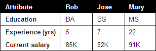
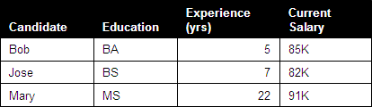
Figure 3 does not follow this natural layout. Most readers would find the configuration of the table in Figure 2 easier to process than that of the table in Figure 3.

Figure 3—Columns and rows in an awkward configuration
Awkward columns and rows

To accommodate physical display limitations, you might, in some cases, have to make exceptions to this guideline. For example, if there were 20 job candidates to compare and contrast, but only three criteria, you should probably place the job candidates in the stubs and the criteria in the column heads. When displaying data online, you have to be especially sensitive to any layout that would force horizontal scrolling.

Managing Complexity

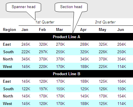
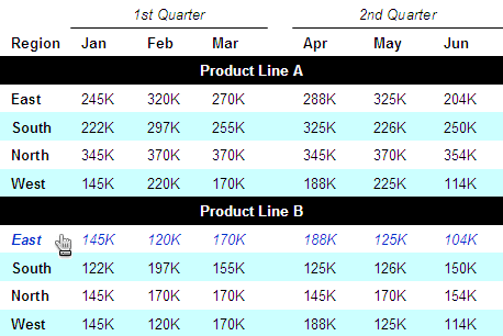
Tabular data can get complex, and a table can contain several stories, with subplots occurring at once. The example table in Figure 4 presents sales information by month, by region, by quarter, and by product line, resulting in a so-called zebra table that has both spanner heads and section heads.

Figure 4—Zebra table with spanner heads and section heads
Zebra table

Let’s take a detailed look at how the table shown in Figure 4 handles such complexity by using the following:

  • minimalist lines—To reduce visual complexity, I’ve removed all cell borders, including the table’s exterior border. Alignment and white space adequately communicate the columnar and row associations. Notice, though, that the spanner heads use lines to clarify what columns are under them.
  • zebra shading—To help users’ eyes scan data across a row and reduce tracking errors—which occur when their eyes wander to an adjacent row—I’ve shaded alternate rows. Visual designers sometimes call this kind of table a zebra table. You can apply shading to columns instead of rows, but shading rows is more common.
  • spanner head—A spanner head groups columns together. In Figure 4, spanner heads group and identify information by quarter, and white space separates the quarters.
  • section head—Section heads divide a table into multiple tables, so to speak. However, you should use them only if the column headings do not change. It would be confusing, for example, if the months for Product Line B were different from the months for Product Line A.

Types of Tables in User Assistance

Because tables can clarify communication, there are many opportunities for their use in user assistance. Next, I’ll give a few examples of different types of tables and some guidelines for using them effectively.

Reference Table

The purpose of a reference table is to help users find relevant data for a specific item—called the look-up value. Make sure look-up values appear in the first column, and be consistent in what information you provide for each item. Figure 5 shows a reference table.

Figure 5—Reference table
Reference table

Comparison Table

In user assistance, comparison tables help users understand and make complex, informed choices when a user interface presents a fixed set of options. Remember to lay out comparison tables so users can compare the features of different items by scanning horizontally and get an aggregated description by scanning vertically. Figure 6 shows a comparison table.

Figure 6—Comparison table
Comparison table

Choice Table

A choice table provides an efficient way of giving instructions within a procedure when a user interface presents users with an array of check boxes or radio buttons or options in drop-down lists. It is much more important to define what each option does and give users tips regarding the different options rather than to tell users how to interact with the controls. For example, when describing an option in a drop-down list, there is no need to say, Select Any to apply the rule to any IP address. Users already know how to interact with drop-down lists, and such instructions would result in the dull repetition of the word select in the description of each option. In this case, it is better just to describe what an option does, not what users do. Figure 7 shows a choice table.

Figure 7—Choice table
Choice table

Techniques for Tables in User Interfaces

User interfaces often include tables, which can accommodate user interactions with the data they contain. The following techniques for tables in user interfaces take advantage of interactivity to communicate more effectively with users. While this discussion does not go into implementation details, it does inform information developers about the various techniques that are available. To ensure the best user experience, rely on interaction designers if a user interface includes interactive tables, and check with accessibility experts when presenting complex tables.

Table Row Hover (tr: hover)

If you are using CSS to define table presentation attributes, you can use the tr: hover effect to change row attributes when a user points to a row. This is another technique to help users scan across a row, without accidentally wandering into an adjacent row. You may encounter browser limitations, so use this effect with caution, and do not rely on it alone. Figure 8 shows how a table might look if a user hovered over the East region row for Product Line B. Notice that font color and style have changed. You could change any <tr> or <td> attributes.

Figure 8—Table using the tr:hover effect
Table row hover

Expand Data on Demand

You can simplify complex tables by using progressive disclosure techniques that let users control how much detail they’re viewing at a time. Here are just a few progressive disclosure techniques for tables:

  • hover text—Use hover text inlays or overlays to provide expanded detail about a cell.
  • expanded text—Let users expand and collapse text within a cell.
  • master/detail—Provide a link on each row that opens a secondary window, containing more columns or details than appear in the primary table.

Allow Inline Editing

If a table contains data users can edit, it’s usually best let them edit individual cells without having to open a secondary window. However, a separate editing window might be better if you have to enforce complex business or formatting rules for the data.

Keep Column Heads in View

Don’t let column heads scroll out of view. This is especially important with tables that have lots of columns. Otherwise, users cannot keep track of what columns contain what data.

Paginate Results

When designing very large tables, you should break them up into pages. In addition to reducing download times, providing table data in manageable chunks makes it easier to process the data.

Allow Filtering and Sorting

In general, you should let users filter and sort data by any of the columns in a table. Allowing users to define filters before downloading a large table improves response time and makes the data easier to process.

Conclusion

Tables can simplify the display of data. They should never make data appear more complicated. A modest use of devices like spanner heads or section heads can simplify otherwise complex relationships. Interactivity can enhance users’ ability to quickly get to relevant information in a table, but if overdone, can add unnecessary layers of complexity. Remember that a table essentially tells a story. Keep it simple, and tell it in the most direct way you can. 

UX Designer at TSYS

Atlanta, Georgia, USA

Mike HughesIn his role as User Experience Architect for IBM Security, Mike’s professional focus is on designing usable user interfaces that accommodate the user as learner. Previously, as User Assistance Architect at IBM, Mike identified tools, methods, and standards for integrating the content and delivery of user assistance, including documentation, Help, elearning, and training. He was formerly Lead UX Designer for CheckFree Corporation, where he instituted their User Experience Research and Design Center. Mike has a PhD in Instructional Technology from the University of Georgia and a Masters in Technical and Professional Communication from Southern Polytechnic State University. He is a Fellow with the Society for Technical Communication and a Certified Performance Technologist through the International Society for Performance Improvement.  Read More

Other Columns by Mike Hughes

Other Articles on User Assistance Design

New on UXmatters