You put your left foot in,
You put your left foot out;
You put your left foot in,
And you shake it all about.
You do the Hokey-Pokey,
And you turn yourself around.
That’s what it’s all about!
And so on…
I am a klutz. I fully admit this fact. So, whenever I’m in a show that requires me to learn any kind of choreography, whether dancing, fighting, or intricate movement details, I start to feel butterflies flutter in my stomach. My own nervousness has been known to get in the way and cause me to stumble. I would probably be fine if I could just learn to relax and go with the flow. But the language of choreography and movement is confusing to me. I just don’t get what I should do. Even as a kid, I always hated that silly game Hokey-Pokey. Case in point: I was in the middle of a reasonably simple dance in a show. We were performing outside, on the grass, and I was so worried about ruts or rocks in the ground that I wasn’t paying attention to everything else. One of my shoes went flying off! Horribly embarrassing! Though I’m sure only the people in the front of the audience even noticed. Did I mention I’m a klutz?
Champion Advertisement
Continue Reading…
As a User Experience Designer, there have been moments on projects when I’ve had similar feelings of ineptitude—usually when I’ve been faced with a large, complex system or some completely new and foreign domain I didn’t understand. Have you ever experienced an awkward moment as you’ve tried to figuratively dance and negotiate your way through an uncomfortable situation? This often brings fear of making a decision or taking a step forward along with it—maybe even some shoe-flying moments. A recent acting class, in which I learned what Laban Movement Analysis is all about, helped me find a way to get past this fear. When people say knowledge is power, they are most assuredly correct.
Laban Movement Analysis and User Experience Design
Laban Movement Analysis provides a language for notating and documenting physical movement—mostly for dance choreography, but in acting as well. Its purpose is to document specific movements in dance. There are three aspects of Laban Movement Analysis that my experience and research tell me have some interesting implications for UX design:
Effort Actions—which categorize the ways people perform actions and their intentions, based on weight, time, space, and flow
Body—which connects the structure and physical characteristics of the body in motion and how they interact
Shape—which describes the ways in which the body changes shape during movement, in relationship to the environment in which motion takes place
In this column, I’d like to explore the application of these three aspects of Laban Movement Analysis to UX design. Hopefully, you’ll see, as I did, the relevance these concepts have to the idea of a shared language for talking about physical and gut-response design. By thinking about and articulating some of the more physical aspects of a user experience and how they connect with user intent, you can create innovative, successful, intuitive designs for users.
Effort and Effort Actions
One way Laban categorizes movement is by elements of Effort or Dynamics, which take into account the way a person performs an action and his or her intention in doing so. Why are these two aspects so important? Because the difference between punching someone in anger and reaching for a glass to take a drink isn’t all that different mechanically—both rely on extending an arm—but a person’s intention affects the strength of the movement, the degree of control over the movement, and the timing of the movement, which are very different in these two cases. Intention makes all the difference. You wouldn’t punch your drink would you?
These dynamic qualities of movement help us to understand how movement reveals the actor’s attitude—which may not be conscious—toward
thinking
feeling
sensing
intuiting
Effort has four factors—each having two polarities—as follows:
space—thinking, attention, where
indirect—all around awareness
direct—focused and specific
time—intuition, decision, when
sustained—leisurely, continuous, lingering
sudden—unexpected, isolated, surprising
weight—sensing, intention, what
light—delicate, sensitive, easy intention
strong—bold, forceful, determined intention
flow—feeling, progression, how
free—going with the flow
bound—contained and inward
There are eight different combinations of these factors that make up Effort Actions, which combine the factors of space, time, and weight. (See Table 1.) Flow is a constant across all actions. One amazing thing about Effort Actions is that, when you read them, you can understand what they are implicitly. Nobody has to explain Dab to you, do they? These are all things we can connect with on a physical and intuitive level. I’m sure you know the feeling of Dab without thinking about it. Thus, Effort Actions give us a common language everyone understands for talking about a user experience we want to create. We can also help match an appropriate action to an intent if we understand what elements make up a particular Effort Action.
Table 1—The eight Effort Actions
Effort Action
Space
Time
Weight
Flow
Glide
Direct
Slow
Light
Free
Slash
Indirect
Fast
Strong
Free
Press
Direct
Slow
Strong
Bound
Flick
Indirect
Fast
Light
Free
Punch
Direct
Fast
Strong
Bound
Float
Indirect
Slow
Light
Free
Dab
Direct
Fast
Light
Bound
Wring
Indirect
Slow
Strong
Bound
Not only can the use of Effort Actions help a team talk about a design as they envision, design, and develop it; it can help ensure that the design you create is clear, articulate, and intuitive, as well as fun and engaging for users. The iPhone is a perfect example of the good use of Effort Actions. This is part of why people get such a rush when using it. The iPhone captures us on more than just a functional level. It engages us both physically and emotionally. This, when you get down to it, is the essence of innovative design, right?
While I could write a whole article on just Effort Actions and the iPhone, I’ll refrain and give only three examples of how the iPhone has achieved great interaction design through Effort Actions and successful innovation.
The first example I want to talk about is the Effort
Action named Glide. The smooth interaction of unlocking the iPhone is quite clearly Glide—though they call it slide. (See Figure 1.) I would argue they didn’t even need to add the words slide to unlock in the user interface. Everything about the visual affordance begs you to do just that. The action is focused, easy, and isolated. Everything you would want unlocking to be. It meets the intention and the actualization of that intention.
Figure 1—Glide, or slide to unlock, on the iPhone
Another Effort Action the iPhone has implemented well is Press. Moving applications around on your iPhone provides an example of Press. (See Figure 2.) This interaction is focused, continuous—until you’re finished—and has a determined intention. Just as we think about pushing furniture around in a room, pressing to move our applications on the iPhone is an interaction that matches our intent and expectations.
Figure 2—Moving applications on the iPhone provides an example of pressing
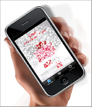
The iPhone has also implemented something that, in essence, is a series of connected, little Flicks, and that is shaking. (See Figure 3.) This Effort Action occurs in situations where you can shake the iPhone to get something to happen. For example, in my GPS application, shaking undoes my last action. I would agree that, in some ways, this works, because I can remember the Etch A Sketch® I loved as a kid, which used shaking to erase a picture. But this totally unexpected result also surprised me. I had not intended to undo anything the first time I noticed this functionality. I was merely holding the phone in my hand while talking.
So, this shaking interaction isn’t quite as intuitive as some of the others on the iPhone, because it starts to blur the boundaries of a truly definitive Effort Action. If you want a function to be intuitive and natural, its boundaries must be distinct, not mushy. I think the problem lies in judging whether shaking is truly the right Effort Action for a user’s intent. Flick should be an isolated or sudden action within a particular context—something that makes it easy to divine intention. However, I don’t believe undoing is that easy an intention to express. We must consider the possible disconnects between a user’s intent, the user interface, and the actual physical gesture an interaction requires. Perhaps the correct Effort Action for undo would be Slash.
Figure 3—Shaking an iPhone (From Adweek, December 2008)
Even if there are still a few bugs to work out, what I find interesting is that the iPhone is using multiple Effort Actions in its design, not just one. By using multiple Effort Actions, the designers of the iPhone can match movement to user intent, then use whatever Effort Action is appropriate for a particular situation without worrying about being consistent across different intents and functions. More important, this approach seems to be working for people. When designers make clear and decisive choices, users can understand and are delighted by how easy interactions are. Connecting some of these physical and emotional metaphors for movement to function would be engaging and fun for users.
Actual, physical interactions aren’t the only things to consider. They just have the most literal interpretations. I have just begun to translate these ideas into an experience design and explore how it should feel. In Table 2, I’ll present my initial ideas about what a UX design using Effort Actions might look like, showing how the user experience would feel to users.
Table 2—Examples of proposed Effort Actions in UX design
Effort Action
User Experience Design Examples
Benefit
Glide
Navigating on supercook.com
Provides smooth transitions between elements and selections.
Slash
Creating a Genius mix on iTunes or Pandora
Lets you swipe through a collection of music.
Press
Creating and navigating taxonomies
Lets you create sets and restricts movement.
Flick
Using Image Spark
Lets you quickly flip through images and set the layout to something other than a grid. Feels more like you have just flicked the images down.
Punch
1-Click Ordering on Amazon
Lets you take a quick and definitive action—that you can’t take back.
Float
Creating a tag cloud
Doesn’t pre-determine navigation.
Dab
Adding a purchase to your cart on an ecommerce site
Says I’m not completely committed to something yet, but am touching it.
Wring
Wading through posts on Craigslist
Forces indiscriminate and tedious browsing.
Body
In Laban, Body describes the structural and physical characteristics of the human body in motion. This aspect of Movement Analysis describes what body parts are moving, how they are connected to other parts, and how they influence each other. This is easy to understand if you think about a baseball player who is a switch hitter. How is it different for him to swing from the right or the left? Where does the movement start? How does the swing affect not only his arms, but his back, legs, and the rest of his body? How does the movement flow between the different parts of his body?
More generally, some helpful ways in which you can think about Body and answer those questions are:
Where does the movement initiate—in what specific body parts?
How do the different body parts connect to each other?
What is the sequence of movement between different parts of the body?
What are the patterns of body organization and connectivity?
If we can answer these questions, it allows us to understand the overall system—or a set of systems working together—that is, how the system actually achieves the movement and how different things impact each other. Any good designer surely thinks about these things. I’m sure this all sounds quite familiar, even when I describe it in terms of UX design. (See Table 3.) The implications of thinking on this level are that a design becomes a coherent, coordinated, holistic system that contains all the necessary functionality to meet users’ needs and intents.
Table 3—Body and UX design
Body
UX Design
Implications
Initiation of movement from specific body parts
User stories and scenarios
Understanding users’ intents and pathways
Connections between different body parts
Flowcharts or site maps of an entire system or structure
Getting an overall picture of how everything hangs together
Sequencing of movement between parts of the body
Workflows or tasks requiring movement through the system
Accounting for all necessary functions
Patterns of body organization and connectivity
Design patterns
Understanding the repeatable and reusable structures and functions
Shape
The aspect of Shape describes how the body changes shape during movement and has factors such as mode or quality. Mode can be about the direction or flow of a shape change—whether for some kind of organic movement or a habitual gesture like shrugging your shoulders. Quality is about the way something is moving. For example, is it contracting, expanding, or rising?
This makes me think about rich interactions, or what we often call Web 2.0 interactions. When designers think about these new capabilities in Web design, we typically focus on the actual affordances—an overlay or a carousel or sliders. But it seems we rarely think about the transitions before and after interactions.
For a good example of transitions, go to google.com, then move your mouse and watch how smoothly features on the page advance into focus. It’s so clean; you almost don’t even notice it happening. Until you show your intent to actually do something, the site doesn’t throw the functionality in your face.
There is more to designing rich interactions than just deciding you want to include a particular interaction. You need to think about how users experience the transitions before and after an interaction. If we throw too much at users without considering how we should use these technological capabilities, we run the risk of overwhelming users and creating a bad user experience.
I’m Ready to Put My Whole Body In
My partner in that shoe-flying dance I described earlier was gracious enough to recover my shoe for me and even put it back on my foot. We carried on with the dance, and thankfully, my shoe stayed firmly on my foot throughout the rest of the performance. But I’ve now learned that the language of movement isn’t really all that confusing if you have a clear way to articulate it and set people’s expectations. Understanding the different ways of thinking about and categorizing movement has helped me realize there is actually some method to what had previously seemed like madness to me. Breaking movement down into intentions, factors, and overall structure has given me a way to calm my butterflies and move forward gracefully. Maybe thinking about UX design in the same way can help us to articulate our designs better and create even more innovative and intuitive products.
You appear to have the impression that Laban effort names are intuitive categories. They are not really. For example, you say that moving iPhone icons is pressing, but pressing is a direct effort and moving icons is usually an indirect effort. This is counterintuitive because it seems obvious that the user is pressing the screen.
The actual effort used for moving icons is strong, sustained, and flexible: wring.
Also, the slide to unlock might start as a glide, but every iPhone user will soon use a direct, fast, and light movement: a dab. The transition from glide to dab comes from the speed of confidence. This offers an interesting insight into UX that is good for both the uncertain and the confident user. Actions should accommodate both a sustained effort and its closely akin sudden effort.
A fantastic article, though, with fascinating interdisciplinary analysis! Thank you!
This is a very informative article. Thank you for posting your analysis and comparison.
I am in the process of getting my CMA in LMA and found the information quite helpful with my research and in introducing LMA to my students. Most of them own iPhones anyway, so this will be an awesome example.
With over fifteen years of experience as an interaction designer and user researcher, focusing on user-centered design methods, Traci has experienced a broad range of work practices. After ten years of consulting, Traci transitioned to working on staff with product teams at companies such as Avid and Oracle. Through her UXmatters column, Dramatic Impact, Traci shares how she infuses aspects of theatrical theory and practice into her design practice to bring a more empathetic, user-centered focus to her work. Traci holds an M.A. in Theater Education from Emerson and a B.S. in Communications Media from Fitchburg State College. She is a member of the Boston chapters of UXPA and IxDA and has spoken at conferences such as the IA Summit and Big Design. She is also a nominee for the 2016 New Hampshire Theatre Awards in the best supporting actress category. Read More