Faceted search has been around for a long time and has become the de facto standard for search on most ecommerce sites. However, filters with numeric values remain among the most confusing, because many sites have not been able to design usable numeric filters that people can use in an intuitive manner. Recently, powerful user interface controls called sliders have become all the rage for specifying numeric attributes in finding user interfaces. Unfortunately, in their rush to implement this latest, greatest feature, many companies have not designed easy-to-use sliders. Rather than solving usability problems, poorly designed sliders create even more issues around numeric filter usability. In my experience, the following three usability issues surface most often with numeric filters:
representing discrete values for aspects as sets of ranges
inadvertently emphasizing overly constrained filter states
being parsimonious with inventory information
In this column, I’ll examine each of these issues and present the best practices that solve these problems.
Champion Advertisement
Continue Reading…
Representing Discrete Values for Aspects as Sets of Ranges
One of the most common pitfalls with numeric aspect filters is their representing discrete values as sets of ranges. What makes a filter value discrete? Certain types of products typically have widely recognized, discrete values—for example, a digital camera might have a 10MP resolution and a lens with 3X zoom—which can often consist of either whole numbers or fractions. These discrete values tend to be consistent across competing brands and models and rarely change from one vendor to the next.
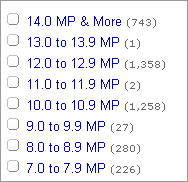
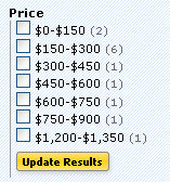
Many sites offering faceted search do not present discrete numeric values for aspect filters in the most useful fashion. Designers are often tempted to present such values to customers as sets of ranges. Presenting discrete filter values as a set of ranges typically results in a user interface similar to that in Figure 1, showing a camera-resolution filter on a major ecommerce site.
Figure 1—Camera-resolution filter with values presented as a set of ranges
My usability studies have shown that many people have trouble finding 10MP within a 9.9MP-11.9MP range and applying the filter correctly. The problem is a mental model mismatch. People don’t think of 10MP as falling within some range. When customers look for discrete values in aspect filters, they are most often looking for a specific value—for example, 10MP—that forms a critical part of the information scent. Most people typically think of a camera resolution as a specific value—not as a numeric value within some range.
When users try to look for the value 10MP within a range, usability problems arise, because the resolutions 9.9MP and 11.9MP simply do not exist as discrete values. While, numerically, it is true that 10MP lies within a 9.9MP-11.9MP range, this range has very poor information scent and requires additional thinking and interpretation on the part of users, which does not make for intuitive and efficient finding. Having to think hard just to find something causes problems for users.
In my user research, I have often observed that people who are in a rush, distracted, or simply not that great at working with fractions in math often select the wrong range of discrete values, wonder why they are not getting the results they expected, get frustrated, and quickly leave a site to navigate to a more usable one.
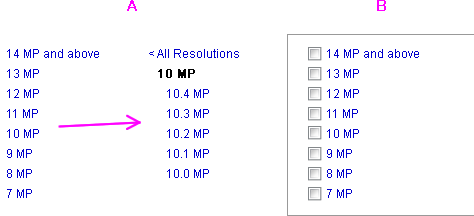
Instead of providing ranges, it is much more effective to present lists of discrete values, showing all of the possible values for an aspect filter. If doing this results in a filter with too many options, simply rounding off the value to around 10MP works very well, as shown in Figure 2. (Note that the word around is usually implied. Although it sometimes shows up in a short form such as ~10MP or 10+MP. However, this extra precision is usually unnecessary, as I will explain in a future column.)
Figure 2—Recommended redesign of camera-resolution filter
When a customer clicks a link representing a discrete value, one option is to expand a list of subvalues—for example, clicking an around 10MP link would show all of the available subvalues: 10.0MP, 10.2MP, 10.3MP, 10.4MP, as shown in Figure 2A. Should you bother designing and implementing this? Usually not. Unless your customers are professionals who might be looking for a particular value, they typically would not drill down past the around 10MP link. Is there really that much difference between digital-camera resolutions of 10.2MP and 10.3MP to a typical consumer? So, unless your company’s inventory is extremely large or you have a very specialized clientele, it is often much more useful to present an approximate value like 10MP.
Should you support single or multiple selection for displaying discrete filter values? The answer is always: It depends. Up until a few years ago, guidelines generally recommended the simplicity of single-selection links for discrete values. Today, however, I highly recommend that my clients implement multiple selection for discrete filter values—provided the finding user interface also supports multiple selection. Mark Burrell of Endeca echoed this sentiment in the 2010 UIE Webinar, “Leveraging Search & Discovery Patterns for Great Online Experiences,” in which he emphasized that most ecommerce customers no longer find multiple selection hard to use and prefer the flexibility it offers.
Numeric Sliders for Filters
Numeric sliders have recently become the rage for faceted search. Sliders can add a touch of interactive fun to what many business people refer to as a boring finding interface. Note that boring user interfaces usually work extremely well, because they are intuitive and easy to use, and UX powerhouses like Amazon and Netflix do quite well without any sliders whatsoever.
That said, sliders can be helpful in some applications, because they give people tremendous filtering power when they are implemented correctly. With great power, however, comes great responsibility: Sliders deserve special consideration from designers—precisely because they make it so easy for your customers to screw up and overconstrain their queries, leading to search results that are either incorrect or of poor quality. This, in turn, results in frustrated customers who leave your Web site quickly without buying anything. The two issues I see most often with sliders are:
inadvertently emphasizing overconstrained filter states
being parsimonious with inventory information
Let’s take a closer look at each of these issues and what we can do about them.
Issue: Inadvertently Emphasizing Overconstrained Filter States
To examine the issue of overconstrained filter states, let’s take a look at an example—the slider rating control on TripAdvisor, shown in Figure 3. Ratings seem deceptively simple, yet raise a host of usability issues when they are implemented incorrectly.
Figure 3—Slider rating control on TripAdvisor
TripAdvisor has implemented ratings using a double slider control, which presents a perfect example of inadvertently emphasizing overconstrained filter states. This double slider control allows a wide variety of ranges—some of which are much more useful than others when it comes to finding particular items or content of interest. For example, rating ranges spanning only a single star—such as 0-1 stars, 1-2 stars, or 2-3 stars—are simply not useful, because short ranges do not match the mental model of the people using the system.
Most of the time, people click a rating filter to get all of the merchandise above a certain rating—that is, as a way to find higher-quality items in their search results. However, a double slider control overemphasizes the ability to constrain the range from both sides, making it very easy to get this wrong by overconstraining a query.
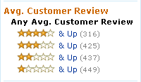
A much more useful way of approaching this design problem is to use a single slider or a set of links like those shown in Figure 4, which shows ratings as they are currently implemented on Amazon.
Figure 4—Amazon’s more useful implementation of ratings as links
We could further improve the rating control shown in Figure 4. Since the goal of people using this control is to get better-quality items, it is not actually that useful to show only a single star—the lowest possible rating. Instead, it might be more intuitive to replace the single star with the word Any and make that the default filter state. The filter shown in Figure 4 also has the important added advantage of providing vital inventory information. Item counts following each set of stars help people using the ratings filter to clearly understand the consequences of their actions and builds appropriate expectations. Understanding what to expect from their actions lets people be more efficient and effective, leading to higher customer satisfaction and better usability. Next, we’ll explore how we can use sliders to show inventory information.
Issue: Being Parsimonious with Inventory Information
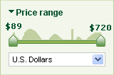
Do all dual sliders emphasize overconstrained filter states? Not necessarily. For some filters dual sliders are entirely appropriate—for example, for price ranges. However, the problem that I described earlier of overconstraining queries and, as a result, providing inadequate information never really goes away. As Figure 5 shows, the dual slider control for the price range filter on TripAdvisor provides no inventory information, so customers would have no idea what the effect of manipulating the sliders might be. Any action customers take might be a hit or a miss—but it is never clear in advance which it will be, because the system simply does not provide the necessary inventory information.
Figure 5—Dual-slider filter for price range on TripAdvisor
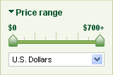
Compare the dual slider for price range on TripAdvisor to the price control on Staples.com, pictured in Figure 6.
Figure 6—Price control on Staples.com with multiple check boxes
As I mentioned in one of my previous columns, “The Mystery of Filtering by Sorting,” overconstraining search results by price is one of the most common human errors we see in usability testing for search user interfaces. Which control would you expect to result in more overconstrained queries: a dual slider or a set of check boxes? The control that makes overconstraining results easier is the dual slider, because it gives no clue as to what to expect from a particular action. On the other hand, the dual slider provides the bling many business people crave as a means of differentiating their user interface from the competition.
In this age of highly interactive Ajax interfaces, clicking links or typing in numbers to specify a price range seems so old-fashioned. Is there a control that would provide the interactivity and fun of the slider, yet offer the inventory information so necessary to helping customers make informed decisions?
One approach would be to use a dual slider for setting a price range, combining it with a sparkline that graphically represents the available inventory information for every price in the range. Figure 7 depicts my suggested redesign of the TripAdvisor price filter, which combines a dual slider with a sparkline, showing the available inventory for each price in the range.
Figure 7—Suggested redesign of the price range filter on TripAdvisor
In his book Beautiful Evidence, Edward Tufte describes sparklines as “data-intense, design-simple, word-sized graphics.” Although I have no idea who first thought of combining a slider with a sparkline, I have been recommending this solution to my clients for over four years, and I can claim to have arrived at this idea independently. Unfortunately, so far, most of my fellow designers and the business people with whom I have worked have remained cold to this idea, stating that a slider with a sparkline would be “above and beyond what an average user could understand.” However, my own experience as a user researcher backs the opposite conclusion. Every usability test participant who has seen the user interface in Figure 7 has confidently stated that he or she understood that the sparkline represented the number of items available, eloquently proving once again that “clarity and simplicity are completely opposite of simple-mindedness,” as Tufte said in his book Envisioning Information.
Recently, during the UIE Webinar I mentioned earlier, I was supremely gratified to hear Mark Burrell of Endeca recommend dual sliders with histograms as one of the best ways of showing price ranges. Burrell’s experience with dual sliders was similar to mine: he said that most people have no trouble understanding that histogram bars—a step-wise variant of a sparkline—represent item inventory for each part of a slider’s range and that histograms clearly help people to avoid overconstraining their queries.
In Conclusion
In our age of rapid development, new ideas and new controls hit the Web almost every day. Even as companies are struggling to overcome the old challenges of numeric faceted filters, designers are innovating interesting new controls with which they can solve those challenges. One such control is the slider, which gives unparalleled power to customers. However, successfully offering this power requires careful UX design in order to avoid potential pitfalls. Again, the following three issues with numeric filters surface most often:
representing discrete values for aspects as sets of ranges
emphasizing overconstrained filter states
being parsimonious with inventory information
Designers’ uninformed use of sliders for filters often exacerbates these issues. In this column, I have presented best practices as well as some novel approaches to help designers overcome these challenges. But there is simply no substitute for empathy and solid qualitative user research. Understanding why customers do certain things is extremely important in designing effective user interfaces. No matter what metrics we have, we cannot improve our user interfaces unless we understand what our customers’ goals are and why people fail to reach them. With every new filtering innovation, it becomes ever more important to stay focused on our customers, with patience, empathy, and understanding.
Good article, but I don’t agree with the suggestion to replace the lowest, one-star, value on the Amazon scale (Figure 4) with the word Any. The user is already reading the ratings via the continuous, visual scale of the stars. I would expect poorer results if the progression is disrupted with a different, verbal, scale.
Hi. I will quote you. “Every usability test participant who has seen the user interface in Figure 7 has confidently stated that he or she understood that the sparkline represented the number of items available.”
I am really skeptical about that. I am not sure, but such graphics may lead to a cognitive overload for average people—those graphics seem a lot more academic than daily life. Can you describe the participants and how you designed your research? About your methodology / approach?
Also, sliders may introduce a complication for people with motor disability skills.
Your sparkline / slider idea is a good one, but it would be computationally expensive. I don’t know offhand any high traffic sites that use it. Maybe Endeca have something up their sleeves / coming soon?
I do not think the slider with the sparklines is particularly useful. The horizontal slider does not provide space for values, and the area behind is not very informative.
If you transpose the slider and make it vertical, things change. Then you can combine the slickness of sliding with the informative content in Figure 7. I have not seen one implemented yet, but would love to.
Thank you all so much for taking the time to comment—I really appreciate it.
@Debra: Good point. I failed to mention this would apply only if a user interface has consistent presentation of the current state, which Amazon does not—at least not for this filter. They do for categories, for example. Also, All need not necessarily be nonvisual. You could use 4 empty stars for consistency if you wish. I’ll be sure to mention this point at my upcoming IA Summit presentation.
@fmachs: Great point on accessibility! The filters need to have an advanced or manual state to be fully compliant. I am actually writing about that very issue in my upcoming column on date filtering.
@Harry: Another great point. Many companies focus on visual design and short-change themselves when it comes to implementation, coming up way short of their UX goals. To my clients, I generally recommend to a more holistic approach to user experience, one that involves engineers early and consistently keeps them engaged as partners throughout the design process. Here is a great site—contributed by Johan Strandell—that could be a testament to what’s possible: Prisjakt.
Prisjakt uses the histogram variant of the sparkline. Though the site is in Norwegian, the result is lightning fast, so you get the idea.
Generally, the way to get around the speed issue is to cache the key attributes. Here is an LRU cache system I developed some time back. In the case of creating a sparkline, you would not even need the timestamp mechanism I described—because the item prices are mostly static—but I hope this article helps convey the idea.
I’m a big fan of the sparkline / slider approach, and I recall a number of Endeca clients using it. While computation is always a concern, I don’t see why computing this histogram should break the CPU bank. Worst case, you should be able to use approximation—for example, only compute the numbers to a couple of significant digits. Remember, the information scent here comes from the visualization.
I’m very interested to know the answer to what fmachs asked earlier:
Can you describe the participants?
Are they tech savvy? Because I believe if I were to give my mum of 50s, who uses the Internet less than 4 hours a day, the slider and sparkline, she’ll not know what it means until she experiments with / uses it.
Thus, could the slider with a sparkline be only valid for users who use the Internet at least more than 4 hours a day?
Founder of the San Francisco Bay Area UX design consultancy DesignCaffeine, Greg is widely recognized as an experience design and user research expert, specializing in search, social networking, business dashboards, and process redesign for mobile and Web platforms. Greg has published over 30 articles and speaks regularly to audiences around the world about how to design intuitive and elegant systems that improve the quality of people’s lives while creating abundant ROI. He has led design projects for Fortune 500 companies and creative startups. Read More