I’ve referred to the work I do as user experience design ever since Don Norman introduced the term at Apple in 1993—when I was a Human Interface Engineer there. But interaction design is absolutely central to the design of application user experiences—whether for the desktop, Web, mobile devices, or other handheld devices—and it is the core skill of application designers.
With this column, I’m introducing a multipart series on what I consider to be the essence of interaction design for application user experiences. First, I’ll lay the groundwork for this series by describing the role of interaction design, then I’ll embark on my exploration of the essence of interaction design by discussing the design of virtual contexts for interaction.
As I began thinking about this series, I realized I should describe the process of design first—or I’d end up constantly revisiting the same process issues—so I wrote my column “Design Is a Process, Not a Methodology.” Throughout this series, I’ll refer you to that column for details about steps of the design process that are especially important in solving particular types of design problems.
Champion Advertisement
Continue Reading…
Interaction Design’s Role in Application Design
Since interaction design plays such a central role in the design of application user experiences, there is much that it encompasses. Good interaction design
effectively communicates the scope and nature of an application’s functionality through its primary contexts for interaction, as well as its menus or navigation system
defines and clearly presents both simple and complex workflows and, thus, facilitates users’ tasks
provides easily discernible opportunities for interactivity through visible affordances, or interactive elements
defines user interactions that are consistent with best practices or highly intuitable—and, thus, easy to learn—and easy to use
specifies behaviors that clearly communicate an application’s responses to user interactions
informs users about system state changes
actively prevents user error
Supporting Roles in Application Design
Although information architecture,
visual interface design, information design, and user assistance design are also essential aspects of user experiencedesign,
all serve supporting roles in the design of applications—that is, they are the
means by which designers facilitate interactions, as follows:
information architecture—An application’s information architecture defines its overall structure, with the goal of supporting findability and usability;provides the basis for the application’s menus or navigation system; verbally communicates the application’s structure through the labeling of its menus or navigation system; and ensures users can easily navigate to related functionality and information from their current context.
visual interface design—An application’s visual interface design visually expresses its hierarchies, groupings, workflows, and affordances—thus, showing users how to interact with the application through effective visual communication; provides iconic representations of the application’s objects and actions; and ensures its user interface is both aesthetically pleasing and accessible to people with color-deficient or low vision.
information design—An application’s information design visually expresses the information the application provides to users—often through charts, graphs, information visualizations, and tabular reports. Another role for an application’s information design is to clearly communicate what information users need to provide to accomplish their tasks—typically, by filling out Web forms or editing options in dialog boxes.
user assistance design—An application’s user assistance design verbally communicates how users can interact with it—telling users both what to do and how to do it. Interactive user assistance communicates what users should do next when filling out forms. More traditional Help systems should communicate the concepts users must understand to use an application effectively, as well as provide step-by-step instructions for specific tasks.
In application design, the designers who are responsible for information architecture, visual interface design, information design, and user assistance design may be either different people who are specialists in particular aspects of UX design or UX designers who are capable of fulfilling all of these roles.
Now that I've described interaction design’s role in application design and how information architecture, visual interface design, information design, and user assistance design support interaction design, let’s begin our exploration of the essence of interaction design with the design of virtual contexts for interaction.
Designing Virtual Contexts for Interaction
An application’s primary context for interaction should effectively communicate the scope and nature of its functionality—that is, what type of application it is. The virtual contexts that would be most appropriate for an application you’re designing depend primarily on the application’s type—and to some extent, on the platform for which you’re designing it. An application’s purpose, features, and the nature of its user experience determine its type, while its overall structure and characteristic frameworks, patterns, affordances, and behaviors express its type. Each virtual context comprises a single screen, Web page, or window. The platform on which an application runs and the size and resolution of its display—otherwise known as an application’s form factor—constrain the screen real estate that is available for each of an application’s virtual contexts.
Designing an Application’s Primary Context
When designing an application, it is important to initially concentrate on the big picture and make high-level design decisions, including what the application’s primary context for interaction should be. By focusing on users’ goals when designing an application’s primary context for interaction, you can establish a sound foundation on which to construct the entire application. Designing the overall structure for an application’s primary context for interaction is a key part of establishing what I call a conceptual model in my column “Design Is a Process, Not a Methodology”—or what Alan Cooper, Robert Reimann, and David Cronin refer to as a Design Framework, in About Face 3.
“The Design Framework defines the overall structure of the users’ experience, from the arrangement of functional elements on the screen, to interactive behaviors and underlying organizing principles, to the visual and form language used to express data, concepts, functionality, and brand identity. … The Design Framework is made up of an interaction framework, a visual design framework, and sometimes an industrial design framework.”—Alan Cooper, Robert Reimann, and David Cronin
As Kim Goodwin says in Designing for the Digital Age, visualizing concrete solutions “begins with defining the framework of the design: the supporting structures and underlying concepts upon which every detail depends.”
A Confusion of Terms
In the software development community within which most UX professionals work, there has been a proliferation of both definitions for and variants of the term framework.
Proponents of object-oriented software development originally adopted the term framework in the early 1990s. The book Design Patterns: Elements of Reusable Object-Oriented Software provides the following definition:
“A framework is a set of cooperating classes that make up a reusable design for a specific class of software. … You customize a framework to a particular application by creating application-specific subclasses of abstract classes from the framework. The framework dictates the architecture of your application … so that you … can concentrate on the specifics of your application. The framework captures the design decisions that are common to its application domain. Frameworks thus emphasize design reuse over code reuse…. … Not only can you build applications faster [with frameworks], but the applications have similar structures. They are easier to maintain, and they seem more consistent to their users.”—Erich Gamma, Richard Helm, Ralph Johnson, and John Vlissides—also known as The Gang of Four
In addition to such generic software frameworks, application frameworks that let developers implement applications that have standard user interfaces for particular operating systems became popular with the advent of Graphic User Interfaces (GUIs). Current examples include Cocoa for Mac OS X and Microsoft Foundation Classes (MFC).
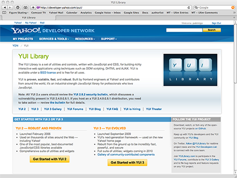
Today, there is a multiplicity of Web application frameworks that support the development of dynamic Web sites and Web applications and are based on programming languages such as Java—for example, Google Web Toolkit (GWT)—Perl, PHP, Python, and Ruby. JavaScript frameworks include JQuery, MooTools, Prototype, script.aculo.us, SWFObject, Yahoo! User Interface Library (YUI), and many others.
In About Face 3, Alan Cooper, Robert Reimann, and David Cronin use the terms Design Framework, interaction framework, visual design framework, and industrial design framework. However, I’ve long been accustomed to using the term framework to refer to a software framework, so I prefer to use the term conceptual model rather than Design Framework. With the omission of the word design from interaction framework, their terms lack parallelism. They define an interaction framework, as follows:
“The interaction framework defines not only the high-level structure of screen layouts but also the flow, behavior, and organization of the product.”—Alan Cooper, Robert Reimann, and David Cronin
In their recent book Web Anatomy: Interaction Design Frameworks That Work, Robert Hoekman, Jr., and Jared Spool use the term framework in a more traditional sense, but with a focus on interaction design:
“Patterns, components, and interaction design frameworks each play a different, essential role in a team’s reuse strategy. … Whereas a design pattern is a common solution to a recurring problem, an interaction design framework is a set of design patterns plus other elements and information, used together to guide the design of a complete system or site context. … A framework … offers guidelines for the design of whole contexts. … Frameworks describe entire subsystems of patterns. … Frameworks are at a high level of abstraction. … Frameworks are the larger anatomical systems that help designers choose which patterns to use….”—Robert Hoekman, Jr., and Jared Spool
So, from two thought leaders in the UX community, we have two very similar terms—interaction framework and interaction design framework—with very different meanings. And, with people’s tendency to abbreviate long terms—which, in fact, Kim Goodwin does in her book Designing for the Digital Age when she describes a framework—we probably have people in different roles on multidisciplinary product teams using the term framework in very different ways.
Application Genres and Their Virtual Contexts
There are three basic genres of applications. (When describing iPhone apps, Apple calls these genres application styles.) An application’s genre depends on its purpose, the tasks it supports and/or the information it provides, and its user experience—including both behavioral and visual characteristics. Some applications combine application genres. For each application genre, there are different types of virtual contexts within which users typically work or play. The three application genres are as follows:
productivity applications—This genre of applications enables users to accomplish their work and supports complex tasks like creating, editing, analyzing, or organizing information—such as documents, presentations, graphics, photos, videos, spreadsheets, databases; communicating via email, instant messengers, or social networking services; maintaining a personal calendar; searching; getting directions; shopping; or doing online banking. Virtual contexts for productivity applications focus on users’ tasks, often present detailed textual and visual information, and usually offer their functionality through fairly standard user interfaces.
utility applications—These applications let users either perform simple tasks that require only minimal user input or quickly look up specific types of information. Examples of utility applications include control panels, desktop widgets, and many mobile apps—for example, apps that provide current weather or traffic conditions, stock prices, or sports scores. Virtual contexts for utility applications display information in highly visual, easy-to-scan formats and let users easily modify simple settings.
immersive applications—This genre encompasses virtual worlds, personal computer games, online multiplayer games, ereaders, media players, and even virtual tools—for example, media capture tools that let users take photos or record video or sound. Immersive applications focus on users’ experience of primarily visual content—whether they’re playing games, watching media, taking photos using their phone’s camera, or using other simple tools. They present their capabilities via richly rendered, highly detailed, often full-screen virtual environments or objects that emulate their real-world counterparts.
Presentation of Applications’ Virtual Contexts
A key factor in designing an application’s primary context for interaction is deciding how best to present the functionality and information the application provides. What should its overall structure be? To what do you want to draw users’ attention? How do you want users to respond? These decisions are wholly dependent on the goals and needs of users and the kinds of tasks they can perform using an application. In About Face 3, Cooper, Reimann, and Cronin refer to an application’s presentation as its posture, but that term doesn’t resonate with me.
An application’s presentation encompasses the structure, hierarchy, look, and affordances of each virtual context within the application. Presentation also communicates a great deal about what users can do with an application, as well as how they should relate to the application.
The nature of particular features in an application and the virtual contexts in which they reside may require presentations that differ significantly from that of the application’s primary context. So, consider the desirable similarities and necessary differences between the presentations of the various contexts within an application, keeping in mind the purpose of each context.
Presentation Patterns for Contexts by Application Genre
Some familiar presentation patterns for virtual contexts of interaction occur in numerous applications, on various platforms. Applications that run on specific platforms and belong to specific genres tend to employ particular presentation patterns. A single application’s complexity can range from just one context and one presentation pattern to any number of contexts and the use of several different presentation patterns.
Here are some common presentation patterns for applications’ virtual contexts in each of the following application genres:
productivity applications
simple list
tabular list
columnar list
grid
master and detail
detailed data
canvas
canvas and palettes
worksheet
dashboard
utility applications
control panel
dialogue
wizard
tabular list
grid
master and detail
detailed data
immersive applications
virtual world
browser
ereader
media player
virtual object/tool
Presentation Patterns for Productivity Applications
Productivity applications let users accomplish tasks that are important to them, and their functionality tends to be complex; therefore, they usually consist of multiple contexts for interaction. Today, productivity applications on desktop computers and the Web share similar capabilities and presentation patterns. However, the presentation patterns for productivity applications on mobile devices are somewhat limited, because of their small screens. Productivity applications generally employ standard user interface elements, and many organize data in hierarchical structures that progress from the general to the specific. In mobile apps, this typically means starting with simple lists and progressing to detailed data users can view or edit, displaying only one level in the hierarchy per context. What are some examples of presentation patterns for productivity applications?
Simple List
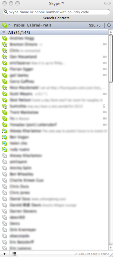
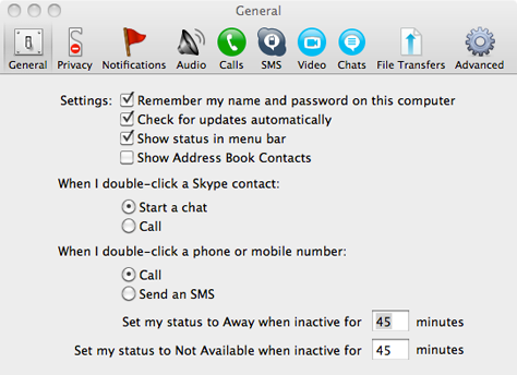
Many desktop, Web, and, especially, mobile productivity applications present data as simple lists that comprise a single column of data. For example, email applications, instant messengers, and mobile devices provide lists of contacts. Skype’s primary context is a list of contacts, as shown in Figure 1.
Figure 1—Skype contacts in a simple list
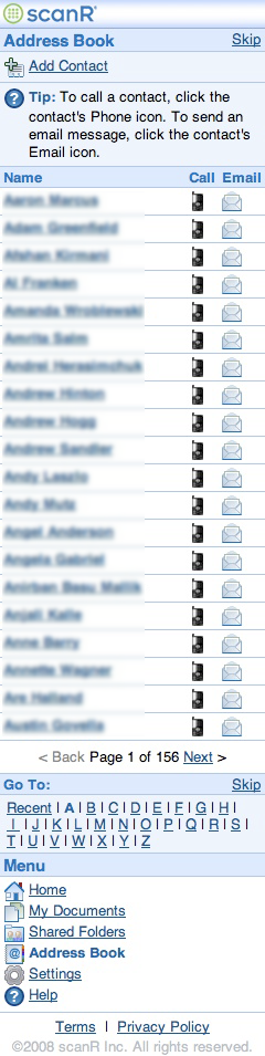
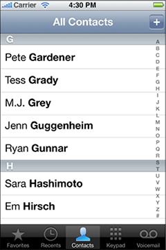
I designed the Address Book page shown in Figure 2—another simple list—for the scanR mobile Web application. Figure 3 shows a simple list of contacts in the iPhone Contacts app. As is usual in iPhone productivity apps, tapping an item in the list lets a user drill down to a detailed data view—in this case, the detailed data for a contact.
Figure 2—Address Book page in scanR mobile Web app Figure 3—iPhone Contacts app’s list of contacts
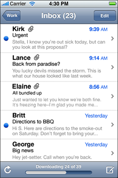
The Inbox in iPhone Mail, shown in Figure 4, is another example of a simple list that lets users drill down to detailed data.
Figure 4—A simple list of messages in iPhone Mail’s Inbox
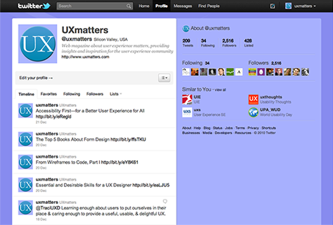
Even activity streams—to which users can add microblog posts—take the form of simple lists. The Twitter Web application, shown in Figure 5, provides another example of an application whose primary context is a simple list.
Figure 5—Twitter stream lists tweets
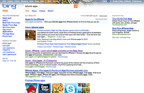
Search results pages offer another common example of the simple list. Figure 6 shows iPad Search; Figure 7, a search results page on Bing.
Figure 6—iPad search Figure 7—List of search results on Bing
Tabular List
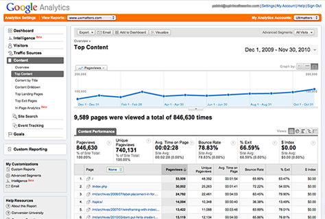
Desktop, Web, and, occasionally, mobile productivity applications present data in tabular lists, comprising multiple columns of data. Each column in a tabular list has a header, and it is often possible to sort such a list by clicking a column header. Displaying reports and the contents of file systems are two common uses of tabular lists. Figure 8 shows a Google Analytics report on the Top Content on UXmatters that combines a sortable tabular list with a graph.
Figure 8—Top Content report in Google Analytics
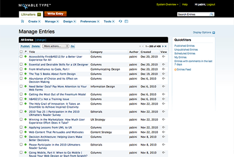
In Movable Type, the Manage Entries page displays a tabular list, with a few filters to the right, as shown in Figure 9.
Figure 9—Movable Type Manage Entries page
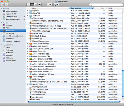
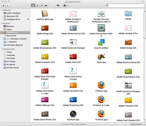
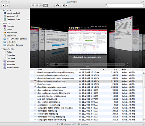
Figure 10 shows the tabular list view of the Mac OS X Finder, which is sortable.
Figure 10—Tabular list view of Mac OS X Finder
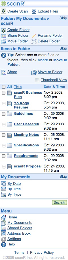
For the scanR mobile Web application, I designed a tabular list that displays the contents of a folder, as shown in Figure 11.
Figure 11—Tabular list of items in a folder, in the scanR mobile Web app
Columnar List
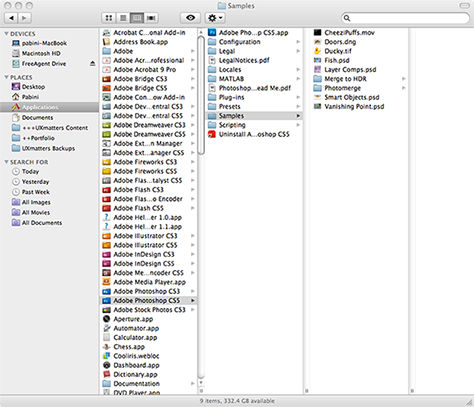
Columnar lists display hierarchies, with each level of the hierarchy displayed in a column, from left to right, so users can easily start browsing at any level in the hierarchy. Figure 12 shows the columnar list view of the Mac OS X Finder. Columnar lists typically provide alternative views of data that might also appear in hierarchical lists, tabular lists, grids, or Cover Flows.
Figure 12—Columnar list view of Mac OS X Finder
Grid
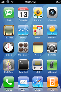
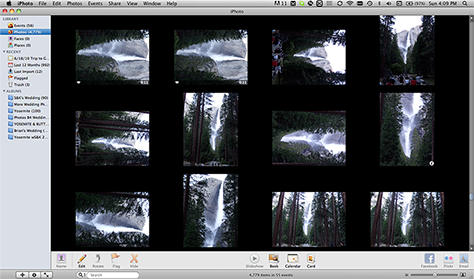
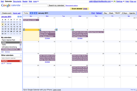
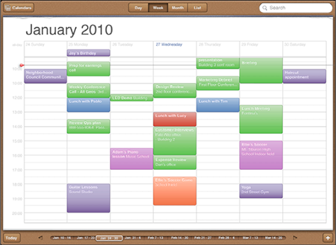
Grid presentations comprise rows and columns of items and take many different forms—from the Mac OS X Finder’s grid view, shown in Figure 13; to the iPhone home screen’s grid presentation of application icons, in Figure 14; to iPhoto’s presentation of photos in a grid, as shown in Figure 15; to the grids of the monthly view in Google Calendar and the daily view in iPad Calendar, shown in Figures 16 and 17, respectively. Applications’ primary contexts of interaction sometimes employ grid presentations.
Figure 13—Grid view of Mac OS X Finder Figure 14—iPhone home screen Figure 15—iPhoto’s grid of photos Figure 16—Google Calendar’s monthly view Figure 17—iPad Calendar’s daily view
Master and Detail
Applications’ primary contexts for interaction often employ master-and-detail presentations. They comprise one or two master panes or areas—which, in the latter case, may appear either side by side or sequentially—and a detail pane or area. A master pane contains items at an upper level of an application’s hierarchy, which may be in a simple list, a hierarchical list in the form of a tree view or drawers, a tabular list, thumbnails, or a set of filters. The master pane can reside on the left side, at the top, or on the right side of a window, page, or screen. The detail pane contains detailed data, or content, which might include text, lists, tables, charts, graphs, diagrams, images, Web forms, or property sheets. Placing the master pane above the detail pane allows the master pane to accommodate list items with longer labels and, especially, tabular lists.
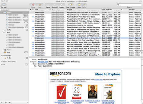
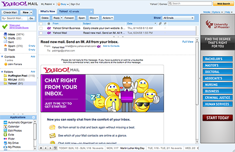
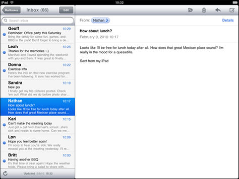
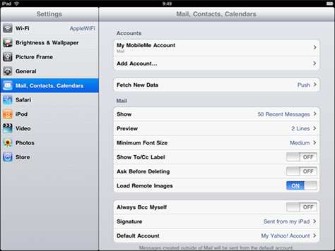
There are many different variants of the master-and-detail presentation. For example, the similar 3-pane, master-and-detail views of Mac Mail, shown in Figure 18, and Yahoo! Mail, shown in Figure 19, display the applications’ entire hierarchy through a simple list of mailboxes, a tabular list of messages, and a detailed data pane that contains the message that is currently selected in the tabular list. iPad Mail has a 2-pane, master-and-detail presentation, as shown in Figure 20.
Figure 18—Mac Mail master and detail view Figure 19—Yahoo! Mail master and detail view Figure 20—iPad Mail Inbox and message pane
Figure 21 shows the Cover Flow view of the Mac OS X Finder. The Cover Flow is in the top pane and provides an animated, 3D user interface that can successively display previews of documents. A tabular list of files resides in the bottom pane. A user can select a file in the list to display it in the Cover Flow.
Figure 21—Mac OS X Finder Cover Flow view
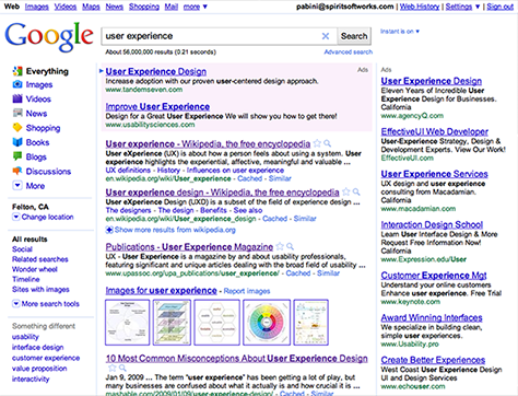
The Google search results page, shown in Figure 22, has a column of filters on the left—in the master pane that controls the display of Web search results in the simple list on the right.
Figure 22—Google search results page, with filters on the left
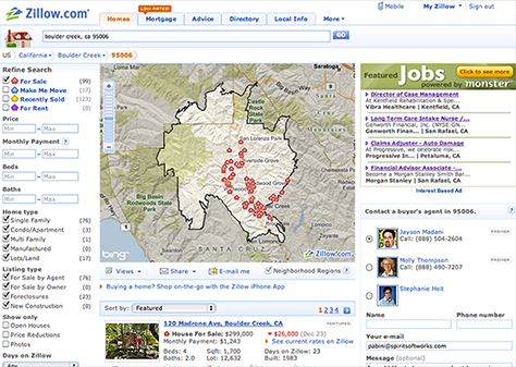
Zillow, shown in Figure 23, also has a column of filters on the left, which control the display of search results in the map and the simple list on the right.
Figure 23—Zillow has filters on the left
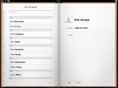
iPad Contacts displays a user’s contacts in a virtual address book, shown in Figure 24. A user can tap a contact in the simple list on the left to display the contact’s detailed data on the right.
Figure 24—iPad Contacts
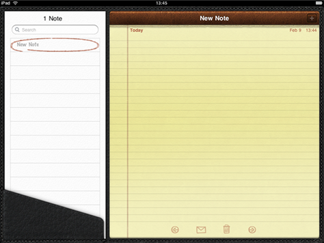
Figure 25 shows iPad Notes, which displays a simple list of notes on the left and a notepad on the right. Tapping a note in the list displays its detailed data on the notepad.
Figure 25—iPad Notes
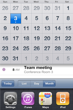
iPhone Calendar’s master-and-detail presentation displays a calendar in a List, Day, or Month view at the top and the detailed data for a selected event at the bottom, as shown in Figure 26.
Figure 26—iPhone Calendar
When a productivity application has sufficient available screen real estate to accommodate a master-and-detail presentation, its use of adjacent panes to navigate the application’s hierarchy provides highly efficient workflows within the scope of a single virtual context.
Detailed Data
Most productivity applications display detailed data in a separate window—as Mac Mail does—or on a subordinate page or screen—like iPhone Mail. Figure 27 shows the window that appears when a user clicks a message in the Inbox’s master list in Mac Mail; Figure 28, the corresponding screen in iPhone Mail.
Figure 27—Mac Mail message’s detailed data in a separate window Figure 28—iPhone Mail message’s detailed data on a separate screen
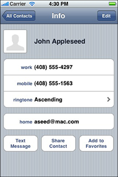
Figure 29 shows the detailed data that appears when a user taps a contact’s name in iPhone Contacts’ simple list of contacts.
Figure 29—A contact’s information in iPhone Contacts
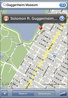
iPhone Maps presents detailed data in the form of maps, as shown in Figure 30, and directions.
Figure 30—iPhone Maps
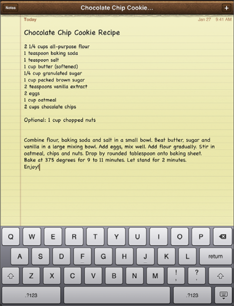
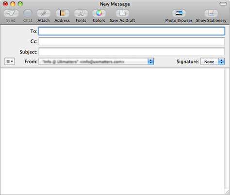
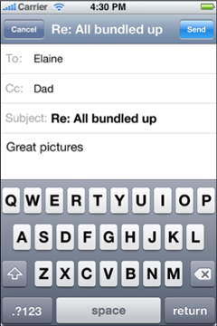
Canvas
Simple productivity applications often employ canvas presentations that comprise a single window, page, or screen. Such applications support the creation and editing of simple documents such as notes and email messages. Figures 31 shows iPad Notes. Figures 32, 33, and 34 show the screens for composing email messages in Mac Mail, iPhone Mail, and iPad Mail, respectively.
Figure 31—iPad Notes Figure 32—A New Message window in Mac Mail Figure 33—iPhone Mail screen for composing messages Figure 34—iPad Mail screen for composing messages
Canvas and Palettes
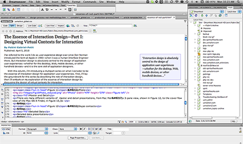
In applications with canvas-and-palette presentations, the canvas is the space in which users create content, while the palettes provide tools that let them format and style the content. Many applications’ primary contexts of interaction employ master-and-detail presentations. In fact, a lot of the applications UX professionals use daily in their work have presentations comprising a canvas and palettes, including Dreamweaver, which is shown in Figure 35, Microsoft Word, InDesign, Visio, OmniGraffle Professional, Photoshop, Illustrator, Fireworks, Keynote, and PowerPoint.
Figure 35—Dreamweaver canvas and palettes
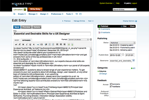
In Movable Type, the canvas area on the Edit Entry page, shown in Figure 36, lets users create blog posts, and the palettes on the right let them set publishing parameters and define metadata for a blog post.
Figure 36—Movable Type Edit Entry page
Worksheet
Spreadsheet applications simulate the presentation of the paper accounting worksheets people used in the days before personal computers. A worksheet comprises rows and columns of cells that form a grid. Each cell in a worksheet can contain either text, a numeric value, or a formula. Excel and other similar applications let users create spreadsheets. Figure 37 shows a worksheet in Excel.
Figure 37—A worksheet in Excel Dashboard
Dashboards provide an overview of information that is essential to completing the tasks users perform using an application and let users drill down to view or edit more detailed information. Much of the information on dashboards takes the form of lists, charts, graphs, information visualizations, and tables.
Stephen Few, author of Information Dashboard Design, has defined a dashboard, as follows:
“A dashboard is a visual display of the most important information needed to achieve one or more objectives; consolidated and arranged on a single screen so the information can be monitored at a glance.”—Stephen Few
For more detailed information about dashboard design, read my review of his excellent book.
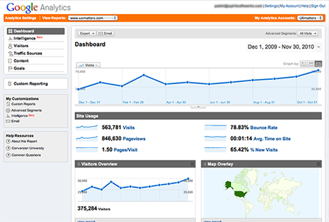
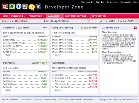
Figure 38 shows the Google Analytics Dashboard; Figure 39, a Dashboard I designed for the GetJar Developer Zone.
Figure 38—Google Analytics Dashboard Figure 39—GetJar Developer Zone Dashboard
Presentation Patterns for Utility Applications
Since the purpose of utility applications is to let users perform simple tasks requiring minimal user input or quickly view summary information, most are simple applications with a narrow focus. Utility applications typically have only a few simple virtual contexts, which let users easily modify settings or obtain the information they need. Effective information design is an essential aspect of the design of utility applications, which should be visually pleasing. Most utility applications have either a flat structure—especially those on mobile devices—or a very shallow hierarchy. They generally employ standard user interface elements. Here are some examples of presentation patterns for utility applications.
Control Panel
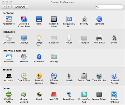
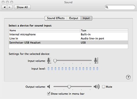
Control panels are simple utility applications that let users view and modify basic settings for an operating system or application. For example, Mac OS X System Preferences, shown in Figures 40 and 41, let users view and configure system-wide settings for a Mac.
Figure 40—Mac OS X System Preferences Figure 41—Mac System Preferences for Sound
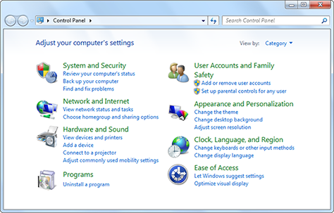
The Control Panel, shown in Figure 42, displays and lets users configure system-wide settings for a PC running Windows.
Figure 42—Windows Control Panel
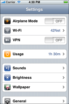
Figure 43 shows system-wide settings for iPad; Figures 44 and 45, for iPhone.
Figure 46 provides an example of application-specific settings—General Preferences for Skype.
Figure 46—Skype Preferences
Dialogue
Through dialogues between applications and their users, applications can obtain the information they need from users and users can communicate what they want to applications. For example, in desktop applications, such dialogues take place through dialog boxes; in Web applications, through Web forms or overlay dialog boxes; in iPhone apps, through settings on the backs of applications’ main views.
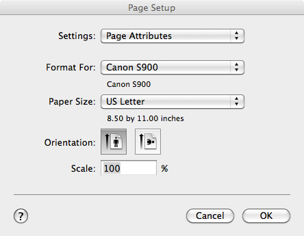
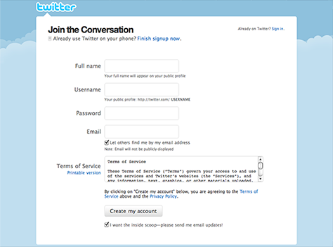
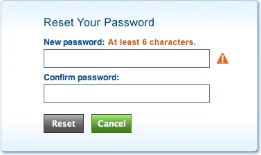
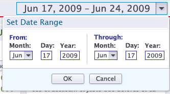
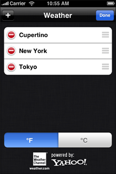
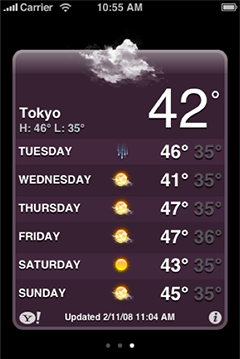
Figure 47 shows the Page Setup dialog box on the Mac; Figure 48, Twitter’s sign-up form; Figure 49, the Reset Your Password overlay dialog box, which I designed for scanR; Figure 50, the Set Date Range overlay dialog box, which I designed for the GetJar Developer Zone; and Figure 51, settings on the back of the main view for the Weather iPhone app.
Figure 47—Mac Page Setup dialog box Figure 48—Twitter’s sign-up form Figure 49—Reset Your Password overlay dialog box on scanR Figure 50—Set Date Range overlay dialog box on GetJar Figure 51—Weather iPhone app’s settings on back of main view
Wizard
Wizards lead users through complex tasks, step by step, providing the user assistance they need to successfully complete a task. They provide an effective way of guiding users through complex tasks in which they lack expertise, so would require assistance; that users perform only infrequently, so would be unlikely to learn; or that have discrete steps users must follow that make more efficient approaches to completing a task impractical. Wizards consist of a series of pages or screens, each of which covers one step in a task. A pane on the left should list all of a wizard’s steps, highlighting the current step, while that on the right displays whatever input fields and user assistance the current step requires.
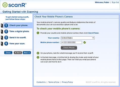
Figure 52 shows a wizard I created for scanR to help users bridge the communications gap between the Web application running on their computer and the application running on their mobile phone.
Figure 52—scanR Getting Started with Scanning wizard
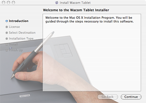
The most common use of wizards is to assist users with software and hardware installations. Figure 53 shows the Wacom Tablet Installer wizard.
Figure 53—Wacom Tablet Installer wizard
Tabular List
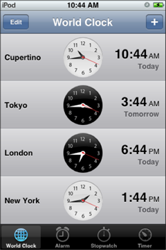
Many mobile utility applications that present summary information for quick reference display data in tabular lists—as do some desktop and Web utility applications. For example, Figure 54 shows the iPhone World Clock, which displays times around the world in a list; Figure 55, the iPhone Weather app. In utility applications, tabular lists commonly do not have column headers, nor are they sortable.
Figure 54—iPhone World Clock Figure 55—iPhone Weather app
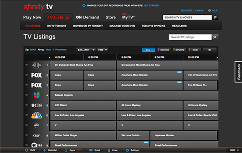
Grid
Grid presentations are common in a range of different utility applications, on various platforms. Sometimes they are useful for utility applications’ primary contexts of interaction, as in the Xfinity TV Listings Web application, shown in Figure 56, which displays its data in a complex grid.
Figure 56—Xfinity TV Listings Web application
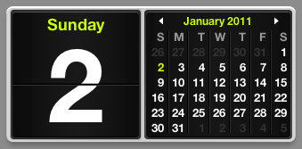
The Mac Dashboard’s calendar and weather widgets, shown in Figures 57 and 58, employ a grid presentation.
Since few utility applications have a hierarchical structure, their use of detailed data presentations is fairly uncommon. But the iTunes Ping app on iPhone, shown in Figure 59, includes a detailed user profile.
Figure 59—User profile in iTunes Ping on iPhone
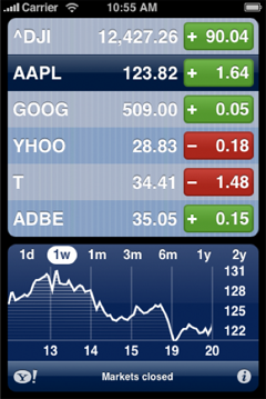
Master and Detail
Because most utility applications are very simple applications, few employ a master-and-detail presentation, but the Stocks iPhone app, shown in Figure 60, is the exception to the rule. It has a master pane at the top that lists stocks a user is tracking, while a detail pane at the bottom displays a graph of the price for the stock that is currently selected in the master pane.
Figure 60—Stocks iPhone app
Presentation Patterns for Immersive Applications
Most immersive applications are recreational in nature, including virtual worlds, games, ereaders, and media players. However, there are also some immersive applications that offer useful virtual tools. These tools emulate their real-world counterparts and can help users accomplish their tasks. Immersive applications are highly experiential, and their design focuses on their rich visual form and content. Here are some examples of presentation patterns for immersive applications.
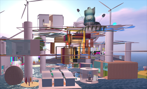
Virtual World
Both virtual worlds and many games offer completely immersive experiences. For example, the fanciful virtual worlds of Second Life provide unique and social experiences. Figures 61 and 62 show two virtual worlds on Second Life: AIRE Ville Spatiale and Firefly.
Figure 61—AIRE Ville Spatiale on Second Life Figure 62—Firefly on Second Life
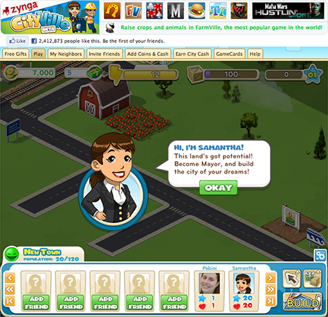
Zynga offers numerous games users can play on the Web—like CityVille, shown in Figure 63—and they’re just one of many vendors in the game market.
Figure 63—Zynga’s CityVille
There are many games for iPhone. One of the most popular is Spider, shown in Figure 64.
Figure 64—Spider for iPhone
Browser
Browsing the Web and other media is extremely absorbing, so highly immersive. Figure 65 shows Safari on the Mac; Figure 66, Safari on iPhone.
Figure 65—Safari on the Mac Figure 66—Safari on iPhone
Photo viewers offer another type of browsing that is highly immersive. Figures 67 and 68 show iPhone Photos, in which users can view their photo albums on their iPhone.
Figure 67—A grid of photos in iPhone Photos Figure 68—A photo in iPhone Photos
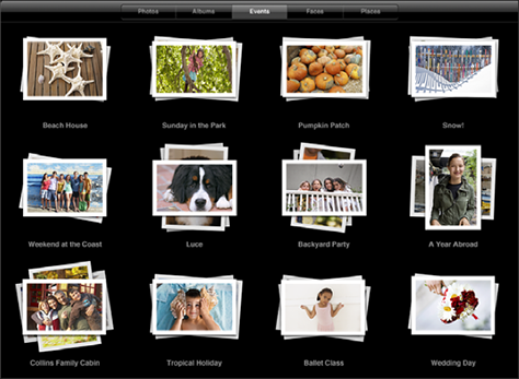
iPad Photos, shown in Figures 69 and 70 lets users browse their photos on their iPad.
Figure 69—Browsing photos by Events in iPad Photos Figure 70—iPad Photos browser
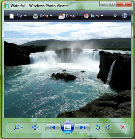
The Windows Photo Viewer, shown in Figure 71, provides a similar browsing experience.
Figure 71—Windows Photo Viewer
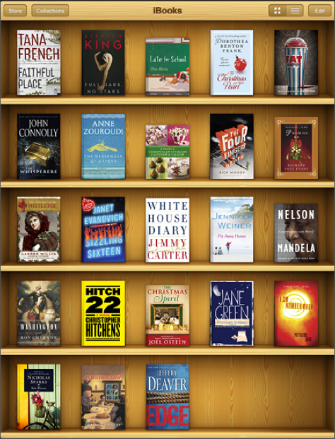
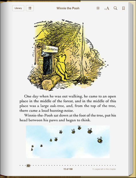
eReader
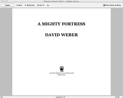
There are ereaders available for every major platform. Figures 72 and 73 show iBooks for iPad. Preview, shown in Figure 74, is a PDF reader for the Mac. Figure 75 shows Kindle for Mac. The New York Times iPhone app is shown in Figure 76.
Figure 72—iBooks for iPad Figure 73—Winnie the Pooh in iBooks for iPad Figure 74—Preview, PDF reader for the Mac Figure 75—Kindle for Mac Figure 76—New York Times iPhone app
Media Player
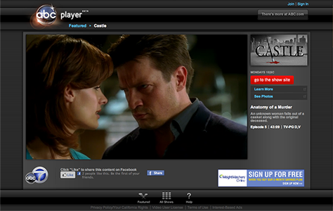
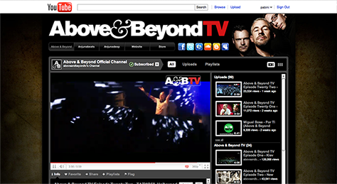
Media players let people enjoy video and music online. Figure 77 shows the ABC Player, the network’s video player on the Web. Figure 78 shows one of the many channels available on YouTube—Above&BeyondTV. YouTube provides an endless supply of video entertainment.
Figure 77—ABC Player Figure 78—Above&Beyond TV on YouTube
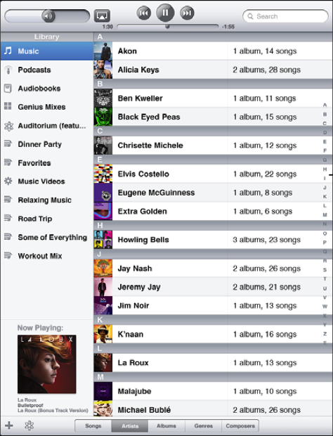
The iPod app for iPad, shown in Figures 79 and 80, lets users browse their music library and listen to their favorite tunes.
Figure 79—Music library in the iPod app for iPad Figure 80—Music player in the iPod app for iPad
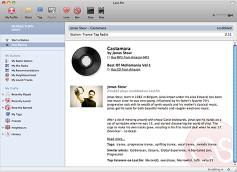
Last, but not least, Last.fm for the Mac, shown in Figure 81, streams music on myriad channels.
Figure 81—Last.fm
Virtual Object/Tool
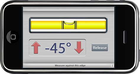
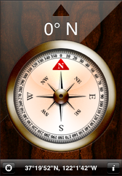
Virtual objects that emulate real-world tools include the cameras in our mobile phones; the incredibly realistic BubbleLevel and Compass iPhone apps, shown in Figures 82 and 83, respectively; and microphones that let us record notes.
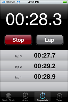
Another handy tool is the iPhone Stopwatch, shown in Figure 86.
Figure 86—iPhone Stopwatch
The Process of Designing Virtual Contexts for Interaction
To create an effective design solution for an application’s primary context for interaction, first and foremost, it is essential that you understand what the application’s potential or current users’ motivations and goals are and how they approach the work or play that is their reason for engaging with the application. Once you have a good understanding of the users and their tasks, you can conceive of an optimal virtual context within which they can accomplish their primary goals.
When designing an application’s primary context for interaction—or, in fact, any virtual context for interaction—there are some key steps you should follow in the user-centered design process I described in my column “Design Is a Process, Not a Methodology.” In the following outline of this design process, I’ve highlighted the key steps to follow when designing virtual contexts by making them bold.
Discovery Phase
Learning about your users—You’ll need to get answers to these questions to design an application’s primary context for interaction so it really meets users’ needs: What are users’ motivations and goals for using the application? Are they different for users in different roles? Should the application’s primary context differ depending on users’ roles? Would users need to be able to customize its user interface? What are the main goals for users in each role? An application’s primary context for interaction must serve the needs of target users, so you must have a deep understanding of their needs, which also serves you well in designing an application’s other virtual contexts.
Modeling your users—This step may not always be essential to the design of virtual contexts. However, when an application’s users have different roles and you’re preparing to design its primary context for interaction, user modeling takes on greater importance.
Analyzing your users’ tasks—To understand what tasks and activities an application’s primary context for interaction must support, consider these questions: What key tasks or activities do users—or users in particular roles—need the application to support? Users perform these key tasks to achieve their main goals—and, in many cases, must perform them frequently. What are users’ mental models of their key tasks or activities? Do users in different roles interrelate and, if so, how? What relationships exist between users’ various tasks? What related capabilities or ancillary information do users need to have close at hand when performing key tasks? An application’s primary context for interaction serves as the starting point for many of its workflows, which often take users to other virtual contexts in the application. Your task analysis helps you to design efficient workflows and determine what other virtual contexts your application requires.
Eliciting and defining clear product requirements—Clearly defined user requirements provide essential information on which to base your decisions when designing an application’s virtual contexts for interaction. Requirements should answer these questions: What key capabilities and features should the application provide to satisfy its target users? On what platforms should the application be available, and what are their form factors? For example, should you create a desktop application, a Web application, or an iPhone app? What capabilities do the target platforms offer and what constraints do they impose? What goals and tasks dotarget users need to be able to accomplish most efficiently? What information needs do they have? Is obtaining information a key goal for them? What tasks should the application’s primary context for interaction support, and what information should it provide?
Design Phase
Developing conceptual models—When you’re doing conceptual modeling for an application’s primary context for interaction, you should consider these questions: What is an application’s core functionality? What should be at the center of the application’s structure? In other words, on what features and information should the application’s primary context focus? What concepts from the application’s task domain should its primary context reveal to users? What kinds of data objects would users need to work with? When conceptualizing an application’s primary context, stay focused on the application’s core value proposition. Follow a similar process for all of the application’s key virtual contexts.
Solving key design problems through ideation—How should the design of an application’s primary context for interaction reveal concepts that are unique to the application’s task domain? Are there appropriate metaphors for these concepts? Should the application’s primary context reflect users’ real-world context? How should the user interface for the application’s primary context best represent the functionality it provides? Should some elements of the user interface be subordinate to or contained by others? How should you present and group the application’s core features within its primary context to facilitate users’ workflows? During ideation, make sure the application’s primary context for interaction focuses on supporting users’ main goals. Again, follow a similar process for the application’s other key virtual contexts.
Doing detailed design—At this point, you’ve already made your key decisions regarding the design of an application’s virtual contexts for interaction, and it’s time to implement them through a design that is both clear and engaging.
Development Support Phase
Providing development support—There’s nothing special to do that’s specific to designing virtual contexts. Just do what you usually do to support the development effort and make sure what you’ve designed gets built.
In Conclusion
With this column, I’ve launched my series on the essence of interaction design by discussing the design of virtual contexts for interaction. To summarize, the optimal designs for an application’s virtual contexts depend on what type of application it is, the platforms for which you’re designing the application, the application’s genre, the purpose of each virtual context and, consequently, its appropriate presentation, and how the application’s various virtual contexts interrelate. I’ve also described how some key steps in a user-centered design process support the design of an application’s contexts for interaction.
An application’s primary context for interaction provides the starting points for many of its key workflows; subordinate contexts often complete those workflows. Together, an application’s primary context for interaction and its menus or navigation system should effectively communicate the scope and nature of the application’s functionality. An application’s menus or navigation system should provide access to all of its virtual contexts and the full scope of its functionality. The design of an application’s menus or navigation system is the next topic in this series.
References
Apple Inc. iOS Human Interface Guidelines. Cupertino, CA: Apple Inc., September 1, 2010.
Cooper, Alan, Robert Reimann, and David Cronin. About Face 3: The Essentials of Interaction Design. 3rd ed. Indianapolis, IN: John Wiley & Sons, Inc., 2007.
—— Information Dashboard Design: The Effective Visual Communication of Data. Sebastopol, CA: O’Reilly, 2006.
Gamma, Erich, Richard Helm, Ralph Johnson, and John Vlissides. Design Patterns: Elements of Reusable Object-Oriented Software. Boston: Addison-Wesley, 1995.
Ginsburg, Suzanne. Designing the iPhone User Experience: A User-Centered Approach to Sketching and Prototyping iPhone Apps. Boston: Addison-Wesley, 2010.
Goodwin, Kim. Designing for the Digital Age: How to Create Human-Centered Products and Services. Indianapolis, IN: Wiley Publishing, 2009.
Hoekman, Robert, Jr., and Jared Spool. Web Anatomy: Interaction Design Frameworks That Work. Berkeley, CA: New Riders, 2010.
Neil, Theresa. “12 Standard Screen Patterns.”Designing Web Interfaces, January 17, 2009. Retrieved December 31, 2010.
Founder, Publisher, and Editor in Chief of UXmatters
Silicon Valley, California, USA
With more than 20 years working in User Experience at companies such as Google, Cisco, WebEx, Apple, and many startups, Pabini now provides UX strategy and design consulting services through her Silicon Valley company, Strategic UX. Her past UX leadership roles include Head of UX for Sales & Marketing IT at Intel, Senior Director of UX and Design at Apttus, Principal UX Architect at BMC Software, VP of User Experience at scanR, and Manager of User Experience at WebEx. Pabini has led UX strategy, design, and user research for Web, mobile, and desktop applications for consumers, small businesses, and enterprises, in diverse product domains. Working collaboratively with business executives, multidisciplinary product teams, and UX teams, she has envisioned and realized holistic UX design solutions for innovative, award-winning products that delighted users, achieved success in the marketplace, and delivered business value. As a UX leader, she has facilitated conceptual modeling and ideation sessions; written user stories; prioritized product and usability requirements; established corporate design frameworks, standards, and guidelines; and integrated lean UX activities into agile development processes. Pabini is a strategic thinker, and the diversity of her experience enables her to synthesize innovative solutions for challenging strategy and design problems. She is passionate about creating great user experiences that meet users’ needs and get business results. A thought leader in the UX community, Pabini was a Founding Director of the Interaction Design Association (IxDA). Read More