Microinteractions are small, yet powerful interaction-design elements that can fundamentally shape how users interact with a digital product. They are critical components that can make a product more user friendly and engaging.
In this article, I’ll explore the concept of microinteractions and how they can enhance the user experience. I’ll provide tips on how to incorporate them into your product designs effectively. Plus, we’ll look at some real-world examples that illustrate how these subtle design features can have a significant impact on the user experience.
Microinteractions can be the key to standing out in a competitive marketplace. You can boost user engagement and retention by leveraging the power of microinteractions in your UX designs.
Champion Advertisement
Continue Reading…
What Are Microinteractions?
Microinteractions are small, single-purpose interactions that take place within a product as part of the larger user experience. For example, consider the shaking animation that appears in a form field when the user enters the wrong password or, in an email app, the appearance of a red dot next to a message’s subject line to indicate a new message.
While these minor interactions might seem insignificant, collectively they can play a crucial role in shaping the overall user experience. The term microinteraction embodies the phrase “less is more” by adding subtle details that enhance how people experience an app, Web site, product, or other digital experience.
Why Are Microinteractions Important for the User Experience?
Microinteractions have become increasingly important in UX design as users have come to expect more seamless, engaging experiences from digital products. They also matter to businesses that want to stand out and offer a service that is superior to those of their competitors.
Let’s consider the following reasons why microinteractions are so important to the user experience:
feedback—Microinteractions provide real-time feedback to users about the outcomes of their interactions, creating a responsive, positive experience. For instance, changing a button’s color when the user clicks it confirms the user’s interaction.
guidance—Microinteractions guide users through a product or Web site. Visual hints such as the progress bar that appears during file uploads can help users understand what’s happening and how long it will take.
user engagement—Microinteractions boost user engagement by making routine interactions more enjoyable. For example, an animation that reveals new content can make scrolling through a feed more captivating.
highlighting of features—Microinteractions can highlight specific features or important interactions, subtly directing the user’s attention to these elements. For example, a subtle animation on a shopping-cart icon could remind the user to proceed to checkout.
communication of system status—Microinteractions can communicate the status of an ongoing process or whether a site or app is functioning as it should, giving users informational comfort. A spinning wheel indicator, for instance, indicates that the system is processing a request.
error prevention—Microinteractions can also help prevent errors by indicating real-time issues. If the user makes a mistake, a microinteraction can show this through a color change, animation, or some other indication.
As you can see, these aren’t minor issues that a UX designer or product developer can afford to ignore. Creating microinteractions could transform your product, mobile app, or Web site into a next-level application that is certain to win over customers.
What Makes Up a Microinteraction?
Dan Saffer’s book, Microinteractions: Designing with Details, provides the ultimate guide to microinteractions. In his book, Saffer breaks the microinteraction down into four components. Let’s explore them in detail now.
1. Triggers: The Initiation
Triggers are the cues that initiate a microinteraction. They can be user initiated—for example, by clicking a button—or system initiated—as when a pop-up appears after a user lands on a Web page. For example, once the user has filled in all the details of a form correctly, the disabled Submit button is enabled. Or a Join or Accept button becomes clickable once the user finishes reading a Web site’s terms and conditions.
2. Rules: The Structure
Once a trigger initiates a microinteraction, rules determine what happens next. For instance, double tapping a post in a social-media feed translates into a like, which then displays a heart graphic and increases the like count on the post.
3. Feedback: The Response
Feedback is how the system communicates the result of a microinteraction to the user. It is a visual, auditory, or tactile response to the user’s action such as a vibration. This is where the magic of microinteractions really shines. If the user clicks the Join button for a public group on Facebook, the button transforms to a Joined button and gives the user access to the group’s content. This feedback indicates that the user’s action was successful.
4. Loops and Modes: The Overall Experience
Loops and modes determine how microinteractions change over a period of time. They define the meta-rules of microinteractions as the system applies them over time. Loops define how long a microinteraction lasts, while modes are for infrequent actions. An example of a loop is a loading spinner that appears while a page is loading. Switching from light mode to dark mode in an app or on a page is an example of a mode microinteraction.
Putting Everything Together
Let’s see what these four parts of a microinteraction look like together. For example, imagine that a user fills out a contact form by entering his or her details, then clicks Submit. This is the trigger. The rules of this interaction then dictate that the form displays a success message and sends it to the brand database. The success message also provides feedback and lets the user know the action has led to a desired outcome. A loop occurs when the form displays a message that says, Send another message or Read our articles while our team works hard to help you. Such a message keeps the user engaged. These are the components of a microinteraction. It’s critical to understand them so you can better implement microinteractions in your product designs.
7 Best Practices for Implementing Microinteractions
To make the most of microinteractions, you must implement them in a way that enhances the overall UX design. Let’s consider some best practices that you should keep in mind when incorporating microinteractions into your designs.
1. Purpose
Identify specific goals and objectives before adding microinteractions to your designs. Microinteractions should always serve a specific purpose and add value to the user experience. Whenever possible avoid adding elements to microinteractions that could create dissonance and discomfort.
2. User-Centeredness
Always consider your target audience when designing microinteractions. Tailor the microinteractions to the needs, behaviors, and preferences of your users. This means doing your research and learning about your audience. Businesses and UX designers can develop blind spots when they’re creating applications and, thus, fail to meet user expectations. Create a user persona and make sure that you build microinteractions around it.
3. Consistency
To maintain a consistent visual language throughout your product, use similar styles and animations for related interactions. This not only makes applying microinteractions easier but also helps users understand how different elements of the product work together. Consistency creates a sense of familiarity and comfort for users, making them more likely to engage with your product.
4. Simplicity
Keep microinteractions simple and subtle. They should not overwhelm or distract the user from the primary task. The name includes micro for a reason. These are little details that enhance the user experience, so should not be loud, distracting, or superfluous.
5. Accessibility
Ensure that microinteractions are accessible to all users, including those who have disabilities or use assistive technologies. There are many ways in which you can do this, so this topic is worthy of an entire article on its own. For example, you could employ ARIA (Accessible Rich Internet Applications) to convey a success message to screen readers. You could boost the contrast between foreground and background elements in a Web site’s design—or add settings that let the user do so—enable keyboard interactions, and much more.
6. Performance
To avoid slowing down your product’s speed and responsiveness, you must optimize the performance of microinteraction animations. Because creating microinteractions could require adding files to your Web site or application, implementing them badly could create the perception that your site is slow or difficult to navigate. Always be careful when adding microinteractions to your designs.
7. Testing, Testing, Testing
Even the best UX designers can still get things wrong. This is why implementing optimal microinteractions requires usability testing. Invest in a usability-testing platform and invite users to interact with your design solutions, give you feedback, and describe their actual experiences as they explore your app or product. Testing your user experience ensures that you’ll discover optimal solutions and improve navigation, engagement, and other key factors.
Microinteractions in UX Design Solutions
Now, let’s look at some examples of microinteractions in UX design.
1. Reddit: Animation While Scrolling
The community and forum-based platform Reddit recently created a Recap experience for users. As Figure 1 shows, this is a great example of a microinteraction that occurs when the user scrolls down a page and led to a new experience with small animations. The transition between the two sections is smooth, interactive, and pleasing. In Figure 1, note the carousel indicators, or progress dots, on the right, which move as the user scrolls. Figure 1—A scrolling effect and carousel indicators
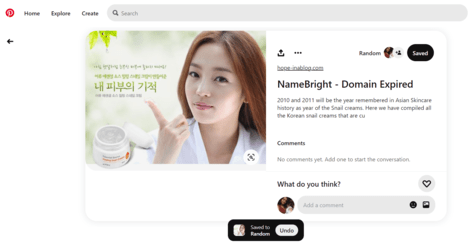
Whenever the user saves a pin on Pinterest, the Save button turns from red to black, and the text changes from Save to Saved, as shown in Figure 2. Plus, a small notification appears by the button, saying Saved to [board name] with an Undo button.
Figure 2—Clicking Save changes the button and displays a notification
Pinterest provides an example of some principles that I outlined earlier.
feedback—Text and color changes that occur when the user clicks the trigger button Save let the user immediately know that the interaction was successful.
rules—In addition to making changes in the graphics and interactions, the system saves the chosen pin on the user’s Pinterest account
In this example, multiple microinteractions are happening simultaneously and together create a good user experience.
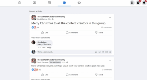
3. Facebook Likes
Check out the simple change in color and the slight movement that occur when the user clicks Like or carries out some other interaction on Facebook, as shown in Figure 3. This microinteraction makes it clear that the user has engaged and added feedback to the post.
Figure 3—Like microinteraction animation on Facebook
Here’s a powerful example of how a microinteraction can also be a conversion point. In this example on TrustPulse, once the user scrolls through the home page and moves the mouse to exit the page, an exit-intent popup appears, as shown in Figure 4. This provides a great opportunity to capture users before they leave the page for good. Here the trigger is a user leaving a page, and the outcome is an opt-in signup form.
Figure 4—The system and the user trigger an opt-in popup
Thoughtful microinteractions can help identify errors and show users where to make appropriate changes. For example, in Figure 5, the simple error message in red appears when someone types an email address in the wrong format. This instant feedback quickly draws the user’s attention to the error and informs the user about what is wrong. This type of informative, but simple communication makes the user experience smoother.
Figure 5—The text in red indicates a form-field error
Canva is a great example of both a brand and a product that exemplify a great user experience. Microinteractions are a key feature of its user-friendly interface. You can see that they’re everywhere if you know to look for them. See how a ToolTip appears when the user hovers over the + symbol on the canvas. Also, note how a floating Canva logo appears when a new design requires time to load.
These simple additions to the user interface go a long way toward helping users understand what to do and reduce their frustration across various touchpoints.
Google Docs
Let’s look at a simple, but powerful example of microinteractions on Google Docs. As shown in Figure 7, the platform adds a checkmark to a currently applied setting, so the user knows what options are active. This prevents the user from selecting the same option twice and provides a smoother user experience.
Microinteractions are an essential part of any digital product. They subtly guide users through their journey and enhance the overall user experience. Going beyond just aesthetics, they facilitate communication between the system and the user, making digital interactions feel more human and easy to understand.
As you’ve seen in the examples I’ve provided, well-designed microinteractions not only add a spark of delight but also help users understand how to use your product, while reducing their frustration across various touchpoints.
So, when you’re designing your next digital product, be sure to leverage the potential of microinteractions. Remember, it’s often such small, nearly invisible details that can make the biggest impact on your product’s user experience.
As the founder of WPBeginner, the largest free WordPress resource site, Syed is one of the leading WordPress experts in the industry, with over ten years of experience,. You can learn more about Syed and his portfolio of companies by following him on his social-media networks. Read More