In my job as a UX design consultant, I work with any number of organizations—and often with their in-house designers. This means one of my biggest consulting duties is explaining myself. Why is something a good idea, or what is the best way to approach a task or problem. I derive the subjects of most of my columns directly from my work. The most common occurrence for me is that I’ve typed a long explanation of a process or created a design pattern for a client organization, and I realize that I’m repeating the same work for others. So, if I can generalize something, I try to share it.
A few years back, for this column, I wrote a series on what I called design tools, covering software, deliverables, and design methods that I commonly used. Lately, my six-year-old column “Tools for Mobile UX Design: Task Flows” has been coming up in discussions about this topic. While it’s not truly out of date, and I still agree with everything it says, it was a bit broad and offered almost too many options. So let’s dive into this topic again, and I’ll discuss some very specific tactics that really help organizations of all sorts get a handle on the design of interactions.
Champion Advertisement
Continue Reading…
Interactive Design
Because UX professionals design interactive systems, the concept of a task flow—both as a deliverable and as part of the collaborative design process—is important. Actually, one reason I work well with Web sites and apps is because I have always understood this—even back when doing graphic design for print. Understanding how to design and lay things out to enable people to find the relevant part of, say, their new employee guide or the right product in a catalog is very similar to designing for digital systems.
I did lots of sketching to show how the final product would work, mocking up the pages, and showing how they would look when being read, while also knowing how the pages would be printed and bound, so I was aware of any technical limitations. Print limitations aren’t about the inability to scroll, but things such as the binding’s not lying flat enough to read the middle of pages or making sure that no content is cut off when the pages are trimmed, by preventing the content from going too close to the edges.
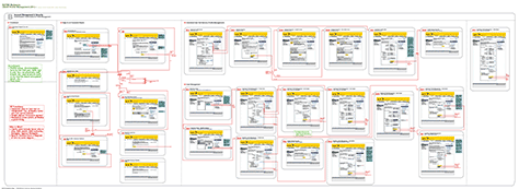
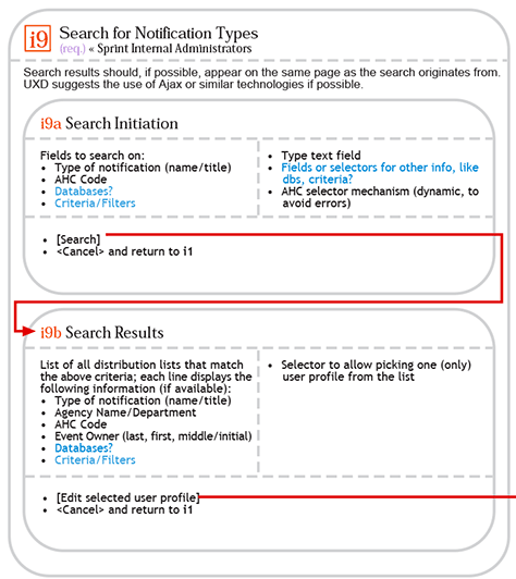
When I moved to interactive design, it was in the earliest days of the Web, and there were no interactive-specific methods. I just kept doing what I’d done for print. To keep in mind how everything goes together when designing one page, I’d tape a printout to the wall or make a diagram of the user’s task flow. When I got a full-time job working with a large team of Web developers who were all collocated, I created a single design document, combining the interactivity and the user interface (UI). As Figure 1 shows, it was a giant flowchart, in which each node was the full user interface for the relevant page or view.
Figure 1—An all-in-one user interface and flowchart document
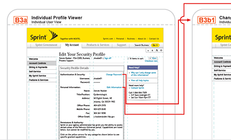
For this flowchart, I also adopted some UML state-chart diagramming methods, with start and end markers, boxes for grouped elements, and so forth. You can see a detail of a small part of the document shown in Figure 1 in Figure 2, which shows both the user interface and the paths from specific links.
Figure 2—Detail of the all-in-one user interface and flowchart document
I loved this approach of creating a single document because looking at the application’s overall structure gave everyone a good sense of the system. Over time, I even added some categories to the diagram and started using the act of creating it to learn tactics for simplifying processes and technical effort through the reuse of UI elements.
I don’t do this now because it wasn’t truly a sustainable approach—partly because of the document’s scale, with many printouts being ten feet long. But I had to give up this approach mostly because it didn’t translate well to remote work. When the developers all moved offshore, I was doing client work for which the developers might not even be on the same continent.
Plus, not everyone consumes content in the same way. Zooming in and out and scrolling on the screen works well for me. But many people can do that only with a large, physical drawing on a wall and get very lost in a giant document on a computer. So I changed the way I do things.
Eventually, I developed an effective UI design and interaction design artifact—partly through doing actual research into how developers and testers consume UX design documentation—that has a drawing and annotations all on one page, as I’ve previously described in my column on “Cascading UX Specifications.” But even when this design documentation is tied to reusable components and style guides, it has no explicit, integrated way of discussing interactivity or how the user perceives the system as a whole and can progress through it. But I didn’t change the way I approached design and still tried to include a flowchart at the beginning of each design document.
Never Draw First
Over time, I’ve realized that it is important not to just add on this diagram, but to actually start with it. Plus, you always need to be able to take a step back from your drawings to consider the impact your detailed design decisions have had on the overall system.
As much as possible, I avoid drawing anything early on. There are a few other approaches I use when collaborating closely with others, but my normal method is to start with a bulleted list. Once I have a basic understanding of the product, process, requirements, technology, audience, organizational goals, and so on, I create a bulleted list.
Don’t Create a Site Map
Most clients, most project teams, and a lot of designers try to create site maps. Just for starters, this term makes my skin crawl because it’s an artifact from bad Web 1.0 design. Instead of having a sensible information architecture (IA), navigation, and wayfinding scheme, they just include a link to a telephone book explaining how your site is constructed at the bottom of every page.
During design, I never make site maps—although, at some point, it could be useful to create an IA diagram. A task flow is a little different. It isn’t about what page is where in a theoretical hierarchy, but how people flow through the system trying to perform their specific tasks.
Model the Interaction
A key thing to remember about most systems is that they are interactive. People do not just look at them or occupy them, but use them. Not just Web sites, but roads and houses and books.
Think about how road trips worked in the days before online maps. Your parents might have gotten out a road atlas or one of those complex, folding maps, and highlighted the route they planned to take. Print maps show the existence, size, and relative location of all the elements within their scope.
The highlighted route showed the expected way your family would interact with the system—which turn to take and where to stop to eat, sleep, or take a tour.
Our system of design documentation must likewise be more than just mapped. You can’t just list every page and organize the documentation to describe the relationships between technologies, but must highlight the most likely paths users would take through the system.
Task Flow Tools: The Bulleted List
When creating a task flow, I’ve tried various tricks and tools for organizing data, both physical and digital, and I’ve settled on the bulleted list. Occasionally, I create a numbered list, but usually just an unordered, bulleted list.
Here’s an example:
CR1457008
As a user, I want the ability to check for new software updates and install them to my connected device.
Precondition: A connected session with any supported device
The user chooses the Check for Software Updates function on the dashboard.
The system checks whether there is new software on Cloud Services, using its device ID.
If no, a message indicates that the software is up to date and no download is necessary.
If yes, an interstitial message box appears with details on the old and new software, a Download and Install button that downloads and installs the updated software, and disclaimers regarding issues with network connectivity and power.
Clicking the Download and Install button loads a progress-indicator interstitial—again including warnings regarding network connectivity and power—and showing the estimated total time for downloading and installing the software.
Once the download-and-install process is complete, a dismissible success banner appears on the dashboard.
This is all you need to create at this step. Do no drawing at all if you can get away with it.
While you could accomplish this goal in some other way—for example, by creating a spreadsheet, particularly using a shared spreadsheet such as Google Sheets that allows commenting, labels, descriptions, and indentations whose formatting does not get lost.
However, I would avoid using other types of tools such as flowcharting tools at this point—partly because this documentation needs to be as accessible as possible and also to help you keep your focus. You can put a bulleted list in an email message, Confluence, OneNote, on story cards, or in whatever system you want. Start simple, then expand. Mostly, a bulleted list retains a single path of interactions. The user sees a page, clicks something, then—next bullet—this other view appears, and the user reacts to it.
Accounting for Complexity
This bulleted list represents what everyone I’ve worked with calls the happy path—a fairly straight-line process, with few branches or options, that assumes no problems.
Of course, in reality, all of the interactive systems that our users work within are complex—arbitrarily complex in the mathematical sense, meaning nearly infinitely complex. You have to address all of the possible ways to get into the process, encounter errors, and avoid them.
Typing out your assumptions about the process based on the requirements, or story, is a good way to challenge this happy path. Go back to your design principles and think about which of them you might be violating. For this software-update feature, I’d challenge the assumption that any user actually wants to check the software status. Sure, maybe a few might, if Customer Care tells them to, but shouldn’t the default be to check automatically?
After questioning this, I find that this process cannot be entirely automatic and occur just in the background—because of the way connections work and the chance of bricking the device if it disconnects—but I still add a branch to inform the user.
CR1457008
As a user, I want the ability to check for new software updates and install them to my connected device.
Precondition: A connected session with any supported device
The dashboard loads.
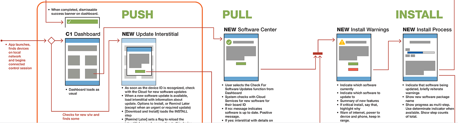
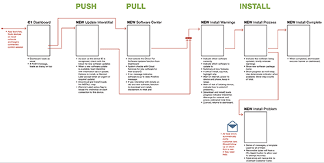
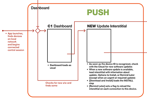
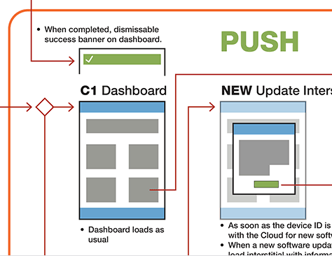
PUSH
As soon as Cloud Services recognizes the device ID, check for new software updates.
If a new software update is available, load an interstitial message box with information about the update. The options are Download and Install or Remind Later—except when it is an urgent or required update.
Clicking Download and Install advances the process to the INSTALL step—see below.
Clicking Remind Later sets a flag that reloads the interstitial on each connection to the device.
PULL
The user chooses the Check for Software Updates function on the dashboard.
The system checks whether there is new software on Cloud Services, using its device ID.
If no, a message indicates that the software is up to date and no download is necessary.
If yes, an interstitial message box appears with details on the old and new software, a Download and Install button that downloads and installs the updated software, and disclaimers regarding issues with network connectivity and power.
INSTALL
Clicking Download and Install loads a progress-indicator interstitial, with warnings regarding issues with network connectivity and power and showing the estimated total time for downloading and installing the software.
Once the download-and-install process is complete, a dismissible success banner appears on the dashboard.
Note how I’ve categorized the interactions as PUSH, Pull, and INSTALL and placed the shared pages, or functions, in their own section. You could go further with this process and have many levels, but at some point, the descriptions start getting a little too complex for even a multilevel bulleted list or spreadsheet.
Boxes and Arrows
Next, it’s finally time to draw, but proceed carefully. Use low-fidelity drawing tools or coarse methods. One reason people use Post-It notes and whiteboards to draw during ideation workshops is that they are purposely very rough. Keep that same principle in mind when drawing boxes and arrows, stick to the structure and ideas, and avoid getting into UI details.
You could break out Lucid Chart, Miro, Visio, or just PowerPoint. I usually draw in Adobe InDesign, OmniGraffle, or whatever vector design tool I’m already using, but that’s because of tool familiarity more than anything else.
The time to move on to the boxes-and-arrows mode is when it becomes too confusing to keep track of a nested, bulleted list. Take each step in the process from the bulleted list and add a page for it to the flowchart. Usually, each bullet point represents one page. If you have broken the bulleted list into sections, as I did earlier, start placing each of the boxes into a labeled section.
As you add each box, the pages should remain in the same order as in the bulleted list. People read flows from left to right and top to bottom—at least in the West, where we have left-to-right languages—so lay out the process in this way. I also make my arrows follow this same approach, with arrows to a page always entering at the upper left and arrows from a page exiting—ideally, adjacent to the function, so the buttons at the bottom—to the lower right whenever possible.
Be sure to paste in the text from the bulleted list below each box. Then, start connecting the boxes and expanding the flowchart, as follows:
Draw arrows between each step, in the order they occur.
Elaborate on functional details and the display of elements, turning these details into new bulleted lists.
The bulleted lists for each item can be as detailed as you want. I still often resort to the UML method and divide the list into display versus interactive items in some way. You can be explicit and create two labeled lists or imply this division through formatting:
Display element
Input—Allow the user to type some value.
<Links, with their full labels>
[Buttons, with descriptions such as SUBMIT]
This diagram would look similar to the example shown in Figure 3.
Figure 3—Simple flowchart with bulleted feature lists below each node
The next step is to reanalyze everything. What other conditions, exceptions, or error states could exist? How should you deal with them? Start explaining the variations, drawing new boxes, linking them up with arrows, and adding branch points or conditions.
Group variations on a single template, again cribbing from UML, providing a labeled box for the whole group and arrows inside the group showing relationships. A set of tabbed views, for example, should be next to each other, with double-ended arrows between them to indicate the shifting view. I don’t use this approach much these days because it isn’t as easy for most other team members to consume, but a stricter state-chart diagram would organize the items not as a list, but in subdivisions within the box itself, as shown in a snippet of a work-in-progress document in Figure 4.
Figure 4—Flowchart for group of nodes, dividing display and functions
You can show a series of pages as a process or a series for which you don’t really need to show every step as a stack of pages. Figure 5 shows some of these drawing methods.
Figure 5—Detail of grouped elements in a task flowchart
In reality, these are not precisely sequential steps. However, as you start pasting in the content—and especially as you begin to expand on your bulleted lists of both display and interactive conditions, you’ll see the gaps in the process. It’s just fine to stop and fill in each of those gaps as you discover them. But some people prefer to add placeholder notes to ensure they don’t lose their way. This could also become messy and need to be revised once it’s complete, to keep the flow going generally left to right and ensure it doesn’t become too cluttered or have too many lines crossing.
This is just fine. You should always be willing to revise or correct a flowchart—or even realize that your design isn’t working and needs major revisions. This is not just a method of artifact creation, but a way of helping you to define your design. Not everything that works in your brain makes sense when you write it down.
The process of expanding your design may have no fixed end. But just as you moved from bulleted lists to boxes and arrows, at a certain point, it’s time to move on to the next step.
Cartoons or Icons
The next step in your design process is not a leap of faith to a pixel-perfect user interface, but another subtle segue from one mode of design to another. Take the flowchart you’ve created and start adding little pictures within each box.
These are not the full user interface, but are more iconic—or as I like to say, they’re cartoon representations of the user interface. You can now show whether a user-interface element is a page or pop-up message box or overlay, a list or a form, and indicate tabs, graphics, and more. But represent these only roughly, providing visual indicators, but not actual detailed designs. Figure 6 shows the same detail area as before, expanded to display the UI detail.
Figure 6—UI type indicators in the flowchart nodes
Each of these representations of UI elements should already exist and correspond to those in a legend. Reuse them as much as possible, creating new ones only when no existing element suffices. This approach, of course, means you are set up for modular, reusable design, making it easier to build, fix, and update user interfaces and enforcing consistency within your mobile app or Web site.
The Structure Is Most Important
Remember, the work of creating a task-flow diagram—and most of the artifacts that UX designers create—is not about creating an artifact for its own sake, but is part of the actual design process. Do this activity to determine whether what is in your head actually works, and use it to progress to other bits of the work, step by step, all the way to a coded product.
The next step is certainly to get buy-in from your team. One of the best things about this form of output is that most people can read flowcharts and everyone can read bulleted lists. Whether you present this artifact or just give the product team a link to review it on their own, this is a good point for everyone to approve or give detailed feedback on your design. Then, as necessary, either change your design or revise the feature or user story to comply with your new understanding.
This collaboration step should also determine what tool you use. Just recently, I did a lot of flowcharts for a client who had a Lucid Chart account that they’d linked to their Confluence shared-resource library. I didn’t love working in that system, but everyone could see the design, comment, and edit it.
The next artifact you could create at this point varies a lot. Often, I create detailed design templates and components, but you might need to hand off your work for another designer to fill in the details. This process could optionally branch to doing analysis, software design, or creating proof-of-concept code in parallel to detailed design.
Creating proper design artifacts and sharing them with your team throughout the design process helps push the process forward. Early-engagement artifacts such as the task-flow diagram give User Experience the highest value and impact on a product, so they are always worth creating.
For his entire 15-year design career, Steven has been documenting design process. He started designing for mobile full time in 2007 when he joined Little Springs Design. Steven’s publications include Designing by Drawing: A Practical Guide to Creating Usable Interactive Design, the O’Reilly book Designing Mobile Interfaces, and an extensive Web site providing mobile design resources to support his book. Steven has led projects on security, account management, content distribution, and communications services for numerous products, in domains ranging from construction supplies to hospital record-keeping. His mobile work has included the design of browsers, ereaders, search, Near Field Communication (NFC), mobile banking, data communications, location services, and operating system overlays. Steven spent eight years with the US mobile operator Sprint and has also worked with AT&T, Qualcomm, Samsung, Skyfire, Bitstream, VivoTech, The Weather Channel, Bank Midwest, IGLTA, Lowe’s, and Hallmark Cards. He runs his own interactive design studio at 4ourth Mobile. Read More
