Greeking is a centuries-old term that refers to the use of placeholder text or images instead of including the real, final content in a design. Traditionally, designers have used greeking because the real text was not available, or they thought it would be irrelevant because they wanted other designers or reviewers to focus on the design alone. At least, these were designers’ traditional arguments for its use.
However, in recent decades, as we’ve applied more and more science to the practice of design, we’ve found that such arguments are not really true, and it can be a terrible idea to use placeholder, dummy, or mock content. Design documents must, by their nature, represent content. So there is now a strong trend toward designing content first, and I strongly agree with it. If you don't have real content or functionality at the beginning of design, it can be hard to design a good solution. Content does not distract from your design. It’s the point of your design’s existence.
Champion Advertisement
Continue Reading…
Mock, fake, or placeholder content has some specific issues that can lead to practical problems with your designs. Plus, over the last few years, the use of placeholder content has become a more pressing issue because many dedicated user-interface (UI) design tools either allow greeking or even use the lorem ipsum style of greeked text for all content by default.
Lorem Ipsum
People use the term greeking for typical placeholder text because it derived from a piece of apparently nonsense text that usually starts Lorem ipsum dolor sit amet, consectetur adipiscing elit….
Such text first appeared in typography sample books around 500 years ago. It’s the old version of The quick brown fox jumps over the lazy dog. Since then, its use slowly transitioned to becoming common for general placeholder text.
But what is greeking? The best known version of greeked text’s oral history is that it comprises random Latin words and means nothing. In fact, it is a mostly unmodified passage from Cicero's De Finibus, a treatise on the theory of ethics from 45 BC that experienced a resurgence in popularity during the Renaissance. It begins with Neque porro quisquam est qui dolorem ipsum quia dolor sit amet, consectetur, adipisci veldt…, which means There is no one who loves pain itself, who seeks after it and wants to have it, simply because it is pain….
The actual origins of greeking’s first use in sample text are lost to history, but its use most likely came about simply because a printer had already set the text in type and kept using it for other samples. Making unauthorized copies of printed works was common during that era—which led to the development of the copyright—so making word-for-word copies of even a sample book makes logical sense. What is more shocking is that the text has remained largely unchanged and is still in use 500 years later.
The reason people call it greek likely relates to the phrase “It was Greek to me,” which first appeared in Shakespeare’s writings in 1599, which coincided with a massive decline of Greek-language instruction in England. But I am not sufficiently well-versed in etymology to dig into this further.
If you do decide to use this style of greeking, having the complete text and choosing bits from the middle of it is the best way to use it, so I have reproduced the text in full here:
Sed ut perspiciatis, unde omnis iste natus error sit voluptatem accusantium doloremque laudantium, totam rem aperiam eaque ipsa, quae ab illo inventore veritatis et quasi architecto beatae vitae dicta sunt, explicabo. nemo enim ipsam voluptatem, quia voluptas sit, aspernatur aut odit aut fugit, sed quia consequuntur magni dolores eos, qui ratione voluptatem sequi nesciunt, neque porro quisquam est, qui dolorem ipsum, quia dolor sit, amet, consectetur, adipisci velit, sed quia non numquam eius modi tempora incidunt, ut labore et dolore magnam aliquam quaerat voluptatem. ut enim ad minima veniam, quis nostrum exercitationem ullam corporis suscipit laboriosam, nisi ut aliquid ex ea commodi consequatur? quis autem vel eum iure reprehenderit, qui in ea voluptate velit esse, quam nihil molestiae consequatur, vel illum, qui dolorem eum fugiat, quo voluptas nulla pariatur? At vero eos et accusamus et iusto odio dignissimos ducimus, qui blanditiis praesentium voluptatum deleniti atque corrupti, quos dolores et quas molestias excepturi sint, obcaecati cupiditate non provident, similique sunt in culpa, qui officia deserunt mollitia animi, id est laborum et dolorum fuga. et harum quidem rerum facilis est et expedita distinctio. nam libero tempore, cum soluta nobis est eligendi optio, cumque nihil impedit, quo minus id, quod maxime placeat, facere possimus, omnis voluptas assumenda est, omnis dolor repellendus. temporibus autem quibusdam et aut officiis debitis aut rerum necessitatibus saepe eveniet, ut et voluptates repudiandae sint et molestiae non recusandae. Itaque earum rerum hic tenetur a sapiente delectus, ut aut reiciendis voluptatibus maiores alias consequatur aut perferendis doloribus asperiores repellat. Hanc ego cum teneam sententiam, quid est cur verear, ne ad eam non possim accommodare Torquatos nostros? quos tu paulo ante cum memoriter, tum etiam erga nos amice et benivole collegisti, nec me tamen laudandis maioribus meis corrupisti nec segniorem ad respondendum reddidisti. quorum facta quem ad modum, quaeso, interpretaris? sicine eos censes aut in armatum hostem impetum fecisse aut in liberos atque in sanguinem suum tam crudelis fuisse, nihil ut de utilitatibus, nihil ut de commodis suis cogitarent? at id ne ferae quidem faciunt, ut ita ruant itaque turbent, ut earum motus et impetus quo pertineant non intellegamus, tu tam egregios viros censes tantas res gessisse sine causa?
Quae fuerit causa, mox videro; interea hoc tenebo, si ob aliquam causam ista, quae sine dubio praeclara sunt, fecerint, virtutem iis per se ipsam causam non fuisse. — Torquem detraxit hosti. — Et quidem se texit, ne interiret. — At magnum periculum adiit. — In oculis quidem exercitus. — Quid ex eo est consecutus? — Laudem et caritatem, quae sunt vitae sine metu degendae praesidia firmissima. — Filium morte multavit. — Si sine causa, nollem me ab eo ortum, tam inportuno tamque crudeli; sin, ut dolore suo sanciret militaris imperii disciplinam exercitumque in gravissimo bello animadversionis metu contineret, saluti prospexit civium, qua intellegebat contineri suam. atque haec ratio late patet.
Types and Uses of Greeking
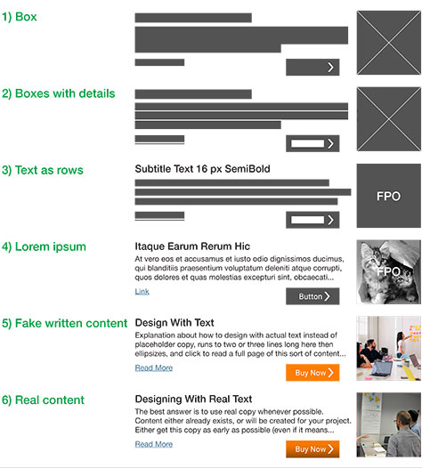
While there is no single approach to designing with content versus using placeholder text, Figure 1 shows a range of options, which compares the five types of greeking to a design with real content.
Figure 1—Five types of greeking versus real content
I categorize the five types of greeking, from least to highest fidelity, as follows:
Box—This approach represents text as an outlined area that the designer expects the content would occupy. Paragraphs are boxes, with a shorter last line to make it clear that it is a box of text versus some other content or UI element. Images are boxes, usually with Xs across them. Functional elements such as buttons appear in their final size, but as simplified versions.
Boxes with details—These are similar to boxes, but with further subdivisions—for example, indicating individual lines of text in paragraphs as a guide to how much content could be in each line. Interactive elements are more detailed—for example, using underlining to indicate links or labels within form elements.
Text as rows—Each line of text, even when within a paragraph, appears as a single line of text, coming closer to the idea of representing the actual content. The largest text items sometimes appear in actual text, but they are usually placeholders such as Title or Caption goes here. Marking placeholder images as images—or often FPO meaning For Position Only—prevents their get into production.
Lorem Ipsum—All words are in their final display size and often their actual style—in the text-greeking style. Photos or illustrations replace other placeholder images, but as with the text, they often have no relevance to the actual image content. Interactive elements begin to get labels, indicating their type or function, so the designer can represent their size and style properly.
Fake written content—Writers provide some actual content, but it is often not the final text. Titles and major labels such as those for buttons have sufficiently realistic labels they could be final or just need a bit of editing. Long or detailed content is often placeholder text such as Caption goes here or might explain, in plain language, what sort of content should replace it.
These five types of greeking are not just historically interesting or those that individual designers might create manually. Software developers have built them into tools for creating digital mockups or have provided various modes of displaying actual, designed content that have been in use since their inception. Many tools greek any text below a certain display size for performance reasons—and because it would not be readable anyway—as shown in Figure 2.
Figure 2—Greeking small text as gray lines in Adobe InDesign
Problems with Greeking
There are several issues with using greeking, mock, or placeholder content of any sort rather than real content—at least in a design context—as follows:.
Greeking is a specialized design language. The consumers of designed documents won’t always understand these styles of greeking—especially those that use boxes or lines. Any source of confusion, even if you resolve it prior to implementation, can cause delays or introduce estimation errors. Not all people universally recognize text greeking of the lorem ipsum variety as fake content, so you may have to explain its use.
Repetitive text leads to reading errors. Whenever I’ve used greeking, I picked random passages of greeked text to achieve variation in the line lengths. But most designers and their tools default to using exactly the same fake content over and over again. For example, every bullet point would start with Lorem ipsum. This practice does not accurately represent the variety of content that the reader would encounter, which leads to people inadvertently skipping over content or otherwise reading content differently from the way they would in reality.
Greeked text doesn’t fit in the same way as real text. Latin has neither the same cadence—that is, the average length of words—nor occurrence of letters as English. The distribution of words is also different, so they fit in the space differently from words in any other language. This is especially true of words in small areas such as on tabs, buttons, or in narrow columns, which would break or wrap differently from your actual content.
Designers can’t actually read text in Latin. Because the words are not words in the designer’s native language, they don’t treat them as words. For example, it’s common for designers to truncate and add an ellipsis to greeked text, creating impossibly short phrases, then to be unhappy when real text doesn’t work well in practice.
No one reads Latin. Latin words are not words that most people would recognize, so no one reads them. Therefore, the reader’s eye tracks differently, so no one notices readability and legibility issues until it’s too late—once you’ve built the real product.
Many of these issues become worse on mobile devices. With short line lengths, wrapping and ellipsizing text are much more common. It’s all too easy to design for fake text, making designers and reviewers happy that everything fits, when the real content would not. This problem becomes even worse if the real text is in a particular technical language with no compound words or typical phrasings. The same issue arises with greeking in addresses, user names, lists of products or categories, and in menus.
Designing with Real Text
The best solution is to use real content whenever possible. Either this content would already exist or your team would create it for your project at some point. Ideally, you would get this copy as early as possible—even if it’s in draft form or you have to make it up yourself—or you would work closely with the content team to create at least enough content for your mockups.
Sadly, many organizations either have no content team or, at best, the team is part of a Marketing organization that doesn’t really understand the requirements for interactive or functional content. Still, you can create the content early or even first thing during the design process. I always start with realistic content—taking a first cut at titles, labels, and descriptive text and using real names, product names, and email addresses—often even before doing any high-fidelity design work, as I discussed in my column “Adaptive Information Design and the Box Diagram.” If you start with text that is close to the real text, your product team would notice what’s wrong and either suggest improvements or get you the real data you need, so this is a good place to start.
Whenever you can, steal content from a legacy product, marketing brochures, PowerPoint decks, or anything else you have. Sure, the text might be overly long or just plain wrong, but many people find it easier to edit than to write from scratch.
Regionalizing Placeholder Text
When providing placeholder or example content, use caution when choosing names for people, products, and locales. Make sure that they are realistic for the product and the region. It could be helpful to create long names for various data fields deliberately. For example, as a person’s name, I have used the name of a former coworker, Narin Jaroensubphayanont, for a long time. (He has since returned to Thailand, where he teaches human-computer interaction.) If you include hyphenated last names, that example won’t seem overwhelmingly long, even for the US. If all of your fake names are as short as John Smith, you’ll be unpleasantly surprised when the real product’s text works poorly.
A crucial lesson for regionally specific information is that different languages have different cadences. So, if you’re designing a global application, periodically load in a language other than your default. Check local address and name formats to make sure the text fits. If you think all addresses are like a home address in the US—that is, an address line, then a city, state, ZIP code line—you’re wrong. Businesses and foreign countries might have five or more address lines. Don’t make any assumptions.
Numbers-Oriented People
I mentioned earlier that using realistic content makes product teams read it, and they’ll notice mistakes or things that just don’t read well early on, allowing you to correct them.
Numbers-oriented people notice mistakes, but not in a good way. Say you’ve designed a checkout page, and it adds up the total quantities and costs. If your math isn’t correct, many people could notice, putting an end to your design review. Often, instead of seeing incorrect numbers as placeholder text, they might assume that there are some hidden fees or that you've made a mathematical error, so you would be hard pressed to get them to focus on the real design issues.
So make sure that all numbers in charts, tables, graphs, and on checkout pages are within realistic ranges and add up properly. This would ensure both that your designs use values of the proper length and the product team evaluates your designs properly.
Seriously, No Jokes
If you have to make up content for temporary, internal use, there is often an inclination to use pop-culture references or internal jokes. Aside from the fact that such fake content is often as unrealistic or unusable as lorem ipsum text for many of the same reasons—including repetitiveness and improbable lengths and cadences—you might be surprised to find out what a poor sense of humor many people have.
Designers have even been fired over the use of inappropriate placeholder copy, and agencies have lost clients. People don’t always notice placeholder content, so lorem ipsum text, references to Add final copy here, and insults to users have made it into production or remained in print on product packaging that appeared on store shelves. While I could provide guidelines to cover such issues, there is just too much chance of making costly mistakes, so it’s best to avoid such issues altogether and assume your mockup could end up on the front page of The New York Times.
Even seemingly innocuous fake content could cause immense problems. I’ve been peripherally involved in incidents where placeholder phone numbers made it into production. They looked real and were not 555 numbers or anything else that was obviously fake, but were simply keyed in by the designers. In two cases, people ended up dialing real numbers, as these examples show:
A phone number that was provided for a retail store instead went to a house. The retired residents, having lived there for decades, received dozens of calls each day, but didn’t want to change their long-held number, even though it had been published in numerous locations. Lawyers got involved, and it took years to sort out this issue.
A phone number for contacting customer care instead dialed an adult-chat number. This problem was easily rectified, but in the few hours before it was fixed, offended customers canceled their account or senior management had to offer their apologies and expensive enticements to persuade them to remain customers.
Unless you really want to talk to lawyers or have to justify to your boss’s boss why it’s necessary to send rebate checks to customers, don’t let this happen to you. So use real content as early in your design process as possible. Think about how bad it would be if your design’s placeholder text made it into production, then choose different text if necessary.
Conclusion
The digital era has both empowered an exponential rise in the information people create and share and resulted in the loss of some information. Huge amounts of the information we create these days never gets archived. Organizations discard far too much legacy media without transferring it to an archive or backing it up.
Plus, we’re losing many of our traditions. The methods and practices of graphic design and human interaction have evolved over centuries, but very few digital-design professionals seem to be aware of this history. Many are dismissive of learning lessons from the past.
Greeking is just one of the design practices whose lessons many of today’s designers are forgetting—lessons that all designers knew just 30 years ago—much to the detriment of the whole practice of design. Even as I did research for this article, I discovered that some references with which everyone was once familiar have disappeared in just the last few years, making it was hard to prove what I know about this topic.
Read, remember, save, and share information that can improve your team’s work and the whole practice of digital design.
For his entire 15-year design career, Steven has been documenting design process. He started designing for mobile full time in 2007 when he joined Little Springs Design. Steven’s publications include Designing by Drawing: A Practical Guide to Creating Usable Interactive Design, the O’Reilly book Designing Mobile Interfaces, and an extensive Web site providing mobile design resources to support his book. Steven has led projects on security, account management, content distribution, and communications services for numerous products, in domains ranging from construction supplies to hospital record-keeping. His mobile work has included the design of browsers, ereaders, search, Near Field Communication (NFC), mobile banking, data communications, location services, and operating system overlays. Steven spent eight years with the US mobile operator Sprint and has also worked with AT&T, Qualcomm, Samsung, Skyfire, Bitstream, VivoTech, The Weather Channel, Bank Midwest, IGLTA, Lowe’s, and Hallmark Cards. He runs his own interactive design studio at 4ourth Mobile. Read More