I rarely talk explicitly about accessibility—not because I don’t care about it, but because accessibility must be so well baked into the overall design process. Plus, there are so many overlaps between accessible design and the concept of design for everyone in every context that my basic design principles and detailed guidelines more or less cover it. On projects, I actually avoid discussing accessibility specifically because I think it tends to lead to project teams’ creating accessibility features, which of course, are all too easy to descope, so teams might never get around to implementing them.
Mobile—and the related trends of using tablets and notebook computers in every environment—has made discussions of universal access even more important. Instead of thinking of disabled rather normal people, it is best to think along the lines of everyone being at least sometimes temporarily disabled. Although much temporary disability is the result of physical conditions, illnesses, or injuries, it can also be the consequence of environmental conditions. For example, sunlight might be coming through a window and glaring off a screen, making it hard to read and colors difficult to differentiate.
Champion Advertisement
Continue Reading…
If you’ve already designed your mobile app or Web site with design best practices in mind, it should remain functional even in such environments, without forcing users to move away from the window, brighten their screen, or enter some special, accessibility mode to increase font size or contrast.
While I’ve discussed some of these topics in earlier columns—most notably in my column “Dark Isn’t Just a Mode”—let’s review the general use of color in universal mobile design.
Color-Deficient Vision
Color-vision deficiency is a set of conditions in which a person cannot distinguish certain colors or can distinguish them only with difficulty. This is typically an inherited condition, and there is no treatment for it.
All of these conditions are commonly called color blindness, or more correctly in most cases, color-deficient vision. However, the complete loss of color vision is extremely rare, so the term color blindness, if not derisive, is at least misleading, so we should try not to use it.
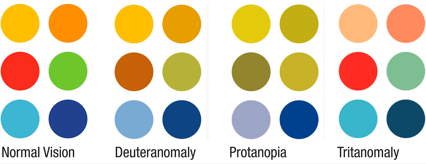
Different types of sensing deficiencies in the eye prevent people from distinguishing certain colors, make it difficult for them to distinguish them, or make them less prominent. Figure 1 shows a selection of colors and examples of how people with certain types of color-deficient vision perceive them.
Figure 1—Normal color perception and with three types of color deficits
The most common type is red/green color deficiency, which affects about 8% of males. Very different physical deficiencies cause the following forms of color-deficient vision:
deuteranomaly—Colors appear shifted toward red, which also causes difficulty in distinguishing violet from blue.
protanomaly—There is reduced red perception, both in saturation and in brightness. Red, orange, yellow, yellow-green, and green appear somewhat shifted in hue toward green, and all of these colors appear paler than they do to a person with normal vision. The redness component that a person with normal color perception sees in a violet or lavender color is so weakened for a person with protanomaly that he may fail to detect it and, therefore, see only the blue component.
protanopia—This causes complete red/green color deficiency, along with such a pronounced reduction of the brightness of red, orange, and yellow that a protanope may confuse reds with black or dark gray. A red traffic light might not appear to be illuminated at all. Violet, lavender, and purple are indistinguishable from various shades of blue because their reddish components are so dimmed as to be invisible. For example, pink flowers may appear to be blue.
deuteranopia—This is a complete loss of red/green sensing, but through a different mechanism, so there are no dimming issues. Still, the terms red, orange, yellow, and green really mean very little to a deuteranope aside from their being names for different colors that everyone else seems to be able to agree on. Similarly, violet, lavender, purple, and blue seem to be too many names for hues that all look alike.
Yellow/blue color deficiencies are much less common, but still occur in 2–3% of males—enough that we should be aware of and plan for this during design.
tritanomaly—Blue and green look similar and yellow and red look similar.
tritanopia—A tritanope has difficulty telling the difference between multiple shades that are associated with blue and yellow—such as green, purple, red, and pink.
A third type of color deficiency also exists: complete color blindness, or achromatopsia. This condition is incredibly rare and results in entirely monochromatic or grayscale vision.
Color-deficiency simulators often use these terms so it is important that you be able to understand them. All rates of incidence that I’ve cited are for males; females very rarely inherit color-deficient vision because both parents would have to have the same gene. But the relative proportions of each type of color deficiency remain the same for both genders.
Unknown and Temporary Disability
Color deficiencies of one sort or another occur in about 8% to 12% of men and about 0.5% to 1% of women. However, we ought to qualify this information, for which there are some significant caveats. Such figures are usually based on populations of Western European origin, and they represent only people who have sought medical diagnosis.
Many years back, I was testing a process that involved users’ reacting to an unexpected error. One research participant simply did not get it, and I couldn’t figure out why. Through eyetracking, I could see his gaze go right over the big, bright yellow warning icon. But even when I prompted him, he never noticed it. At the end of the test, I asked him to look at an alternative design in which the warning was a triangle instead of a circle, but there was no other difference. He immediately noticed it so we adopted this more pronounced shape for use on the site. This person almost certainly had a color-vision deficit.
To overcome such deficiencies, we used multiple methods of encoding the icon, with a shape that was distinct enough to catch the eye without relying just on color. Minor color-vision deficits such as this often are not obvious to the individuals who have them. They can still tell colors apart, but learn the world of color in a slightly different way. My impression from usability testing and some other research is that over 20% of the population probably has some kind of color-vision deficiency.
Use Care When Making Assumptions or Following Standards
A lot of the wisdom, best practices, and even standards that designers have handed down to one another are old. While they’re not always literally inaccurate, they’re not always applicable, or they might accidentally promulgate bias. For example, a lot of basic assumptions about how color and contrast work are based on reflective light. Signs are reflective, but transmissive light works entirely differently, as on all of the digital displays for which we design.
The basis of much human factors work came from the US Air Force and Navy trying to understand how people work, so pilots would die less often in the high-performance aircraft that were introduced in the 1930s, then in the jets of the mid-to-late 1940s. This research provided comprehensive information, and people don’t change so it’s still applicable, but only for those people. Military officers are not children or the elderly. At that time, pilots were never women, almost everyone belonged to a very narrow range of ethnicities, and none of the young men was ever colorblind.
The military research and the early computer research that we still use also applies only to the way those people worked at the time. Both types of research almost always assumed workstations or a user focused on a task on a system in a fixed relationship to the user. In pretty much every reality—and more so as our devices have become more and more mobile—environmental conditions are many and varied. Some of them can create problems similar in effect to color blindness.
Color blindness is not an illness, but a condition that, similar to distraction or transient physical circumstances, changes how people work. We can’t assume that disabled people belong one class. However, we must assume that the concept of temporary disability could impact anyone and design to accommodate this. Glare is the most common issue and can reduce device contrast, but there are also other issues such as dust and dirt on the screen, rain, and users wearing sunglasses or simply viewing screens at restricted angles, in concert with the way people can view some flat-panel displays properly only at fairly narrow viewing angles. All of these factors can destroy the visibility of colors or change their appearance.
Don’t rely on color to signal information. Design with enough contrast and rely on words and shapes to convey meaning. Then you’ll be designing for those with color-deficient vision whether that is a condition or just the user’s circumstances.
Color and Contrast
If we can’t trust people’s perception of color, how can we design with color? Design for contrast first. I’m sure you all know that you should check a design for sufficient contrast to make sure words and icons are legible. But I suggest you start with contrast instead. This isn’t as radical as it might seem if you think about how you might start a design as a sketch on paper or a whiteboard. You didn’t choose the colors and fill them in, but drew outlines and bold shapes—probably in just the one color of your favorite pencil or marker.
When you move to your design tool and start applying colors, make conscious decisions about contrast. You might even create the first rendering of your design in grayscale. Fill everything in with grays, then apply branded colors that match the necessary contrast levels. Remember, you shouldn’t grudgingly design for accessibility, but design for universal access from the ground up.
How Much Contrast?
When I said the necessary contrast levels, what does that mean? Well, it depends—and most of all, it depends on size. Large elements require less contrast to be visible. The AAA standard—the highest level—from the Web Content Accessibility Guidelines (WCAG) 2.1 recommendations defines two minimal contrast ratios: 7:1 for normal text and 4.5:1 for large text. Why does contrast change for different font sizes? Because of the smallest perceptible difference. Smaller things are harder to see.
This concept extends, within reason, even to larger items. You can get away with a 3:1 ratio for say the background of a card on a page background, and it would still be easily discernible. Higher ratios are also visible. Because thin type is thin, it is harder to read. Either use heavier type weights or higher contrast.
I always go for the greatest contrast I can. So I often default to black on white, whose contrast ratio is 23:1. But be aware that some people find excessive contrast hard to read. However, simply reducing contrast is hard to justify because you might need it for many people and in many environments. Therefore, the best trick is using inverse polarity, or dark mode. Rather than changing the contrast levels between items, I always start with white text on a black background, but reduce the total light output of the screen, which tends to help people with myopia or other vision issues for whom high-contrast backgrounds can cause issues.
I’ll also give you an old print-design cheat: use borders. If contrast is marginal, but you cannot or just don’t want to change it, you can often add a higher-contrast border. Just the slightly greater contrast of a tiny one-pixel-wide border can make the edge contrast sharp enough to cause the shape to stand out, without your changing the overall color. You can even use this same trick for larger text or icons—such as on dashboards, where more high-contrast base colors would not be appropriate.
Contrast, Not Color Contrast
If you are already familiar with the W3C standards for accessibility, you might have noticed how I’ve said contrast, by itself, every time. The term color contrast, despite being the W3C-promoted industry term, is misleading, so I deliberately avoid using it. Because I went to school for art and graphic design, I have a background in color theory.
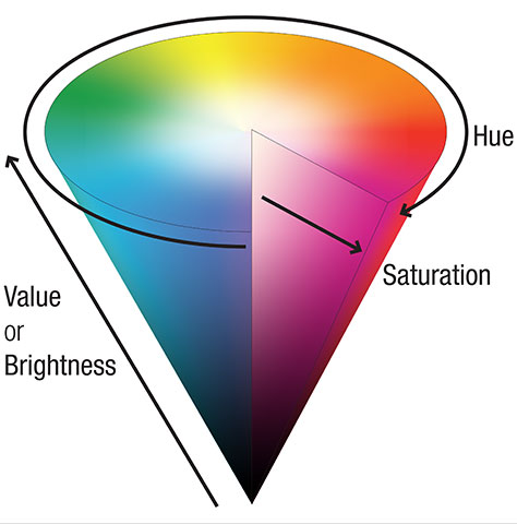
A color comprises three components, which I’ll try to explain as simply as I can:
hue—The part of a spectrum on which the color appears.
saturation—The intensity of the hue’s chroma, or intensity.
value, or brightness—The amount of black or white that has been added to the color.
Together these are called HSV or HSB. They give you the same colors as from RGB model, but that refers to how machines display colors. HSV refers to the way people perceive colors. There are several ways to visualize color spaces such as these models. Figure 2 shows a good 3-D model for understanding and specifying color, but we often see color represented as the three sliders of a color picker.
Figure 2—Diagram of the HSV color space
But to most people, in most situations, including most designers, developers, and product managers, the term color more or less refers to the hue part and nothing else. It means red or green. Therefore, the term color contrast implies that contrast relates to the hue, but it does not.
Contrast instead means the difference between the value, or brightness, level of two different elements. Small differences are low contrast, so hard to differentiate or see. Large differences are high contrast, so easy to tell apart or read.
Critically, this difference holds regardless of the hue itself. Contrast—as well as your understanding of it—is important. It lets you accurately address the needs of readability for accessibility, within the unpredictable environments in which mobile users find themselves. This is highly relevant when you’re thinking of changing palettes. Contrast is contrast, regardless of the color of the elements.
Contextual Differentiability
This evening, I was out in the yard relaxing and periodically looking up to make sure my preschooler was not getting into trouble. Every time, it took me a while to find him despite the fact he was wearing a lot of bright orange. We like bright colors, so many items on the deck or in the yard are bright red or orange, and he didn’t stand out in that context.
This is a recurring issue in ad hoc safety cultures. While aircraft carrier decks are color coded, anything that might be dangerous in a factory or construction site is yellow or maybe orange. The result is that you can’t find the actual danger among the sea of yellow. Many workers make sure to buy a high-visibility blue or green tape measure, and many contractors paint big stripes of color such as blue and black on all their equipment, just so it stands out in an environment with safety yellow everywhere.
In case you aren’t following the analogies, don’t just follow common practice. Instead, choose colors that are appropriate for your context. A red dot to indicate unread messages would be invisible on a red background. Even using red for warnings when the company brand is red is risky.
Often, when we need more colors, we take the existing palette and create tints, adding white, or shades, adding black, of those colors. By doing this, you can get a palette of very useful colors that mesh with the brand. But a tint of red is pink, which, along with some other colors, might have very distinct meanings that could be vastly at odds with your overall palette, and thus, confuse or even offend your users in the wrong context.
Always consider the totality of how color would work with the other elements of your digital product.
New Models for the Complexity of Color
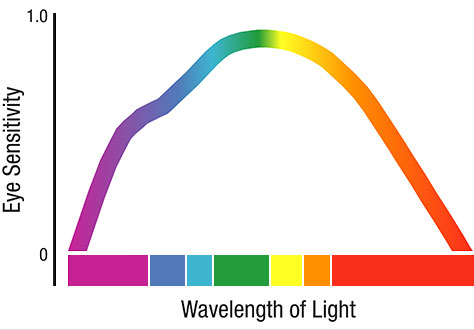
The way people perceive color does not relate to the way photons actually behave. Of course, our eyes can detect only a portion of the spectrum. But even within that range, each of our blue, green, and red cones, as well as the rods, can detect color best at only one frequency. Each of these individual best-detection ranges is not equal to the others.
Although our brains generally try to adjust our perception of all colors so we can see them at close to the same brightness, we don’t really. Even in full sunlight, we perceive yellow and green colors to be brighter than orange or blue, and vastly brighter than red or violet. Figure 3 shows the relative response levels, the luminous efficiency of the eye, in the photopic, or full-daylight, vision range.
Figure 3—Spectral response per CIE 1978 in full daylight
I’ve found this to hold true when designing products. Red doesn’t stick out in the way conventional wisdom tells us it should, so it is often a terrible color for highly important warning or alert messages. It can easily blend into dark backgrounds or, especially for small icons, appear to users at a glance or in their peripheral vision as dark gray or black when on light backgrounds.
Of course, in different lighting conditions, our eyes work differently yet again. As conditions get darker, we see less and less color and at a lower resolution. Therefore, it is important to use large elements and design to emphasize contrast over color.
Lately, it has become clearer that the contrast-checking tools we all use do not model human vision properly. There are proposals for new models that would more accurately represent actual contrast. For now, just keep all this information in mind and avoid deciding to use marginal contrast ratios. They may, in reality, be too low contrast to be legible.
Color and a Design Hierarchy
Now you have it! My solution for designing with color is to design first and foremost as though there is no color. So what’s left? Well, I like to fall back on my design hierarchy. There are a bunch of these, so you may use another one, but my hierarchy, from most to least important, is as follows:
Position
Size
Shape
Contrast
Color
Form
Color is only one of these attributes and is not especially far up the chain. Let’s look at a specific example that causes many issues when coding for identification on many projects: status icons. Figure 4 shows a very typical set of unique icons, each with its own color.
Figure 4—A set of color-coded status icons
However, you’ll note that all of these icons also reside within a surrounding shape, which is a good way to make shapes such as the checkmark or especially the exclamation mark or the letter i more visible than they would be on their own. But they all use the same shape. Looking at these icons without any color makes it obvious that they are fairly hard to differentiate at a glance, as Figure 5 shows.
Figure 5—The same icons with all color removed
What if we made the shapes themselves convey greater meaning? Round circles are friendly, squares are sharper and seem more urgent, and triangles are downright dangerous, as Figure 6 shows. Even without the cultural familiarity that triangles denote warnings, they still look sharp and dangerous.
Figure 6—The same icons with different containing shapes and labels
Aside from the icons in this last example being obviously easier to understand, we know from actual experience that they work better. One reason is multi-encoding—presenting the same information in multiple ways.
Adding text labels to any icon provides both an icon you can interpret at a glance and a slightly deeper reading. There’s some evidence that multiple encoding works better not just because of the capability or environmental reasons I have outlined in this article but because these different modes of communication might address different parts of the brain. Some people actually recognize the words better than the icons.
Conclusion
There are many guidelines on how to create color palettes and select and use color in digital design. However, I hope this column has given you a higher-level understanding of how to use color properly for your context. Don’t fear making small changes throughout your designs as the team offer their opinions or worry that the design might break as the product evolves and new branding changes everything. Instead, design based on contrast and a higher-level understanding of visibility, legibility, and readability.
Don’t let exclusionary standards and assumptions encourage you to ignore unusual use cases or disabled users. We can see that both of these, one way or another, are not edge cases, but part of the norm. Designing products requires designing for everyone in every environment in which they might reasonably use them.
Addressing accessibility is very often simply a natural extension of the principle of multi-encoding: individual capabilities vary from person to person and from one situation to the next. That is normal, and you must plan for it. We need to ensure that our designs work for everyone, without making people think too hard or risking their missing key information.
For his entire 15-year design career, Steven has been documenting design process. He started designing for mobile full time in 2007 when he joined Little Springs Design. Steven’s publications include Designing by Drawing: A Practical Guide to Creating Usable Interactive Design, the O’Reilly book Designing Mobile Interfaces, and an extensive Web site providing mobile design resources to support his book. Steven has led projects on security, account management, content distribution, and communications services for numerous products, in domains ranging from construction supplies to hospital record-keeping. His mobile work has included the design of browsers, ereaders, search, Near Field Communication (NFC), mobile banking, data communications, location services, and operating system overlays. Steven spent eight years with the US mobile operator Sprint and has also worked with AT&T, Qualcomm, Samsung, Skyfire, Bitstream, VivoTech, The Weather Channel, Bank Midwest, IGLTA, Lowe’s, and Hallmark Cards. He runs his own interactive design studio at 4ourth Mobile. Read More


