This article is Part I of a quick reference on color theory for digital displays. It is the first in a series of articles about the use of color in application program user interfaces and on Web sites.
Primary Colors of Additive Color Synthesis
Computer monitors display information using the RGB (Red-Green-Blue) color model. An RGB monitor synthesizes colors additively by selectively illuminating each of its pixel’s red, green, and blue phosphor dots at varying levels of intensity. The light from a pixel’s three phosphor dots blends together to synthesize a single color. In additive color synthesis, all hues of the visible spectrum of light are mixtures of various proportions of one, two, or three of the primary colors of light.
red
(#FF0000)
green
(#00FF00)
blue
(#0000FF)
Champion Advertisement
Continue Reading…
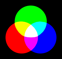
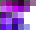
Figure 1 shows how the primary colors combine to create the secondary colors.
Figure 1—Primary and secondary colors of additive synthesis
In additive synthesis, equal proportions of two primary colors combine to create the secondary colors. Equal proportions of all three primary colors combine to create white (#FFFFFF).
The complementary color for a primary color is the secondary color of which it does not comprise a part.
For more information about complementary colors, see Color Harmony.
Secondary and Intermediate Colors
Secondary colors—cyan, yellow, and magenta—consist of equal proportions of two primary colors, as follows:
green
+
blue
=
cyan
(#00FFFF)
red
+
green
=
yellow
(#FFFF00)
red
+
blue
=
magenta
(#FF00FF)
The complementary color for a secondary color is the primary color that does not comprise part of the mixture that forms the secondary color.
For more information about complementary colors, see Color Harmony.
Intermediate colors—light chartreuse, orange, hot pink, bright violet, azure blue, and chrysoprase green—consist of equal proportions of adjacent primary and secondary colors, as follows:
green
+
yellow
=
light chartreuse
(#99FF00)
red
+
yellow
=
orange
(#FF9900)
red
+
magenta
=
hot pink
(#FF0099)
blue
+
magenta
=
bright violet
(#9900FF)
blue
+
cyan
=
azure
blue
(#0099FF)
green
+
cyan
=
chrysoprase green
(#00FF99)
Note—Throughout this article, I’ve used colors from the Web-safe palette in the examples. While it’s no longer necessary to restrict one’s use of color on the Web, doing so in these examples simplifies their scope. Because the Web palette comprises only 216 colors, the hexadecimal values of intermediate colors result from only approximately equal proportions of the primary colors.
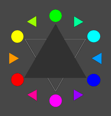
Color Wheel
In Figure 2, the color wheel shows the primary, secondary, and intermediate colors.
Figure 2—Color wheel
The solid triangle in the center indicates the relative positions of the primary colors; the inverted triangle, the secondary colors; and the triangular color swatches represent the intermediate colors.
Color Temperature
Color temperature is the relative warmth or coolness of a color. The long-wavelength, warm colors range from red (#FF0000), with a wavelength of 700 millimicrons, through light chartreuse, with a wavelength of 535 millimicrons. The short-wavelength, cool colors range from green (#00FF00), with a wavelength of 500 millimicrons, through violet (#9933FF), with a wavelength of 400 millimicrons. On the color wheel, magenta (#FF00FF) and the colors on the left are warm colors; green (#00FF00) and the colors on the right, cool colors. In any given visual composition, a color’s temperature is relative to that of its surrounding colors.
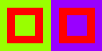
Contrasting colors that are adjacent to a color can also influence its temperature through a simultaneous-contrast effect, as shown in Figure 3.
Figure 3—Simultaneous-contrast effect
In this figure, red (#FF0000) appears warmer and slightly yellowish when surrounded by light chartreuse (#99FF00), but cooler and slightly bluish when surrounded by bright violet (#9900FF).
For more information about the simultaneous-contrast effect, see Color-Contrast Effects.
Contrasts in color temperature also create spatial illusions. Warm colors like red (#FF0000) appear to advance, while cool colors like blue (#0000FF) appear to recede. Areas in warm colors also appear larger than areas in cool colors.
Tertiary, Achromatic, and Other Synthesized Colors
Tertiary colors are mixtures of complementary colors—which appear directly opposite one another on a color wheel. Because they contain some proportion of all three primary colors, they are relatively neutral. Also, they tend to harmonize with most other colors, because of their interrelationship with them. The following are some examples of tertiary colors:
1 light
chartreuse
+
2 bright
violet
=
lavender
#9966FF
3 orange
+
1 azure
blue
=
peach
#FF9966
3 hot pink
+
2 chrysoprase
green
=
light
orchid
#FF99FF
Note—Throughout this article, I’ve used colors from the Web-safe palette in the examples. While it’s no longer necessary to restrict one’s use of color on the Web, doing so in these examples simplifies their scope. Because the Web palette comprises only 216 colors, the proportional values shown for tertiary and synthesized colors are approximate.
Achromatic or neutral colors include white, shades of gray, and black. White (#FFFFFF) consists of equal proportions of all three primary colors at their full intensities. Black (#000000) is the absence of color. The Web-safe grays—silver (#CCCCCC), medium gray (#999999), dark gray (#666666), and charcoal gray (#333333)—also consist of equal proportions of all three primary colors, but at increasingly lower intensities.
red
+
green
+
blue
=
white
#FFFFFF
red
–
green
–
blue
=
black
#000000
Synthesized colors usually consist of unequal proportions of two or three of the primary colors—for example:
2 red
+
5 green
=
bright
chartreuse
#66FF00
5 red
+
2 green
=
tangerine
#FF6600
2 red
+
5 blue
=
bright
blue-violet
#6600FF
2 red
+
3 green
+
3 blue
=
aqua
#66FFFF
4 red
+
1 green
+
1 blue
=
coral
#FF6666
Hexadecimal Color Values
Throughout this series of articles, I've used hexadecimal values to specify the RGB (Red-Green-Blue) values of colors, as is typical when specifying colors on Web pages. For example, in the hexadecimal value for orchid, #CC66FF, CC represents the amount of red, which is 80%; 66, the amount of green, 40%; and FF, the amount of blue, 100%.
Table 1 shows the six equivalent decimal and hexadecimal values that specify red, green, and blue values for all Web-safe colors, with their corresponding percentages. Colors other than Web-safe colors can comprise any values of red, green, and blue.
Table 1—RGB values in Web-safe colors and their percentages
Decimal
Hexadecimal
Percentage
0
00
0%
51
33
20%
102
66
40%
153
99
60%
204
CC
80%
255
FF
100%
RGB values indicate the intensity of each of the primary colors of light—ranging from 0%, the darkest value, which indicates the absence of a color, to 100%, the lightest value, which indicates that a color is at its full intensity. Variations in the intensity of the primary colors of light result in different hues with different levels of value and chroma.
For information about the color properties—hue, value, and chroma—see Color Properties.
Color Properties
Chromatic colors—that is, all colors except white, shades of gray, and black—have three dimensions, or properties:
hue—A perceptible color that corresponds to a unique, dominant wavelength of light.
value—The relative lightness or darkness of a color.
chroma, or saturation—The relative purity and intensity of a chromatic color.
Hue
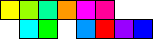
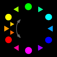
A perceptible color, or hue, corresponds to a unique, dominant wavelength of light in the spectrum—for example, the colors that appear on the color wheel shown in Figure 4.
Figure 4—Hues on the color wheel
The primary and secondary hues are full-chroma colors; the intermediate hues, high-chroma colors.
All spectral hues result from mixing different combinations and proportions of the three primary colors—red, green, and blue. For example, Figure 5 shows various hues of violet (#9933FF).
Figure 5—Hues of violet (#9933FF)
These hues of violet range from bright red-violet (#CC00FF) to blue-violet (#6633FF) and include hues with differing values and chroma levels.
Value
Value describes the relative lightness or darkness of a color. This property applies to both chromatic colors and achromatic colors—which have no hue or chroma. Figure 6 shows a gray scale comprising achromatic colors.
Figure 6—Achromatic colors—a Web-safe gray scale
Values in this gray scale range from the highest, white, through several shades of gray, to the lowest, black.
By combining spectral hues with white or black, different values are achieved. A tint combines a hue with white; a tone, with a mixture of white and black—that is, a shade of gray; and a shade, with black. Dark hues, or shades, have low values; light hues, or tints, high values. For example, the following hues are values of red (#FF0000):
carnation pink
(#FF99CC)
Tint
Empire ruby red
(#CC3333)
Tone
deep burnt sienna
(#660000)
Shade
The intrinsic values of different high-chroma colors vary, as shown in Figures 7 and 8. At the extremes of the value scale, the brightest yellow (#FFFF00) is much lighter than the brightest blue (#0000FF).
Figure 7—Colors have different intrinsic values
In this value scale, the values of the high-chroma colors from the color wheel range from the highest, yellow, to the lowest, blue. Colors that are vertically aligned have approximately the same value.
Figure 8—Intrinsic values of colors
This figure shows the relative values of the colors on the color wheel in non-Web-safe grays.
The human eye cannot easily distinguish differences in value below 15%, especially at the light and dark extremes of a scale. Optimally, minimal differences in value should range between 15 to 25%.
Chroma
Chroma, or saturation, describes the relative purity and intensity of a chromatic color. Chroma levels range from the brilliance of vivid, highly saturated colors to completely neutral grays.
Highly saturated, high-chroma colors comprise a narrow band of wavelengths and, thus, contain very little or no gray and no white. Medium-chroma colors comprise more different wavelengths and, thus, contain more gray. Desaturated, low-chroma colors comprise many different wavelengths and contain a lot of gray, white, or black. Achromatic colors—gray, white, and black—have chroma levels as low as zero. Figure 9 shows a range of chroma levels, while Figure 10 shows various hues that have similar chroma levels.
Figure 9—A range of chroma levels
The hues include pure cyan (#00FFFF), Caribbean blue (#33CCCC), Mediterranean blue (#339999), deep blue-green (#336666), and charcoal gray (#333333)
Figure 10—Hues with medium chroma
The hues include yellow green (#99CC33), cobalt violet (#CC3399), violet (#9933FF), Seurat blue (#3399CC), and cadmium orange (#FF9933)
Color Harmony
A harmonious color scheme depends upon the balance between all three properties of color—hue, value, and chroma. You can achieve color harmony by using complementary, analogous, or monochromatic colors. It is also important to balance the value and chroma of the hues in a color scheme. You can use the five methods of color harmony involving complementary colors either alone or in combination with the analogous, monochromatic, tonal, or chromatic methods.
The nine principal methods of achieving color harmony include
five types of color harmony achieved using complementary colors, as follows:
complementary color harmony—using two colors that are directly opposite another color on a color wheel
split-complementary color harmony—using a color and the two colors that are immediately adjacent to its complementary color
triadic color harmony—using three colors that are equidistant from one another on a color wheel
tetradic color harmony—using four colors that are equidistant from one another on a color wheel
tetradic split-complementary color harmony—using two pairs of split-complements, which appear immediately adjacent to complementary colors on a color wheel
analogous color harmony—using a range of colors that appear adjacent to one another on a color wheel
monochromatic color harmony—using hues of the same color that have different levels of value and/or chroma
tonal color harmony—using colors with similar values
chromatic color harmony—using colors with similar levels of chroma, or saturation
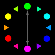
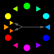
Complementary Color Harmony
Complementary colors appear directly opposite one another on a color wheel—for example, green (#00FF00) and magenta (#FF00FF), as shown in Figure 11. Each pair of complementary colors comprises a warm color and a cool color. While complementary colors contain relatively balanced proportions of their primary colors, their values and chroma levels may vary.
Figure 11—Complementary color harmony
Combining equal proportions of two complementary colors produces white (#FFFFFF).
Split-Complementary Color Harmony
A color’s two split-complementary colors appear immediately adjacent to its complementary color on a color wheel. Figure 12 shows an example of split-complementary color harmony.
Figure 12—Split-complementary color harmony
The split-complements of azure blue (#0099FF) are tangerine (#FF6600) and light mustard (#FFCC00).
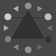
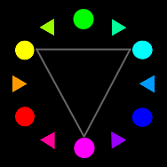
Triadic Color Harmony
Triadic complementary colors comprise three colors that are equidistant from one another on a color wheel. Figure 13 shows an example of triadic color harmony.
Figure 13—Triadic color harmony
The triadic complementary colors are cyan (#00FFFF), yellow (#FFFF00), and magenta (#FF00FF).
Combining equal proportions of three triadic complementary colors produces white (#FFFFFF).
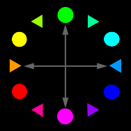
Tetradic Color Harmony
Tetradic complementary colors comprise four colors that are equidistant from one another on a color wheel. Figure 14 shows an example of tetradic color harmony.
Figure 14—Tetradic color harmony
The tetradic complementary colors are green (#00FF00), azure blue (#0099FF), magenta (#FF00FF), and orange (#FF9900).
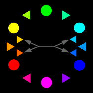
Tetradic Split-Complementary Color Harmony
Tetradic split-complementary colors comprise two pairs of split-complements that appear immediately adjacent to complementary colors on a color wheel. Figure 15 provides an example, showing two pairs of split-complements.
Figure 15—Tetradic split-complementary color harmony
This tetradic split-complement comprises two pairs of split-complements: tangerine (#FF6600) and light mustard (#FFCC00) and turquoise blue (#00CCFF) and light azurite blue (#0066FF).
Analogous Color Harmony
Analogous color harmony combines closely related hues that are often rather muted and contain either only two primary colors or, if they contain all three primary colors, two in relatively weak proportions. Analogous colors are a range of colors that appear immediately adjacent to one another on a color wheel—as in the example shown in Figure 16.
Figure 16—Analogous color harmony
The analogous colors are orange (#FF9900), tangerine (#FF6600), red (#FF0000), light mustard (#FFCC00), and yellow (#FFFF00).
Monochromatic Color Harmony
Monochromatic color harmony combines hues of a single color that have varying levels of value and chroma. Optionally, a monochromatic color scheme can also include white, black, or shades of gray. The following example shows a monochromatic color scheme that includes neutral colors:
bright violet
(#9900FF)
Hue
orchid
(#CC66FF)
Tint
lavender
(#9966FF)
Tone
deep violet
(#6600CC)
Shade
white
(#FFFFFF)
Neutral
charcoal gray
(#333333)
Neutral
Tonal Color Harmony
Tonal color harmony combines hues that have similar values. For example, a low-contrast tonal color scheme might include only tints, as the following example shows:
pale jade green
(#CCFFCC)
Tint
pale lilac
(#FFCCFF)
Tint
pale coral
(#FFCCCC)
Tint
north-light blue
(#CCCCFF)
Tint
ice blue
(#CCFFFF)
Tint
A high-contrast tonal color scheme might include only tones, as shown in the following example:
phthalo green
(#00FF66)
Tone
light azurite blue
(#0066FF)
Tone
blue-violet
(#6633FF)
Tone
coral pink
(#FF6699)
Tone
Another high-contrast tonal color scheme might include only shades, as shown in the following example:
aubergine purple
(#663399)
Shade
teal
(#006666)
Shade
ruby red
(#993366)
Shade
Monet blue
(#333399)
Shade
Chromatic Color Harmony
Chromatic color harmony combines hues that have similar chroma levels. For example, a high-contrast color scheme might include only medium-chroma hues, as in the following example:
cobalt violet
(#CC3399)
Medium chroma hue
violet
(#9933FF)
Medium chroma hue
Seurat blue
(#CCCCFF)
Medium chroma hue
yellow-green
(#99CC33)
Medium chroma hue
Color Contrast
A harmonious color scheme also depends upon choosing colors that contrast sufficiently with one another along the three dimensions of color—hue, value, and chroma.
You can create color contrast through varying
hue while value and chroma remain relatively constant—See an example in Figure 17.
value while hue and chroma remain relatively constant—For examples, see Figures 18 and 19.
chroma while hue and value remain relatively constant—See Figure 20.
hue, value, and/or chroma—You can vary any two or all three of these color properties, as Figure 21 shows.
Figure 17—Color contrast through changing only hue
For example, the hues fuchsia (#CC33CC), olive green (#CCCC33), and Caribbean blue (#33CCCC)
Figure 18—Color contrast through changing only value
For example, the shades bright fuchsia (#CC00CC), lilac (#CC66CC), and rose (#CC99CC)
Figure 19—Another example of achieving color contrast through changing only value
For example, using cyan (#00FFFF), bright turquoise (#00CCCC), and peacock blue (#009999)
Figure 20—Color contrast through changing only chroma
For example, using bright violet (#9900FF), aubergine purple (#663399), and charcoal gray (#333333)
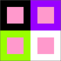
Figure 21—Color contrast through changing hue, value, and chroma
In this example, the hue and size of a carnation pink (#FF99CC) square appear to change, depending on its contrast with its background color.
On the black background, the carnation pink square appears lighter, larger, and as though it were advancing toward the foreground. On the white background, it appears darker, smaller, and as though it were receding into the background. The black margin around the carnation pink square appears narrower than the white margin.
A simultaneous-contrast effect between the carnation pink square and the light chartreuse (#99FF00) background causes both of these complementary colors to appear dramatically intensified.
There is less contrast between the carnation pink square and the bright violet (#9900FF) background—which is also a high-chroma hue—because of their analogous color harmony.
For information about the simultaneous contrast effect and other color-contrast effects, see Color-Contrast Effects.
Read more:
For information about contrast effects, color dominance, and color balance, see “Color Theory for Digital Displays: A Quick Reference: Part II.”
Akinola—Figure 16 shows an example of analogous colors—the analogous colors for orange. Each color has a similar range of analogous colors. To create an analogous color scheme, you can use any color within its range of analogous colors. Here are more examples of analogous colors:
primary colors—Analogous colors for each primary color
include its adjacent intermediate colors.
red—Analogous colors include orange and hot pink.
blue—Analogous colors include bright violet and azure blue.
green—Analogous colors include chrysoprase green and light chartreuse.
secondary colors—Analogous colors for each secondary color
include its adjacent intermediate colors.
cyan—Analogous colors include azure blue and chrysoprase green.
yellow—Analogous colors include light chartreuse and orange.
magenta—Analogous colors include hot pink and bright violet.
intermediate colors—Analogous colors for each intermediate color
include its adjacent primary and secondary colors.
light chartreuse—Analogous colors include green and yellow.
orange—Analogous colors include yellow and red.
hot pink—Analogous colors include red and magenta.
bright violet—Analogous colors include magenta and blue.
azure blue—Analogous colors include blue and cyan.
chrysoprase green—Analogous colors include cyan and green.
Please bear in mind that, beyond the primary and secondary colors, these color names are merely descriptive.
I’m making a Web site as part of my school project, and, well, this Web site has really cool information that helps during research!! Analogous colours always look good, I think! I’m going to be using purples—red purple and blue purples on my Web site. Verdana always rocks!! :)
I was just wondering whether mustard comes under neutral colours? Or not?
Gandhali—I’m glad you’ve found this information helpful. I agree with you about analogous colors.
Mustard is not a neutral color. While it’s akin to brown, its chroma is too high for a true neutral. It’s still very definitely a yellow. You can create neutrals by combining black and white to create grays; combining either two complementary colors or all three primary colors to create browns; or combining black or white with brown to create very dark browns, ivory, or beige.
Note that what you’re calling violet is not spectral violet, but a not-strictly-accurate synonym for purple. RGB monitors cannot display any wavelengths shorter than the blue primary. Some people perceive purple and violet as the same color, but others, myself included, do not. Monitors cannot reproduce true shorter-than-blue violet.
Founder, Publisher, and Editor in Chief of UXmatters
Silicon Valley, California, USA
With more than 20 years working in User Experience at companies such as Google, Cisco, WebEx, Apple, and many startups, Pabini now provides UX strategy and design consulting services through her Silicon Valley company, Strategic UX. Her past UX leadership roles include Head of UX for Sales & Marketing IT at Intel, Senior Director of UX and Design at Apttus, Principal UX Architect at BMC Software, VP of User Experience at scanR, and Manager of User Experience at WebEx. Pabini has led UX strategy, design, and user research for Web, mobile, and desktop applications for consumers, small businesses, and enterprises, in diverse product domains. Working collaboratively with business executives, multidisciplinary product teams, and UX teams, she has envisioned and realized holistic UX design solutions for innovative, award-winning products that delighted users, achieved success in the marketplace, and delivered business value. As a UX leader, she has facilitated conceptual modeling and ideation sessions; written user stories; prioritized product and usability requirements; established corporate design frameworks, standards, and guidelines; and integrated lean UX activities into agile development processes. Pabini is a strategic thinker, and the diversity of her experience enables her to synthesize innovative solutions for challenging strategy and design problems. She is passionate about creating great user experiences that meet users’ needs and get business results. A thought leader in the UX community, Pabini was a Founding Director of the Interaction Design Association (IxDA). Read More