This article is Part III of my series “Color Theory for Digital Displays.” It describes how you can apply color theory to application program user interfaces and Web pages and provides many guidelines for the effective use of color.
Champion Advertisement
Continue Reading…
Ensuring the Readability of Text Through Contrast
For backgrounds behind text, use solid, contrasting colors, and avoid the use of textures and patterns, which can make letterforms difficult to distinguish or even illegible. Choose combinations of text color and background color with care. Value contrast between body text and its background color should be a minimum of about eighty percent.
Contrast with a White Background
Black text on a white background provides maximal value contrast and, therefore, optimal readability for body text. The contrast between charcoal gray (#333333) text and a white background is about eighty percent—thus giving minimally good value contrast.
The following dark colors provide good to excellent contrast and legibility for text on a white background:
Excellent:
Black (#000000) text on a white background.
Excellent:
Kashmir green (#003300) text on a white background.
Excellent:
Midnight blue (#000033) text on a white background.
Excellent:
Burnt umber (#330000) text on a white background.
Good:
Charcoal gray (#333333) text on a white background.
Excellent:
Peruvian turquoise (#003333) text on a white background.
Excellent:
Deep purple (#330033) text on a white background.
Excellent:
Raw umber (#333300) text on a white background.
Good:
Slate (#333366) text on a white background.
Very good:
Forest green (#006600) text on a white background.
Good:
Navy blue (#000066) text on a white background.
Good:
Deep burnt sienna (#660000) text on a white background.
Good:
Indigo blue (#330066) text on a white background.
Very good:
Viridian green (#006633) text on a white background.
Good:
Prussian blue (#003366) text on a white background.
Good:
Deep burgundy (#660033) text on a white background.
Contrast with a Black or Dark Background
On a black background, the high-chroma colors yellow (#FFFF00), green (#00FF00), cyan (#00FFFF), and magenta (#FF00FF) provide the best contrast. While white text on a black background provides very high value contrast, it is less readable and causes greater eye fatigue than black text on a white background. All light-colored text on dark backgrounds causes eye fatigue. Generally, reserve the use of light colors on dark backgrounds for small amounts of bold text—for example, headings, labels and links in navigation bars and menus, button labels, or pull-quotes—and make sure that the font size is large enough to ensure readability.
The following high-chroma colors provide very good contrast and legibility for text on a black background:
Very good:
Yellow (#FFFF00) text on a black background.
Very good:
Green (#00FF00) text on a black background.
Very good:
Cyan (#00FFFF) text on a black background.
Very good:
Magenta (#FF00FF) text on a black background.
The Problem With Blue
Because only two percent of all retinal cones—the photoreceptors that provide color vision—are blue-sensitive cones and the eye brings blue into focus in front of rather than on the retina, visual acuity for the blue range of the spectrum is poor and it decreases with age. User performance in symbol identification is poorer with blue symbols than with symbols of any other color. Therefore, avoid using dark or highly saturated shades of blue for text or other elements consisting of fine lines on a black or other dark background. Also, avoid text or symbols consisting of fine lines in highly saturated blue hues on a white or other light background. Text in desaturated blue hues is adequately legible on light backgrounds. Blue is a good background color.
Contrast and Legibility
To provide the best legibility, ensure that text contrasts adequately with its background in both hue and value. When there is insufficient contrast between the hue or value of text and its background color, the text appears blurred or has a halo effect around it, making it difficult to read and resulting in eye strain. Text that is in a color that contrasts well with an achromatic background of black, gray, or white or black or white text on a high-contrast, color background generally provides better legibility than when both text and background are in different chromatic colors—unless the two colors contrast greatly in both hue and value.
The following color combinations provide good contrast and legibility:
Good:
Black (#000000) text on a cyan (#00FFFF) background.
Very good:
Black (#000000) text on a yellow (#FFFF00) background.
Good:
Black (#000000) text on a pale thalo yellow green (#99FF99) background.
Good:
White (#FFFFFF) text on a blue (#0000FF) background.
Avoid using gray for text or symbols consisting of fine lines on a color background, because a successive-contrast effect causes them to take on the hue of their background color’s complement. All Web-safe grays are too dark to serve as effective background colors for black body text. However, the non-Web-safe light gray (#EFEFEF) makes a good background color for black text. White text contrasts adequately with a charcoal gray (#333333) background.
The following color combinations demonstrate various degrees of contrast and legibility, ranging from excellent to much too little contrast:
Tip—If the contrast is insufficient for legibility, you can select the text to read it.
white
(#FFFFFF)
black
(#000000)
medium gray
(#999999)
There is excellent contrast between this black text and the white background.
There is sufficient contrast between this silver (#CCCCCC) text and the black background.
There is too little contrast between this black text and the medium gray background.
There is very good contrast between this indigo blue text and the white background.
There is much too little contrast between this indigo blue text and the black background.
There is too little contrast between this indigo blue text and the medium gray background.
There is good contrast between this charcoal gray text and the white background.
There is much too little contrast between this charcoal gray text and the black background.
There is too little contrast between this charcoal gray text and the medium gray background.
There is too little contrast between this medium gray text and the white background.
There is too little contrast between this medium gray text and the black background.
There is much too little contrast between this dark gray (#666666) text and the medium gray background.
There is much too little contrast between this goldenrod text and the white background.
There is good contrast between this goldenrod text and the black background.
There is too little contrast between this goldenrod text and the medium gray background.
There is much too little contrast between this silver (#CCCCCC) text and the white background.
There is very good contrast between this white text and the black background.
There is too little contrast between this white text and the medium gray background.
charcoal gray
(#333333)
goldenrod (#FFCC66)
indigo blue
(#330066)
There is much too little contrast between this black text and the charcoal gray background.
There is good contrast between this black text and the goldenrod background.
There is much too little contrast between this black text and the indigo blue background.
There is much too little contrast between this indigo blue text and the charcoal gray background.
There too little contrast between this indigo blue text and the goldenrod background and a slight simultaneous-contrast effect makes it a bit difficult to read.
There is too little contrast between this blue (#0000FF) text and the indigo blue background.
There is too little contrast between this dark gray (#666666) text and the charcoal gray background.
There is too little contrast between this charcoal gray text and the goldenrod background.
There is much too little contrast between this charcoal gray text and the indigo blue background.
There is too little contrast between this medium gray text and the charcoal gray background.
There is much too little contrast between this medium gray text and the goldenrod background.
There is too little contrast between this medium gray text and the indigo blue background.
There is sufficient contrast between this goldenrod text and the charcoal gray background.
There is much too little contrast between this yellow (#FFFF00) text and the goldenrod background.
There is too little contrast between this goldenrod text and the indigo blue background and a slight simultaneous-contrast effect makes it a bit difficult to read.
There is good contrast between this white text and the charcoal gray background.
There is much too little contrast between this white text and the goldenrod background.
There is good contrast between this white text and the indigo blue background.
Highlighting Text
Use high-contrast colors for small amounts of text that you want to emphasize strongly—that is, either a high-chroma color on a dark or light background, or a dark color on a light or high-chroma background. The best color combinations for highlighting information are as follows:
Red (#FF0000) text on a white (#FFFFFF) background.
Purple (#990099) text on a white (#FFFFFF) background.
Yellow (#FFFF00) text on a Prussian blue (#003366) background.
Black (#000000) text on an orange (#FF9900) background.
Red (#FF0000) text on a black (#000000) background.
Yellow (#FFFF00) text on a black (#000000) background.
Green (#00FF00) text on a black (#000000) background.
Cyan (#00FFFF) text on a black (#000000) background.
Text and the Simultaneous-Contrast Effect
The least legible combinations of colors for text and background are those that cause a strong simultaneous-contrast effect—particularly green text on a red background, red text on a green background, red text on a blue background, and other similar color combinations, as shown in the following examples. When a simultaneous-contrast effect occurs between the color of text and its background color, the text appears to vibrate, making it very difficult to read and causing fatigue and eye strain.
There is a strong simultaneous-contrast effect between this green (#00FF00) text and the red (#FF0000) background.
There is a strong simultaneous-contrast effect between this red (#FF0000) text and the green (#00FF00) background.
There is a strong simultaneous-contrast effect between this red (#FF0000) text and the blue (#0000FF) background.
There is a strong simultaneous-contrast effect between this cyan (#00FFFF) text and the red (#FF0000) background.
There is a strong simultaneous-contrast effect between this magenta (#FF00FF) text and the green (#00FF00) background.
There is a moderate simultaneous-contrast effect between this yellow (#FFFF00) text and the blue (#0000FF) background.
There is a strong simultaneous-contrast effect between this red (#FF0000) text and the cyan (#00FFFF) background.
There is a strong simultaneous-contrast effect between this green (#00FF00) text and the magenta (#FF00FF) background.
There is a moderate simultaneous-contrast effect between this blue (#0000FF) text and the yellow (#FFFF00) background.
Combinations of colors that are far apart on the visible spectrum require users to constantly refocus their eyes, resulting in visual discomfort and, possibly, fatigue.
Enhancing the User Experience With Color
Apply the following design principles regarding the use of color to enhance the user experience of an application program or Web site:
Use color consistently throughout.
Before designing an application or Web site, establish design guidelines, including conventions for the use of color. These conventions should dictate all purposes for which you use color, what colors apply to specific types of elements, and the meanings associated with specific colors. Use these color conventions consistently throughout an application or Web site. Once users interpret the meanings of colors, they will apply those meanings wherever they encounter the colors. If your use of color is inconsistent, users will be unable to build a mental model of color usage or to reliably interpret the meanings of specific colors.
Use color both to support users’ tasks and for branding.
Ideally, to ensure maximal user performance in applications, it is best to use color only to support users’ tasks and decision-making. Because color is such a salient, powerful visual cue, its arbitrary use for aesthetic purposes can actually degrade user performance. However, on the Web, the use of color for branding purposes is important. On the Web, color branding provides a sense of place, which is very important to user orientation and helps prevent users from becoming lost in hyperspace. Try to restrict the use of color that is solely for branding to certain areas of Web pages—for example, a logo in the upper-left corner of a page, a header, or a footer. In the main content area of a Web page, in a Web form, or in an interactive Web application, the use of color should be task related. In such contexts, use color judiciously—only where it provides real value and enhances user performance. Excessive use of color reduces its effectiveness.
Use color to increase user satisfaction.
Use color to enhance the aesthetic appeal of an application or Web site—even if the use of color does not improve user performance. Most people prefer color rather than achromatic Web pages, and on the Web, user satisfaction is just as important as user performance. However, ensure that the use of color is not visually distracting, impairing usability and reducing users’ ability to complete their tasks successfully.
Using Color for Identification, Grouping, and Emphasis
There are many ways in which you can use color to help identify objects, communicate structure, guide the attention of users, or indicate status. Use color to do the following:
Identify groups of related Web pages.
You can use different color schemes to identify groups of related Web pages, communicating a Web site’s high-level information architecture and making it easy for users to quickly identify the part of a Web site to which a page belongs, as shown in Figure 1. In this example, each section of the Web site has a different color scheme, so when a user points to the Process tab, it changes to that section’s color.
Figure 1—Identifying groups of related pages
Distinguish specific Web pages.
You can use a different color scheme to distinguish specific Web pages. Doing so provides a sense of place and, thus, can help to minimize user confusion and errors. For example, a purchasing process funnel might have a different color scheme from the rest of an eCommerce site.
Relate visual elements or controls.
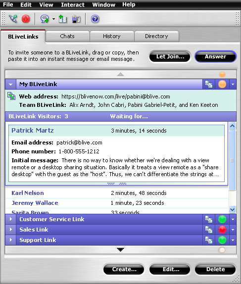
You can show the relationship between visual elements or controls of a specific type by consistently rendering them in the same color. For example, in Figure 2, all elements of a single type such as tabs, buttons, list items, and icons have the same visual treatment, but their appearance is distinct from elements of other types. Color-coding is the most effective means of communicating a relationship between elements that are spatially distant from one another.
You can also use monochromatic colors—that is, various hues of the same color—closely related analogous colors, or other low-contrast colors to express similarity or close relationships between visual elements—for example, to represent different states of the same element as in Figure 2. In this example, the items in the list appear in different analogous colors, depending on whether they’re collapsed or expanded.
Demarcate areas of a window or Web page.
You can use background color to demarcate different areas of a window or Web page, thereby communicating its logical structure, differentiating its different types of content, and improving its scanability and readability, as Figure 2 shows. You can also use color to set off the navigation bar on a Web page as on this Web site.
Figure 2—Demarcating different areas of a window
Group controls or information in a window or on a Web page.
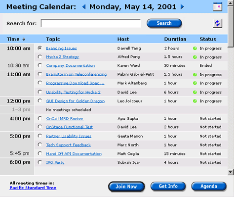
You can use background color to set off groups of related controls or related items of information that are adjacent to one another. The advantage of using color for this purpose—rather than white space, borders, or some other visual cue—is that color does not consume any additional screen real estate.
For example, the main frame of a Web application page shown in Figure 3 demonstrates the use of a pale Wedgewood blue (#99CCFF) background to set off a page title bar. A very light, non-Web-safe shade of gray (#EFEFEF) distinguishes control bars at both the top and bottom of the page. Providing structure to the table, pale Wedgewood blue sets off the table header, silver (#CCCCCC) highlights the column by which the table is currently sorted—the Time column—white dividing lines demarcate hours, and rows of alternating shades of lighter grays (#EFEFEF and #E7E3E7) make it easier to track the rows in the table visually. The dominant color, pale Wedgewood blue, highlights both the page title and the headers in the table. The color with the highest chroma level is the green of the status indicators for in-progress meetings, calling the attention of users to this important information.
Figure 3—Grouping controls and information
Highlight important task-related information.
You can use a high-contrast accent color to emphasize and draw users’ attention to important task-related information in a window or on a Web page—for example, when prompting users regarding essential interactions. When users’ tasks depend on their ability to quickly and reliably distinguish important information, color is the most effective visual cue for highlighting such information. However, excessive use of this technique reduces its effectiveness.
On a form page, use red (#FF0000)—or another intense, warm hue containing a lot of red—to highlight the labels of any fields whose values are in error.
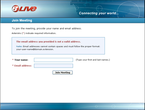
In the example shown in Figure 4, the dominant color, teal (#348CB4), calls attention to the page title bar, which defines the current task. Asterisks indicating required information are in the highlight color burgundy (#983132), as are error message text and the highlighted label for a value that is in error.
Figure 4—Highlighting important information
You can use color to distinguish a field’s label from its data. When a user is filling out a form, highlighted field labels help guide the user through the form. However, when displaying uneditable data, highlighting the data in fields rather than their labels helps focus users’ attention on the data.
Color can also help communicate the logical structure of task-related information. For example, you can use color to highlight sequences of steps in instructions or descriptions of processes.
Help users to find information on content-rich Web pages.
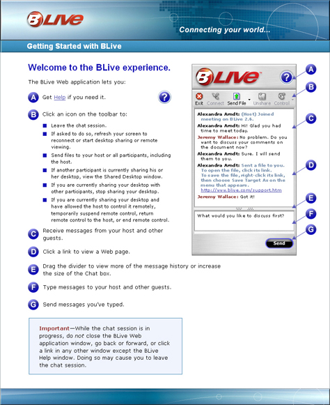
Color provides the most effective means of highlighting text, symbols, or other elements on a Web page in order to support user tasks that involve browsing or scanning for information, as shown in Figure 5.
Figure 5—Helping users to find information
The greater the density of information on a page and the greater the distance between highlighted visual elements, the more this type of color-coding improves user performance. Because color is such an effective visual cue, its use can also reduce eye scanning movements and, thus, visual fatigue. For example, you can help users to find information more quickly and easily by using color to highlight all section headings or by placing all headings on a background of the same color, as on this site. Additionally, cross-reference arrows, bullets, and table-heading backgrounds also appear in the highlight color. Differences in size or shape also characterize most of these elements, but color is the most salient visual cue. Using redundant visual cues—such as color and size or shape—enhances user performance.
Represent hierarchical information.
Color is useful in representing hierarchy in either a navigation bar or in content—through section headings. In the navigation bar shown in Figure 6, the use of light cobalt blue (#0066CC) tree-view controls lets users display groups of links, and light chartreuse (#99FF00) group labels provide a hierarchical structure. The links are in white (#FFFFFF). This navigation bar is for a Web application, which provides no browseable content. Therefore, it was not necessary to use the standard colors for different link states.
Figure 6—Showing hierarchy
Indicate link states.
Use link colors consistently throughout a Web application, Web site, subsite, or group of related Web pages. To avoid confusing users about whether they have previously viewed specific pages on a content Web site, indicate visited links. The default link-state colors are as follows:
Within content, links should be in the default blue (#0000FF) or some other blue hue. Reserve this link color only for links.
Links over which a user is hovering—that is, to which a user is currently pointing—should be in the default red (#FF0000) or some other red hue.
Active links that a user is currently clicking should also be in the default red (#FF0000) or some other red hue.
Visited links should be in the Internet Explorer default color, bright violet (#9900FF); the Netscape Navigator default color, purple (#990099); or some other violet hue. Hues with lower chroma levels are ideal for visited links.
Visually distinguish the linked elements, or hot spots, in an image map.
The following guidelines may apply to either true image maps or simulated image maps—which are multipart images that comprise rectangular image slices residing in the cells of a table:
Use a distinctive color for each linked element in an image map.
Use color to group related elements in an image map.
When a user points to a linked image in a simulated image map, display a border in the Web site’s standard link color to highlight it.
When a user points to a linked image in a simulated image map, change its color, creating a rollover effect.
Color code data and provide legends.
It is easier for users to interpret color-coded data than data that uses other coding techniques such as shape or size. When expressing data using color-coding, try to limit the number of different colors to a maximum of seven. Many users cannot reliably distinguish more than four or five different colors—especially when the colors are not in close proximity to one another—or remember what they mean. Therefore, keep color sets as small as the data permits—preferably comprising four or fewer colors.
To ensure that users can distinguish colors and remember color-coding, all colors should be sufficiently different from one another and range across the visible spectrum. Highly saturated colors are the easiest to distinguish. The most common color confusions are orange (#FF9900) with red (#FF0000) and yellow (#FFFF00) with orange. Colors that are close together on the visible spectrum become more difficult to distinguish as the distance between color-coded elements increases or the size of such elements decreases. Small elements tend to appear desaturated and surrounding colors may cause an apparent shift in their hue.
Use saturated, high-chroma colors to emphasize data; desaturated, low-chroma colors to de-emphasize data. When using color to express a continuum, use shorter wavelength, low-chroma colors such as violet (#9933FF) or blue (#0000FF) to represent the low end of the continuum; longer wavelength, high-chroma colors such as red (#FF0000) or orange (#FF9900), the high end.
If color-coding is arbitrary—that is, neither uses common color associations nor reflects the color of familiar, real-world objects—and particularly if it uses more than six or eight colors, provide a clear legend in a prominent location to assist users in interpreting color-coded data, as shown in Figure 7. Throughout the data, use only one color to represent a particular thing, use various values or chromas of the same color to represent similar things, and assign each color only a single meaning.
Figure 7—Providing a legend for color-coded data
Visually distinguish the icons on a toolbar.
You can use color to visually distinguish and help users identify the icons on a toolbar. Color is a more effective means of distinguishing icons than either shape or size, and can reduce the mental exertion that icon identification requires. For example, the colors of icons on this Web-application toolbar help users to distinguish them from one another.
Figure 8—Distinguishing icons using color
Using Color Associations in Expressing State Information
You can use people’s color associations to communicate state information effectively. Your use of color should be consistent with both job-related and cultural color associations. Using common color associations helps users to interpret color-coding correctly. For example, most Americans associate the states shown in Table 1 with certain colors.
Table 1—Color associations for states
State
Color
Off
Red or Blue
On
Red or Green
Start
Green
Stop
Red
Caution
Yellow
Go
Green
Safe
Green
Warning
Yellow
Danger
Red
Emergency
Red
Hot
Red
Cold
Blue
However, color associations may differ in various cultures, so provide clarifying text, redundant coding, or a legend to ensure that an international audience can correctly interpret color-coded state information. When developing an application or Web site for a particular culture, you should learn about its color associations before using color to indicate state information.
Applying arbitrary meanings to color-coding that conflict with common color associations causes confusion. Use high-contrast, high-chroma colors to express state information.
Indicating Availability Using Color or Value
You can use differences in color or value to indicate the availability or unavailability of links or controls.
For Links on Navigation Bars
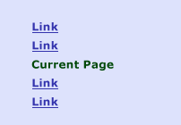
The same links or buttons should appear on the navigation bar or menus on either all pages on a Web site or all pages in a major subsection of a large site—and should be in a consistent location. However, it should not be possible for a user to click a link or button that would reload the current Web page or scroll to the beginning of a section that a user is already viewing. You can indicate that such an item on a navigation bar or menu is unavailable by removing any underlining from its label or by changing its color to a pale, low-chroma hue; a light shade of gray, as shown in Figure 9; or a different color that contrasts strongly with the color of an available link or button.
Figure 9—An item on a navigation bar that appears dimmed
If a navigation bar comprises rollover buttons, neither the color nor the appearance of the link or button for the current page or section should change when a user points to it. Alternatively, you can remove any button appearance and change the link or button’s background color to that of the page’s content or another color indicating selection, giving its label the appearance of an indicator of the current page or section rather than a link.
For Controls
In applications, controls that are not currently available appear dimmed—that is, are rendered in shades of gray, tints, or neutralized colors. Also, all windows except the active window appear dimmed. The following examples show the dimmed appearance of various types of controls and an inactive window:
Window controls appear dimmed when they are unavailable, as shown in Figure 10.
Figure 10—Window controls that appear dimmed
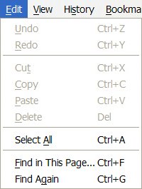
Commands in menus appear dimmed when they are unavailable. Figure 11 shows a menu in which a number of commands appear dimmed.
Figure 11—Commands that appear dimmed
Icons on toolbars appear dimmed when they are unavailable. Several icons appear dimmed in the examples shown in Figure 12.
Figure 12—Icons that appear dimmed
Custom controls appear dimmed when they are unavailable, as shown in Figure 13.
Figure 13—Custom controls that appear dimmed
Buttons on Web pages, on panels, and in dialog boxes appear dimmed when they are unavailable. Figure 14 shows buttons that appear dimmed.
Figure 14—Buttons that appear dimmed
Controls on Web pages, in dialog boxes, and on panels appear dimmed when they are unavailable. Figure 15 shows drop-down menus, a text box, and a checkbox that appear dimmed.
Figure 15—Controls that appear dimmed
Inactive windows—that is, windows that are not currently accepting user input—appear dimmed, as shown in Figure 16.
Figure 16—Inactive windowFigure 17—Active window
In Figure 16, the title bar and menu bar of an inactive window appear dimmed, while the blue title bar and black menu titles of the window in Figure 17 indicate that it is an active window. The Forward button in the active window also appears dimmed, because it is not currently available.
Galitz, Wibert O. User-Interface Screen Design. Boston: QED Publishing Group, 1993.
Mayhew, Deborah J. Principles and Guidelines in Software User Interface Design. Englewood Cliffs, NJ: Prentice Hall, 1992.
ThinkQuest. Psychological Effects of Color Perception. Retrieved July 12, 2003 from http://library.thinkquest.org/50065/psych/effects.html. No longer available.
Fascinating post. My only observation is the utter absence of discussion about color blindness. As much as 10% of the population is color blind, yet most applications ignore this fact—or don’t care.
Office suites, video games, Web-based applications—nearly all ignore the possibility that one in ten of their potential consumers may not be able to navigate the interface or see critical elements of the programs.
Why not help users to calibrate the color palette to their own eyes? I suspect this would be challenging—especially for multi-user mode—but I also imagine 10% market share has to be a fairly juicy bone.
A really wonderful article, which should be preserved forever. It proves that designing or being a designer is not as easy a task as many think it to be. I have certainly gained a lot by reading the entire series, and I have filed it for future reference. Million thanks to you for providing invaluable inputs.
I was at an international tax presentation recently, and one of the speakers was using a PowerPoint presentation. Fascinating use of colour by this presenter as many of the diagrams were so poor. This must have arisen due to the contrasting displays, possibly a CRT to design the slides and the much poorer contrast of a light projector.
It strikes me that a tool that can identify high risk colour contrasts on a finished Web page, etcetera, would help give designers something to reassure them that what looks good on their screens will still look good in other less controllable situations.
I’d be interested to see a review of these colour combinations simulated for different visual media and environments.
What you’re proposing goes directly against guidelines and common sense when providing a widely accessible interface. How can you justify this?
I think technically and from conclusive user testing—inclusive of all users—black text on a light sepia/ocher is in fact the easiest to read—not black on white—exactly because of the high contrast.
If you are making articles like this in this era, you honestly need to pay more attention when posting articles to such a public forum.
I’m glad people are finding this article helpful and of interest.
Ken—This article is part of a series, the remaining installment of which is titled “Ensuring Accessibility for People With Color-Deficient Vision.” I do care about issues of accessibility, and I think everyone should. According to the references that provided the basis for my forthcoming article: “Approximately four percent of people of European descent either have color-deficient vision or are color-blind—specifically, about eight percent of men, but
only 0.4 percent of women.” I don’t have data for other cultures. Do you?
On the Web, it might be interesting to provide a CSS specifically for people with a particular type of color deficiency, just as we provide a print CSS on this site. However, that would add a lot of complexity, and browsers or Web sites would need to provide a mechanism for displaying Web pages using such style sheets. To keep things as simple as possible, I just make an effort to create pages that are legible to everyone. The best tool I’ve found for validating that they are is the Colorblind Web Page Filter. It renders full-sized HTML/CSS pages. It has some problems with CSS layouts, but really does quite a good job. It also provides filters for more types of color deficiency than I’ve seen in other tools.
UK Tax Expert—The projection of PowerPoint slides often results in some loss of contrast. Solving the problem of inadequate contrast on PowerPoint slides is basically a matter of ensuring high value contrast between foreground and background. To judge the degree of contrast between the elements on a Web page, you can use GrayBit to render a gray-scale equivalent of the page. It does a beautiful job of rendering CSS layouts in shades of gray, so you can do a visual check of a color scheme. However, it does not provide any feedback on whether contrast is adequate. Another tool that does provide such feedback is AccessColor, but it makes its judgments based on only color contrast and does not take font weight and size into account, so I think making a visual check of a gray-scale rendering is actually more effective. Unfortunately, I don’t know of any tools that let you do the same with PowerPoint slides, but you could mock up a presentation’s color scheme on a Web page and evaluate it using these tools.
Mike—You haven’t made it clear precisely what you’re taking exception with, so it’s difficult to respond to your statements. My goal in writing this series of articles was to bring together into a concise reference all of the information about color I’ve found useful in designing user interfaces. It is not the outcome of any original research on the topic of color perception. If you or anyone knows of any recent usability studies that contradict anything in this article, please cite or post a link to the study.
Many studies recommend using black text on a white background for maximal contrast and legibility. An article in the Journal of Design Communication, “The Effect of Color Contrast on Message Legibility” (Laura Bix, Hugh Lockhart, Fernando Cardoso, and Susan Selke, Spring 2003) cites several usability studies:
“Not surprisingly, black text on a white background was the most legible contrast combination for all age groups. This is consistent with the findings and recommendations of others that recommend dark text on a light background as the most legible (Arnold, 1972; Bradley et al., 1994; Food and Drug Administration, February 27, 1997; Food and Drug Administration, March 17, 1999; Institute of Grocery Distribution, 1994; Sorg, 1985).”
“As for color, as long as there is sufficient contrast between the text and the background, many color combinations are possible. However, most studies have shown that dark characters on a light background are superior to light characters on a dark background (when the refresh rate is fairly high). For example, Bauer and Cavonius (1980) found that participants were 26% more accurate in reading text when they read it with dark characters on a light background. Moreover, a survey by Scharff, et al. (1996) revealed that the color combination perceived as being most readable is the traditional black text on white background. However, it is common for websites (such as this one) to have an off-white background in order to reduce the flicker and glare associated with white backgrounds.”
The background color on SURL is perhaps close to what you’re referring to as “light sepia/ocher.” While I think a light off-white background would be fine, I find the contrast on that site too low, and its background color would not be generally useful on sites with color schemes with which it would clash. Aesthetics matter, too. In the non-virtual world, most “whites” are in actuality very light tints of some color or other. I see no reason why one could not use the same color-mixing technique for high-contrast background colors behind black text. The article on SURL has no date of publication and may be a bit out of date. Flicker is no longer an issue with today’s displays. One remedy for glare is to use a white background only behind the main content area on a page, as on this site.
Another accessibility issue is ensuring there is adequate value contrast for people over 40, whose perception of contrast gradually diminishes with age. According to the National Library of Medicine publication “Making Your Web Site Senior Friendly” (February 2001):
“Changes in vision that occur with age can make it more difficult to read a computer screen. These include reductions in the amount of light that reaches the retina, loss of contrast sensitivity, and loss of the ability to detect fine details.”
Particularly for seniors, high contrast is important. And the number of seniors online is large and growing rapidly.
To Mike: There are differences of opinion by those who have conducted extensive color studies as to what is the absolute best dark color on a light background. Black on white is best for people with poor vision and glare is not as much of a problem as you seem to think it is. As long as there is high contrast, and it’s dark on a light background for extended amounts of text, it doesn’t matter that much for the average user. You might want to look into some graphic design classes and read a few more books than the usability pamphlet you seem to have picked up one day that made you an expert.
To perhaps expand on Mike’s comments, if you want more on why high contrasts—for example, black text on a white background—can lead to reading problems for a significant number of online readers, check out this site. Note that it even allows you to change the background so that the contrast isn’t so high.
Hewlett Packard (HP) provide an online colour contrast verification tool that uses the W3C algorithms, but sets the colour difference range at greater than 400, which results in a greater range of foreground and background colour combinations being deemed acceptable. They believe that the contrast ratios that the W3C suggest are too high contrast.
Personally speaking, I have the background on my computer set to a cream colour, not white, because I have the same reading issues, where I can’t read text with high contrast very easily.
P.S. I have 15 plus years of usability experience, in case Jeff accuses me of only reading a pamphlet or two. :-)
Fiona—I realize that the glare of pure white backgrounds can cause problems for some people. The thing is, I don’t think that’s a problem for which designers can reliably compensate—and I’m saying this as someone who is also somewhat sensitive to glare. All of the applications I use—and in which I work for many long hours every day—have white backgrounds. I’ve chosen to compensate for glare by turning down the brightness of my monitor slightly. You’ve compensated by altering the background color on your computer. Browsers also provide settings that let people control background color. Plus, there are anti-glare filters that people can place over their screens. I think most people who have problems with glare would likely have made some sort of adjustment to their computers, as we both have.
On the Web, pages that comprise only black text are the exception, so any background color must contrast adequately with all of the colors of text. For me, with my computer setup, the consequence of a designer’s reducing the contrast between foreground and background is usually reduced readability, because of inadequate contrast. For example, on the Irlen site, only the white background affords adequate contrast for completely comfortable reading. The off-white background is marginally okay, but doesn’t really provide adequate contrast behind the violet text. The rest of the colors don’t provide sufficient contrast for me. My point is that, since people’s perceptions of contrast differ, the most reliable remedy for glare lies in the hands of individual users. Why diminish optimal contrast for the majority when the minority for whom glare is a problem have probably already handled the problem and your solution might actually diminish optimal contrast for them, too?
Plus, there’s the issue of adjacent colors influencing one another, as I’ve described in Part II of this series, in the section “Contrast Effects.” Any background color, other than pure white, will alter the color of any text or graphics in the foreground, at least slightly and sometimes dramatically.
Thanks for sharing the Irlen “Bibliography of Research.” It certainly is an extensive list of papers. Unfortunately, it provides no links to any of the papers, so without a lot of searching, there’s no way to know what tale those studies would tell. I see that a few of the papers do discuss contrast, but mostly for people with disabilities. I’ll search and see what I can find. Do you have any specific research data you’d like to share? Not all of the usability studies I’ve read have concurred regarding issues of contrasting background colors. So, there’s judgment involved in deciding what studies to give credence and in setting design priorities, too.
I’m glad to learn that I’m not the only one who thinks the contrast ratios the W3C suggests are too high. I don’t have any actual data to support that perception though. Does HP?
I’ve now looked at the Irlen site in more detail and made an effort to find any research papers freely available on the Web that their “Bibliography of Research” includes on the topic of contrast—which of course led me on to an odyssey of discovery. Here’s what I’ve found:
Interestingly, Irlen sells colored acetate overlays that ostensibly make reading the pages of books easier for people with certain disabilities. The site also depicts people wearing filtered glasses. So, Irlen is also recommending solutions that are under the control of individuals.
As I mentioned before, people over 40 experience reduced perception of contrast. According to U.S. Census Bureau statistics, approximately 40% of the U.S. population is over 40.
Dyslexics are another large segment of the population who are less sensitive to contrast than people with normal vision. According to the paper “Sensory Processing in Dyslexic Children,” by Craig Wright, “Ben-Yehudah et al. (2001) reported a group of dyslexic adults … were less sensitive to contrast than a control group….” A BBC report stated, “Dyslexia affects 10% of the population; 4% severely.”
With these kinds of numbers, it’s apparent that many more people have difficulty with lower contrast between text and its background than have difficulty with high contrast.
Only two papers in the Irlen “Bibliography of Research” seemed relevant to the topic of this article, and unfortunately, neither is available on the Web.
However, in my search, I did find the following interesting papers:
Mike makes an excellent point about the use of colour. As a design researcher, I continually question any research that’s done. I look at how the research was performed—methodology is key—and how long ago it was performed. Especially in today’s digital world, trends and technologies are continually changing.
So, in looking at the research that’s cited by the article that’s cited here:
“Many studies recommend using black text on a white background for maximal contrast and legibility. An article in the Journal of Design Communication, ‘The Effect of Color Contrast on Message Legibility’ (Laura Bix, Hugh Lockhart, Fernando Cardoso, and Susan Selke, Spring 2003) cites several usability studies:
“Not surprisingly, black text on a white background was the most legible contrast combination for all age groups. This is consistent with the findings and recommendations of others that recommend dark text on a light background as the most legible (Arnold, 1972; Bradley et al., 1994; Food and Drug Administration, February 27, 1997; Food and Drug Administration, March 17, 1999; Institute of Grocery Distribution, 1994; Sorg, 1985).”
This study from 2003 references studies that are at least 7-8 years old. In the digital world, that’s centuries ago. It’s time to revisit these studies and re-evaluate their validity.
Speaking from experience, having been doing design research for over 15 years, run too many usability tests to remember, on a variety of products and variety of mediums—for example, TV, mobile, handheld, Web, desktop—black (#000) text on a white (#FFF) background is not the easiest to read. It’s actually rather harsh. High contrast is best, but that doesn’t mean black on white. Charcoal gray (#333, or #444) is easier to read on a white background, based on my experience of a few hundred participants plus.
Todd—I agree with you that methodology is key in usability testing, if we are to derive useful data from a test. I would also like to see more up-to-date test results regarding the use of both background color and text color in digital displays. I’ve scoured the Web for data and haven’t come up with anything more recent than the test results cited in this series of articles. Thus, my request for additional information from our readers. Since those tests were done, most people have switched from CRT displays to flat-panel displays—a change that could impact test results. Because of the differences in people’s vision, I think it would take a pretty extensive test effort to come up with conclusive information on this subject. Hopefully, someone will undertake such a study and publish the results on the Web when they do.
1) This sentence would do well if it were rewritten: “Text that is in a color that contrasts well with an achromatic background of black, gray, or white or black or white text on a high-contrast, color background generally provides better legibility than when both text and background are in different chromatic colors—unless the two colors contrast greatly in both hue and value.”
2) You introduced the concept of a “simultaneous-contrast effect”, but it wasn’t explained. A short comment on just what this concept means would be helpful.
That is a complex sentence and requires advanced reading skills, but its syntax is correct.
This is a four-part series. I explained the simultaneous-contrast effect in Part 2, in the section “Color-Contrast Effects.” Plus, there are several examples in both Part 2 and in this article, Part 3.
Founder, Publisher, and Editor in Chief of UXmatters
Silicon Valley, California, USA
With more than 20 years working in User Experience at companies such as Google, Cisco, WebEx, Apple, and many startups, Pabini now provides UX strategy and design consulting services through her Silicon Valley company, Strategic UX. Her past UX leadership roles include Head of UX for Sales & Marketing IT at Intel, Senior Director of UX and Design at Apttus, Principal UX Architect at BMC Software, VP of User Experience at scanR, and Manager of User Experience at WebEx. Pabini has led UX strategy, design, and user research for Web, mobile, and desktop applications for consumers, small businesses, and enterprises, in diverse product domains. Working collaboratively with business executives, multidisciplinary product teams, and UX teams, she has envisioned and realized holistic UX design solutions for innovative, award-winning products that delighted users, achieved success in the marketplace, and delivered business value. As a UX leader, she has facilitated conceptual modeling and ideation sessions; written user stories; prioritized product and usability requirements; established corporate design frameworks, standards, and guidelines; and integrated lean UX activities into agile development processes. Pabini is a strategic thinker, and the diversity of her experience enables her to synthesize innovative solutions for challenging strategy and design problems. She is passionate about creating great user experiences that meet users’ needs and get business results. A thought leader in the UX community, Pabini was a Founding Director of the Interaction Design Association (IxDA). Read More


