The role of color psychology in visual design should never be underestimated. When you implement the use of color correctly, you can transform merely aesthetic elements into powerful tools that effectively communicate your brand message, influence user behaviors, shape the user experience, and impact Web site–search rankings.
This article focuses on color psychology’s pivotal role in helping UX designers provide their target audience with a better user experience through their Web-site designs. You’ll discover some ways in which color can be an influential change driver. You’ll also learn how to influence buying behaviors and optimize Web site’s for search engines by applying some tips on using color in your visual designs.
By the end of this article, you’ll be better equipped to leverage color psychology in making informed design decisions that will boost your Web site’s performance on search engines and drive conversions for your clients.
Champion Advertisement
Continue Reading…
The Importance of Color in Visual Design
In this digital age, the impact of color on brand perception and purchasing decision-making processes is as immediate as it is profound. It takes people only 50 milliseconds to form an opinion about a Web-site design, and these opinions are based primarily on color.
Color is more than merely a visual-design element. Color is a nonverbal storyteller that speaks to people subconsciously about a brand and its products. These silent messages influence people’s emotions, opinions, and decisions about the brand.
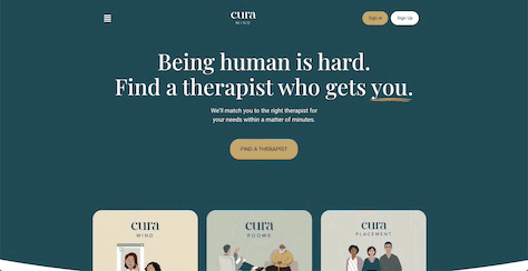
This is why, if you conduct brand research in specific industries, you’ll notice that they often use variations of the same color palette. For example, brands within the healthcare and wellness industries, such as Curamind, as shown in Figure 1, predominantly use colors within the blue and green spectrum because these colors convey trust and give people a sense of well-being. The color palette for this mental-health Web site combines the emotions and messages that blues and greens convey.
Figure 1—Curamind’s blue-green color palette
On the other hand, it’s not uncommon to find bright, colorful brands within the education industry, especially brands targeting children such as ABCMouse, which is shown in Figure 2. These colors stimulate the brain and communicate fun, excitement, enthusiasm, and a positive learning environment.
Figure 2—Education Web site catering to children and pre-teens
It’s the designers’ job to ensure that the colors of a brand’s logo and Web site convey the right message to shape positive perceptions toward the brand and strengthen its identity. This is crucial because it affects how people interact with a brand’s Web site and influences their purchasing decisions.
Understanding Color Psychology and User Behavior
Color psychology is all about understanding how colors trigger emotional responses that, in turn, influence people’s perceptions and behaviors. This is important because people make decisions based on their emotions—from something as mundane as choosing what to eat for dinner to life-changing choices such as starting an online business or who to marry.
The brain’s cognitive function can cause one to hold off on making a decision long enough to weigh pros and cons that are based on facts and logic. However, there are instances when emotions trump logic and significantly influence our decisions.
Colors have an uncanny ability to trigger emotional responses in people because of the messages they send and the associations that people have developed over the years. Some of the most commonly used colors have the following associated meanings and emotions:
As a designer, it’s your job not only to choose colors that trigger the right emotions and send the proper messages but also to create a visual hierarchy that appeals to the eye and effectively influences user behaviors and actions. This visual hierarchy strategically arranges design elements to subconsciously direct and guide users to perform a desired action. Designers achieve this impact by employing color to highlight specific elements with vibrant, contrasting colors, making call-to-action (CTA) buttons, offers, and featured products stand out, capturing users’ attention, and encouraging them to take action.
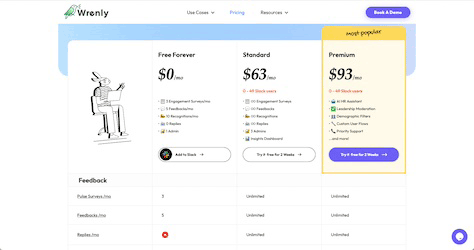
Wrenly’s pricing page provides a perfect example of using color to prompt user action. Outlining the Premium plan information in bright yellow makes the section stand out against the other softer colors in the color palette and draws the user’s attention to it.
Figure 3—Wrenly’s pricing page
Another way of creating a visual hierarchy using color is by varying the background or text color on a Web page. This subtle change can visually break a page’s content into sections, making it easier for users to navigate the page and find what they need. This technique is also helpful in breaking up text-heavy pages into more digestible chunks, making it easier for visitors to consume the content, even on small devices.
How Colors Influence SEO and Organic Visibility
For many designers, search engine optimization (SEO) is a distinct realm within the digital multiverse. After all, designers focus on creating a visually appealing Web-site design that delivers a great user experience and compels users to take the brand’s desired actions. In contrast, an SEO strategy is more technical and focuses on promoting brand awareness and organic visibility by improving a Web site’s search rankings. However, in reality, color is pivotal to the overall success of a brand’s SEO strategy.
In this digital age, implementing standard SEO best practices such as ensuring that the correct metadata is in place, using long-tailed keywords, and generating high-quality backlinks is not enough to get a high ranking on search-results pages (SERPs).
The algorithms of search engines such as Google and Bing determine a Web site’s ranking, using user-engagement metrics such as the following:
bounce rate—the percentage of people who leave a Web page without any form of interaction
engagement rate—the percentage of people who stay on a page longer than ten seconds or who interact with it—for example, by clicking a button
Using the right colors and a visual hierarchy that matches the brand’s customer journey contribute to improving such user-engagement metrics. In turn, search engines reward the brand with higher rankings, making it more visible to its target audience.
Color also significantly impacts the readability of a Web site’s content. In addition to making it easy for users to consume text-based content, designers must also ensure that the color scheme and overall Web-site design provide a great user experience for people with disabilities.
Indeed, the synergy between color and SEO is crucial in enabling brands to achieve their business objectives. Learning SEO basics and effective strategies can enable you to make more informed color choices so your designs appeal to both people and search engines.
Tips for Testing and Optimizing Colors for UX and SEO
So far, you’ve learned why and how the use of color can make or break the overall effectiveness of your Web-site designs.
Now, let’s consider six practical tips on how to test and optimize colors for both the user experience and SEO, enabling you to create Web-site designs that are visually appealing and effective in helping brands achieve their goals.
1. Align the Color Palette with the Brand Message
When choosing a color palette, the primary colors must match the company’s brand. Some quick brand research can provide you with this information and ensure consistency across the company’s collateral materials.
However, if a company doesn’t yet have a well-defined set of brand colors, it’s your job as a designer to create a color palette that accurately conveys the brand’s values and desired image.
Select secondary and accent colors that complement the primary colors you’ve chosen. Be sure to adhere to accessibility guidelines when selecting colors, so you can be confident that the color palette you’ve chosen won’t cause people to experience any discomfort when viewing a page.
Here are some tools that you can use in devising color palettes:
Coolors—Lets you generate and download color palettes that are based on a single primary color or choose a color palette from their database of pre-built color palettes.
Paletton—Provides color-palette options for monochromatic, complementary, and analogous color schemes.
ColorSafe—Enables you to create a color palette that adheres to the WCAG guidelines.
2. A/B Test Your Color Decisions
One of the biggest challenges designers face when getting brands to buy into their designs is convincing stakeholders of the reasoning behind their creative decisions. A/B testing strengthens your position by providing your clients with data on how your color decisions perform, thus helping them to reach their business goals.
3. Gather User Feedback on Color Choices
User feedback from surveys and focus groups enable you to gather candid insights about your visual design’s colors from the brand’s target customers. Some questions you might ask include the following:
What impressions did you have about the company before reading any of the Web site’s text?
What emotions or moods did you feel while you were on the Web site?
Were the text and content easy to read and understand against its background colors?
How easy was it for you to know which elements were interactive?
The insights you gain can help guide you in making well-informed revisions to your overall designs. The brand’s SEO specialist can use these same insights in writing the Web site’s metadata and in doing keyword research, increasing the Web site’s organic visibility on SERPs.
4. Ensure Consistency Across All Devices
Device screens vary in their size and resolution. Although differences in a color’s hue, value, and saturation might be negligible to the naked eye, they could be enough to distort the emotions and messages that the colors convey to the brand’s target audience.
Therefore, it is essential to verify that the colors you’ve chosen remain consistent across all device sizes and resolutions. Tools such as Adobe Creative Cloud have built-in color-management features that ensure the integrity of your color palette—and the emotions and messages you want to convey.
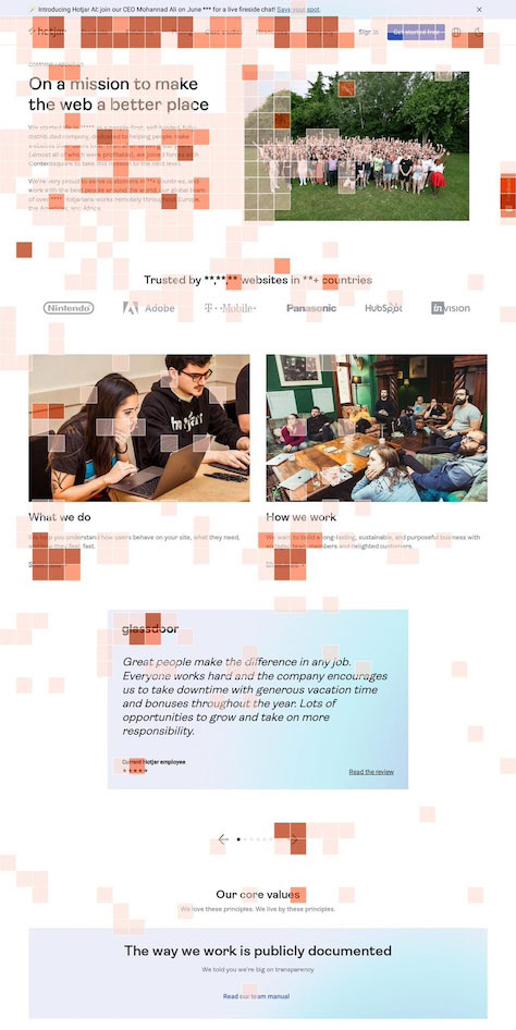
5. Take Advantage of Heat Maps
Heat maps are visual tracking tools that show the areas of a Web page on which users spent the most time and where their eyes focused, as shown in Figure 4.
Figure 4—Heat map showing users’ engagement with a Web page
As with user feedback, the information you gather from these tools can help you make any necessary adjustments to your colors and edit a page’s overall design to improve click-through rates (CTR) and conversion rates.
6. Adjust Colors Based on Current SEO Metrics
Although UX designers aren’t expected to track and understand SEO metrics such as the numbers of high-quality backlinks a page generates and its bounce rates, it is still important to gain insights into these metrics because they show how effective your color choices and overall design are in helping a brand realize its goals. Schedule a meeting with the brand’s SEO specialist at least once every quarter, so you’ll know which metrics need improvement and you can adjust your color choices and designs accordingly.
Conclusion
When you use color strategically, it can provide a great user experience, boost a Web site’s search rankings, and convert visitors into loyal customers. By leveraging color psychology and the tips in this article, you can design a Web site whose user experience is capable of influencing and shaping user behaviors, enabling a brand to reach its goals.
Still, it’s important to remember that every brand and target audience is unique. Make a habit of constantly testing your designs and gathering feedback at regular intervals so you can choose the right colors to use in your visual designs.
Colors evoke specific associations and emotions, making them a powerful tool for shaping user perceptions. Brands can harness the subtleties of color psychology to convey their message effectively and cultivate a cohesive brand identity across digital platforms.
Marketing Manager at Teranga Digital Marketing Ltd
Mumbai, Maharashtra, India
Jaya is a seasoned content writer and search-engine optimization (SEO) professional who has written hundreds of blog posts in more than 30 different industry niches. When she’s not writing or decoding algorithms, you’ll likely find her obsessing over a book! Read More