When users interact with a digital product, its visual design guides them in knowing what to do next. Prominently placed banner images draw their eye, and the design of call-to-action (CTA) buttons lets users know that they are clickable.
A key component of mindful UX design, visual hierarchy is instrumental in making user experiences as easy to learn and use as people expect them to be. UX designers often use visual-hierarchy frameworks to arrange design elements and place elements in a user interface. Logic, user expectations, and common best practices support this design process. In this article, I’ll describe the main features of visual hierarchy and explore how it helps make user experiences both more functional and more delightful for users.
Champion Advertisement
Continue Reading…
What Is Visual Hierarchy in UX Design?
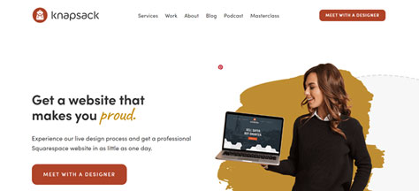
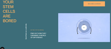
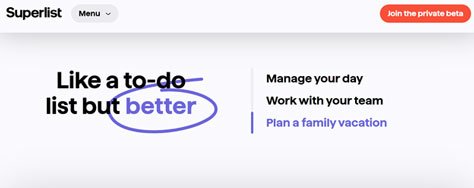
When you are a new designer using an AI Web builder in a non-collaborative environment, understanding visual hierarchy is essential to creating effective designs. Visual hierarchy refers to the arrangement of design elements on a page in the order of their importance. Place whatever elements you want people to notice first in a prominent position, and use larger sizes and striking colors to signify their importance and draw the eye. Visual hierarchy results in a clean layout with a clear arrangement of elements, as shown in Figure 1.
This layout is clean and also clear. Its main calls-to-action are highlighted in a single color—the burgundy that is also the color of the logo—maintaining consistency and repetition throughout the site. Its brief textual elements use three font variations, which could be a bit much in a typical layout. However, the emphasis on proud keeps things interesting here.
Visual hierarchy guides the user’s focus on the page—from one element to the next—propelling the user toward taking a certain action such as meeting with a designer, downloading an ebook, or booking a consultation.
Good visual hierarchy results in designs in which a page’s elemental organization is natural and logical. Users won’t become frustrated when looking for relevant buttons or accidentally click or tap a button that takes them somewhere they didn’t intend to be. Users automatically know what the next step should be because the page’s design is laid out in a clear progression.
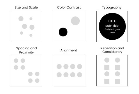
6 Core Elements of Visual Hierarchy
Figure 2 shows the six foundational elements of a good visual hierarchy.
Figure 2—6 core elements of visual hierarchy
1. Scale and Size
Progressions in size are the most impactful way of creating visual order. Larger elements are most prominent, always stand out on a page, and grab people’s attention, as shown in Figure 3. Size is also a highly effective attribute when you need to communicate importance. People naturally associate significance with size and scale.
Scale also tells the user how different elements relate to each other and shows their relative importance, as shown in Figure 4. That’s why headings and titles use a much larger font size than the body text.
Figure 4—Scale highlights the relative importance of elements
Users pay more attention to headings to help them determine whether they want to engage with content further. For the larger elements in a design, use commanding sizes, striking colors, and appealing fonts.
2. Color and Contrast
While size may be the most obvious way to attract the user’s eye, colors have the power to instantly communicate meaning and influence behavior. Subtle shades and pastel hues have a gentle and welcoming look, as shown in Figure 5, while darker, more saturated tones signal energy and authority.
Figure 5—Welcoming pastel colors provide good contrast for most text
In visual hierarchy, color combinations that have a healthy contrast ratio draw the eye, as shown in Figure 6. The higher the contrast, the more pull an element has. That’s why a black-and-white combination of foreground and background colors is more appealing and engaging than a yellow-and-white scheme. Use highly contrasting colors for the more important elements in a layout. Think of banner images or product pictures. CTA buttons, hyperlinked text, and body copy also benefit from highly contrasting colors.
Figure 6—High-contrast color combinations highlight key features
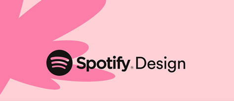
Typography in visual hierarchy involves using fonts in various sizes, weights, colors, and styles to convey a sense of order and organization, as Figure 7 shows. Once again, larger fonts in striking colors take center stage while leaner fonts in secondary colors are useful in conveying second-tier information.
Figure 7—Using two font weights helps Spotify highlight its brand logo
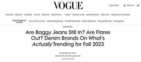
In addition to the more prominent visual elements of typography such as size and color, variations in style also differentiate typographical elements. Different typefaces convey different meanings. With their imposing appearance, serif and slab fonts are often ideal font choices for headlines. But you can flip this script. As shown in Figure 8, Vogue, the fashion magazine, uses sans serif as their main font for their navigation system, as well as for article titles. But their body text is in a serif font. Since serif fonts are ideal for improving legibility, their design choice is effective, and the contrast looks polished.
Figure 8—Using friendly sans serif fonts for headlines on Vogue
According to Gestalt principles, people perceive closely spaced elements as belonging to the same group, as shown in Figure 9, while those that are placed further apart both from other groupings and from each other appear unrelated and unconnected. Designers can use the principle of proximity to group things together and convey a sense of their belonging together.
Figure 9—Closely spaced elements represent connection and relevance
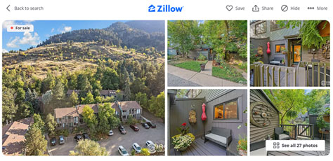
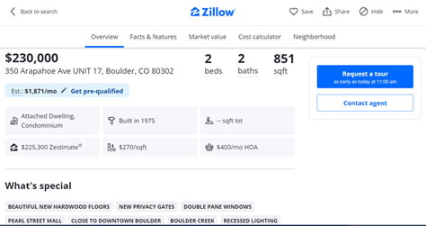
For example, Zillow presents real-estate photos in a neat grid and features buttons that are consistently presented and designed in the same way to establish a sense of connection.
In Figure 10, essential details about a property such as type, date built, and land area are grouped in neat rows. The distances between elements influence users’ interpretation of the layout. Beneath these, you can see special features that are presented in a similar way, but with a slightly different design, communicating proximity and distinction at the same time.
Figure 10—Elements’ spacing influences users’ interpretation of a layout
The spacing between elements—how close or distant they are from one another—impacts users’ interpretation of them, and they apply that interpretation to your broader design as they engage with it further.
5. Alignment
Alignment refers to the placement of design elements, whether text or images, in a certain structure or pattern on a page to aid users’ reading and comprehension. Alignment is necessary to place elements within a structure and direct the eye across the page. Some common patterns include the F-pattern and the Z-pattern.
Text-heavy Web sites that users visit to consume large amounts of textual content, often use the F-pattern, which places text elements near the left margin while it places images to the right. Magazines and blogs are common examples. In Figure 11, the visual hierarchy employs left alignment because most Western languages read from left to right.
Figure 11—Left alignment of textual elements ensures easy readability
In Z-pattern formations, alignment is more fluid, as shown in Figure 12. Key text elements are at the left, while other objects are either in the center or on the right.
Figure 12—Fluid alignments provide flexible arrangements of elements
Alignment not only helps users perceive which information on a page is more important but also enables them to put that information into perspective. Alignment also improves legibility.
6. Repetition and Consistency
Repetition and consistency are the most important factors in terms of establishing elemental relationships, as Figure 13 shows. You can highlight whichever element you want to emphasize more by repeating it throughout a design. The repetition could be something as simple as a word in a handwritten font while the rest of the text is in a clean sans serif font.
Figure 13—Repetition of elements on a page helps users connect them
Consistent repetition of a font style allows users to look for that detail and connect it to certain other elements or information. Styles also evoke certain emotions.
Consistency refers not only to the repetition of certain elements in a site’s overall design but also to your following design norms. For example, a site’s main CTAs always use a certain color throughout the site, and logos generally appear in the upper-left corner of all pages across sites, as shown in Figure 14. Since people have come to expect company logos to be in a certain location on a page, moving a logo to another location would result in user frustration and a botched UX design. Don’t change such details when repeating the elements of a layout.
Consistently repeating certain elements in a Web site’s design and placing them where users have come to expect them to be, helps users to move through the site and gives its composition a more unified, coherent look. But some variation is okay as long as the core idea remains intact, as shown in Figure 15.
Figure 15—Some variation within consistency can be refreshing
When you present the elements of a user interface or information in a clear sequence, arranging them in the order of their importance, it becomes easy for users to know what to pay attention to first. Visual hierarchy ensures that information flows in a natural progression, in which subsequent steps become clear as they move forward. Good UX design requires the clarity that starts with a strong system of visual hierarchy.
Karla is an accomplished writer and blogger with a degree in marketing. With over five years of experience in writing strategic content, she has worked with startups and their founders to help them develop and execute effective content strategies that deliver results. Karla is known for her ability to craft compelling content that resonates with readers and drives engagement. She has a keen understanding of the power of storytelling and how to use it to build brands and connect with audiences. Read More
