Visual designers design and implement the aesthetics of a product, application, or Web site, including its use of images, colors, and fonts. How designers place visual elements on a page to create an overall look and feel is crucial to delivering an effective, attractive design.
In this article, I’ll share some visual-design principles that play a significant role in UX design, including scale, balance, contrast, color, hierarchy, dominance, and Gestalt principles. I’ll also explain why each principle is essential to achieving a well-balanced, functional design that supports a great UX experience.
Champion Advertisement
Continue Reading…
7 Visual Design Principles for UX Design
When you look at something, you can immediately tell whether you like it based just on what you see. This visceral level of design determines how users perceive a product and how it makes them feel. However, few people can point out exactly why they find something appealing or are turned off by it. Understanding these design principles can help designers to impact users on visceral, behavioral, and reflective levels through their work.
1. Scale
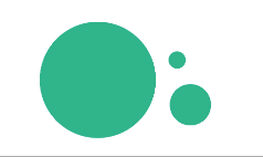
Scale refers to the relative sizes of certain elements in a design, in comparison to other elements, as Figure 1 demonstrates. Using scale by making the primary element larger than the other elements of a composition can help you emphasize that element. Scale can also establish a visual hierarchy, making the more prominent elements seem more important than the others. You can also create a sense of scale because elements that are closer appear larger to the user.
Figure 1—Scale
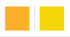
2. Balance
When there is an evenly distributed amount of visual weight on both sides of an imaginary axis, as shown in Figure 2, you’ve achieved balance in a design. Well-balanced designs appear stable and natural, while imbalanced designs seem unnatural.
Figure 2—Balance
For example, to achieve balance, you could aim for a symmetrical design by having similar visual elements on a page’s left and right sides. However, you could alternatively achieve a well-balanced design by arranging elements of different sizes to appear unified on either side rather than relying on symmetry.
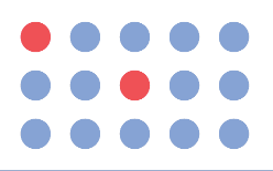
3. Contrast
Contrast involves using differences in color, value, or size to make an element stand out, as shown in Figure 3. UX designers and user-interface (UI) designers commonly use contrast for emphasis and, thus, impart greater meaning to an element. For example, using a red button on a white background might indicate a destructive action such as deleting an app.
Figure 3—Contrast
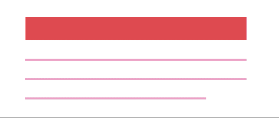
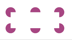
4. Visual Hierarchy
The use of visual hierarchy establishes the importance of the various elements in a composition through variations in scale, color, value, spacing, placement, and other visual cues. As a designer, you can create a visual hierarchy to guide the user’s eyes on a page, prompting the user to attend to the elements of higher importance first, as Figure 4 shows. Pages that have a clear visual hierarchy are the foundation of a good user experience. The user can readily understand an effective visual hierarchy.
Figure 4—A visual hierarchy
5. Gestalt Principles
Gestalt principles explain how the human brain simplifies and organizes complex images by combining different elements in an organized system that appears whole. Figure 5 provides an example. These principles include similarity, continuation, closure, proximity, order, symmetry, figure, and common region. In UX design, proximity is vital and refers to users’ perceiving elements that are visually closer as being part of the same group.
Figure 5—Example of the use of Gestalt principles
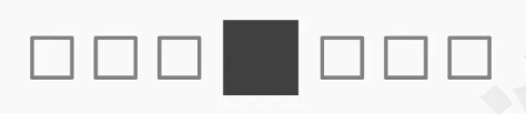
6. Dominance
Dominance causes users’ eyes to focus on a single element. Color, shape, scale, and placement can establish the dominance of a visual element, as Figure 6 shows.
Hero images are a good example of using dominance to get users’ attention. However, you should ensure that unity and balance are still key factors of a design.
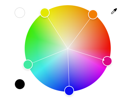
7. Color
Color impacts users psychologically. Designers use color choices and color combinations to differentiate elements, create depth, emphasize certain elements, and establish visual hierarchy.
Applying design principles for the use of color requires understanding the role of color as part of any harmonious composition. Figure 7 shows the full color spectrum. Plus, color is a key element of visual design, and how you decide to put color to work in a user interface is a key part of a product’s branding.
We can break down any product or service—whether it’s a Web site or a mobile app—into its various visual-design elements. Now, let’s consider the most basic elements that designers use in creating an impactful, usable design.
Line
A line is a stroke that connects two points. It is the simplest visual design element. Designers use lines to create shapes, patterns, and textures.
Despite being the most essential elements, lines have properties that can express different aspects of visual design. A line can be thin or thick, straight or curved, geometric or organic, and each of these properties can create an overall design that has a different emotional impact on the user.
Shape
A shape is an area that is usually formed by lines, but you can also create shapes using color, value, or textures. A two-dimensional shape has the overall dimensions length and width.
The human eye identifies an object based on its shape, then on closer inspection, focuses on the details of that object. Thus, shape is crucial to effective communication and in driving a great user experience.
Negative Space
Negative space, or whitespace, is the empty area around a shape or figure, which represents positive space. Designers must be aware that, when designing positive shapes, they’re also designing negative spaces. Both are equally important to creating balance within a composition.
Volume
Volume is the visual representation of an object with three dimensions: length, width, and depth. However, in visual design, we see volume as being two dimensional (2D) because the screens of digital products are 2D.
Value
Value determines the lightness or darkness of a visual element. A design with high value contrast creates a sense of clarity, while a design that uses similar values is more subtle. In 2D design, lighter values simulate light hitting a surface, while darker values simulate shadows.
Color
Color is a visual element that has two properties: value and light. The use of color in digital design is different from the way it’s used in ink, which employs a subtractive color model, using CMYK (Cyan, Magenta, Yellow, and Key, or Black). Mixing colors in a digital medium uses an additive model, combining RBG (Red, Green, and Blue) colors with a varied range of light on a screen.
In visual design, the use of colors conveys emotions, creates shapes and areas, adds interest to a design, and helps differentiate your work from that of others.
UX Design Inspirations
Today, there are many experienced Web designers, and the Web sites and apps that they create demonstrate their mastery of the art of good UX design. Let’s look at some examples of good UX design from well-known brands for inspiration.
Airbnb
The Airbnb Web site, shown in Figure 8, and their app frequently receive praise for their usability. The platform has a simple, unified user interface that makes navigating and searching for new destinations easy.
Their use of negative space is impeccable, and the simple lines and iconography that they’ve incorporated in the design enable users to locate clickable elements with ease.
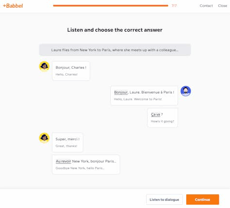
Babbel provides intuitive, smooth user journeys in both their mobile app and the desktop version of their Web site, which is shown in Figure 9. Their user interface creates a distraction-free experience while encouraging users to keep moving through their language lessons.
Orange visual elements could be perceived as overpowering, but this Babbel design incorporates orange for essential elements such as CTA buttons, providing a clear visual hierarchy through color and contrast.
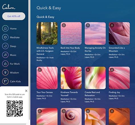
Calm
Calm uses color and balance to guide users through their application. As Figure 10 shows, one of the product’s key visual-design features is its use of icons and images to suggest specific content to users, according to their preferences and plans, which makes this personalized user experience more engaging and helps short-cut decision-making.
In addition to mastering the fundamental, technical implications of UX design, striving for other goals of good UX design can lead to success on your next Web-site design project.
The key to success is to create a user-centered design, which means involving users from the early stages of the design process. Start with UX research to learn about users’ preferences and behaviors and understand how they engage with similar products.
Overall, the following are the main characteristics and goals of good UX design:
functionality—The design is working and helping users to meet their needs and goals, as expected.
trustworthiness—When a product is reliable, the user experience provides enough information to the user. When an organization offers high-quality, transparent deals, this builds trust.
simplicity—A simple UX design makes it easy for users to understand, use, and interact with a product.
driving adoption—When a product is well designed, users’ adoption journey can be short and straightforward, which means they can find, try, use, and enjoy the product easily.
boosting customer retention—A good product engages users to stay with it for a longer period of time.
reducing churn—If its design is effective, users are more likely to keep using a product, eventually reducing its churn rate—users frequently canceling or failing to renew their subscription.
Consider these characteristics and goals during the design and development process. All of these characteristics are measurable. Therefore, you should periodically evaluate whether your product is performing well or needs improvement.
UX Design Best Practices
Finally, let’s consider some essential UX design best practices.
Accessibility
Accessibility in the digital world enables the full participation of everyone who is looking for a solution to their problem. Therefore, accessibility must always be part of the UX design process to ensure that the final product is usable by the widest possible audience, regardless of their background or abilities.
Design Consistency
Consistency enables users to rely on a user experience and trust the interactions they’re having with your product. Achieving consistency means ensuring that all of the user interface’s visual elements are uniform and logical, so the user feels comfortable interacting with it.
User Research
Creating a good user experience is about eliciting trust. New users often worry about becoming familiar with a new app because they don’t know whether it’s the right fit for them.
Investing time, effort, and resources in user research can enable you to understand what your users need and how to best deliver it, so you can focus your UX design effort on solving their specific problems.
Usability Testing
Usability testing helps you to learn about how people use your product, Web site, or app. It requires recruiting a representative group of participants or actual users who can provide insights into how they’re interacting with the user interface.
Wrapping Up
When learning about UX design, understanding these principles of visual design can take you beyond just creating something beautiful and aesthetically pleasing. Applying these principles lets you increase a product, Web site, or app’s usability and invoke certain emotions and perhaps even excitement, making users feel good. Visual design can help strengthen users’ perception of a brand by reinforcing a core message through the user experience. Once you put these visual-design principles into practice, your visuals can drive engagement and increased usability, which is the ultimate goal when you’re working on a UX design project.
Alina is a journalist-turned-content producer who works at Envato. She is passionate about copywriting and content writing, and also enjoys writing poetry and reading nonfiction. Read More
