In 2023, it’s time to leave vivid colors behind. Muted colors are now quietly dominating Web design. While muted colors are the opposite of bright and bold, they can still affect the user emotionally and deliver a message of modernity, serenity, and calm. Plus, designers often use muted colors to improve functionality in Web design. From a UX design perspective, a muted color palette is a great way to add interest to your Web site without compromising its simplicity.
In this article, I’ll guide you through the process of choosing a muted color palette to give your designs a sleek, sophisticated look. I’ll also provide examples of the use of muted colors for inspiration and help you get your creative juices flowing. Consider a muted color palette for your next UX design or Web-design project.
Champion Advertisement
Continue Reading…
What Is Color Theory?
Color theory is a set of principles and guidelines regarding the use of color when building a visual composition. Understanding color theory and its application in design, as well as design psychology, are fundamental for designers who create visual content. If you’re designing a Web site, you must pay attention to these color principles because they impact usability.
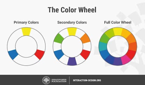
The Color Wheel
The color wheel is a way of visually representing primary colors—red, yellow, and blue—secondary colors—orange, purple, and green—and tertiary colors—magenta, vermillion, violet, teal, amber, and chartreuse—along with their respective hues, tints, tones, and shades. You don’t have to memorize all of these colors at once. When you’re using online design tools or design software, there are many colors that you can choose without using this basic color wheel.
However, it’s important to know how the color wheel works because this can help you to choose a color scheme and understand how each color relates to those that come next to it in the color spectrum.
Using the color wheel shown in Figure 1, you can create brighter, lighter, softer, and darker colors by mixing those colors with white, black, and gray to create color variants.
If you need to find the perfect combination of colors easily, Adobe Color offers an online color wheel that you can use to create a color scheme by automatically applying the color harmony rule.
Definitions of Terms
Understanding the following terms can help you to differentiate different aspects of color theory:
hue—Hue is synonymous of what people normally call color. Remember, primary hues—or what we refer to as primary colors—don’t carry other colors within them. In other words, hues are the simplest colors.
value—The relative lightness or darkness of a color is its value. The following terms describe colors that have different values and how to mix them:
shade—You get a shade of another color when you add black to any hue. The various shades of a color refer to the amount of black you’ve added to the mix. Any given color can have a range of shades.
tint—This is the opposite of a shade. You can get a variety of tints by adding white to a color. Any given color can have a range of tints.
tone—A tone combines a color with both black and white. This term is more often applied to painting rather than Web design.
saturation—This is the relative purity and intensity of a color. To increase a hue’s saturation, add very little gray and no white to the color. To decrease saturation, add black, gray, and white to a color.
What Are Muted Colors?
Muted colors are desaturated colors. They appear somewhat dull or a washed out because you create a muted color by mixing it with gray. However, there’s so much more to a muted color palette than just desaturated hues. Some artists create a desaturated color palette by mixing colors with their complementary, or opposite, colors—for example, red and green or blue and orange, which cancel each other out.
Think about the colors in nature. Perhaps the colors of a rainy day, the soil, or a soft winter sunrise. These are very different from summer colors that are bright, bold, and vivid. A muted color palette has less intensity to it and often appears subdued or grayed.
Why Use Muted Colors?
Mixing colors digitally is not an exact science. You need to experiment with ratios, values, and saturations of colors to get the results you want. In UX design, a firm grasp of color theory enables you to deliver harmonious, accessible designs to users. For this reason, understanding the value of muted colors can help you optimize the user experience and create a user interface that has high usability.
Muted Colors Versus Vivid Colors
Muted colors are easy on the eyes and look fabulous in flat designs—a user-interface design style that consists of simple, two-dimensional elements. Soft blues and grays do not tire people’s eyes or cause screen fatigue.
Plus, muted colors make a design appear more natural and effortless, while vivid colors can make looking at a Web site feel uncomfortable because the colors could be too high contrast on some screens.
Thus, the use of bright colors is now considered counterproductive in the Web-design world because of the strain they put on people’s eyes, which could interfere with legibility and readability.
Muted Color-Palette Inspiration
Muted colors and pastel tones have low hue saturation. When mixed with white, these colors typically appear soothing. Think about sage green, baby blue, or the colors of a sandy beach. The following examples of muted color palettes can provide inspiration when you’re creating your own harmonious color combinations.
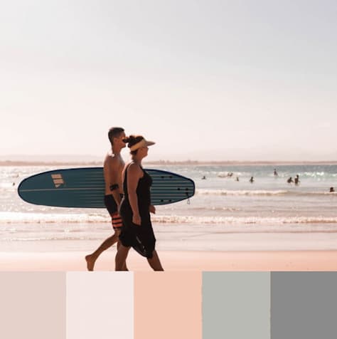
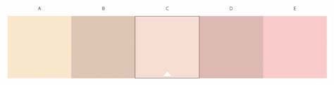
warm grays and pinks—Use rose and tan colors in combination with warm grays for lifestyle, fashion, or wellness Web sites and beauty brands. Figure 2 provides an example.
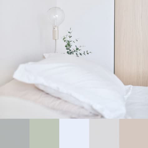
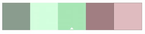
soft grays and sage—Keeping things natural with sage and soft grays exudes a natural, peaceful atmosphere. The palette shown in Figure 3 is a good choice for wellness and health Web sites, which require a calming aesthetic.
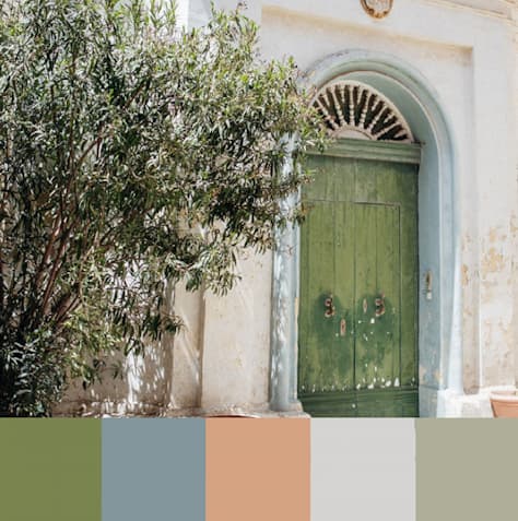
olive and earth tones—The color palette shown in Figure 4 comprises earthy colors and is perfect for home-decor Web sites. Although the first three tones hint at brighter colors, the overall look is still muted.
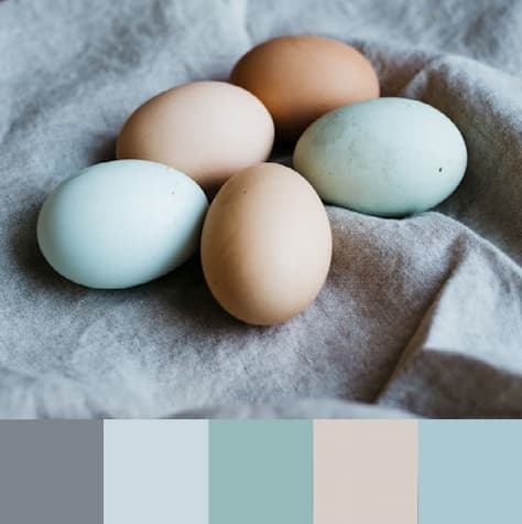
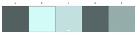
earth tones, light blues and cool grays—This color palette shown in Figure 5 works beautifully because of its combination of earth tones with soft blues and grays. These colors are ideal for an education or wellness Web site and give a soothing touch.
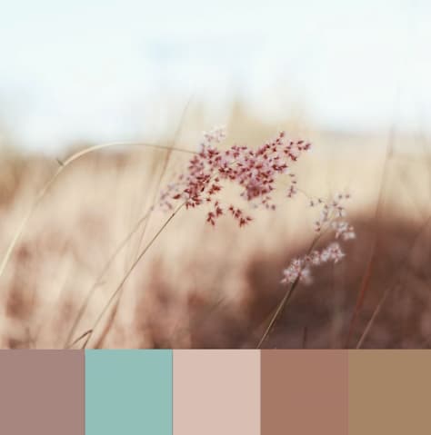
tan and rosy brown—The earthy palette in Figure 6 is inspired by nature and feels grounding. It gives a sense of warmth and homely contentment. This combination of warm colors would work amazingly well for fashion Web sites, travel and lifestyle blogs, or wedding planners.
There are no strict rules for using muted colors in Web design or user-interface design. Still, some combinations work better than others, so let’s explore how some brands have mastered the use of muted color palettes to showcase their products.
Thinx
Thinx uses warm colors to give its Web site an overall appearance of friendly calm. Plus, negative space plays a major role in keeping the design shown in Figure 7 uncluttered. The Web site’s copy is also straightforward. There are no unexpected pops of color to distract the user from reading and scrolling through the information.
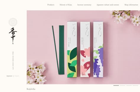
Despite the use of pink all over their Web site, Koju Incense still manages to keep things muted, as Figure 8 shows. These tints of pink include a lot of white—especially in the navigation bar’s background color. The product photo also includes white and a hint of black to tone it down.
Playing with tones and tints of the same hue keeps a Web site’s palette from overwhelming the user and brings focus to a product.
Honest Company provides a good example of using colors from the same side of the color wheel—warm colors in this case—while bringing in a little contrast to give it a more playful appearance. As shown in Figure 9, the Web site’s color palette is neutral and muted, so the site looks clean and tidy, which is perfect for a wellness brand.
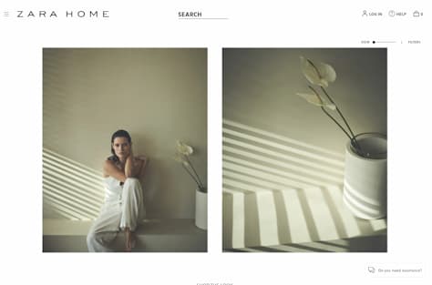
Zara Home is another great example of why flat design, simplicity, and muted colors work so well together. The Web site, shown in Figure 10, looks effortless because there are no intense colors. Also, the negative space lets users navigate smoothly because the focus is on textures and products. Muted colors are dominant, but most belong to the color wheel’s warmer side.
If you want to create your own muted color palette, you should know that there are various types of color schemes that can help you to choose colors. Using a color scheme is a safe way to ensure that the colors you select look harmonious and work well together.
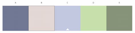
Monochromatic color schemes use variations of the same color’s shades and tints, as shown in Figure 11. Using colors that share the same hue gives a consistent, elegant look, although it lacks strong contrast.
Figure 11—A monochromatic color scheme
Analogous
Analogous color schemes like that shown in Figure 12 combine one main color with the two colors that are directly beside it on the color wheel. These color schemes work well when you’re creating a softer design because they use harmonious colors from the same side of the color wheel—for example, red, orange, and yellow or purple, blue, and green. Graphic elements that use analogous schemes blend together nicely without any high contrast.
Figure 12—An analogous color scheme
Complementary
Complementary color schemes use two colors that are directly across from each other in the color wheel. It’s best to choose one predominant color and use its opposite as an accent color. As Figure 13 shows, this is a high-contrast scheme.
Figure 13—A complementary color scheme
Split-Complementary
As Figure 14 shows, a split-complementary scheme includes a dominant color and the two colors that are directly adjacent to its complement. This is a more subtle palette than a complementary scheme, but still with the benefit of some contrast.
Figure 14—A split-complementary color scheme
Triadic
Triadic color schemes result from choosing three colors that are placed equidistantly around the color wheel such as those shown in Figure 15. They offer highly contrasting colors with the same tone, which is great for muted color palettes and subtle color combinations.
Figure 15—A triadic color scheme
Tetradic
A tetradic, or square, color scheme uses four colors that are equidistant from each other on the color wheel. This means choosing two pairs of opposite colors with even space between them. Figure 16 shows an example of a tetradic color scheme.
Figure 16—A tetradic color scheme
Wrapping Up
Hopefully, this guide has helped you to understand the subtle power of muted colors in design and how they can influence the user experience. Muted color palettes are timeless and, even as trends come and go, these underestimated tones are often perfect for Web sites and user interfaces that have great usability. So, if you’re looking for sleek visuals that stand the test of time, go ahead and try one of these muted color palettes or create your own. I can’t wait to see what you come up with!
Alina is a journalist-turned-content producer who works at Envato. She is passionate about copywriting and content writing, and also enjoys writing poetry and reading nonfiction. Read More