Recently, a client asked me to do a heuristic evaluation. They had hired another vendor to design an iOS app for one of their divisions, and it was my job to see how well they had done. And I almost failed. It was way, way too hard to evaluate the design, because it was all pages. There was no overall view of the system, no task flow, and only occasionally had they even really defined an interaction.
This is, sadly, typical of our industry today—and one way or another—this is something that I encounter regularly. While mobile UX designers may like to pretend that no design before the iPhone matters, we stick to many of the principles of 1970s graphic design in practice. Just look up almost any UX design pattern library, and you’ll find nothing but screenshots.
Champion Advertisement
Continue Reading…
Task Map, Story Map, Task Flow, IA…
Early on any design project, I create a diagram that describes the entire scope of the system from the point of view of the user—considering all touchpoints, all actors, and all storage and delays. Figure 1 shows an example of such a task-flow diagram.
Figure 1—A task-flow diagram
You may refer to such diagrams as task maps, workflows, IA (information architecture) diagrams, sitemaps, or by some other name. Some of these terms overlap; some describe slightly different or very different artifacts. But their differences aren’t super important. It’s the principle that is key: that it’s important to create an artifact that helps you to analyze requirements and design an entire system at once.
As far as your client is concerned, the task-flow diagram provides value in that it describes the scope, process, and performance of the whole system. Your client and team can evaluate the diagram; it establishes a baseline design for high-level estimation; and it provides a guide for your more detailed diagrams and specifications later on.
Features, Not Pages
But the task-flow diagram has a more important role, in making sure that you and the whole team are keeping the user and the context of each feature well in mind. In the task flows for any system, there will be nodes where the system shows information to the user or the user provides input. For a Web site or an app, these user interfaces typically take the form of pages. However, don’t forget that they might not be pages, but instead may be states or views. Another channel may provide certain features. Features may be split or combined as you progress through detailed design.
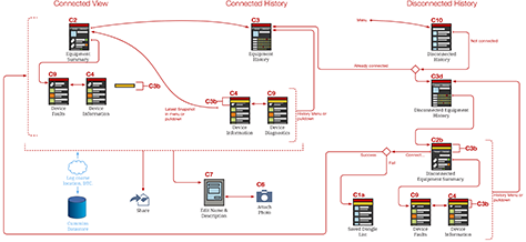
Figure 2 is a detail of Figure 1 and demonstrates that you should resist the urge to get too involved in designing features at this stage. Leave them as boxes with labels or, at most, just sketch the user-interface elements.
Figure 2—The most detail you should provide for pages in a task flow
A common mistake in software development processes is just accepting a list of features, then mapping pretty much each of them to a page or view. This is why there are so many steps in simple tasks like transferring funds between accounts at your bank. Everything is serial, sequential, and segregated. Clearly, that’s inefficient—and annoying for the people who actually use the system.
Design solutions also tend to focus on just one platform, with the assumption being that there are unlimited technical resources such as bandwidth and memory. If you want to make a terrible Web site, fine. But if you want to create a good Web service on multiple platforms, you need to plan. If it were just engineers heading wildly into coding, that would be one thing, but there is also such as thing as software design, which has traditionally used diagrams, too. When I see designers who just start drawing pages or coding, I know there’s a problem—not just with them, but with the UX practice as a whole.
Context, Environment, and Ecosystem
System design is important. We all like to refer to the “UX Is Not UI” chart and complain about clients who demand that we just pretty up the user interface, choose the colors, and maybe change the buttons. But I see lots of designers, UX teams, and design agencies delivering just that. Where are the product design, the taxonomy, the interaction specs? I don’t see nearly enough of these other artifacts—those that would enable us legitimately to call ourselves UX designers and communicate the value that we can really bring to the process. These are the deliverables that show our focus on the user, the environment, the context, and the holistic experience.
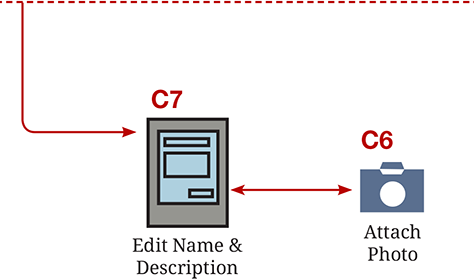
Back to tactics or storyboarding—at least the way most UX professionals do it now—is another way to think about all of this. Draw only users, their actions, and their environment. Leave out screen design entirely so you can focus on the user experience and the user. Figure 3 shows an example of a storyboard I drew for Lowe’s Home Improvement.
Figure 3—A storyboard shows user context and behaviors
I created the storyboards at exactly the time when this should be done: early. My going through these exercises, not just designing the system, freaked out a few of my client contacts. Clients’ having the wrong expectations of what we’ll deliver is our fault as an industry. We sell ourselves with portfolios of pretty pictures and write endlessly about the pros and cons of flat design when we should be talking about the power of a custom URI or how to decide when to build or use intents.
Artifacts such as storyboards work great—and not just because they really make you, the designer, confront who the user is and what they do outside the phone, but because they’re something real for everyone to hang onto. Clients who may not understand an IA diagram can begin to see how the product solves problems for real people.
Doesn’t Prototyping Make This Pointless?
When I conduct workshops on this topic—and even when I discuss the whole principle of design documentation, as in my previous columns on design tools, “Tools for Mobile UX Design” and “Tools for Mobile UX Design: Adobe InDesign”—people regularly ask me questions about one key issue: prototypes.
The idea is that prototypes show instead of tell, so we don’t need documentation—or even meetings. This concept has two problems:
It’s simply impossible to prototype out of the blue. You will end up with similar results as you would just sketching a user interface. Things will become inconsistent as you design screens for just one platform, instead of designing data, processes, and flows.
I have never in my life been shown a prototype to evaluate. I work with lots of people, and they hire lots and lots of other vendors to do design work. Some of them are big, name-brand design organizations who expound on the new world of Lean, prototype-centric design. Still, I’ve never seen anything but Photoshop drawings, PDFs, Word documents, PowerPoint presentations, and so on.
Okay, once I saw an Axure prototype, but because of various sharing issues, most people, including the developers, viewed a simple PDF export. Which brings up another key point: It’s not a prototype if it doesn’t work in context. If it works only on a desktop computer, it’s missing much of the point of prototyping in a world where 30 to 80% of your Web traffic is on mobile devices.
Value Understanding Over Pointless Speed
Don’t assume that creating these task flows would slow down your launch. However, it will take time. You may already sell UX design, in part, as a way to ensure that development is efficient and speedy. The same principle applies: If you just start drawing comps or draw UI designs page by page, you will waste time. You will duplicate effort, won’t create a very good, coherent overall product design, and you will have to revise it later—if you even still have a job.
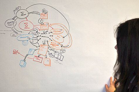
At the beginning of a project, take a little time to understand the overall product vision, plan your design strategy, and draw your concepts, so everyone on the team has the same understanding. You can collaborate on developing the task flow, as shown in Figure 4, so the whole team is on the same page.
Figure 4—Drawing a task flow as a team exercise
My experience on a couple hundred launched agile and Lean projects makes it clear to me that these methods strongly encourage setting aside careful consideration of design strategy and empathy. But to adhere to a user-centric ethos, you have to be free to explore options, make decisions, and stick to them if you want to get anywhere.
Even if we make good design decisions, we forget why we’ve made them. People are terrible at remembering project details, interactions, and decisions. Therefore, we must document this information somewhere permanent, so we’ll know why we did what we did.
On projects that go too fast, products are rarely designed at all. Oh, sure, they may have pretty interface designs, but the software architecture suffers. Decisions get made based on whatever technology is available that team members happen to be comfortable with. Overly speedy projects get bogged down in technical debt very, very fast.
Creating design documentation isn’t really that slow even at the moment of execution. You can sketch the design solution for an emergent issue while people stand around a whiteboard, then get on your computer to formalize the design and specifications. When I do this, I can usually finish my documentation in time to print it out and stick it on the wall before the developers have come back with their detailed questions.
Conclusion
For years, really ever since User Experience became a practice area with processes and principles, we’ve been saying that the best time to engage with a project is early. But we simply do not exercise that principle often enough. We’re all too happy to please our bosses and clients in the short term—and let them insist that we can do our work fast, cheap, and well.
Unfortunately, all of this dysfunction is worsening just as more people are using more types of devices and better-connected devices. People who expect not just functionality, not just beauty, but well-integrated, robustly predictable services across all of their devices.
Our work can be responsive, accurate, and reasonably fast without sacrificing quality—from design through implementation. But we cannot achieve this by guessing or shortcutting the design process. We can’t do this by ignoring the user, making assumptions about technology, and mistaking design trends for patterns.
When you start your next project, first ask the right questions, then solve the design problems through design strategy. Try creating storyboards, task flows, and architecture documentation. Try creating these artifacts with your project team—and see how doing this helps make the rest of the project go better and faster.
I’m currently struggling to guide three different product teams on creating journeys and tasks for pretty much all the benefits you describe and to introduce them to UX.
Now the practical issue I’m facing is finding a tool that helps on maintaining this as a mindmap, with simplicity and yet flexible.
We are sketching them together in brainstorms, but with each iteration, the product grows, and it is important to keep track of what’s being affected and feature patterns gaps as they emerge.
What would you use to move these to digital and keep building them up?
I feel fully identified with all you explain here. Working in a little ecommerce company—although we are eight people on the Web team—we are only just two designers. We work with Jira and sprints, and we rarely have time to make work flows. I always try to do them, but in the real world in a small company, it is sometimes impossible.
Sorry I missed your comments. Answering now anyway:
Marco: I have never found a tool that makes it easy to go digital. I use InDesign—and Visio or OmniGraffle when I have to due to sharing—but I do fine in all these because I have mad drawing skills.
Sara and Marco: Now I find it doesn’t take long, after the first time. Set up that first one then keep all the components. I am using the drawing widgets for paragraph, masthead, table, and so on. I first drew them over 10 years ago. I just re-use them over and over again. If you make them in a library-oriented tool such as PowerPoint or Visio, after the one drawing-centric person sets it up, you can get almost anyone to do this, pretty easily.
And as I say sometimes—if not above—this doesn’t take much time compared to fixing stuff later on. Once you have the basic diagram, changes take minutes, so if you make sure it’s the document of record, you keep it up to date right after each meeting and share a new copy.
The line, “When I see designers who just start drawing pages or coding, I know there’s a problem—not just with them, but with the UX practice as a whole.”
How true, but such a prevalent practice. Jump into details of page layout before understanding workflows and call it UX design.
For mindmaps, FreeMind is a great tool. Google Drawing is effective for creating shareable workflow diagrams.
There are storyboard tools, but I’ve never found one as flexible and fast as sketching on a whiteboard or with pen and paper. I photograph sketches and post them to the team collaboration site to document ideas.
For his entire 15-year design career, Steven has been documenting design process. He started designing for mobile full time in 2007 when he joined Little Springs Design. Steven’s publications include Designing by Drawing: A Practical Guide to Creating Usable Interactive Design, the O’Reilly book Designing Mobile Interfaces, and an extensive Web site providing mobile design resources to support his book. Steven has led projects on security, account management, content distribution, and communications services for numerous products, in domains ranging from construction supplies to hospital record-keeping. His mobile work has included the design of browsers, ereaders, search, Near Field Communication (NFC), mobile banking, data communications, location services, and operating system overlays. Steven spent eight years with the US mobile operator Sprint and has also worked with AT&T, Qualcomm, Samsung, Skyfire, Bitstream, VivoTech, The Weather Channel, Bank Midwest, IGLTA, Lowe’s, and Hallmark Cards. He runs his own interactive design studio at 4ourth Mobile. Read More