Top

Tools for Mobile UX Design: Adobe InDesign

Mobile Matters

Designing for every screen

A column by Steven Hoober
September 9, 2013

Whenever I discuss at length how I draw—like I did in my last column, “Tools for Mobile UX Design”—people start asking for tactical details about my methods. Many of them are easy to explain and understand. Even if you haven’t seen information design with Post-it® notes, it’s pretty easy to understand after seeing one photo. So I’ve instead chosen to explain one of the more complex cases: I would like to discuss in some detail how I draw wireframes, as well as some of the tips and tricks that make wireframing easier for me to do using my tool of choice, Adobe InDesign.

Champion Advertisement
Continue Reading…

UI Specifications

Actually, I insist that I don’t do wireframes. Oh, sure, I do lots of drawings that serve the same purpose, and I often summarize what I do for clients by describing them in this way. However, I work with different teams all the time, and within UX practice areas, the term wireframe still seems to mean a black-and-white vector comp. It’s pretty much just a drawing of a page.

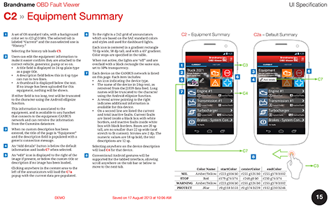
I create UI Specifications. A few other designers that I have encountered do similar work, but I am the only one I know of who insists on using that term. There are some obvious practical reasons, mostly having to do with the argument about drawing versus prototyping. From too much bad experience, I fall firmly on the side of show and tell. As shown in Figure 1, a UI Specification has both drawings and lots of words, tables, and numbers to tell implementation teams how to get to the drawing and how to make it move. It has annotations on the left and a table of colors below the high-fidelity drawings on the right. And don’t forget timings and behaviors. We create interactions, not just user interfaces.

Figure 1—An example page from a UI Specification
An example page from a UI Specification

Perhaps the key reason that I actually call them specifications is that it helps User Experience to be part of the conversation. We don’t do drawings; we specify a key part of the process, and we’ll open bugs against any parts that Engineering doesn’t do right.

A few weeks ago, I talked to a developer at Garmin. This was interesting because, while I have plenty of friends there, his process was totally different from theirs, and design got baked inviolably into the process. He doesn’t work on Web sites or apps, but on aviation systems—cockpit design and so on. They don’t have designers, but human-factors engineers. I have had this title on my business cards and worked with people who went to school to get degrees in this discipline. This is really what we do every day—even for apps and Web sites and the rest of our non-life-threatening work.

As long as we take our UX work seriously, pursue our work with scientific rigor, and tell everyone else in an organization that is what we do, we can make surprising headway. Specifications get taken seriously.

Yes, I know that, after all, UI stands for user interface, but the term UX Specification was pushing for mass-market understanding. No one parses that title that deeply, so this is still my name for the deliverables that I produce.

Programmatic Design

More and more, I find that specifying user-interface designs is crucial. The reason that this is so is one of the key things now making our applications and Web sites look good: we don’t need to embed so many images anymore. I haven’t 9-sliced anything in years.

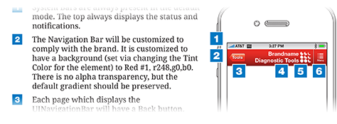
Instead, we can programmatically specify lots of things. Need a different color for the title in your iOS app? Just change the tint color for the Navigation Bar. Need anything at all to be a gradient on a Web page? CSS now supports gradients on almost any component. For example, Figure 2 shows a diagram of a title bar in red, while the annotations specify its color and how to display it correctly.

Figure 2—A diagram showing a title bar, with annotations that provide color specifications
A diagram showing a title bar, with annotations that provide color specifications

I have built entire apps and Web sites with just one embedded graphic: the logo. And that only because we really can’t render a logo programmatically. The future is even more promising, but that’s a topic for another day.

My specifications are full of words describing everything. While I still sometimes create wireframe-style, grayscale boxes and lines; more often, I just do everything at full fidelity, then specify how to get there, including the component or method, the sizes—both the physical sizes of the elements in a design and a scalable unit for the platform—the colors, transparency, and so on.

Scale and Math

Scale is one thing, units of measurement are another; and this is where InDesign helps us all out. It supports pretty much any unit. Pick the one you are most comfortable with. Since I started with print design, I use picas and points. I still even own and use pica sticks.

What’s even better is that InDesign doesn’t lock you into a particular unit. Even when units are set to points, I can type 5 cm in the Width box. The box will then switch to displaying 141.732 pt—but only after first resizing the object to 5cm. It’s still the same physical size. If you didn’t already know that iPhone screens are all 5 cm wide, this is a good thing to know. I didn’t deliberately memorize this, but after typing it in a few times, I remembered it. Working at scale makes me think at device and human scale all the time.

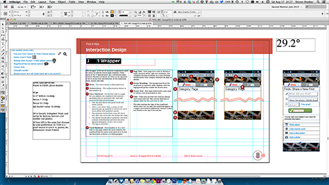
When specifying physical sizes, this makes things easy. You just follow your guidelines for text size and add that information to your annotations. Even for other sizes—say converting to Apple points or Android dp / sp—just figure out your scaling ratio and make a note at the side of your document about that. Visio gets confused by this, but InDesign lets you place drawing objects outside the print area—whether to organize them, save things, or leave yourself notes. I often do this, as shown in Figure 3, where I’ve included an optional design, a reminder of the brand angle with which everything must align, and a list of items to fix in the design.

Figure 3—My notes outside the drawing area
My notes outside the drawing area

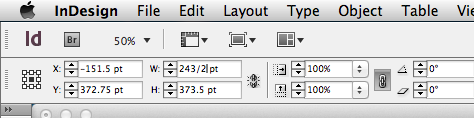
You can even do simple math in the Size and Scale fields. Just type directly into the fields, as shown in Figure 4. Want a box that’s as wide as the screen to be half as wide? Divide the width in half by typing /2 after the current size, then pressing Enter. This is a great way to resize things without using scale panels. If you aren’t enough of a mathematician, a slash indicates division; an asterisk, multiplication. All of these symbols must precede the unit label. These fields don’t accept complex formulas, so don’t try to use parentheses and so on.

Figure 4—Dividing the width of the Width field in half
Dividing the width of the Width field in half

Layers

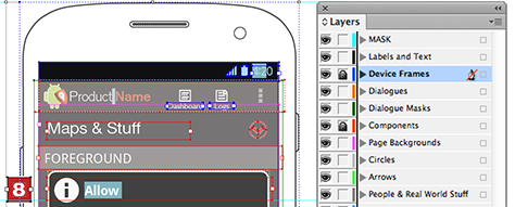
If you’ve worked in any serious drawing tool in the past decade, you know about layers. If you are used to Adobe Photoshop, be aware that layers are a bit different in vector tools. Each layer is more like a group of layers. You can draw each object on its own level and can move it forward and backward within the layer. Or you can draw everything in the single, default layer, and it will look just fine.

But if you organize your drawings better, things become really easy. Let’s say you’re working on a dialog box. If you put that in a Dialog Box layer, when messing with it, you can lock or hide Components, Backgrounds, and Device Frames layers. Color coding each layer helps you to identify which layer you currently have selected, so if it’s not locked, you can be sure that you’ve grabbed the right object. See Figure 5 for an example of how I organize my drawings in layers, with different objects on layers that correspond to the layers of key UI elements.

Figure 5Layers palette for a typical mobile app project
Layers palette for a typical mobile app project

Templates and Snippets

Using page templates is pretty obvious, and I’m sure you know how they work in general. When using InDesign, I use templates more than in most applications, because they are so easy to work with. Just double-click the master document at the top of the Pages palette, shown in Figure 6, then you can use all the usual drawing tools there. Note that you can have as many master pages as you want. Any object can be on a master page. This also means that you can just slap your masthead, footers, and titles into place on a page, then when you get time, clean up your document by ripping them out and putting them on the master page.

Figure 6— Master pages at the top of the Pages palette
Master pages at the top of the Pages palette

Be sure to notice the Paste in Place command on the Edit menu. It remembers an object’s position on a page. This even works between documents—as long as the page sizes are the same—which makes consistency between pages and documents pay off.

Much more powerful than Master pages is the ability of InDesign to place and manipulate external files. It’s a print-production application, so it does this with great precision, and at the end, everything prints out at its perfect resolution.

As long as you keep Display Performance set to High Quality, zooming in also shows embedded files at pixel-perfect resolution. I try not to use raster images like screenshots too much, but for quick work or early work, this makes it easy to create high-quality sketches combining vector type and shapes with raster images. I find this to be a lot easier than opening a screenshot in Photoshop to edit it, and of course, a lot easier to change later on.

You can embed all sorts of images—including other InDesign files—into your master document. But the real power to me is in reusing embedded objects. In a UI specification, you’ll have dozens of pages—often with the same components on each page. You’ll use a masthead or a phone wrapper everywhere. InDesign provides clever tools like Libraries and Snippets, which Adobe designed especially for pasting reusable files. Unfortunately, I have grown out of using these because I find them tedious to set up, and they seem to change formats with each release. I can no longer use the nice library that I set up for my design elements because I upgraded, so I’ve given up on them.

So now, I pretend to have snippets, but they are just other InDesign files that I’ve stored in a folder, as shown in Figure 7. Any time I want to, I can open a file and update it. Then I just update all the links—which is annoyingly manual, but quick—and the changes flow in. I use these for mastheads, device frames, backgrounds, and anything that I am going to use in exactly the same format, over and over again.

Figure 7—Organize all your files so they are easy to find and reuse for other projects
Organize all your files so they are easy to find and reuse for other projects

Many other designers who use InDesign to create their design documents do the same, but with Illustrator instead. I also do this whenever I exceed the capabilities of InDesign, and there’s nothing wrong with that approach either.

But personally, I can get 99.75% of what I need just drawing in InDesign, so I find it easier by far to use just the one application.

One last hint: It’s much quicker to embed your small files—like mastheads or buttons—if their page size is the same as that of the other objects you’ve drawn. You’ll find that InDesign doesn’t seem to let you create very small pages, but the trick is that you need to make their margins zero—under Layout Margins & Columns. The real trick is that you have to do this for all master pages, so select those that you’ve already created and do the same to them.

Polymorphism

Objects that stay the same every time are omnimorphic. Objects that change are polymorphic. These days, this concept—if not the term—gets discussed a lot in relation to responsive design. In my experience, no tool is good at specifying flexible or polymorphic layouts or elements.

Let’s take something as common as the masthead in iOS. I have a simple masthead that is the same everywhere. (For my project, it contains the app title, not a page title.) So how do I change the Back button? That’s a separate object that, in InDesign, I can change each time. And it’s on another layer, so I can grab it by locking the fixed-objects layer.

You can also easily create several Snippets files—whether in InDesign or Illustrator. Just clone the file, and create a variant. To reduce the number of files, you can use sprites, just like on the Web. Create all variants of icons or other similar images in a single file, then display only a single image as needed. It works just like a sprite, for which you set the viewable area separately from the dimensions of the embedded file. Try it out. It’s neat.

Reuse

I’ve already talked a lot about some of the tactics for creating reusable components, using embedded files, layers, or even paste in place. But there’s even more to it, which has led me to stick with a single app for years and years. Whenever I can, I use InDesign—partly just because I have been using it for years.

In theory, I can have every widget that I need in a special InDesign file, which I can even share. I go, for example, to the right page of icons, find the section on clocks, and grab one. But practically, I tend to be too busy to spend the time organizing my images. So, I just steal good ideas and images from other projects that I’ve done. And since they’re vector shapes, I can resize, recolor, and modify them to suit my needs. Just this week, I borrowed components from drawing that I had created five years ago.

Portability

All of this becomes easier if your images are consistent in style, use of layers, use of scale, and so on. When you reuse a component from another project, they’ll mesh easily. Pasted objects preserve their color swatch names, layer names, and so on. This is cool, but can also make your documents a mess if you aren’t consistent and create new color palettes and use different standards for layer names on each project.

A lot of applications let you move pages between documents, but InDesign does this rather more neatly than most. Right-click the page in question on the Pages palette, then choose Move Pages… from the menu that appears. You can choose to move pages to other documents. They don’t bring over their master page, so the headers for your new project automatically get built in.

When things aren’t in InDesign, I find Illustrator to be my savior. Lots of stuff is available as vector art in PDFs. I like to borrow icons from things like handset manuals. Plus, companies that won’t give you a logo probably have a document with one in it. Just open the page in Illustrator, and it often becomes editable vector art. When you’re ready, you can even copy and paste it into InDesign. While this works for most images, it won’t work for some complex images.

The approach is similar for raster images. You can just copy simple objects from your browser or from Photoshop and paste them in. Note that transparent images won’t copy correctly. The clipboard turns the clear parts black. Those, you’ll have to save and then place directly, by choosing File > Place.

You should save colors as swatches, which you can then import and export. There’s a way to save swatch files, but that’s another custom thing that I don’t bother with. Instead, I create a set of squares in the colors that I use most and keep it at the side of a drawing. When I paste them into a new drawing, not only are the colors preserved, but the swatch names get imported, too.

Type and Annotations

One thing InDesign does really well is type. Even when other applications are fine for creating a particular drawing style, the type often kills me. I can barely work in OmniGraffle, for example. Let me explain things better.

InDesign is, at its core, a page-layout application, so text is a core element—so much so that you need to know the proper lingo to understand the application. Don’t look for a Font palette or menu. You won’t find one. The menu item is Type, and the two key palettes for working with type are Character and Paragraph.

InDesign provides lots and lots of control over type. Way more than I can go into here. Much of it is manual control though, and this may annoy you. For example, you can use a menu item to add a bulleted or numbered list. Want to indent it further? Well, you have to use the tab strip and/or the Paragraph palette.

There’s a very robust style tool. It’s important to use this to help enforce consistency—and so you don’t always have to remember all of the tedious controls. Create a few styles and save them. Yes, there are separate character and paragraph styles, which have a parent/child relationship.

Don’t miss out on the fun, hidden features. Most palettes have a little menu at the right. The Character and Paragraph palettes have crucial features on those menus. Character has underlining styles, which I often customize to allow me to highlight text. This is powerful enough that I can create buttons and rows of alternating colors using just text controls. There are also tables, which have an alternate-rows feature, but I use tables less often.

On the Paragraph palette menu is a Paragraph Rules… function. Rules are just lines. They let you build list views and customize their alignment and color to precisely match, say, the Android default list view, as shown in Figure 8. With InDesign type controls, you can automatically space useful features like paragraphs and divider lines in your designs.

Figure 8—Automatic spacing is a useful feature for paragraphs and divider lines
Automatic spacing is a useful feature for paragraphs and divider lines

Written specifications are most often called annotations—not just by me—because they provide notes about your drawings. Annotations aren’t very useful when their references to a drawing aren’t clear, so over the years, I’ve gone through several styles of pointers. This is especially easy in InDesign, because you can put type inside just about anything. So, you can create a rounded box with a line coming out of it—as just one shape—and place a number inside it.

And, if you want not only to number your annotations, but also to put a similar shape within the text, you can even do that. Just paste a suitably sized image right into the text. If it’s not lined up correctly, just right-click the embedded graphic, then select Embedded Object > Options.

Other Features

There are many, many more features in InDesign, of course. This is one of those applications that can do essentially anything you want, so if you find yourself wishing it had a capability, just do a search for it. Some of its capabilities are pretty unexpected—like GREP searching, which I have actually used to good effect when building indexes.

Although this column has provided an overview of how to use Adobe InDesign, many of these tips simply extend my principles for tactical design to this specific application. I generally do much the same when using Visio, OmniGraffle, PowerPoint, or Keynote. And I could probably do pretty well with a dozen other applications that I don’t recall now or haven’t used yet. Just make sure that you are doing the best job you can to meet your ongoing needs. 

President of 4ourth Mobile

Mission, Kansas, USA

Steven HooberFor his entire 15-year design career, Steven has been documenting design process. He started designing for mobile full time in 2007 when he joined Little Springs Design. Steven’s publications include Designing by Drawing: A Practical Guide to Creating Usable Interactive Design, the O’Reilly book Designing Mobile Interfaces, and an extensive Web site providing mobile design resources to support his book. Steven has led projects on security, account management, content distribution, and communications services for numerous products, in domains ranging from construction supplies to hospital record-keeping. His mobile work has included the design of browsers, ereaders, search, Near Field Communication (NFC), mobile banking, data communications, location services, and operating system overlays. Steven spent eight years with the US mobile operator Sprint and has also worked with AT&T, Qualcomm, Samsung, Skyfire, Bitstream, VivoTech, The Weather Channel, Bank Midwest, IGLTA, Lowe’s, and Hallmark Cards. He runs his own interactive design studio at 4ourth Mobile.  Read More

Other Columns by Steven Hoober

Other Articles on UX Design

New on UXmatters