Top

Tools for Mobile UX Design

Mobile Matters

Designing for every screen

A column by Steven Hoober
June 17, 2013

There are several ways to approach the design of interactive systems and an ever larger number of specialized products to help UX professionals do their work. But I think there is a bit of a gap between some well-discussed practices that many of these new tools support and the way many UX professionals actually do their work.

Several times a week, someone I know or follow discusses the value of designing in the browser—that is, opening a text editor and creating HTML as the first step of detailed design. This might be great, except:

  • I don’t design just Web sites.
  • Even if I’m designing a Web front end, it also has APIs, email notifications, and other services that I want to specify.
  • It’s a bit clunkier to do a Web implementation for mobile.
  • When does concept work get done?
  • How can we do this collaboratively?
  • It implies the coded solution is final, when sometimes we just need a sketch.
  • And I could go on…

Champion Advertisement
Continue Reading…

Designing in HTML is not the only issue. I have similar concerns regarding almost any specialized tool or solution for UX design—like doing all design work in Axure or Fireworks.

I actually think we need many tools and should use the best tool we can for any one design or communication task. I also have some concerns about how bad tool choices can cause breakpoints between design phases, so can result in concept ideas getting lost if a designer switches too vigorously from one style of work to another. But that’s a discussion for another day.

In this column, I’ve put together a discussion of a few of the tools and design practices that I regularly use.

Creating UI Specifications

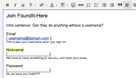
I suppose I could have called this wireframing, but I have issues with the use of that term. Not because I disagree in any significant way with any of the principles of wireframing, but because the term is sometimes misapplied or misunderstood to mean only drawings. With a wireframe mindset, annotations are too often a nice-to-have feature that gets tacked on later, if at all. Simply calling a design document a specification helps a lot. For me, this means that about half of any page in the specification is filled with words—like the whole left side of the specification page shown in Figure 1.

Figure 1—Typical page of a UI specification, with diagrams on the right and descriptions on the left
Typical page of a UI specification, with diagrams on the right and descriptions on the left

My focus on writing enough to call what I create a specification also drives the tools that I use for creating design documentation. Lately, I’ve been drawing in OmniGraffle and Visio, and I have tried several other tools over the years. But these days, when I have a choice, I draw in Adobe InDesign. It has most of the features of Illustrator, but better supports the creation of multi-page documents, so makes it easier to create complete documents. Plus, it provides superlative text creation, editing, and formatting tools. It even supports index creation and has GREP for really complex search-and-replace tasks if that’s what you need.

I know lots of people who like other tools for their many existing templates. But I have a design background, and I like to work with people who can also draw. I prefer having the flexibility of a fairly full-featured drawing tool, so I can come up with all-new solutions to problems and, if necessary, shift the degree of fidelity with which I’m representing any design. When I’m working with a separate visual design team, I draw in gray scale or lines, but when I am the sole designer, I tend to skip doing user interface design as a separate step, so simply draw high-fidelity mockups in my interaction design and architecture documents.

Communicating Concepts

Another key task in which I employ my ability to draw almost anything is in communicating concepts, choosing whatever way is most relevant. Concept documents of various sorts—some of which I’ve shown in Figure 2—are crucial to communicating initial ideas and making sure everyone is working off the same page.

Figure 2—Concept drawings include storyboards, task models, and sketches that communicate the context of use
Concept drawings include storyboards, task models, and sketches that communicate the context of use

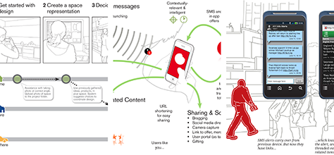
Whether you write about or draw mobile UX design concepts, you should communicate details about services, data, sensors, networks, and users. Maybe provide flow charts. Hardly ever screens. Storyboards and other ways of organically showing key principles relating to users’ tasks are great. So much so that I regularly have to repurpose such documents for use in presentations and slideshow decks that go out to executives and venture capitalists. As much as a demo or prototype can add value by explaining what a product is and how it works, it is important to set the context and explain your future plans.

Creating Scalable Designs

The other key reason that I use a vector tool—usually InDesign—over anything raster- or pixel-centric is that I stick strongly to principles of multi-device design, so I never like to get locked into one scale. Vector drawings can easily be adapted to other scales and let you show several user interfaces at once with minimal effort.

More importantly, this sort of work process rapidly leads you to assume that everything can stretch or shrink, so you’ll draw and specify in percentages, ratios, physical sizes, or other ways that work on every device. It helps you not to be so worried about the fragmentation of your platform, even when talking to developers about implementing your design work.

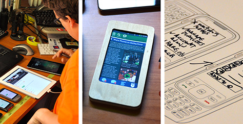
Using Pencil, Paper, and Hardware

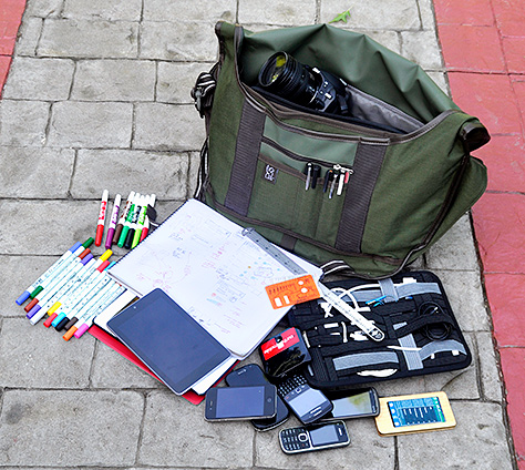
Drawing on paper is a great tool. I don’t do this for every project, but it’s a capability that is always available to me. My briefcase always contains a drawing pad, markers, pencils, erasers, rulers, and a Touch Template. But I don’t usually use pencils. Instead, I use marker paper and a gray marker for layout, then draw details in other colors.

Figure 3—What I carry with me pretty much every day to sketch, document, and test designs
What I carry with me pretty much every day to sketch, document, and test designs

Sometimes, drawing on paper is the best way to do group work. Even if you’re the only one drawing, it can be more engaging for a small group. Plus, I travel a lot, and drawing on paper is also great for airplanes and other environments where drawing on a computer doesn’t work so well.

I know of people who do pretty much the same things on their iPad. But that doesn’t work well for me. I like tools and physical media.

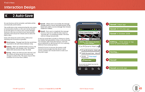
Designing and Reviewing at Device Scale

A key to designing for mobile devices especially is to design at device scale, as shown in Figure 4. I do this as much as possible regardless of how I am drawing. It’s important to get everyone to think at device scale and in the device context. Even if you present your designs on a big conference-room screen, try to pass around either paper printouts that show the screens at their real size or some sample devices displaying the screens.

Figure 4—Designing at scale on a device or sketching designs at the physical size of a device
Designing at scale on a device or sketching designs at the physical size of a device

One of my favorite things to do is to put designs—whether scanned sketches, wireframes, or comps—onto a mobile device. Just looking at the interfaces in the device’s photo viewer or gallery can really pull people into the right mindset. This works so well that I’ve done pretty good first-run usability tests like this

For paper sketching, I have prepared some device templates that I print out to make it easier to keep the various devices in mind. Making several templates available—rather than printing out only an iPhone template, for example—also helps to remind everyone about what happens when you switch devices or orientations or how to design for phones and tablets at the same time. If you’d like to use some of these templates, you can download a printable PDFPDF or an editable InDesign CS6 file.

If all that’s not crazy enough, I sometimes even use plywood tablets, eReaders, or mobile devices on which I sketch or tape designs. If you don’t have the woodworking skills, just get your scissors out and tape bits of paper to your actual phone. It works surprisingly well. But of course, there are commercially available templates, sketchpads, and other products that can help with this if you want to buy them.

Using Post-its

I have hundreds of 3M Post-it® sticky notepads and bags of markers in my office. While I rarely use them when working on my own, I find that they are indispensable for any group-design or information-gathering exercise. There’s so much that people have already said about using them, so I won’t go on, but these are a key tool. If your office doesn’t already have Post-its of various sizes and colors on every surface, with many spares in a supply cabinet, get to an office supply store today.

Working in Google Spreadsheet

My most heavily used tool for many of the most critical parts of my work in defining a user interface is without a doubt the spreadsheet—for example, Microsoft Excel, Google Spreadsheet, or their competitors.

Over the years, as I have learned various methods of listening to clients and users, I have developed a series of tools that are just forms, words, and bulleted lists. Over time, I have settled on the spreadsheet—rather than Microsoft Word or any other application—as my tool of choice in which to record everything. I have derived my method of using spreadsheets for this purpose, in part, from the data gathering tools that some people at Sprint use while observing usability research.

I prefer Google Spreadsheet over all others. You can check out an example document of mine, a heuristic evaluation. I prefer interacting with Google Spreadsheet because it has only the tools that I need and few others. It is easy to use—and even to type in. Of course, sharing is its key feature, and it’s much better than any other sharing system. (Don’t even talk to me about file-based sharing systems.) In Google Spreadsheet, multiple people can be editing a spreadsheet at the same time, so can share the same view of the document without using tedious screen-sharing software. It is also very reliable. Since each user edits only cells, if there is a conflict, the worst thing that can happen is that you lose a cell’s data.

If I must, I can use other spreadsheets. And I often use Excel for corporate clients who are fearful of the cloud. But the collaboration capabilities of Google Spreadsheet should not be dismissed lightly.

Drawing on Whiteboards and Taking Photos

Another thing that I keep in my briefcase is my own set of narrow whiteboard markers. These are brilliant for actual interface design work or complex flow charting. Whatever size markers you use, be sure you always have some with you or, before a meeting, check that your office is well stocked with them.

You can make or buy stencils to make it easier to draw at whiteboard scale. Although you really cannot draw at device scale on a whiteboard, maintaining consistency in the sizes of the screens that you draw does help.

When working on a whiteboard in front of a group, remember that it’s all about the group. Approach this just like you would giving a presentation. Make sure that everyone can see, that you tell observers what you’re doing, and that you engage your audience the whole time.

The most important thing is always to capture what you create. Take photos. If you’re working in a giant corporate headquarters where taking photos is not allowed, make sure that no one is around and the door is closed when you’re taking photos. Watch out for glare, and use a good camera. For this reason and others, I carry a serious DSLR all the time. Often, your mobile phone won’t capture enough detail that you can actually read your little scribbles.

Working in HTML

Yes, I do in fact work in HTML, but mostly as a way to validate ideas and build mockups and prototypes. I often use these mockups to prove to my colleagues and clients that an idea is sound—or the contrary. Plus, we put them in front of users to test design concepts.

You’d be surprised what you can fake by exporting realistic-looking drawings, modifying screenshots, and adding a little bit of animation. If you aren’t up on your CSS transforms, go ahead and use animated GIF or JavaScript, if that’s easier.

And you can mock up a lot more than you might think. I sometimes like to use HTML to emulate applications running in a full-screen browser. People—whether other team members or test participants—are very inclined to suspend their disbelief, so you can put this over on people pretty easily.

Check out this example mockup and get the source code for a snippet of a recent iOS app that I emulated on the Web for usability testing. Be sure to use a full-screen browser, or it won’t look so good.

Using Email or Almost Any Tool

A few weeks ago, design strategist Tom Maiorana tweeted, “Making a product good looks like a string of monotonous emails requesting minor changes and a team that gets why it matters.”

Sometimes you have to use the tools at hand. And when team interactions have been all about emailing, I have sometimes ended up communicating design directly in an email message. Perhaps not well, but it’s fast. So, if it lets you adequately describe a user interface, email is occasionally the right answer.

Figure 5—An example of a form design in an email message
An example of designing a form in an email message

This works better than you’d think. However, I’m not saying that email is a good way to do design; just that you can design with almost any tool. Some people I know do very well with PowerPoint and other applications that were not built to be design tools. Sometimes, what is available and what makes it easiest to communicate with the rest of your team is more important than what makes drawing easier.

Doing Whatever Works for You

I haven’t mentioned Photoshop or Fireworks because I philosophically disagree with their being too user-interface focused. I know people who use these tools for everything from IA diagrams to wireframes. But I personally find them to be clunkier means of creating such design deliverables, so I don’t use them. If they work for you, keep using them.

Likewise, I haven’t used many prototyping environments. While I have played with most of them and have used a few on specific projects, I find that prototyping environments are not generally suitable for my projects and can get in the way of creating innovative solutions. To reiterate a point that I made in my earlier discussion of template-centric tools versus general drawing tools, I think designers should be trusted to design using whatever tools suit their needs and let them achieve whatever design solution they may come up with.

These are my tool preferences, but you should use whatever tools you need to get your work done. Use the tools that you are most comfortable with, that meet the needs of your design solution and your process, and that let you create deliverables that your clients can easily understand and your implementation team can easily turn into executable code.

Please tell me about your favorite tools in the comments. I hope you’ll share how you use them and why. 

References

4ourth Mobile Patterns Wiki. “4ourth Mobile Touch Template.” 4ourth Mobile, undated. Retrieved March 15, 2013.

4ourth Mobile Patterns Wiki. “Drawing Tools & Templates.” 4ourth Mobile, undated. Retrieved March 15, 2013. (This is a huge list of design templates from third parties, the makers of various design tools, and official ones from some OS makers.)

Chapman, Cameron. “Ultimate Guide to Website Wireframing.” Six Revisions, November 1, 2010. Retrieved June 13, 2013.

Hoober, Steven. “Web to Mobile - Testing How Well It Will Work.” Donttouchme, October 28, 2011. Retrieved March 5, 2013.

Karafillis, Anastasios. “When Creativity Applications Hamper Creativity.” UX Magazine, April 18, 2013. Retrieved June 13, 2013.

Potter, Matthew. “A Web Developer’s Guide to Adobe InDesign.” Smashing Magazine, June 23, 2011. Retrieved June 13, 2013.

Rogers, Jared. “Building a Better User Experience by Designing in the Browser.” UX Magazine, April 29, 2013. Retrieved June 13, 2013.

Smith, Grace. “20 Excellent Wireframing Tools for Mobile.” Mashable, April 2, 2013. Retrieved June 13, 2013.

Spool, Jared. “Five Prevalent Pitfalls When Prototyping.” User Interface Engineering, May 2, 2013. Retrieved June 13, 2013.

Walker, Tom. “15 Desktop & Online Wireframing Tools.” UX Magazine, March 11, 2010. Retrieved June 13, 2013.

Warfel, Todd Zaki. “Design in the Browser.” UX Magazine, March 20, 2013. Retrieved June 13, 2013. (This is a pretty mobile-centric look at this topic.)

President of 4ourth Mobile

Mission, Kansas, USA

Steven HooberFor his entire 15-year design career, Steven has been documenting design process. He started designing for mobile full time in 2007 when he joined Little Springs Design. Steven’s publications include Designing by Drawing: A Practical Guide to Creating Usable Interactive Design, the O’Reilly book Designing Mobile Interfaces, and an extensive Web site providing mobile design resources to support his book. Steven has led projects on security, account management, content distribution, and communications services for numerous products, in domains ranging from construction supplies to hospital record-keeping. His mobile work has included the design of browsers, ereaders, search, Near Field Communication (NFC), mobile banking, data communications, location services, and operating system overlays. Steven spent eight years with the US mobile operator Sprint and has also worked with AT&T, Qualcomm, Samsung, Skyfire, Bitstream, VivoTech, The Weather Channel, Bank Midwest, IGLTA, Lowe’s, and Hallmark Cards. He runs his own interactive design studio at 4ourth Mobile.  Read More

Other Columns by Steven Hoober

Other Articles on Mobile UX Design

New on UXmatters