In the fields of user experience and service design, we use storyboards to illustrate our solutions, so clients can walk in the shoes of their customers, staff, or community and see our solutions as we see them. Storyboards are appealing at an aesthetic level, but are trickier to use in persuading clients who are more used to cold, hard numbers, charts, and tables. Offering more tangible measures of customer sentiment helps clients make connections between the experiences we depict and the sorts of technology, financial, and resource decisions that are necessary to make those experiences happen.
Champion Advertisement
Continue Reading…
Dexter’s Authority
Way back in ancient times, there was a great Australian TV game show called Perfect Match. The ever buff and polished Greg Evans hosted the show, and a lovely young lady or a peppy gent would ask three questions of three contestants who were seated on the other side of a screen. The lady or gentleman then chose one of the contestants, and the new couple went on a holiday together to see if they were, indeed, the perfect match.
It was all good, clean fun, but what really gave the show its spark for me was Dexter, the robot. Once the couple negotiated the receding screen and met each other, Dexter would announce—in a voice that sounded vaguely like a Dalek crossed with Kryten—their compatibility score as a percentage. Who knows what zoopy, algorithmy nonsense went into its calculation? That score was official, because it came from a robot. A fake robot at that, but we played along anyway.
And that’s when the magic would happen. Whatever judgments we, the viewers, had just made about the couple—based on their answers and the expressions on their faces when they met—we would find ourselves submitting to the authority of that compatibility score. During the brief interview the couple had with Greg Evans at the end of the show, the score would either hang over them like a damp cloud or bestow a glowing aura of approval.
The Net Promoter Score (NPS)
Amazing things, official scores. But I’m not speaking of just any score. Unlike scores in sports, where you see players earn their scores with your own eyes, the types of scores that are of interest here quantify the intangible. These scores lend the mark of authority to something that we might otherwise gauge only with our intuition. These sorts of scores are of immense interest to disciplines like human resources, marketing, and social media marketing.
One example of such a score is the NPS, or Net Promoter Score. The NPS is an aggregate of three types of data, leading to a score of how likely it is that people would recommend a certain brand or company to a friend. Although not without its critics, this score’s authority has grown over the years, and I’ve increasingly seen it become a factor in clients’ official KPIs. They run something like this: Improve online customer service experience to increase NPS by 15% over the next quarter.
Using Storyboards to Illustrate Experiences
So, what do scores like these have to do with using storyboards in UX and service design? It’s well documented that storytelling in general and storyboards in particular are highly useful in these disciplines, mainly in bringing the various elements of personas, user requirements, business goals, and functionality together into one engaging—even entertaining—visualization that all stakeholders can understand and empathize with.
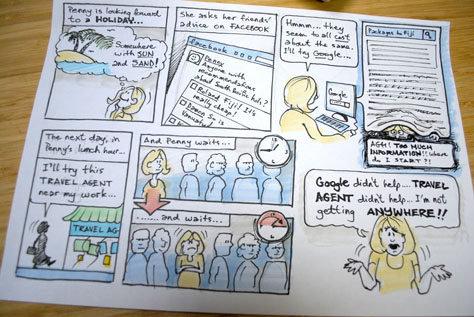
One touted advantage of storyboards—and quite rightly, too—is their ability to show the emotional state of the main character. This is very important in making the particular case a storyboard exists to make. Clients need to empathize with this character and his or her situation, feel the full weight of a particular customer experience problem, or experience the relief and joy a new design engenders. The simple storyboard in Figure 1 plots a lady’s experience in trying to book a holiday. This story ends with a problem: each of the channels she tries has a different weakness that leaves her with no good answer.
Figure 1—A simple storyboard
Quantifying Emotion Using Sentiment Charts
But feelings are subjective, right? And how delighted about a new smartphone app feature is that customer really? Or how frustrated are people really that they can’t comment on a blog post without signing in first? It can be a stretch for clients and stakeholders to relate the experiences you’re illustrating to their business rules, budgets, timelines, and technical constraints.
To prevent our stakeholders from dismissing our ideas and hard work by rationalizing them away, we can embrace the fact that many stakeholders are more comfortable with numbers and measures rather than just emotions. We can graph what our characters are going through with sentiment charts—and, thereby, give our ideas the ring of rigor and authority.
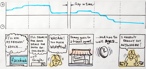
A sentiment chart is basically a worm-line that plots a character’s emotional state as he or she progresses through the plot of a storyboard. Changes in the line’s level may go either up or down and be gradual or abrupt, depending on the story the chart tells. A sentiment chart usually sits above a storyboard, though in some cases, may appear without a storyboard. However, both work best when they are viewed together. Indeed, depicting a character’s emotional journey as a chart may tell an extra story in itself. The simple sentiment chart in Figure 2 shows an abbreviated version of the same scenario the storyboard in Figure 1 illustrates. Note the gap representing a passage of time the storyboard does not depict.
Figure 2—A sentiment chart above a storyboard
Add Points to Reflect Specific Moments
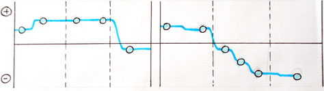
Any storyboard should include clear moments in the story where triggers occur, where the main character makes decisions; and his expectations are met, exceeded, or not met at all. These point to what service design professionals call service moments. These moments are important in the measurement of sentiment, so try to ensure that each moment resides in its own frame. The sentiment chart above the storyboard can then denote that specific moment and change in sentiment with a dot or circle. As Figure 3 shows, adding points to a sentiment line makes the changes in the graph more specific to the events in the storyboard.
Figure 3—Points on a sentiment chart denoting service moments
Add Bands to Show Behavior Thresholds
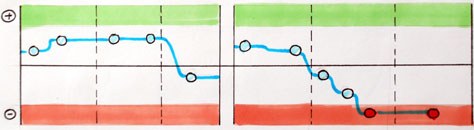
By adding positive and negative sentiment bands to a sentiment chart, as shown in Figure 4, we can indicate to our audience the points where customer sentiment strays into the more extreme ends of the spectrum. Adding positive and negative sentiment bands to a sentiment chart makes threshold behavior clearer and highlights moments when you can extend a positive threshold or avoid a negative threshold. Taking an NPS as an example—along with any user research you are working with on your project—it may be useful to show, if your character’s sentiment rises into the green band of positive sentiment, he is more likely to recommend your client’s brand to others. What opportunities might there be in that character’s experience to try to push his sentiment into that band and keep it there?
Figure 4—Positive and negative sentiment bands
Likewise, research results for your project may show that customers would leave your client for a competitor if their sentiment dipped below a certain threshold. Seeing this on a sentiment chart could be a powerful reminder of such dangers to all stakeholders, prompting everyone to ask: What can we do to prevent that from happening, in this given scenario?
Further Quantification Using Service Features
You may be thinking that sentiment charts give a bird’s eye view of sentiment over time, but are still a little bit too arbitrary, because it’s largely up to the researcher or designer to decide where on the scale a character’s sentiment lies from moment to moment.
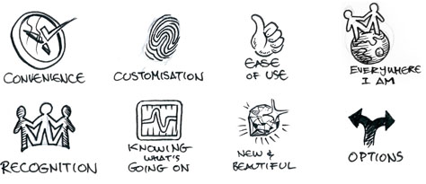
And, on one level, you’d be right. After all, there are many times on a project when a UX professional must use his or her best judgment, based on the available evidence and ideas. But, thankfully, there is a way to better quantify each moment’s sentiment by analyzing what service features have contributed to that sentiment. Service features are best thought of as heuristics of the experience that are valuable in some way to a customer. These are not functional features, so much as they represent the value that those features provide. Was the experience convenient? Personalized for the customer? Easy to use?
Each service feature can increment the score by one, and together they represent cumulative value to a customer. It’s important to realize that a feature’s perceived value decreases the more aware of it we become, so each feature has progressively less value the more a character experiences it in a story. Figure 5 shows a range of service features that are often present in people’s experiences of systems and services. I have a growing collection of nearly twenty service features at the moment, but I’m sure there are more. These are the ones that have come up time and time again in the user experience and service design projects I have been involved with.
Figure 5—Service features customers are likely to encounter
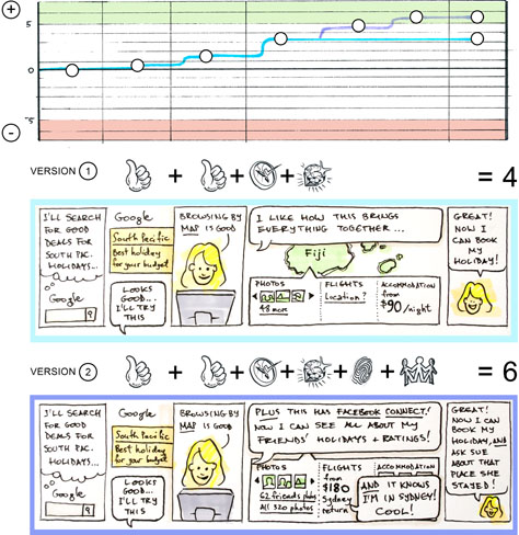
Figure 6 shows an example of using service features and a sentiment chart to quantify the level of positive sentiment that an experience engenders. It shows two versions of the scenario that I depicted earlier, picking it up at the point where Penny uses a search engine, but this time with a more optimal experience. The second version includes some extra functionality with more service features that generate higher sentiment levels. This demonstrates how extra customization and recognition features can make the difference between a good experience and a great experience worth sharing.
Figure 6—Combining service features with a sentiment chart and storyboard
Quantifying the extra sentiment by using service features demonstrates the connection between the new functionality and the benefits it brings, enabling you to make a clearer business case to stakeholders for the extra investment necessary to achieve that benefit.
Measure Your Experiences
If you use storyboards in your user experience practice, try adding the extra dimension of sentiment charting and quantification through service features, then use them in your presentations to your clients or stakeholders. It’s also possible to use the service features as a form of currency, facilitating the prioritization of one feature over another, if necessary. But that’s something for another article.
Question for you though: how do you help your stakeholders to not interpret things like the sentiment charts as being representative of the wider audience? (I’m assuming you’re basing these charts on small sample qual.)
I love, love, love this article! It’s very well written, and you make your point very effectively. However, as you yourself admit, calling the use of sentiment charts in this way quantitative seems inaccurate. While I think combining the charts with your storyboards conveys information more effectively than either visualization alone, they’re both just that, visualizations.
I think that quantifying the number of service features is a fantastic idea that gets us part of the way there. But without specific research behind it, calling it data could be misleading. That said, if you did specific research with customers, asking them to narrate stories to you about their past experience with these various service features and quantify, somehow, the emotional impact of those experiences, that would be fantastic!
I could imagine different audiences and different contexts in which one service feature might have a small impact—for example, a Recognition feature in a system used by technical users every day might be worth .25 points—whereas others might be worth more—for example, Customization in that same context might be worth 2 points. And then, of course, there would have to be anti-service features that have negative values, but I assume that these are essentially just the opposites of the features you’ve identified.
Anyway, this is a fantastic article. Don’t take this comment as a criticism; it’s really just critique.
Thanks, Patrick! The character in the storyboard—in this case Penny—should be a specific, well-forme,d research-based persona that already exists, that stakeholders would already be familiar with.
In fact, it’s always good to make sure the audience knows who Penny is and her habits, drivers, and preferences, before taking in the story.
As you’re probably aware, it’s easy to take erroneous assumptions about customer experience from a storyboard like this, if it’s not clear that it’s about one particular archetype. For example, some people couldn’t care less if the map included their friends’ photos and ratings, in which case the chart would not include an increase in sentiment.
Another application of the charting I’ve described could well be plotting one persona’s experience against another’s, to gauge the relative value of a set of features.
I found this very interesting, I am studying UX at the university at the moment, and this is a method I have never come across before. Do you think, in a research-based approach, the service features could be replaced by phenomenology—for example, emotions and senses?
Could you share with us, which “Service features” do you use today? Is there someplace to access this criterion as you mentioned that you have a collection of nearly twenty service features at the moment?
Ben has deep experience working with clients in the telecommunications and finance industries, as well as government departments and not-for-profits, enabling them to maximize the value of their online presence and creating digital experiences worth sharing. He enjoys being the communication bridge between management, designers, developers, and business decision makers, helping them to refine their digital strategy, listening to the people for whom we create digital presences, and coming up with deep insights and compelling designs. Ben is passionate about participatory design practices, fostering behavior change through digital media, and the power of design to change lives rather than just the decor. When not dreaming up ways of using his kids’ toys as prototyping tools, he gets into sketchnoting, drawing, and oil painting. Read More